An orange graphic with black and white text reads, “What is SEG and other FAQ. All about silicone edge graphics.” A hand pulls fabric with a silicone edge from a frame, showing how seg tension fabric displays work; a dog’s face is in the background.

SEG Fabric Displays – FAQ

What is SEG and other FAQ

Silicone Edge Graphics (SEG) shows up in almost every retail, trade show, and event environment we work in. Most clients haven’t been told how the format actually works until they’re mid-project. These are the questions worth answering before that point

SEG lightbox peeled back SEG lightbox with taught fabric

Frequently asked questions

What does SEG stand for in SEG fabric displays?

SEG stands for Silicone Edge Graphics. The display is a printed fabric panel with a thin silicone strip sewn along its edges. The strip presses into a matching groove in an aluminum frame, holding the fabric taut and edge to edge with no visible hardware.

What are the advantages of SEG over rigid signage or vinyl banners?

Three things separate SEG from rigid signage and vinyl banners: the finish, the workflow, and the lifecycle. The silicone edge gives a flush, frameless look with no visible seams or hardware. Aluminum frames are lightweight enough for one-person assembly and dismantle. Graphics can be swapped without replacing the frame, which makes SEG more cost-effective across multiple campaigns or store rollouts.

Are SEG fabric displays reusable?

Yes. The aluminum frame is the long-lived component, designed for repeated assembly cycles. The fabric graphic is washable and replaceable, so when the campaign changes the frame stays and only the graphic gets reprinted. This is the main reason SEG works well for retailers running seasonal or rotating displays.

Can SEG fabric displays be customized in size and shape?

Yes. SEG can be built wall-mounted, freestanding, suspended, curved, angled, or backlit, in custom sizes. The fabric flexes around shaped frames, which makes SEG one of the more adaptable display formats for non-rectangular or oversized environments.

How are SEG fabric displays installed?

The aluminum frame has a continuous channel running along its inside edge. To install, press the silicone strip on the fabric into that channel, working around the perimeter. The fabric pulls taut as it seats. No tools, no fasteners, no exposed hardware. Removing it is the same process in reverse.

Are SEG fabric displays suitable for outdoor use?

Standard SEG is designed for indoor use. Outdoor-rated SEG exists and uses different fabric, ink, and frame materials engineered for UV, moisture, and wind exposure. If the install is outdoor, this needs to be specified at the design phase, not adapted afterward.

What kind of printing technology is used for SEG fabric displays?

Dye-sublimation. The ink is heat-transferred into the fabric fibres rather than sitting on top of the surface, which is why SEG graphics resist fading and do not crack or peel with handling. The trade-off is that colour matching is slightly different from standard offset or inkjet printing, so brand colours should be approved on a fabric proof rather than a paper proof.

How portable are SEG fabric displays?

Very. Aluminum frame components are lightweight, and SEG fabric folds without permanently creasing, so a frame and its graphic typically ship in a soft case or compact crate. Most SEG displays are set up by one or two people without specialized tools.

Can SEG fabric displays be illuminated?

Yes. Backlit SEG uses an LED-edge or LED-array lightbox frame in place of a standard SEG frame. Light passes evenly through the fabric, creating a glowing display with no visible bulbs or hot spots. This is the format used in retail, transit, and trade show environments where the display needs to read at distance or in low light.

Do LED lights in SEG fabric displays consume a lot of electricity?

No. LEDs draw substantially less power than fluorescent or incandescent lighting at equivalent brightness output. Exact wattage depends on the size of the box and the LED array configuration, but for retailers running illuminated displays many hours per day, a backlit SEG lightbox is generally one of the lower-power options available among illuminated display formats.

When should I choose SEG over rigid signage?

When the message changes more than once a year, when the install needs to ship and reinstall multiple times, or when the environment calls for a frameless, oversized, or backlit look. Rigid signage still wins on permanent installations where the graphic never changes and weight is not a concern.

How long do SEG fabric displays last?

The aluminum frame is built for years of repeated use. The fabric graphic itself depends on handling, washing frequency, and lighting conditions, but a properly stored SEG graphic typically lasts through multiple campaign cycles before colour or surface degradation becomes visible.

Are SEG fabric displays suitable for different industries or events?

Yes. SEG is used across retail stores, pop-ups, and mall installations, trade shows and exhibitions, corporate environments, museums, conferences, and event spaces. The format works in any environment where a clean, frameless graphic surface is needed and the install conditions are predictable. The fabric weight, frame depth, and lighting configuration may change between use cases, but the underlying SEG system is the same.

Do you still have questions? We’d be happy to answer them. Email us at info@shomi.ca for more information.

An orange background with a red stop sign on the right. The text reads: shomi! Discover the science behind why your display isn't getting noticed.

The Science Behind Why Your Display Isn’t Getting Noticed

Motion, light, and dimensional builds aren't design trends. They're biology.

The human visual system is hardwired to detect motion, respond to light contrast, and interpret depth. The right display format matches those instincts to the demands of the environment it’s going into. Here’s the science behind it, and what it means for how you spec and build.

The Problem With “Pretty” Displays

Most branded displays are designed to look good in a photo. Clean lines, on-brand colours, sharp graphics. And then they get installed in a trade show hall or a retail environment, and they disappear.

Not because the design was bad. Because the environment ate them alive. Nobody told the display it was going to a trade show floor with 400 other displays, all of which also have great brand colours.

A busy trade show floor has hundreds of competing displays. A retail corridor has competing signage at every turn. A branded environment in a corporate lobby competes with phone screens, overhead lighting, and foot traffic. In that kind of sensory noise, a display that isn’t working with the visual system’s attention mechanisms is fighting an uphill battle.

The displays that actually get noticed share three characteristics: they move, they glow, or they come off the wall. Often all three.

That’s not a coincidence. It’s anatomy.

Motion: The Override Instinct

The human visual system didn’t evolve to admire graphics. It evolved to detect threats and opportunities. Your display is neither, but it can borrow from the same wiring. One of its most deeply wired functions is motion detection.

The retina has two primary types of photoreceptors: rods and cones. Rods are concentrated in the peripheral visual field and are specifically tuned to detect changes in light intensity over time, which is the biological basis for motion perception. This is why something moving at the edge of your vision captures your attention before you’ve consciously registered it. The response is involuntary.

Research in visual neuroscience consistently confirms that peripheral motion detection triggers involuntary attention shifts. Pratt, Radulescu, Guo, and Abrams documented this directly in their 2010 study “It’s Alive! Animate motion captures visual attention”, published in Psychological Science, finding that animate motion captures visual attention faster and more reliably than static stimuli. The brain’s superior colliculus, which handles orienting reflexes, responds to motion cues and redirects gaze before the cortex has a chance to evaluate the stimulus. In plain language: people look before they decide to look.

For display fabricators and brand managers, this has a direct implication. Animated content, whether it’s a looping LED sequence, an illuminated fabric frame with shifting backlighting, or a mechanically animated dimensional element, triggers a response that static displays simply cannot. You’re not trying to be interesting. You’re engaging a reflex.

The Nielsen Norman Group has documented related effects in digital environments. Their article “Animation for Attention and Comprehension” confirms that movement in peripheral vision triggers a stimulus-driven shift in visual attention, what they describe as bottom-up processing, distinct from the goal-directed attention a person chooses to give. The same principle applies in physical space.

“People look before they decide to look. Motion engages a reflex, not a preference.”

The iMPAKT in-motion Advantage

For environments where motion is the right tool, animated lightbox systems like the iMPAKT in-motion exist specifically for that application. The display itself moves. Not the graphic, not a screen embedded in a frame, the entire illuminated panel animates. The result is a motion cue that registers in peripheral vision from a distance, drawing viewers in before they’ve made a conscious decision to engage.

It’s an additional layer on top of the contrast advantage that any quality lightbox already delivers. In environments where foot traffic is high, dwell time is short, and competing displays are dense, that motion layer can be the difference between being noticed and being part of the background. In a quieter branded environment, a corporate reception area, a showroom, a permanent retail installation, a well-fabricated static lightbox is often exactly the right call.

Light: Contrast Is What the Eye Follows

Light doesn’t just illuminate a display. It creates the contrast that the visual system uses to parse its environment.

The eye doesn’t respond uniformly to all light. It responds to differences. The Mach band effect, described by physicist Ernst Mach in the 1860s and subsequently confirmed by neurophysiological research, demonstrates that the visual system actively enhances edges between light and dark regions. Lateral inhibition in retinal ganglion cells sharpens contrast perception so that the brain can quickly identify boundaries and objects. An illuminated display against a darker background is, quite literally, easier for the visual system to isolate from its surroundings.

This is why backlit displays consistently outperform front-lit or non-illuminated displays in terms of dwell time and recall. The 2023 OAAA/Solomon Partners U.S. Major Media Advertising Effectiveness Analysis — an aggregation of publicly available recall studies from 2017 to 2022 — found that illuminated and digital OOH formats generated the highest consumer recall of any measured media channel. The underlying mechanism is contrast detection, not aesthetic preference.

Lightboxes work because they create a controlled luminance differential. The graphic isn’t just lit; it’s made to be the brightest, most contrast-rich element in a viewer’s peripheral field. The eye finds it automatically.

The quality of that light matters, though. Even backlighting, consistent colour temperature, and high colour rendering are the difference between a display that reads clearly from across a room and one that looks washed out or patchy up close. This is a fabrication issue as much as a design issue. A low-quality light source undermines the very mechanism that makes the format effective.

“The eye doesn’t respond to light. It responds to contrast. Illuminated displays win because they’re the sharpest edge in the room.”

Dimensional Builds: The Depth Signal

The third mechanism is depth perception, and it operates through a different set of visual cues entirely.

The human visual system interprets three-dimensional space using a combination of binocular disparity (the slight difference in each eye’s view of an object), motion parallax (how objects shift relative to each other as you move), and monocular depth cues including relative size, overlap, and shadow. When an object occupies multiple depth planes, the brain registers it as physically present rather than as a surface to be scanned and categorized.

A flat wall graphic is processed differently than a dimensional build that extends off the wall. The dimensional build activates the brain’s object recognition systems, not just its pattern recognition systems. It reads as a thing rather than a sign.

Research in environmental psychology, including work by Paco Underhill documented in Why We Buy: The Science of Shopping (1999), has repeatedly shown that tactile and dimensional elements increase dwell time in retail environments. The visual system signals the body to slow down and gather more information about a complex three-dimensional object. A flat graphic doesn’t trigger the same response.

For branded environments specifically, dimensionality communicates something beyond the graphic content itself. A brand that builds in three dimensions is implying permanence, investment, and presence. The perception is partly subliminal. A foam-core pop-up reads as temporary. A fabricated dimensional installation reads as the real thing. The brain makes that call in about the same amount of time it takes someone to walk past.

“A dimensional build activates object recognition, not just pattern recognition. It reads as a thing rather than a sign.”

Matching Mechanisms to Environment

Motion, light, and dimension each work through separate visual pathways. Understanding which ones are active in your display is how you match the format to the environment it’s going into.

A well-fabricated SEG lightbox is doing serious work on the contrast pathway. It creates a controlled luminance differential that the eye finds automatically. In the right environment — a corporate lobby, a permanent retail installation, an exhibition space with controlled lighting — that’s precisely what’s needed and nothing more is required. The display looks authoritative, the graphic is vivid, and it does its job.

The question of whether to add motion or dimensionality isn’t about making a better display in the abstract. It’s about reading the environment. A busy trade show floor with hundreds of competing illuminated displays is a different problem than a flagship retail space with a single brand story to tell. The former rewards motion because peripheral attention is the only currency that matters when 400 other displays are fighting for the same eyes. The latter rewards craft, finish, and dimensional presence because the viewer has time to engage.

Add a dimensional component — a fabricated element that protrudes from the frame, a three-dimensional logo application, a tiered structure that creates shadow and depth — and the object recognition pathway activates alongside the contrast pathway. Add motion and you’ve engaged peripheral vision as well. These aren’t upgrades on a single scale. They’re different tools for different environments, and the right combination depends entirely on where the display is going and who it needs to stop.

This is the logic behind why well-specified branded environments outperform underspecified ones in brand recall and engagement. It’s not about spending more for the sake of it. It’s about honestly matching the mechanisms to the demands of the space.

Because in physical environments, attention isn’t won by decoration. It’s won by how the brain actually sees. The most effective experiential environments are designed with that in mind long before anything gets built.

What This Means for Production

Understanding the perceptual mechanisms behind effective displays should change how you approach production decisions, not just design decisions.

On motion: animation needs to be designed into the display at the fabrication stage. An animated lightbox system has to be specified early. Trying to retrofit motion into a static display system produces compromised results. Get the fabrication right from the start.

On light: the performance of a backlit display depends on the light source, the diffusion method, and the fabric or media in front of it. A graphic designed for a particular light output and colour temperature will look completely different behind a different system. These variables need to be coordinated across the design and production teams before anything gets built. This is the argument for early production involvement in every display project.

On dimension: dimensional builds require structural engineering, not just design intent. Weight distribution, wall attachment, shipping constraints, and installation access are fabrication considerations that have to be resolved before the design is locked. A dimensional build that can’t be safely installed or shipped intact is a design that exists only in a rendering. The production team has to be in the room when the concept is being developed.

The displays that capture attention aren’t accidents. They’re the result of applying known perceptual principles to fabrication decisions made early in the process.

The Right Question to Ask

Before any display budget gets approved, there’s one question worth asking: what does this environment actually demand?

A well-fabricated SEG lightbox in a controlled, lower-traffic space is engaging the contrast pathway precisely and effectively. That’s not a compromise. That’s correct specification. Adding motion or dimension to an environment that doesn’t need them doesn’t improve the display — it just adds cost and complexity.

In a high-traffic, high-competition environment — a major trade show floor, a flagship retail launch, a keynote-stage branded installation — the question becomes which additional mechanisms are worth activating. Motion for peripheral attention. Dimension for object recognition and perceived permanence. Both together for environments where the display needs to earn its place against serious competition.

There’s no universal right answer. But asking the question forces an honest conversation about whether the display is being specified for the environment it’s actually going into, or just for the rendering it’s going to look good in.

One of those outcomes shows up in post-show reports. The other shows up in the photo the intern took for the recap deck.


shomi! fabricates branded environments, lightbox display systems, and dimensional builds for trade shows, retail, and corporate spaces across Canada. The iMPAKT in-Motion animated lightbox is part of the iMPAKT display family.

Text on a white background reads: shōmi! WHY SOME SEG ENVIRONMENTS FEEL CHEAP AND HOW TO AVOID IT with shōmi! in gray, the main headline in bold orange, and the subheadline in black.

Why Some SEG Environments Feel Cheap (and How to Avoid It)

When SEG environments miss the mark, it’s rarely because the system itself failed. It’s because SEG was asked to do work it was never designed to do, or because key details were treated as optional. SEG isn’t the problem. Bad decisions around it are. Here’s where things usually go sideways.

Treating SEG as structure

SEG carries imagery, not weight. When it’s used as a substitute for framing, backing, or architectural support, it starts to feel flimsy. Flex becomes visible. Edges telegraph movement. The environment loses authority. Example: A large floor-to-ceiling SEG wall is mounted directly to drywall, skipping sub-framing or rigid backing. During graphic changes, the frame twists slightly. Corners soften. The surface never quite feels solid again — even though nothing is technically “wrong.”

Ignoring depth

Flat is fast. Depth is intentional. SEG installations that sit flush to the wall with no reveal or setback tend to feel temporary. Even minor wall irregularities show through the fabric, and from an angle the graphic loses presence. Example: A wall-mounted SEG frame installed flush to drywall looks fine head-on, but under overhead retail lighting every wall imperfection telegraphs through, flattening the graphic.

Poor seam strategy

Seams are inevitable. How they’re planned determines whether they disappear or dominate. When seam placement is driven by printer width instead of sightlines, the surface stops reading as continuous. The eye finds the interruption before it finds the message. Example: A seam lands directly in the primary entrance sightline because it matched printer width. Shoppers pause there naturally, and the seam becomes the first thing the eye resolves. But placement is only half the issue. Execution matters just as much. Seams that aren’t properly tensioned, aligned, and finished amplify the problem. Slight vertical drift, inconsistent tension, or colour shift between panels makes the break visible from across the room. What should disappear becomes structural. This is where finishing becomes critical. Finishing isn’t just cutting and adding silicone. It’s controlling tolerances, sequencing tension correctly, and ensuring multi-panel graphics resolve as a single visual field once installed. When finishing is treated as an afterthought, seams look like compromises. When it’s treated as production discipline, seams virtually disappear.

Underestimating lighting

Lighting is not an accessory, it’s half the system. Uneven illumination, hot spots, or the wrong colour temperature can quietly undo great artwork. Example: An SEG lightbox uses generic LEDs. Skin tones skew cool, brand colours flatten, and brightness varies across the surface — even though the print and files were approved.

Weak finishing at edges and corners

Edges are where quality shows up. Loose silicone, soft corners, exposed tolerances, or inconsistent tension don’t scream error. They whisper impermanence.

Example: Silicone edges bunch slightly at the corners. Most people can’t articulate what’s wrong, but the display never feels as resolved as the millwork beside it.

This isn’t about cosmetics. It’s about control. Corners require calculated relief cuts. Silicone needs to seat cleanly without distortion. Fabric tension has to be balanced across the entire frame, not forced into place at the end. When installers are compensating for production shortcuts, the result shows up at the perimeter first.

Finishing is what determines whether the system reads as engineered or improvised.

When finishing is rushed, edges telegraph it. When finishing is deliberate, the frame disappears and the graphic holds authority.

Overusing SEG

SEG is powerful…until it’s everywhere. When every surface carries fabric, hierarchy disappears and nothing feels intentional. Example: Walls, columns, and dividers are all wrapped in SEG. Individually fine, collectively loud. The space starts to feel disposable instead of designed.

How to get SEG right

SEG feels premium when it’s:

  • Supported, not stressed
  • Given depth, not flattened
  • Lit intentionally, not generically
  • Finished with controlled tolerances, not field adjustments

  • Used where change is expected, not everywhere

When structure is solid, seams are planned, lighting is calibrated, and finishing is disciplined, the system disappears and the environment takes over.

That’s the goal.

SEG isn’t cheap by nature. It’s precise. It reflects the level of control behind it.

When decisions are intentional and execution is tight, SEG doesn’t feel temporary. It feels engineered.

Get the fundamentals right, and SEG becomes one of the most efficient and effective tools in retail environments today.

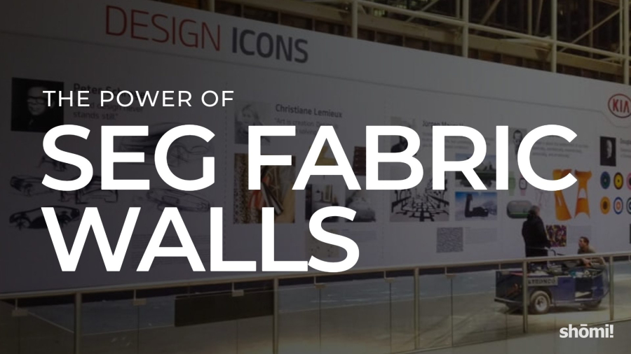
A large printed fabric wall display featuring the words The Power of SEG Fabric Walls in bold text stands out in a modern exhibition space, where people interact and explore the impressive fabric walls nearby.

Transforming Spaces: The Power of SEG Fabric Walls

SEG fabric walls have quietly become one of the most-used display systems in retail, trade shows, and corporate environments, and most of the people standing in front of them have no idea what they’re looking at. They just notice the graphic is huge, the edges are perfectly clean, and there’s no visible frame.

Here’s what the system actually is, why it’s become the default for large-format display work, and where it earns its place.

What SEG actually is

SEG stands for Silicone Edge Graphics. The system is straightforward once you’ve seen it once: a printed fabric graphic has a thin silicone bead sewn into its perimeter, and that bead pushes into a channel that runs around the inside of an aluminum frame. When the fabric tensions into the channel, it pulls completely flat and disappears the edge. No visible frame edge, no wrinkles, no exposed hardware. Just a clean, taut, frameless-looking graphic.

The aluminum frame stays. The fabric graphic swaps out. That single fact is most of why the system has taken over the industry.

Why it’s become the default for large-format display

Graphics swap, frame stays

A traditional rigid printed panel is a one-time-use object. When the campaign changes, the panel gets replaced and the old one heads to a dumpster. With SEG, the frame stays in place across years and campaigns. You ship a folded piece of fabric instead of a 4-by-8-foot rigid panel. The freight savings alone justify the system on most repeat-campaign builds, and the environmental case is a real one.

The visual quality is hard to beat

The dye-sublimated print on a properly tensioned fabric reads as a single continuous surface. In most cases, large-format fabric can be printed in one piece at sizes that would require seaming multiple rigid panels together, which means no visible joins breaking up the graphic. Compared to a rigid panel with visible edges and seams, or a vinyl banner with corner grommets, an SEG wall reads as more deliberate, more designed, and more premium. It’s the closest a large-format display gets to looking like it was always part of the architecture.

It scales

SEG works at almost any size: a 2-foot accent panel, a 30-foot trade show backwall, a curved feature wall in a retail space, a suspended fabric structure over a corporate lobby. The aluminum frame system is modular, which means a single graphic library can be assembled in different configurations as a space or campaign demands.

Installation is faster than the system has any right to be

This is the part most people don’t believe until they’ve watched it happen. A correctly designed SEG wall goes up in a fraction of the time a rigid panel installation takes. The frame snaps together, the fabric pushes in around the perimeter, and the wall is finished. When we helped Canadian Tire transform a hotel conference room into a fully branded space for their 100th anniversary, the entire build happened overnight. Try that with rigid panels.

Where SEG earns its place

The systems are versatile, but they shine brightest in a few specific applications:

  • Trade show backwalls and exhibits. Light to ship, fast to install, dramatic at scale, and the graphic refreshes each show without rebuilding the frame.
  • Immersive retail environments. Curved walls, themed spaces, and full-room takeovers that require the graphic to read seamlessly across large surfaces. Arcadia Earth is one example we worked on: large-scale fabric installations were a core part of the immersive build.
  • Backlit displays. SEG fabric over an internal LED array produces a frameless lightbox with even illumination across the full surface. Useful anywhere ambient light is low, or where the display needs to compete visually with brighter surroundings like windows, screens, or other backlit signage.
  • Corporate lobbies and office environments. Branded fabric panels create a permanent-looking architectural feature that can still be updated when the brand evolves.
  • Pop-ups and short-run activations. A pop-up that needs to look brand-new in a different city next month is exactly the case SEG was designed for.

A few honest caveats

SEG isn’t always the right call. The frame system has a real upfront cost, which doesn’t pay back on a one-time build that’s never being reused. Very small graphics (under a couple of feet) often look better in rigid materials. Outdoor installations need specific fabric and frame specs, since standard indoor SEG isn’t built for wind and weather.

Fabric choice also matters more than most people realize. Backlit, dye-sublimated stretch and non-stretch, black-back fabric for blocking light bleed-through, UV-printed non-stretch: each has a use case, and using the wrong one for the application is a common source of disappointing results. Stretch fabric on a tight curve, non-stretch on a flat panel, backlit on anything that needs to be lit from behind: the match-ups aren’t interchangeable.

The general rule: SEG is the right call when the graphic is going to change, when the install needs to be clean and fast, when scale matters, or when the space has design ambitions beyond a printed sign. It’s not the right call when none of those are true.

How shōmi! works with SEG

SEG is the underlying technology behind several of our product lines. FABRiK Frames are the unlit version: wall-mounted, suspended, free-standing, and custom configurations for retail, trade shows, corporate, and experiential builds. iMPAKT Lightboxes are the backlit version, using the same SEG fabric system over an internal LED light array for displays that need to read in low light or compete with bright surrounding environments. iMPAKT in-motion takes the lightbox further with programmable LED sequencing, so the graphic itself can animate and shift while the fabric stays static.

We work across the full fabric range (dye-sublimated stretch and non-stretch, backlit, non-lit black-back, UV-printed non-stretch), so the fabric gets matched to what the build actually needs, rather than what’s easiest to source.

If you’re considering SEG for an upcoming project and want a second opinion on whether the system fits, or how to spec it for what you’re trying to do, we’re happy to take a look.