RNS Case study(1)

Making Company Values Part of the Workplace

As RNS Health Care Services prepared to move to Aurora, Ontario, they came to shōmi! Custom with three walls and a clear idea of what each one should say about their company values. The brief was short. The ambitions weren’t.

Three spaces. Three different jobs.

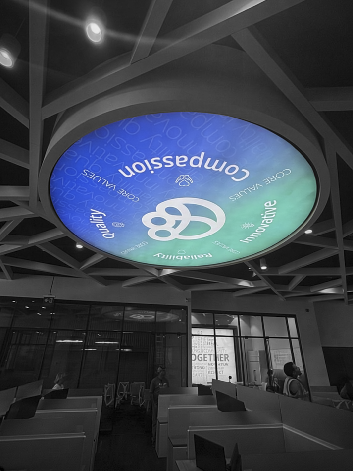
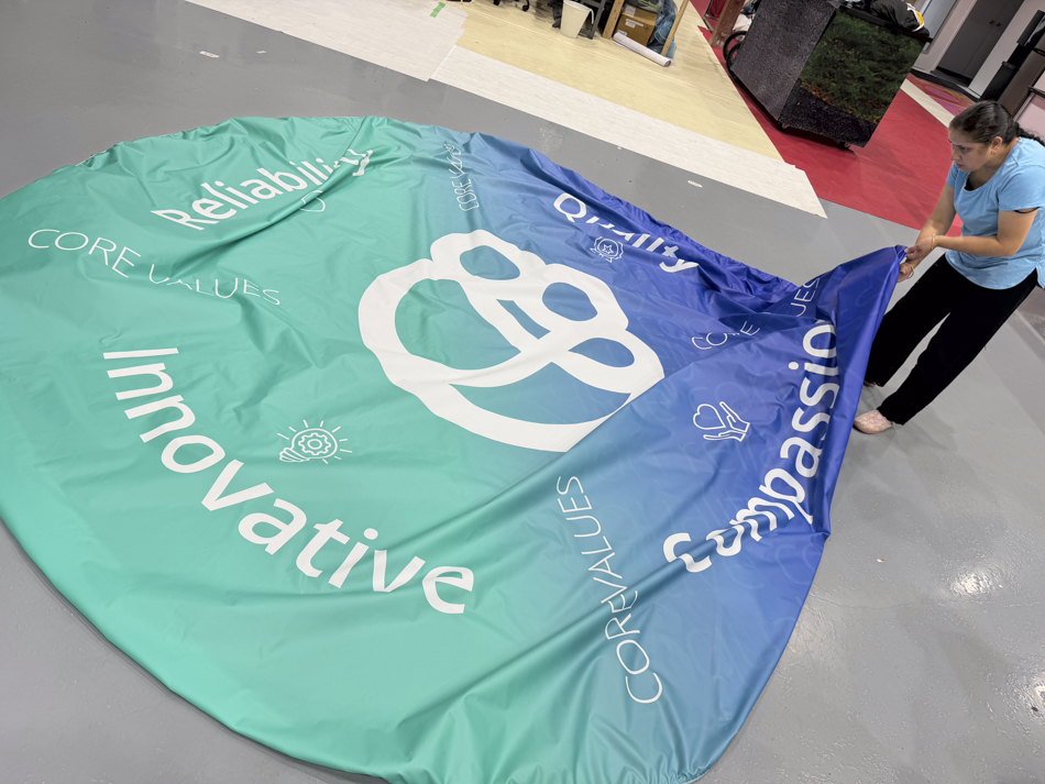
  • Express the values (circular backlit feature). Compassion, Quality, Reliability, Innovative. Four values, one circle, hanging over the open office where everyone sees it every day. No pressure.
  • Celebrate the team (lunchroom). A graphic about team building and employee appreciation, for the one room where people go specifically to not think about work.
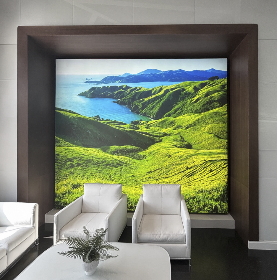
  • Bring in some calm (reception). Greenery, ideally a landscape, as a counterweight to an office that had committed fully to blue and white.

Questions first, pixels second.

The fastest way to burn through a design budget is to guess. So before opening a single file, we sent RNS a short list of questions for each space.

Text or icons? Photos or illustration? Celebratory or understated? Tropical or forest? We also asked for a few rough visual references, because one screenshot of something you like saves three rounds of something you don’t.

The answers came back clear: keep the values text-led, skip the team photos, and go forest or botanical.

Designed for the light

For the circular feature, we recommended white type on a coloured background. When the light comes from behind, white type glows and colour holds its ground, so the words read clearly from across the office.

From three concepts to five graphics.

RNS picked a favourite circle early and asked for more of it. In about three weeks the project grew from three graphics to five, which is the good kind of growth: the kind that happens because the client likes what they’re seeing.

Letting the logo lead (circular feature). RNS asked us to drop the company name from the centre and let the logo carry the circle on its own. We then added the value symbols from the RNS website, so each word got a mark of its own. Less a sign, more a seal.

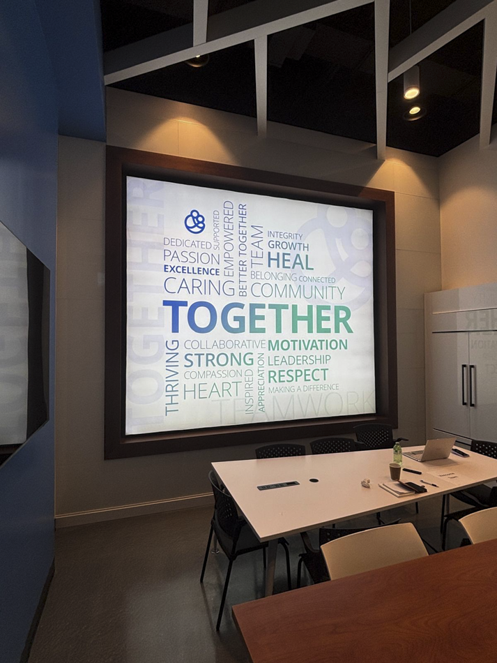
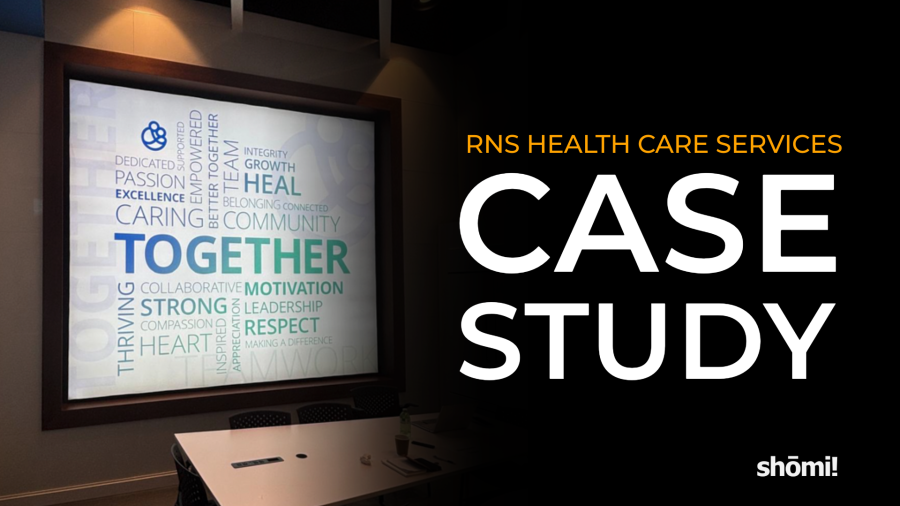
Words over faces (lunchroom). No team photos meant nobody had to chase down headshots. The lunchroom became a word cloud instead, with Together set large enough that nobody misses the point over lunch.

Greenery, after a second look (reception). RNS had a favourite landscape, then asked to see the wall behind reception before committing. After seeing it, they went back to an earlier option, which is exactly what a second look is for.

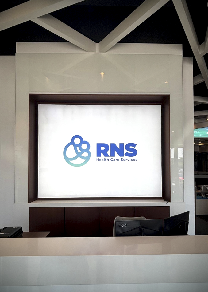
Two additions to the brief (reception wall and entrance). The wall behind reception wasn’t in the original ask. Once it surfaced, proofs went back the same day, in horizontal and vertical layouts plus a white-on-blue option. A second, smaller logo circle joined the project for the entrance.

Approved is not the same as print-ready.

Approval came twenty days after the brief. That’s when the less glamorous work starts, and it’s where a 13-foot mistake gets expensive.

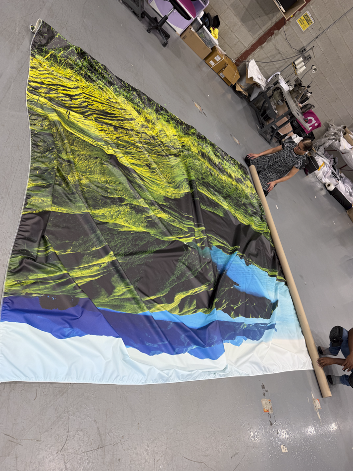
Before anything reached the printer, we confirmed the approved version of every piece, double checked measurement, and checked whether the sizes included bleed. One of those checks turned up a conflict on the greenery wall: the client’s last email named one version and the final file list named another. We confirmed which was the correct file before it was printed more than 11 feet wide.

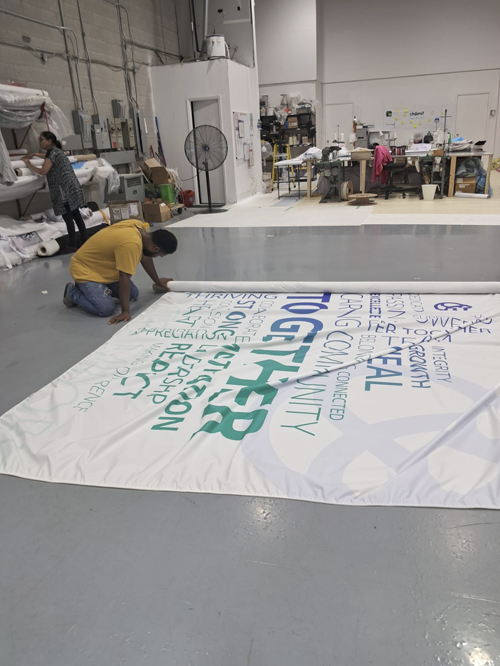
When a final size changed after approval, we rebuilt the file and moved the old ones out of the print folder, so nobody could grab the wrong one by accident. When a new size changed the greenery wall’s proportions, we recomposed the image instead of stretching it (because scale-to-fit has ruined more landscapes than every drought on record).

GraphicFinished size (W × H)
Core values circle156″ diameter
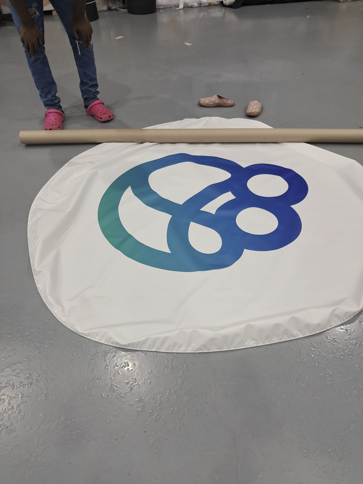
Logo circle72″ diameter
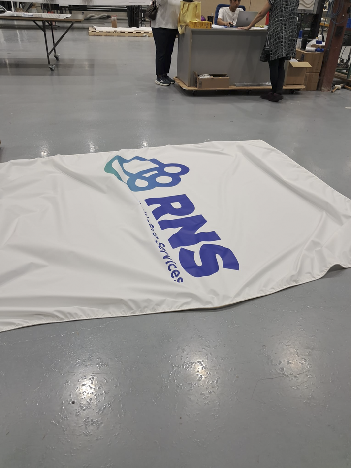
Lunchroom word cloud127″ × 110″
Greenery wall137″ × 120″
Reception logo wall110″ × 83″

Five graphics. One story.

The finished pieces carry the RNS blue-to-teal gradient from the entrance ceiling to the lunchroom wall. The brand stops being something hung on the walls and starts feeling like part of the building.

  • Core values. Four values and their symbols around an enlarged logo, in white type built to glow.
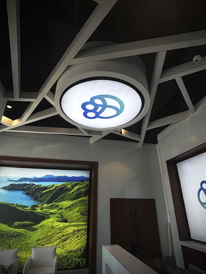
  • Entrance. The full-colour logo mark, lit overhead as people walk in.
  • Lunchroom. Teamwork and appreciation in words, with the word “Together” as the focal point.
  • Reception. Rolling green hills over a blue bay. Calm, and still on brand.
  • Front desk. The horizontal logo on white, framed behind reception.

Planning workplace graphics for a new space? Get in touch with our team to talk through your project.

RNS Health Care Services, Aurora, Ontario. Five graphics designed, printed and installed by shōmi!
Large white text over a blurred makeup retail display reads: PERMANENT VS SEMI-PERMANENT RETAIL DISPLAYS – HOW TO DECIDE BASED ON LIFECYCLE, NOT JUST BUDGET. A woman applies lipstick on a screen in the background, highlighting permanent vs semi-permanent retail displays.

Permanent vs Semi-Permanent Retail Displays

How to decide based on lifecycle, not just budget

The best display decision isn’t permanent vs semi-permanent. It’s whether the build matches the intended lifespan. Define that first, and the rest of the spec, including budget, tends to clarify itself.

When teams come to us, the first question we ask isn’t how much they want to spend. It’s how long the display actually needs to perform. Those are very different questions, and confusing them is one of the more reliably expensive mistakes we see at shōmi!.

Not the most expensive. That honour usually goes to approving a build without a site survey, and discovering on install day that the freight elevator is six inches too short.

This article is about making that distinction clearly. The smarter decision tends to follow.

The real question: what’s the intended lifespan?

What you actually need to define is intended lifespan. The labels permanent and semi-permanent describe construction method, not the business need.

A display built for a three-month campaign window isn’t a semi-permanent display that happens to come down early. It’s a three-month display.

A display anchoring a flagship retail environment for three-plus years is a different animal entirely. Briefing it as though it were a pop-up is how you end up with a very expensive pop-up.

The problem is that most teams default to “cheaper” when the timeline is vague or short, and “more premium” when a space feels important. Nobody writes down how long the thing actually needs to stand up. The result is either a flimsy build in a space that needed durability, or an overbuilt structure for a campaign that ended in Q2.

The question that unlocks everything else: how many months will this display be in active use, and under what conditions?

Cost per month of use: a smarter metric

The metric that actually matters: total cost (build + maintenance + any refresh costs) divided by months of active use. Do that calculation for both options before you decide.

Budget conversations tend to focus on upfront cost. That’s reasonable. Upfront cost is the number everyone can see. Cost per month of use is the number that tends to surface later, usually during a budget review nobody was looking forward to.

A modular lightbox system with a higher upfront cost that performs reliably across 36 months works out significantly cheaper per month than a lower-cost build that needs to be replaced or repaired at month 14. Conversely, a well-engineered semi-permanent solution purpose-built for a four-month activation is almost always the right call over a permanent structure that gets torn down before it has paid for itself.

This re-frame also changes how you evaluate maintenance and refresh costs. A display that’s nominally cheaper but requires significant upkeep, or that can’t accommodate graphic swaps without a partial rebuild, often has a higher effective cost per month than it appears on a quote.

Durability vs flexibility: knowing the trade-off

Permanent and semi-permanent systems involve a real trade-off between durability and flexibility, and it’s worth being direct about that rather than pretending one solution does everything equally well.

Permanent or long-lifecycle builds are designed to hold up. Welded frames, hardwired lighting, heavier substrates, site-specific installation. They’re built with the assumption that the environment and the brand direction will remain reasonably stable. When that assumption holds, they perform exceptionally. When it doesn’t, you’re looking at significant cost to modify or remove them, plus a fairly uncomfortable conversation with whoever approved the brief, who is suddenly very hard to find on the org chart.

Semi-permanent and modular systems trade some of that raw durability for adaptability. Graphic changeouts. Reconfigurable footprints. Easier decommissioning. Modular systems, designed well, are still highly durable within their intended use range. But they’re built with change in mind, and that’s a fundamentally different design philosophy.

Neither approach is superior in the abstract. The right question is: how stable is the brand direction, the space, and the product assortment over the display’s intended lifespan? The more stable the answers, the stronger the case for a permanent build. The more variable, the stronger the case for a system that can move with you.

Environmental exposure considerations

Lifespan isn’t just a function of time. It’s a function of what the display is exposed to during that time.

A display in a controlled interior retail environment faces very different demands than one in a high-traffic trade show context, a window installation with direct sun exposure, or an exterior or semi-exterior activation. Materials degrade at different rates. Lighting systems behave differently under temperature variation. Fabric graphics can fade, stretch, or attract particulate in ways that affect how the display reads from even a short distance.

These aren’t edge cases. They are standard variables that should inform material selection, construction method, and anticipated maintenance intervals from the outset. A display spec that ignores environmental exposure is an incomplete spec. It will complete itself eventually, just not in a way you’ll enjoy.

Relevant questions to address before finalizing any build: interior or exterior? Direct sunlight exposure? Temperature range? Expected foot traffic proximity? Cleaning frequency and method? If any of those answers are “we aren’t sure yet,” that uncertainty belongs in the brief, not buried in assumptions.

Planning your refresh strategy before you build

One of the more consistent gaps we see in display planning is that the refresh strategy is treated as a later problem. It isn’t. It directly affects what you should build.

If a display is intended to run for 18 months but the creative direction will change every six months, that’s a modular display with a graphic swap schedule. If it’s intended to run for 18 months with a single consistent visual, the build brief looks quite different. Both are legitimate scenarios. But they require different construction approaches, different materials, and different budget planning.

Mapping your refresh cadence at the briefing stage also surfaces hidden costs that often get missed. Graphic production. Install labour for each swap. Storage or disposal of retired materials. These are real line items, and they’re much easier to plan for when the refresh strategy is defined before a supplier is engaged, not after the display is already built. Discovering them after the fact is a rite of passage nobody needs to repeat.

A display that was never designed to accommodate a graphic change will cost more to update than one that was. That cost is avoidable with planning.

When modular systems outperform fully custom builds

Custom builds have an obvious appeal. They’re purpose-designed for a specific space, they can achieve effects that off-the-shelf systems can’t, and they read as considered and intentional when executed well. For flagship environments with stable long-term briefs, they’re often the right answer.

Modular systems, however, outperform custom builds in a specific and important set of circumstances.

When the display footprint needs to flex across different retail or event locations, a modular system that can be reconfigured to fit multiple footprints will consistently outperform a custom build designed for a single space. When graphic content changes frequently, systems built around tool-free fabric or panel swaps reduce both labour cost and install time. When the client is operating across multiple markets or store formats simultaneously, the logistics and maintenance advantages of a standardized modular system are substantial.

The case for modular also strengthens whenever there’s meaningful uncertainty about the long-term direction of the space. A custom build locks you into a decision that was correct on the day it was specified. Brands change their minds. Spaces get repurposed. Priorities shift after someone attends a competitor’s trade show. A modular system gives you room to adjust.

It’s worth noting that modular doesn’t mean generic. Systems like iMPAKT lightbox and HORiZON Frameless are engineered to deliver high-impact visuals within frameworks that are genuinely flexible. The trade-off between custom and modular is narrower than it used to be.

The permanent vs semi-permanent framing is a reasonable shorthand, but it shouldn’t be doing the work that a proper lifecycle analysis does. Get the lifespan defined, run the cost-per-month numbers, and map the refresh cadence before you brief a supplier.

That’s how you avoid building the wrong thing at the right price.

Frequently asked questions

What's the difference between permanent and semi-permanent retail displays?

The terms describe construction method, not intended lifespan. Permanent displays are typically built with welded frames, hardwired lighting, heavier substrates, and site-specific installation, designed for stable, long-term use. Semi-permanent and modular displays trade some of that raw durability for adaptability, with graphic swap capability, reconfigurable footprints, and easier decommissioning. The right choice depends less on the label and more on how long the display actually needs to perform, in what environment, and how often the creative will change.

How do I decide between a permanent and semi-permanent display?

Start with intended lifespan, not budget. Define how many months the display needs to be in active use, under what environmental conditions, and how often the creative will refresh. Then calculate total cost (build, maintenance, expected refresh) divided by months of active use for both options on the table. A modular system with a higher upfront cost often works out cheaper per month over 36 months than a low-cost build that needs replacing at month 14. The reverse is also true: a well-engineered semi-permanent display is almost always the right call over a permanent build that gets decommissioned before it has paid for itself.

What is “cost per month of active use” in retail display planning?

Cost per month of active use is total project cost (build, maintenance, and any anticipated refresh costs) divided by the number of months the display will actually perform. It’s a more useful planning metric than upfront cost alone because it surfaces hidden costs that don’t appear on the original quote, including maintenance, graphic refresh production, install labour for each swap, and storage or disposal at end of life. Running this calculation for both permanent and semi-permanent options at the briefing stage usually clarifies which build is actually the better value.

When does a modular display outperform a fully custom build?

A modular display outperforms a custom build when the footprint needs to flex across different locations, when graphic content changes frequently, or when the client is operating across multiple markets simultaneously. Modular also wins when there’s meaningful uncertainty about the long-term direction of the space, since a custom build locks in a decision that was correct only on the day it was specified. Modular doesn’t mean generic. Systems like shōmi!’s iMPAKT lightbox and HORiZON Frameless deliver high-impact visuals within frameworks that are genuinely flexible.

How does environmental exposure affect retail display lifespan?

Materially. A display in a controlled interior retail environment faces very different demands than one in a high-traffic trade show context, a window installation with direct sun exposure, or an exterior activation. Materials degrade at different rates, lighting systems behave differently under temperature variation, and fabric graphics can fade, stretch, or attract particulate in ways that affect how the display reads at distance. Environmental exposure should inform material selection, construction method, and maintenance intervals from the start, not be addressed after the build is delivered.

What should a retail display brief include?

A complete retail display brief should define intended lifespan in months, planned refresh cadence and graphic swap schedule, environmental conditions (interior or exterior, sunlight exposure, temperature range, foot traffic proximity), cleaning frequency and method, and budget. If any of those answers are unknown, that uncertainty belongs in the brief itself rather than buried in assumptions. The clearer the brief, the more accurate the cost per month of use calculation, and the more confident the build recommendation that follows.

An orange graphic with black and white text reads, “What is SEG and other FAQ. All about silicone edge graphics.” A hand pulls fabric with a silicone edge from a frame, showing how seg tension fabric displays work; a dog’s face is in the background.

What Is SEG? Silicone Edge Graphics, Explained

What is SEG and other FAQ

What is SEG? SEG, short for silicone edge graphics, is a printed fabric panel with a thin silicone strip sewn around its edge. The strip presses into a channel in an aluminum frame, which pulls the fabric taut and hides every bit of hardware. Swap the fabric, keep the frame. That’s most of the magic; the rest of this page covers the parts people ask us about.

SEG lightbox peeled back SEG lightbox with taught fabric

Frequently asked questions

What does SEG stand for in SEG fabric displays?

SEG stands for Silicone Edge Graphics. The display is a printed fabric panel with a thin silicone strip sewn along its edges. The strip presses into a matching groove in an aluminum frame, holding the fabric taut and edge to edge with no visible hardware.

Where is SEG used?

Retail, trade shows, corporate interiors, museums and events: anywhere a large graphic needs to look seamless and change more often than the walls do. Whether it’s the right call for your space is a different question, and we answer it honestly in SEG Fabric Walls: Where They Work and When They Don’t.

What are the advantages of SEG over rigid signage or vinyl banners?

Three things separate SEG from rigid signage and vinyl banners: the finish, the workflow, and the lifecycle. The silicone edge gives a flush, frameless look with no visible seams or hardware. Aluminum frames are lightweight enough for one-person assembly and dismantle. Graphics can be swapped without replacing the frame, which makes SEG more cost-effective across multiple campaigns or store rollouts.

Are SEG fabric displays reusable?

Yes. The aluminum frame is the long-lived component, designed for repeated assembly cycles. The fabric graphic is washable and replaceable, so when the campaign changes the frame stays and only the graphic gets reprinted. This is the main reason SEG works well for retailers running seasonal or rotating displays.

Can SEG fabric displays be customized in size and shape?

Yes. SEG can be built wall-mounted, freestanding, suspended, curved, angled, or backlit, in custom sizes. The fabric flexes around shaped frames, which makes SEG one of the more adaptable display formats for non-rectangular or oversized environments.

How are SEG fabric displays installed?

The aluminum frame has a continuous channel running along its inside edge. To install, press the silicone strip on the fabric into that channel, working around the perimeter. The fabric pulls taut as it seats. No tools, no fasteners, no exposed hardware. Removing it is the same process in reverse.

Are SEG fabric displays suitable for outdoor use?

Standard SEG is designed for indoor use. Outdoor-rated SEG exists and uses different fabric, ink, and frame materials engineered for UV, moisture, and wind exposure. If the install is outdoor, this needs to be specified at the design phase, not adapted afterward.

What kind of printing technology is used for SEG fabric displays?

Dye-sublimation. The ink is heat-transferred into the fabric fibres rather than sitting on top of the surface, which is why SEG graphics resist fading and do not crack or peel with handling. The trade-off is that colour matching is slightly different from standard offset or inkjet printing, so brand colours should be approved on a fabric proof rather than a paper proof.

How portable are SEG fabric displays?

Very. Aluminum frame components are lightweight, and SEG fabric folds without permanently creasing, so a frame and its graphic typically ship in a soft case or compact crate. Most SEG displays are set up by one or two people without specialized tools.

Can SEG fabric displays be illuminated?

Yes. Backlit SEG uses an LED-edge or LED-array lightbox frame in place of a standard SEG frame. Light passes evenly through the fabric, creating a glowing display with no visible bulbs or hot spots. This is the format used in retail, transit, and trade show environments where the display needs to read at distance or in low light.

Do LED lights in SEG fabric displays consume a lot of electricity?

No. LEDs draw substantially less power than fluorescent or incandescent lighting at equivalent brightness output. Exact wattage depends on the size of the box and the LED array configuration, but for retailers running illuminated displays many hours per day, a backlit SEG lightbox is generally one of the lower-power options available among illuminated display formats.

How long do SEG fabric displays last?

The aluminum frame is built for years of repeated use. The fabric graphic itself depends on handling, washing frequency, and lighting conditions, but a properly stored SEG graphic typically lasts through multiple campaign cycles before colour or surface degradation becomes visible.

If you’ve ever seen SEG that looked cheap, the fabric wasn’t the problem. Arash breaks down the usual suspects in Why Some SEG Environments Feel Cheap (and How to Avoid It).

Do you still have questions? We’d be happy to answer them. Email us at [email protected] for more information.

Text on a white background reads: shōmi! WHY SOME SEG ENVIRONMENTS FEEL CHEAP AND HOW TO AVOID IT with shōmi! in gray, the main headline in bold orange, and the subheadline in black.

Why Some SEG Environments Feel Cheap (and How to Avoid It)

New to SEG? Start with What Is SEG? Silicone Edge Graphics, Explained.

Still deciding whether it fits your project? SEG Fabric Walls: Where They Work and When They Don’t.

When SEG environments miss the mark, it’s rarely because the system itself failed. It’s because SEG was asked to do work it was never designed to do, or because key details were treated as optional.

SEG isn’t the problem. Bad decisions around it are.
Here’s where things usually go sideways.

Treating SEG as structure

SEG carries imagery, not weight.

When it’s used as a substitute for framing, backing, or architectural support, it starts to feel flimsy. Flex becomes visible. Edges telegraph movement. The environment loses authority.

Example: A large floor-to-ceiling SEG wall is mounted directly to drywall, skipping sub-framing or rigid backing. During graphic changes, the frame twists slightly. Corners soften. The surface never quite feels solid again — even though nothing is technically “wrong.”

Ignoring depth

Flat is fast. Depth is intentional.

SEG installations that sit flush to the wall with no reveal or setback tend to feel temporary. Even minor wall irregularities show through the fabric, and from an angle the graphic loses presence.

Example: A wall-mounted SEG frame installed flush to drywall looks fine head-on, but under overhead retail lighting every wall imperfection telegraphs through, flattening the graphic.

Poor seam strategy

Seams are inevitable. How they’re planned determines whether they disappear or dominate.

When seam placement is driven by printer width instead of sightlines, the surface stops reading as continuous. The eye finds the interruption before it finds the message.

Example: A seam lands directly in the primary entrance sightline because it matched printer width. Shoppers pause there naturally, and the seam becomes the first thing the eye resolves.

But placement is only half the issue. Execution matters just as much.

Seams that aren’t properly tensioned, aligned, and finished amplify the problem. Slight vertical drift, inconsistent tension, or colour shift between panels makes the break visible from across the room. What should disappear becomes structural.

This is where finishing becomes critical.

Finishing isn’t just cutting and adding silicone. It’s controlling tolerances, sequencing tension correctly, and ensuring multi-panel graphics resolve as a single visual field once installed. When finishing is treated as an afterthought, seams look like compromises. When it’s treated as production discipline, seams virtually disappear.

Underestimating lighting

Lighting is not an accessory, it’s half the system.

Uneven illumination, hot spots, or the wrong colour temperature can quietly undo great artwork.

Example: An SEG lightbox uses generic LEDs. Skin tones skew cool, brand colours flatten, and brightness varies across the surface — even though the print and files were approved.

Weak finishing at edges and corners

Edges are where quality shows up.

Loose silicone, soft corners, exposed tolerances, or inconsistent tension don’t scream error. They whisper impermanence.

Example: Silicone edges bunch slightly at the corners. Most people can’t articulate what’s wrong, but the display never feels as resolved as the millwork beside it.

This isn’t about cosmetics. It’s about control.

Corners require calculated relief cuts. Silicone needs to seat cleanly without distortion. Fabric tension has to be balanced across the entire frame, not forced into place at the end. When installers are compensating for production shortcuts, the result shows up at the perimeter first.

Finishing is what determines whether the system reads as engineered or improvised.

When finishing is rushed, edges telegraph it. When finishing is deliberate, the frame disappears and the graphic holds authority.

Overusing SEG

SEG is powerful…until it’s everywhere.

When every surface carries fabric, hierarchy disappears and nothing feels intentional.

Example: Walls, columns, and dividers are all wrapped in SEG. Individually fine, collectively loud. The space starts to feel disposable instead of designed.

How to get SEG right

SEG feels premium when it’s:

  • Supported, not stressed
  • Given depth, not flattened
  • Lit intentionally, not generically
  • Finished with controlled tolerances, not field adjustments

  • Used where change is expected, not everywhere

When structure is solid, seams are planned, lighting is calibrated, and finishing is disciplined, the system disappears and the environment takes over.

That’s the goal.

SEG isn’t cheap by nature. It’s precise. It reflects the level of control behind it.

When decisions are intentional and execution is tight, SEG doesn’t feel temporary. It feels engineered.

Get the fundamentals right, and SEG becomes one of the most efficient and effective tools in retail environments today.

A large printed fabric wall display featuring the words The Power of SEG Fabric Walls in bold text stands out in a modern exhibition space, where people interact and explore the impressive fabric walls nearby.

SEG Fabric Walls: Where They Work and When They Don’t

SEG fabric walls get specified for almost everything now, which is how you end up with a gorgeous backwall at one show and a sad, rippling one at the next. The system usually isn’t the variable; the use case is. Here’s where SEG earns its place, where it doesn’t, and what that’s looked like on our own builds.

What SEG is (the short version)

SEG fabric walls are printed fabric panels with a silicone edge that presses into an aluminum frame, so the graphic sits flat and frameless and can be swapped without touching the structure. For installation, printing and lighting details, see What Is SEG? Silicone Edge Graphics, Explained.

Why it’s become the default for large-format display

Graphics swap, frame stays

A traditional rigid printed panel is a one-time-use object. When the campaign changes, the panel gets replaced and the old one heads to a dumpster. With SEG, the frame stays in place across years and campaigns. You ship a folded piece of fabric instead of a 4-by-8-foot rigid panel. The freight savings alone justify the system on most repeat-campaign builds, and the environmental case is a real one.

The visual quality is hard to beat

The dye-sublimated print on a properly tensioned fabric reads as a single continuous surface. In most cases, large-format fabric can be printed in one piece at sizes that would require seaming multiple rigid panels together, which means no visible joins breaking up the graphic. Compared to a rigid panel with visible edges and seams, or a vinyl banner with corner grommets, an SEG wall reads as more deliberate, more designed, and more premium. It’s the closest a large-format display gets to looking like it was always part of the architecture.

It scales

SEG works at almost any size: a 2-foot accent panel, a 30-foot trade show backwall, a curved feature wall in a retail space, a suspended fabric structure over a corporate lobby. The aluminum frame system is modular, which means a single graphic library can be assembled in different configurations as a space or campaign demands.

Installation is faster than the system has any right to be

This is the part most people don’t believe until they’ve watched it happen. A correctly designed SEG wall goes up in a fraction of the time a rigid panel installation takes. The frame snaps together, the fabric pushes in around the perimeter, and the wall is finished. When we helped Canadian Tire transform a hotel conference room into a fully branded space for their 100th anniversary, the entire build happened overnight. Try that with rigid panels.

Where SEG earns its place

Trade show builds that need a second life. For JennAir, through prspktvMEDIA, we built a 30′ x 30′ luxury environment (900 sq ft) on the show floor in four days. Half the space was enclosed in black walls made of printed stretch fabric in SEG frames, which gave large, seamless panels without the weight of hard walls. When the show closed, the floor and wall system didn’t go in a dumpster; it was adapted into a permanent installation at a luxury appliance retailer.

Luxury on a trade show budget. Maytag’s Salondromat booth (10′ x 20′, also with prspktvMEDIA) needed to read as a high-end salon without a high-end freight bill. The walls are SEG stretch fabric printed to simulate wainscoting, with faux crown moulding in printed vinyl on aluminum composite. Real wainscoting doesn’t fold into a crate. This did.

Immersive environments that have to fit through a normal door. Arcadia Earth at The Well in Toronto turned a bare 17,000-square-foot retail unit into a coral reef. The large assets had to come in through a small front door, so we used modular SEG lightboxes and printed fabrics that broke down for transport and reassembled on site. Dimmable LEDs put more light at the top of each panel and less at the bottom to mimic how light falls underwater, and fabric brightness was tuned so it didn’t drown out the projection mapping.

Retail graphics that change every season. The frame stays; the fabric changes. A store associate can swap an SEG panel by hand in a couple of minutes, which matters more than any render when the person doing the swap started on Monday.

A few honest caveats

SEG isn’t always the right call. The frame system has a real upfront cost, and it only earns that back when the message changes often, when displays ship and reinstall repeatedly, or when you want a frameless, oversized or backlit look. If the graphic is permanent and the display never moves, rigid signage is usually the simpler buy. Very small graphics (under a couple of feet) often look better in rigid materials too. And outdoor installations need specific fabric and frame specs, since standard indoor SEG isn’t built for wind and weather.

Fabric choice also matters more than most people realize. Backlit, dye-sublimated stretch and non-stretch, black-back fabric for blocking light bleed-through, UV-printed non-stretch: each has a use case, and using the wrong one for the application is a common source of disappointing results. Stretch fabric on a tight curve, non-stretch on a flat panel, backlit on anything that needs to be lit from behind: the match-ups aren’t interchangeable.

The general rule: SEG is the right call when the graphic is going to change, when the install needs to be clean and fast, when scale matters, or when the space has design ambitions beyond a printed sign. It’s not the right call when none of those are true.

And when SEG is the right call but still looks cheap, that’s an execution problem, not a fabric one. Arash covers it in Why Some SEG Environments Feel Cheap (and How to Avoid It).

How shōmi! works with SEG

SEG is the underlying technology behind several of our product lines. FABRiK Frames are the unlit version: wall-mounted, suspended, free-standing, and custom configurations for retail, trade shows, corporate, and experiential builds. iMPAKT Lightboxes are the backlit version, using the same SEG fabric system over an internal LED light array for displays that need to read in low light or compete with bright surrounding environments. iMPAKT in-motion takes the lightbox further with programmable LED sequencing, so the graphic itself can animate and shift while the fabric stays static.

We work across the full fabric range (dye-sublimated stretch and non-stretch, backlit, non-lit black-back, UV-printed non-stretch), so the fabric gets matched to what the build actually needs, rather than what’s easiest to source.

If you’re considering SEG for an upcoming project and want a second opinion on whether the system fits, or how to spec it for what you’re trying to do, we’re happy to take a look.