As RNS Health Care Services prepared to move to Aurora, Ontario, they came to shōmi! Custom with three walls and a clear idea of what each one should say about their company values. The brief was short. The ambitions weren’t.
Three spaces. Three different jobs.
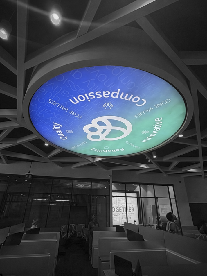
- Express the values (circular backlit feature). Compassion, Quality, Reliability, Innovative. Four values, one circle, hanging over the open office where everyone sees it every day. No pressure.
- Celebrate the team (lunchroom). A graphic about team building and employee appreciation, for the one room where people go specifically to not think about work.
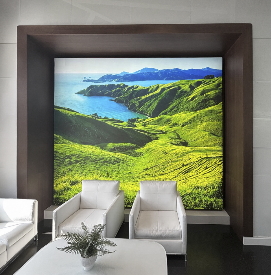
- Bring in some calm (reception). Greenery, ideally a landscape, as a counterweight to an office that had committed fully to blue and white.
Questions first, pixels second.
The fastest way to burn through a design budget is to guess. So before opening a single file, we sent RNS a short list of questions for each space.
Text or icons? Photos or illustration? Celebratory or understated? Tropical or forest? We also asked for a few rough visual references, because one screenshot of something you like saves three rounds of something you don’t.
The answers came back clear: keep the values text-led, skip the team photos, and go forest or botanical.
Designed for the light
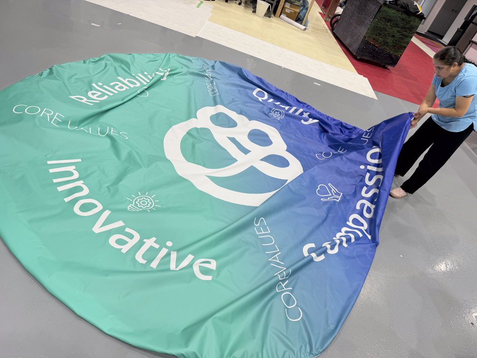
For the circular feature, we recommended white type on a coloured background. When the light comes from behind, white type glows and colour holds its ground, so the words read clearly from across the office.
From three concepts to five graphics.
RNS picked a favourite circle early and asked for more of it. In about three weeks the project grew from three graphics to five, which is the good kind of growth: the kind that happens because the client likes what they’re seeing.
Letting the logo lead (circular feature). RNS asked us to drop the company name from the centre and let the logo carry the circle on its own. We then added the value symbols from the RNS website, so each word got a mark of its own. Less a sign, more a seal.
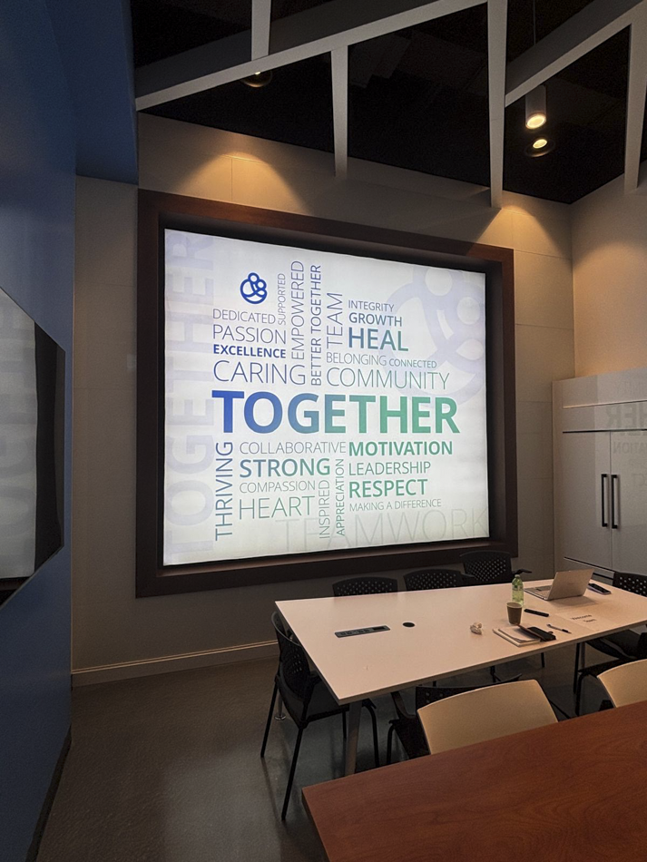
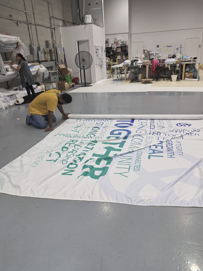
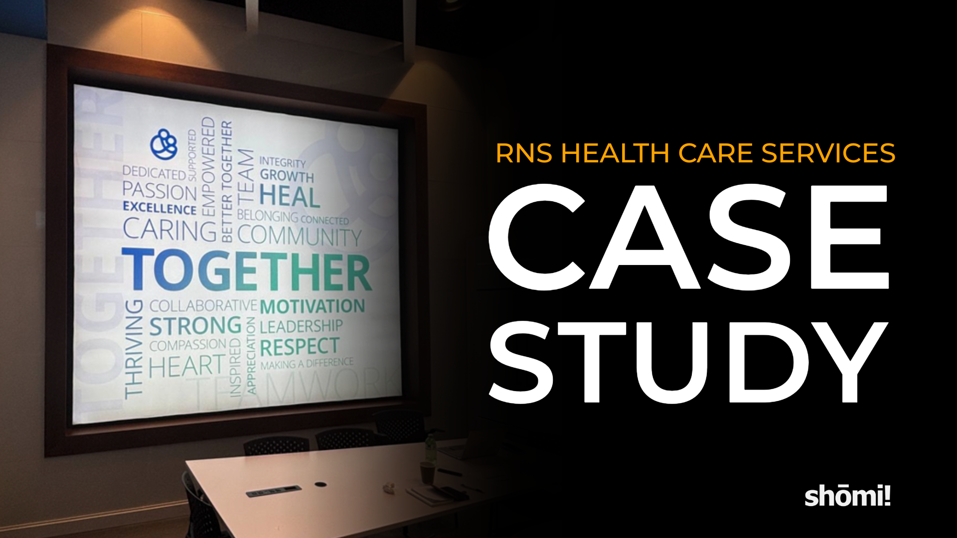
Words over faces (lunchroom). No team photos meant nobody had to chase down headshots. The lunchroom became a word cloud instead, with Together set large enough that nobody misses the point over lunch.
Greenery, after a second look (reception). RNS had a favourite landscape, then asked to see the wall behind reception before committing. After seeing it, they went back to an earlier option, which is exactly what a second look is for.
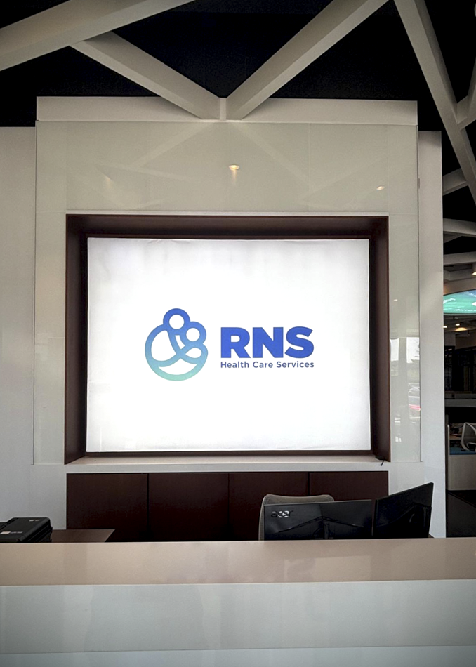
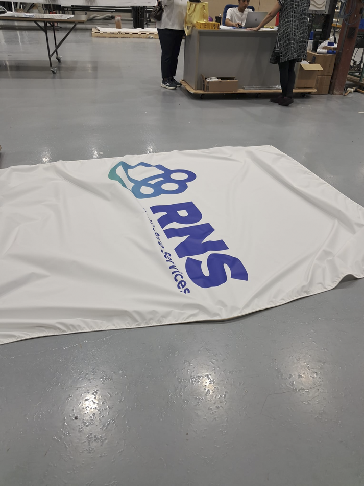
Two additions to the brief (reception wall and entrance). The wall behind reception wasn’t in the original ask. Once it surfaced, proofs went back the same day, in horizontal and vertical layouts plus a white-on-blue option. A second, smaller logo circle joined the project for the entrance.
Approved is not the same as print-ready.
Approval came twenty days after the brief. That’s when the less glamorous work starts, and it’s where a 13-foot mistake gets expensive.
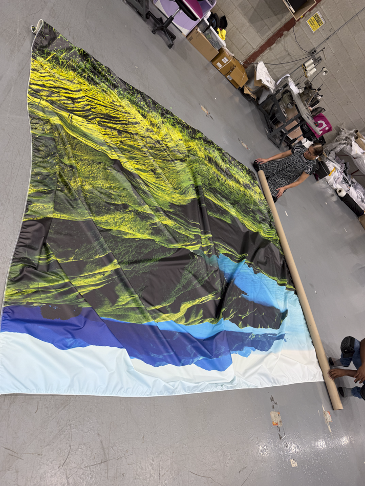
Before anything reached the printer, we confirmed the approved version of every piece, double checked measurement, and checked whether the sizes included bleed. One of those checks turned up a conflict on the greenery wall: the client’s last email named one version and the final file list named another. We confirmed which was the correct file before it was printed more than 11 feet wide.
When a final size changed after approval, we rebuilt the file and moved the old ones out of the print folder, so nobody could grab the wrong one by accident. When a new size changed the greenery wall’s proportions, we recomposed the image instead of stretching it (because scale-to-fit has ruined more landscapes than every drought on record).
| Graphic | Finished size (W × H) |
|---|---|
| Core values circle | 156″ diameter |
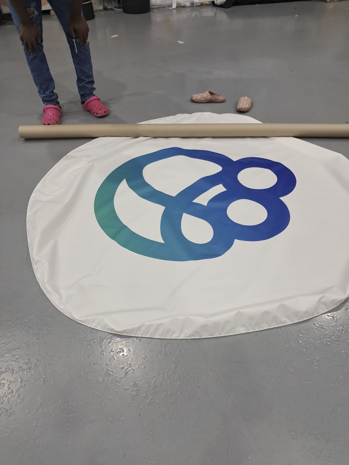
| Logo circle | 72″ diameter |
| Lunchroom word cloud | 127″ × 110″ |
| Greenery wall | 137″ × 120″ |
| Reception logo wall | 110″ × 83″ |
Five graphics. One story.
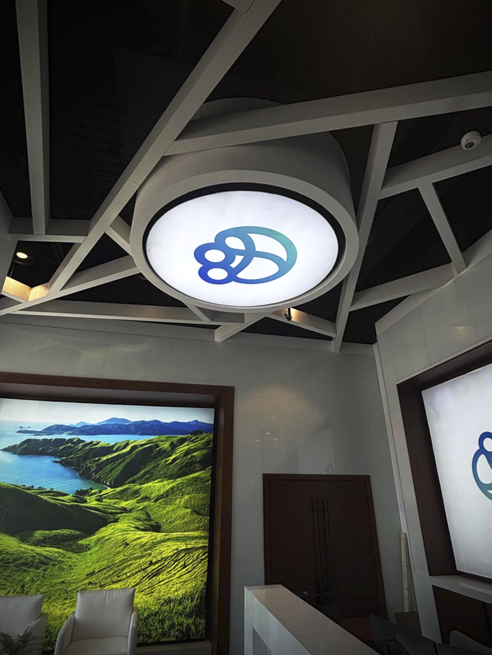
The finished pieces carry the RNS blue-to-teal gradient from the entrance ceiling to the lunchroom wall. The brand stops being something hung on the walls and starts feeling like part of the building.
- Core values. Four values and their symbols around an enlarged logo, in white type built to glow.
- Entrance. The full-colour logo mark, lit overhead as people walk in.
- Lunchroom. Teamwork and appreciation in words, with the word “Together” as the focal point.
- Reception. Rolling green hills over a blue bay. Calm, and still on brand.
- Front desk. The horizontal logo on white, framed behind reception.
Planning workplace graphics for a new space? Get in touch with our team to talk through your project.
RNS Health Care Services, Aurora, Ontario. Five graphics designed, printed and installed by shōmi!