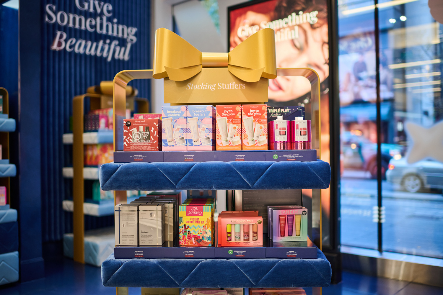
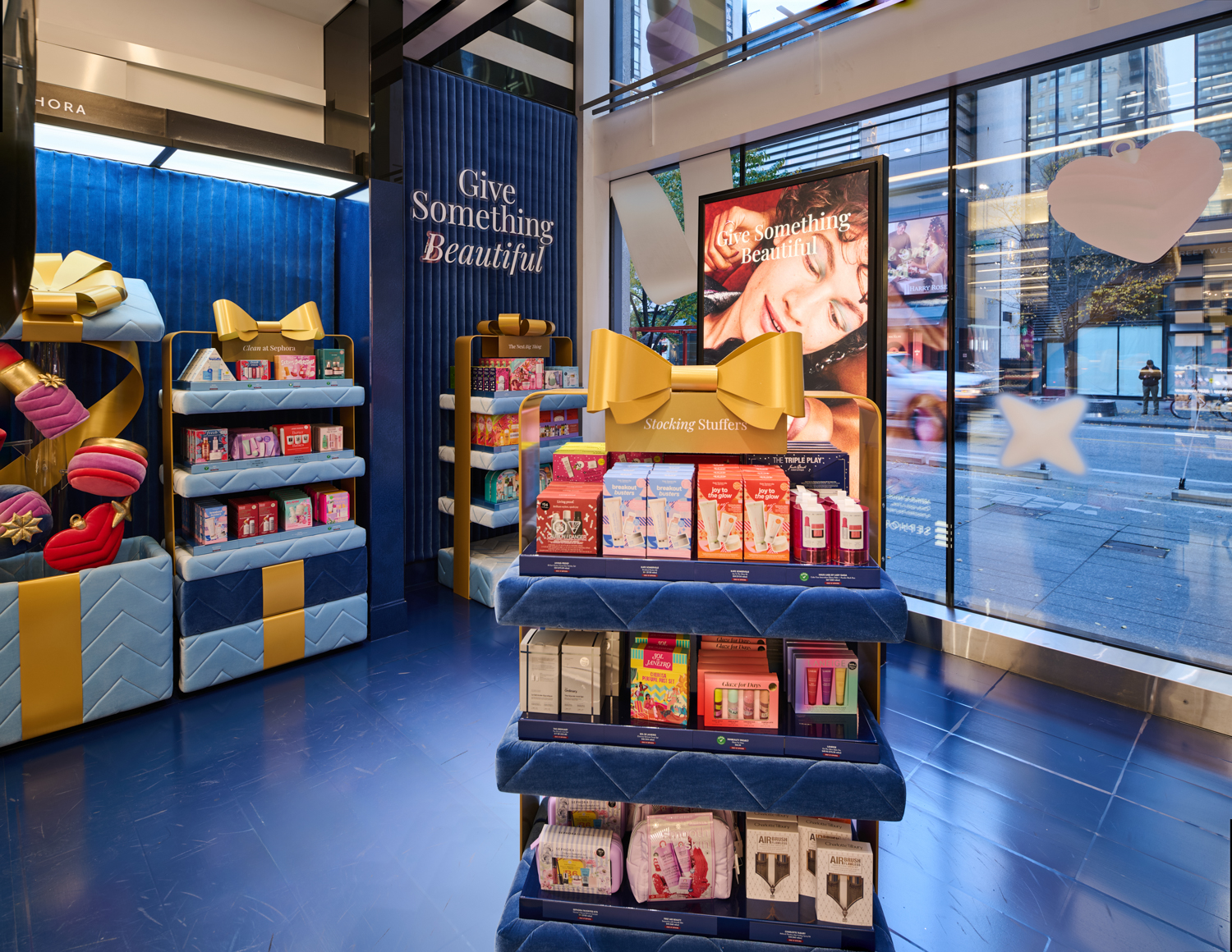
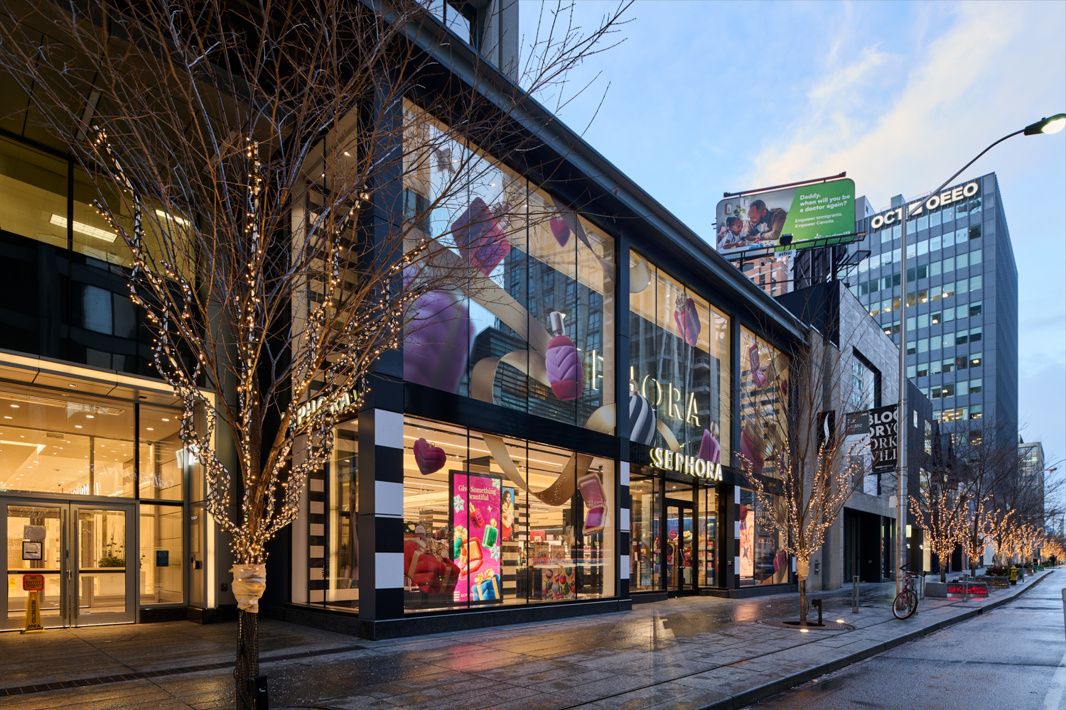
A Sephora retail display styled as gift boxes filled with beauty products, with the text Case Study: Sephora Holiday and the Shōmi logo.

Custom Holiday Displays: How We Made a Gift Box Explode for Sephora

Custom holiday displays for Sephora Canada came down to one question: how do you make a gift box explode with nothing visibly holding it up? Then make it last two months in eight stores, even when shoppers sat on parts that were never meant to hold a person. Park Creative Studio designed it. shōmi! Custom fabricated it, about eleven weeks from brief to ready. Here’s the fabrication behind it, and what the retail floor taught us after opening night.

The Brief: Custom Holiday Displays for Sephora

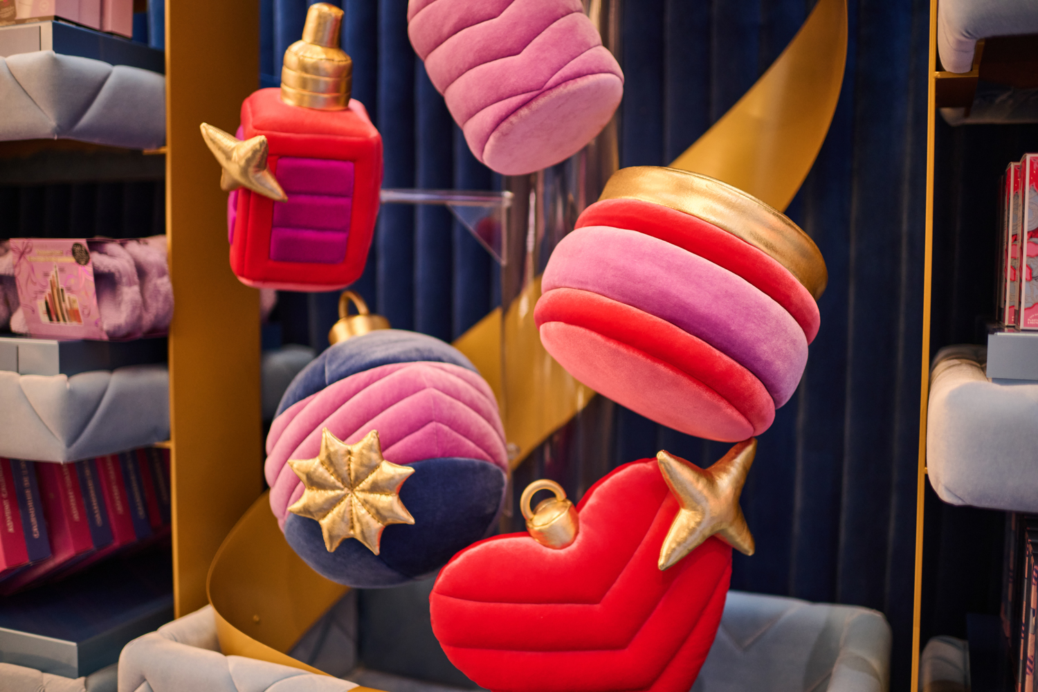
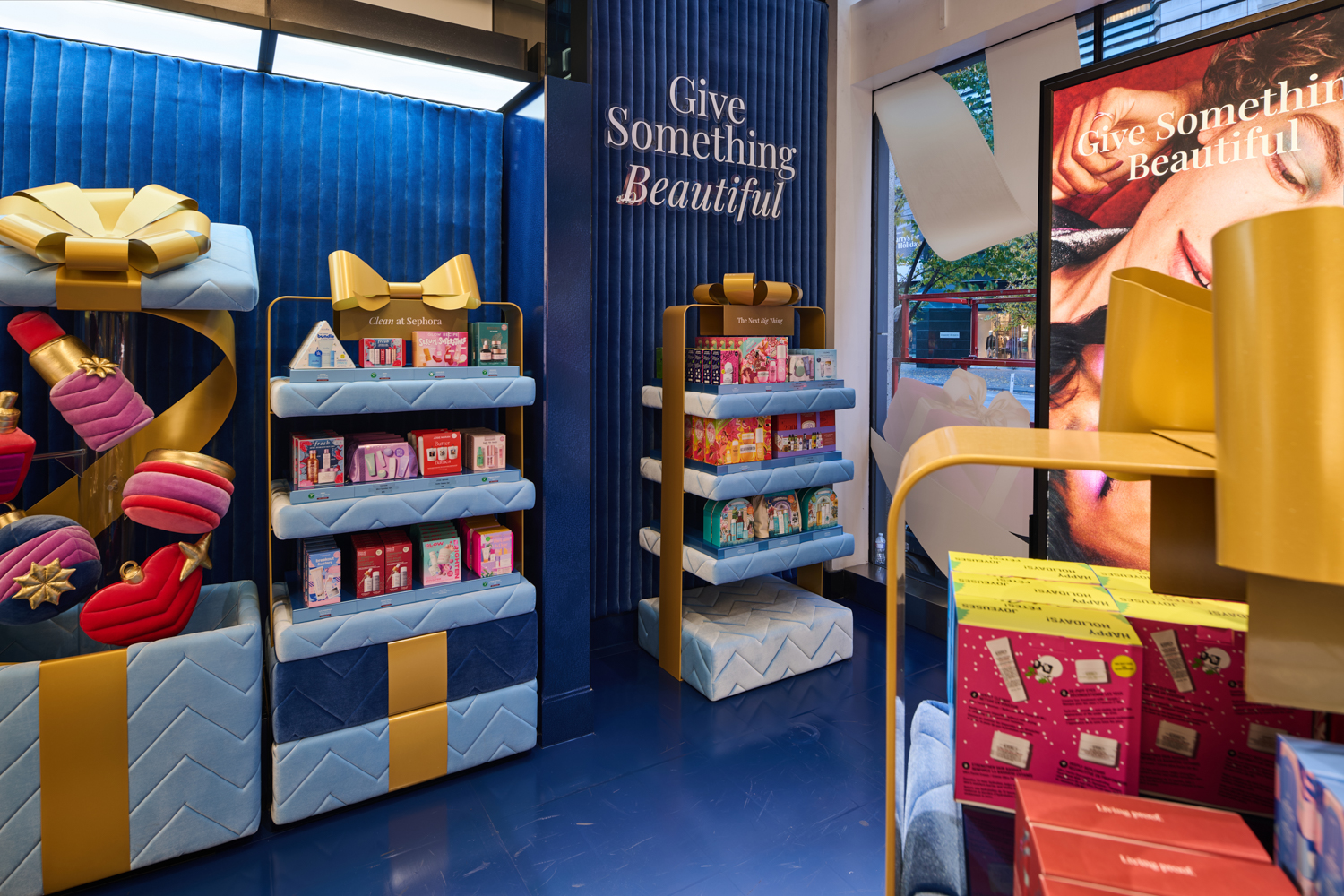
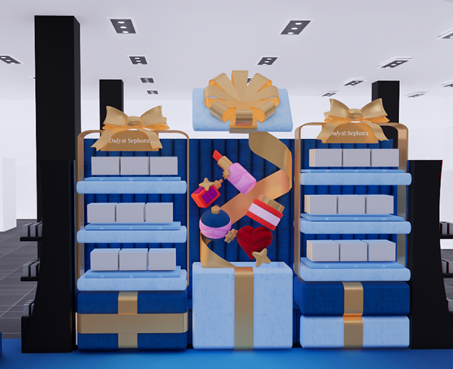
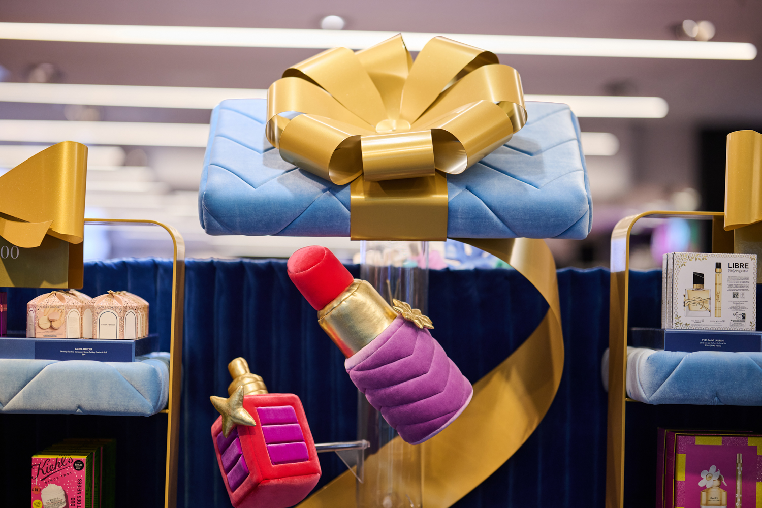
The idea from Park Creative Studio was an “Only at Sephora” holiday pop-up: gifts wrapped in navy and light blue quilted velvet, tied with gold ribbons and bows, and gift boxes bursting open with oversized beauty icons (a lipstick, a compact, an ornament, a heart, a cream jar). Headers on every fixture read “Only at Sephora”.

The same look had to work in eight stores of very different sizes, so the kit flexed: 24 fixtures in all, made up of five gondolas, three freestanding gift boxes, six four-tier shelves and ten three-tier shelves. We were briefed on August 12, 2024. Everything was ready between October 28 and 30. That’s eleven weeks, which is plenty of time right up until you add quilted velvet.

The Hard Part: A Gift Box That Explodes

The rendering showed a box on the floor, its lid levitating above it and very large product replicas flying out, as if the box had just burst open. It’s a great picture. But a rendering has no gravity and no shoppers. The real brief wasn’t “build a box.” It was: hold everything in mid-air with nothing anyone can see.
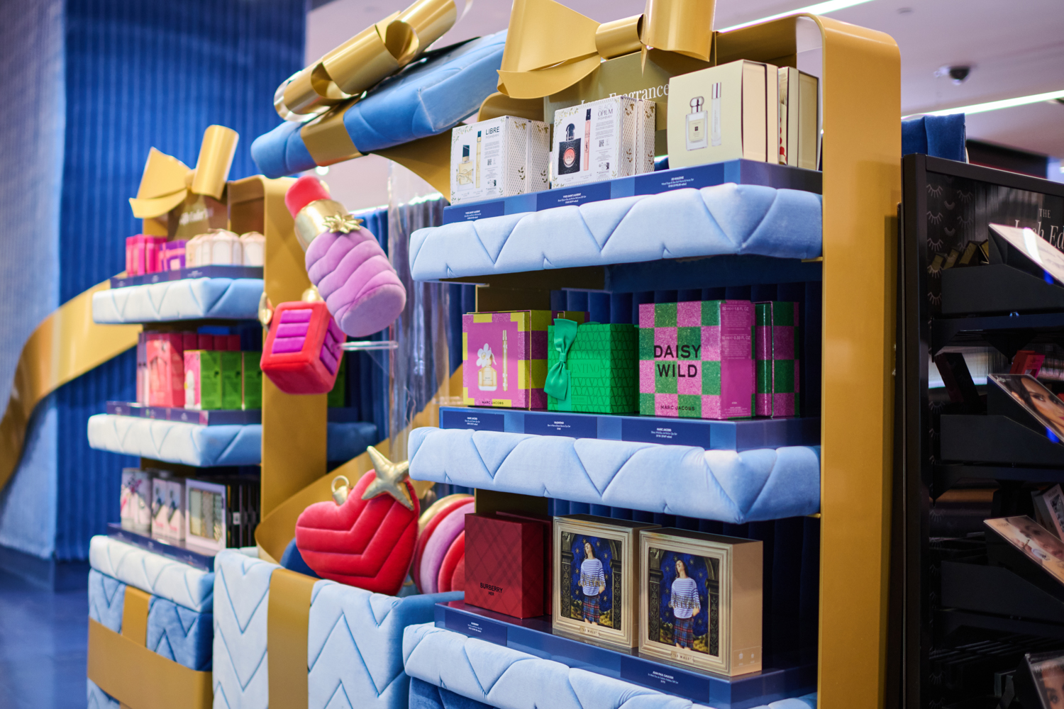
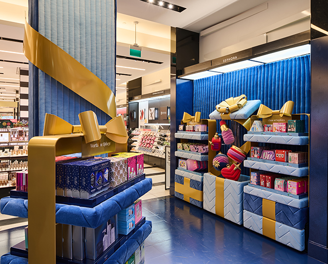
Two retail shelving units displaying white gift boxes, flanking a central pillar decorated with 3D icons of makeup and gift boxes, all wrapped with large gold bows.

We started with the obvious: hang the plush replicas. No hanging points allowed. Next we offered metal brackets from behind, hidden when you look straight on. Some would show from an angle, so that was a no too, and the same went for a bracket on the lid. That left clear acrylic: a clear acrylic tube up the centre, with acrylic rod arms branching out to hold each plush icon and the lid, kept as low-profile and invisible as acrylic gets. Acrylic disappears better than anything else we could use. It’s also the least forgiving. That trade-off comes back later.

We worked out how the oversized plush icons had to be built to sit on those arms, then commissioned our partner, a local plush artist, to make them. The finished box looks like it’s mid-explosion. Nothing you can see is holding it up.

The Build: Velvet, Quilted Like a Mattress

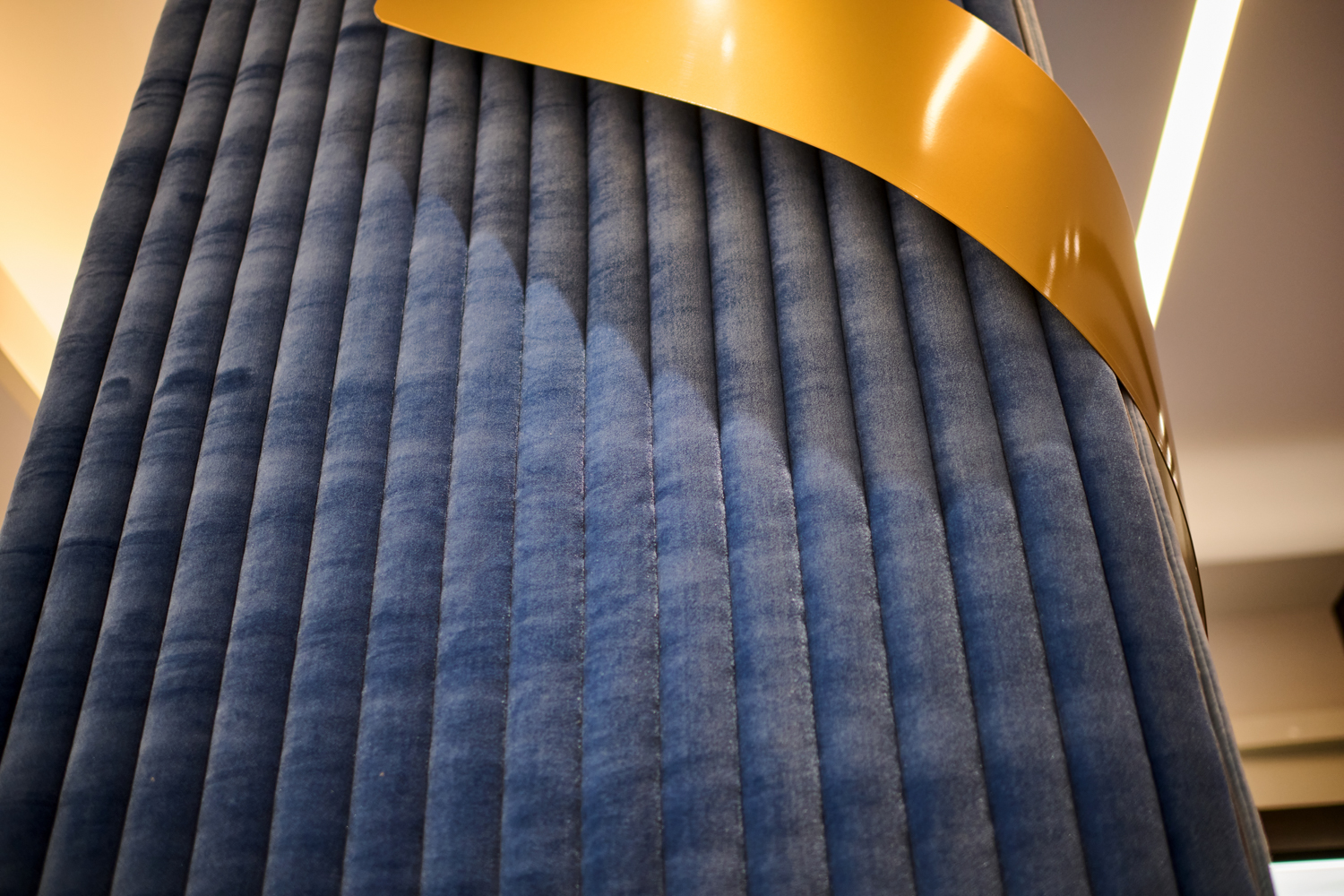
Velvet is soft and stretchy, which is another way of saying it’s hard to work with. The design called for long runs of it, channel-quilted over batting, and a regular sewing machine isn’t built for that. So we put it on the machine that is: a programmable multi-needle quilter, the kind mattress makers run, stitching rows of ribs in a single pass. Two layers of batting, a fabric backing, 3-inch ribs, dead straight over long runs. On an eleven-week timeline, that speed mattered.A series of blue, vertical, pleated fabric panels with a beige corner bracket in the upper right.
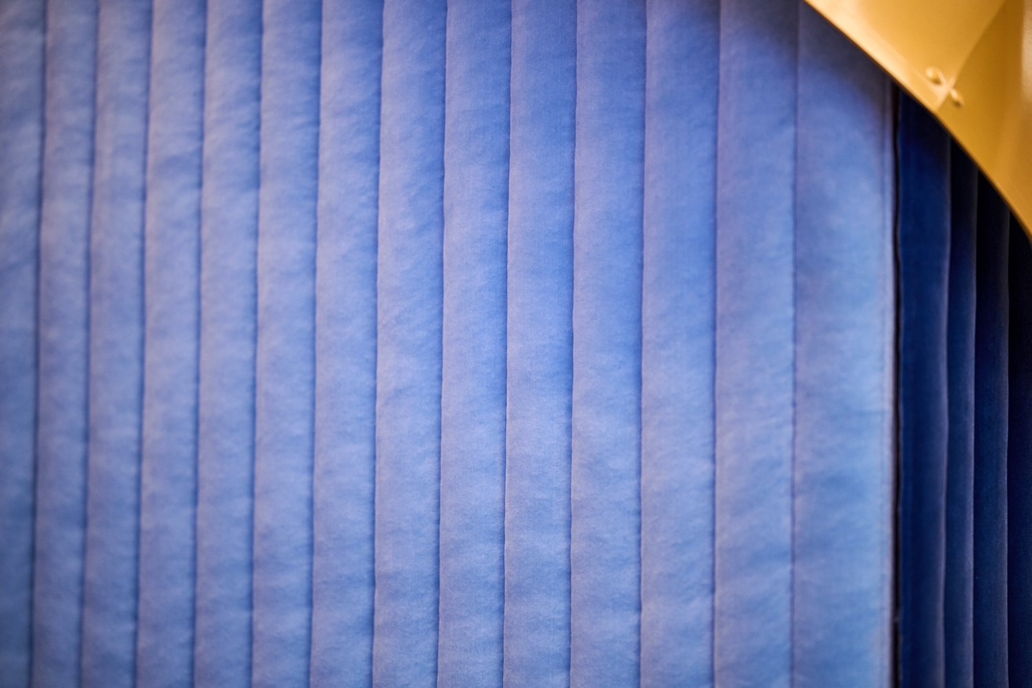
The fabric maxed out at 60 inches wide, and that set the width of every panel. We cut each panel on the nearest rib line so no rib was ever split, joined the panels on a heavy-duty lockstitch machine, sewed in 2-inch Velcro, and kept each one slightly short, because velvet stretches down over time. Every panel kept the same nap direction so the colour reads evenly, because velvet will tell on you.

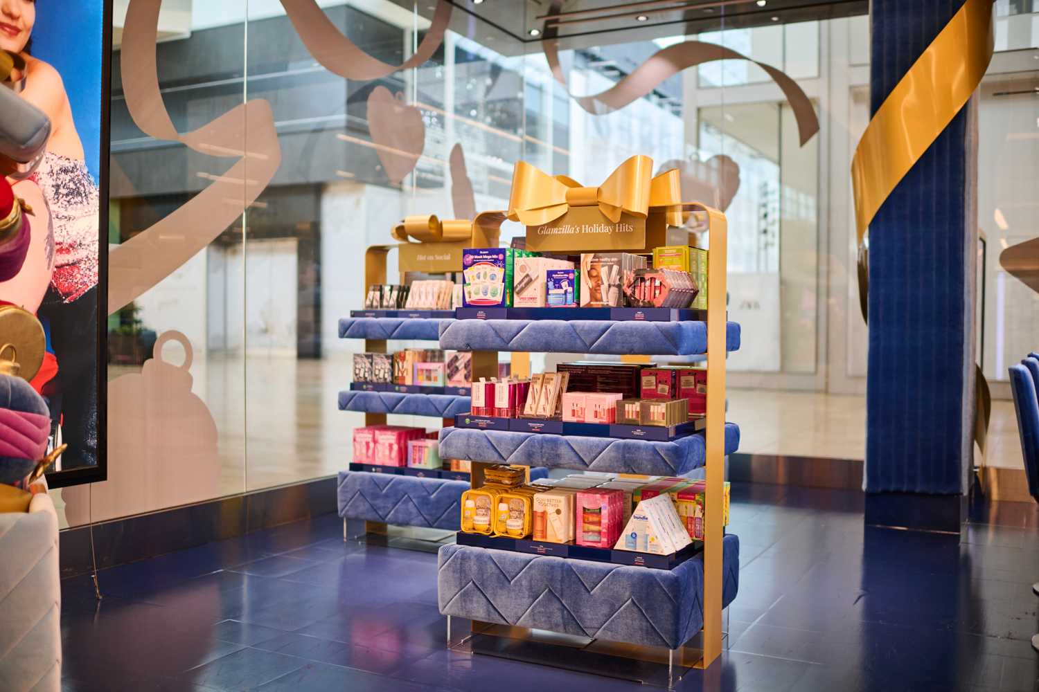
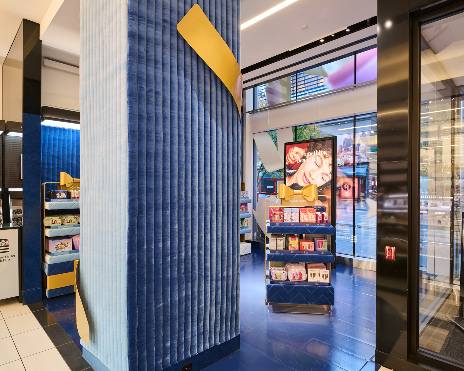
The columns at Bloor, Eaton Centre and Yorkdale were square, with each of the four faces clad separately, from about 10.5 feet tall at Yorkdale to about 12 feet at Bloor (3.2 to 3.7 metres). Each panel has a flap of peel-and-stick Velcro that grabs the next face on site, so the four faces wrap the column as one piece, and the cladding comes down again without damaging the store. Seams overlap by one rib and are sewn along the rib line, so they disappear into the channel. The other stores got printed vinyl on their columns, which is much less dramatic to write about.Sephora store shelves and display tables decorated with large gold bows to resemble gift boxes, featuring various beauty gift sets.

Upholstery and the Gold

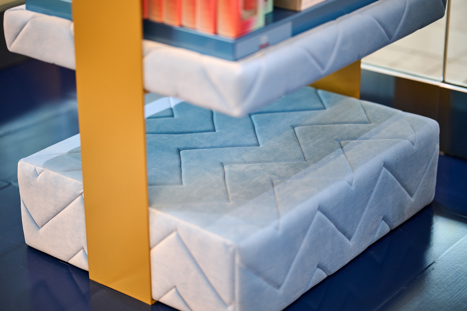
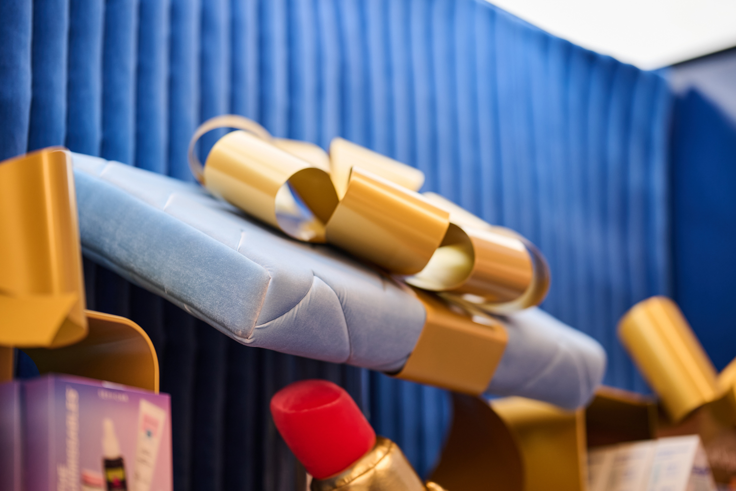
The upholstery. Every fixture got the velvet treatment: the cushion shelves, the cushion bases, the gift boxes, and the quilted back panels on the built-in gondolas, all in a 6-inch chevron quilt pattern. The velvet sits over half-inch foam on millwork, with broadcloth behind it to stabilize the stretch and carry the chevron layout. We sanded the millwork corners first so they wouldn’t wear through the fabric. We’ve upholstered enough fixtures to know velvet will find the one sharp edge you missed.

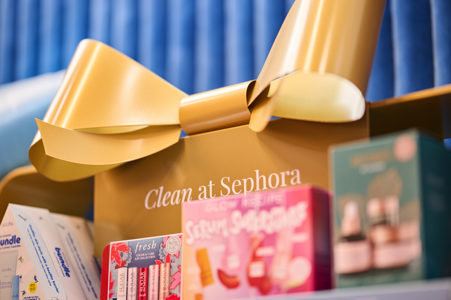
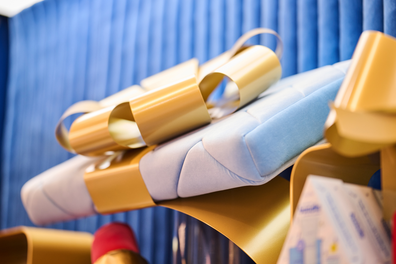
The gold. The ribbons and bows are steel and aluminum. The shelves are held by gold, ribbon-shaped frames with the shelf brackets built in, and topped with 40 metal bows in two styles (18 of one, 22 of the other). Add the headers and 78 steel shelf trays, and that’s a lot of gold to keep consistent. Aluminum ribbon strips, 96 inches long, were bent to wrap the gift box bases and the gondola bases. Before anything went to powder coat, we sprayed out eight metallic samples to match the gold, because gold turns out to be a whole family of colours.

Install, and What Shoppers Did to It

Everything shipped across Canada from our shop and went in overnight, installed by local partners in each market using store-by-store install guides we wrote. Crews of four to six people per store started at closing time and worked until it was done. Smaller stores were wrapped by 4 a.m. The larger ones ran until 8 a.m. Installs began on October 31, and we kept the displays maintained through January 8, 2025, which turned out to be useful.

Then shoppers arrived. They used the base of an exploding gift box as a seat and leaned back on the plush icons, and some of the acrylic rods cracked at three stores. Acrylic was the right call for staying invisible. It was never meant to be a backrest. We repaired them and sent spare parts to the sites. We also proposed clear acrylic shields and spare repair kits for the other stores. A retail floor will tell you exactly what looks like furniture.
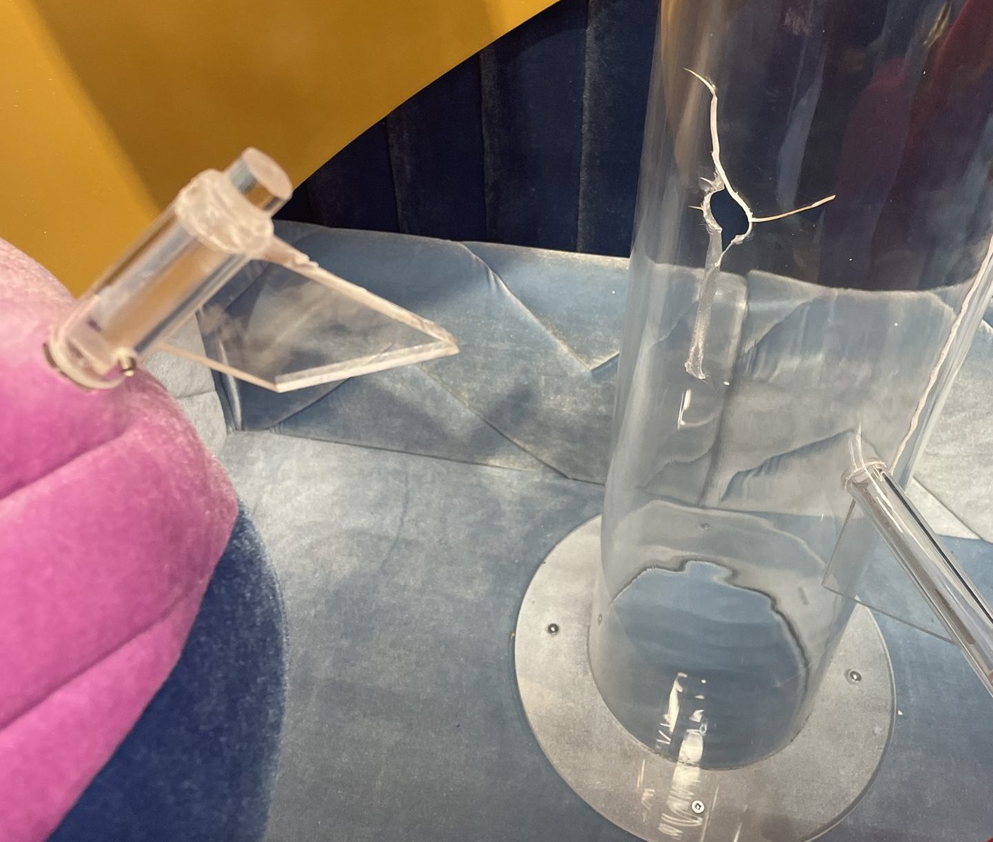
A clear acrylic tube with a visible crack stands on a blue surface next to a purple object and a yellow architectural element.

Two more things needed solving on the fly. The gold ribbon on each velvet column had to wrap around on top of the velvet, so we designed custom brackets that went through the velvet and fastened to the wall, with standoffs to carry the powder-coated sheet metal ribbon. And days before a Sephora leadership visit on November 20, a column ribbon at Bloor got scuffed. We made a new one and installed it after-hours on November 19.

By the Numbers

Eight stores. 24 fixtures. About eleven weeks from brief to ready. About 115 yards of velvet (roughly 105 metres), 40 metal bows and 78 steel shelf trays. Delivered on time and on budget.

The Real Lesson

A wrapped gift is a simple idea. Keeping it wrapped, in eight stores, from the first overnight install through January, with shoppers leaning on it, is not. Park Creative Studio drew a gift box that explodes. Keeping it exploding took clear acrylic, spare parts and a crew that doesn’t mind working through the night.  We build for January.

Planning a custom holiday build or a multi-store rollout, with something in the rendering that shouldn’t be able to stand up? That’s the kind of problem we like to work on. Talk to the shōmi! Custom team about your project.

Sephora Holiday 2024. Designed by Park Creative Studio. Fabricated by shōmi! Custom Photography by Robert Lowdon Photography.
RNS Case study(1)

Making Company Values Part of the Workplace

As RNS Health Care Services prepared to move to Aurora, Ontario, they came to shōmi! Custom with three walls and a clear idea of what each one should say about their company values. The brief was short. The ambitions weren’t.

Three spaces. Three different jobs.

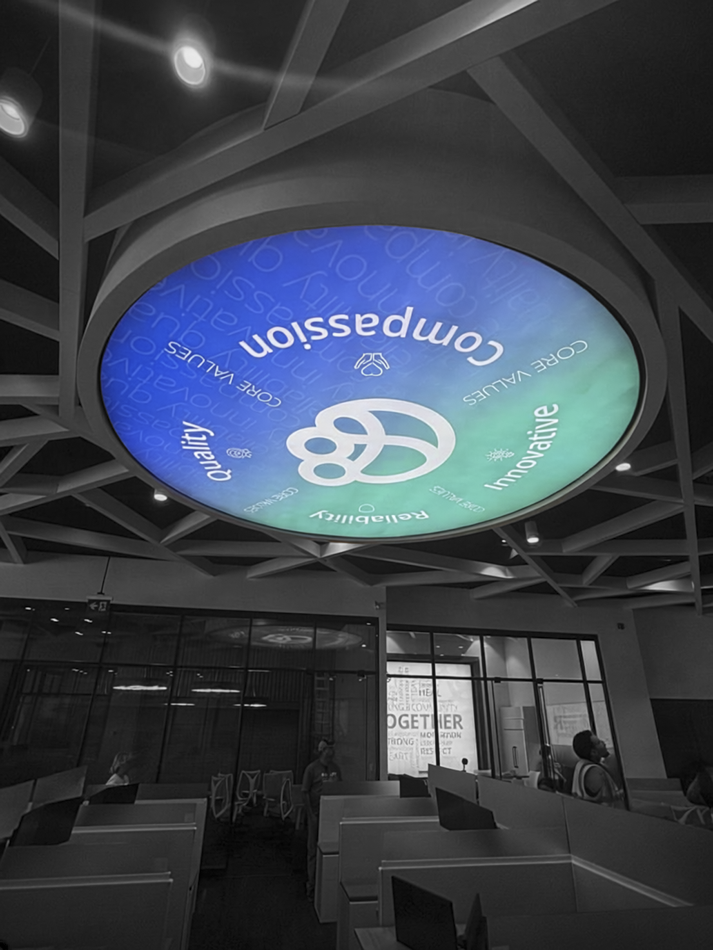
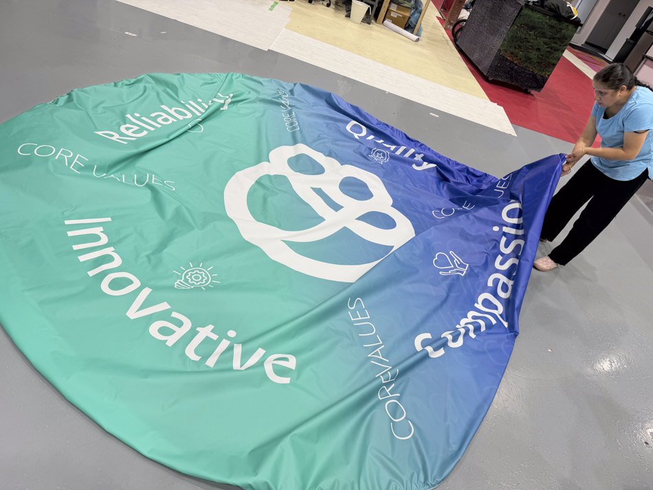
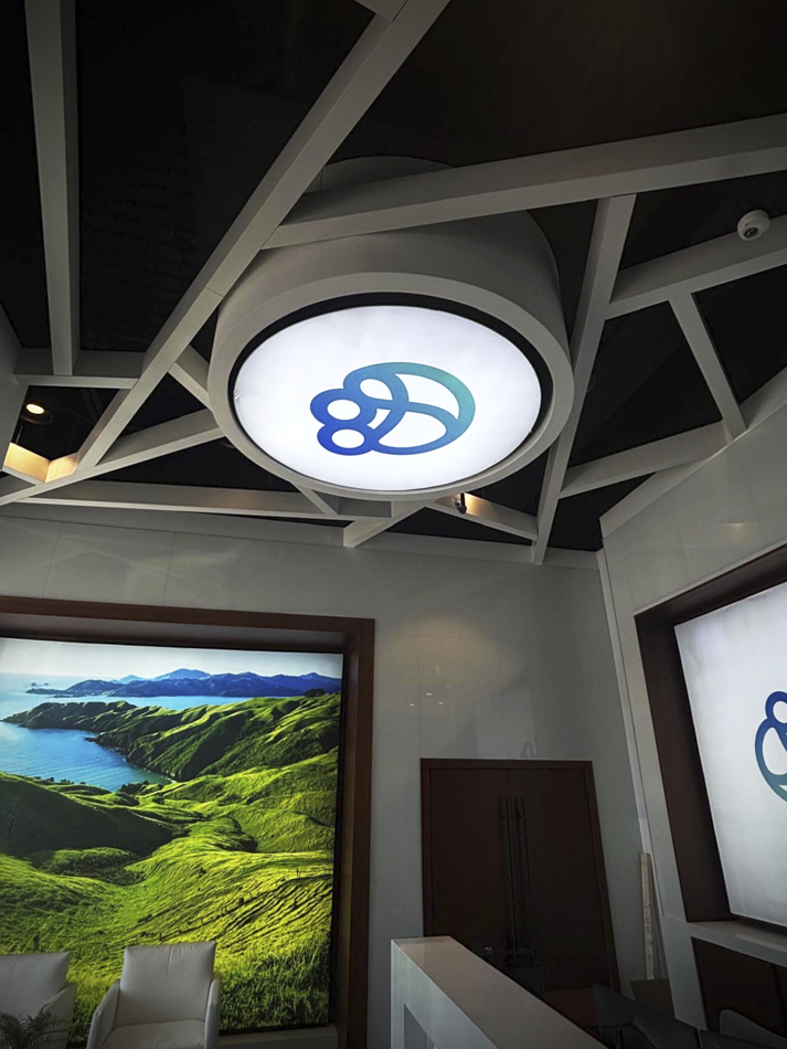
  • Express the values (circular backlit feature). Compassion, Quality, Reliability, Innovative. Four values, one circle, hanging over the open office where everyone sees it every day. No pressure.
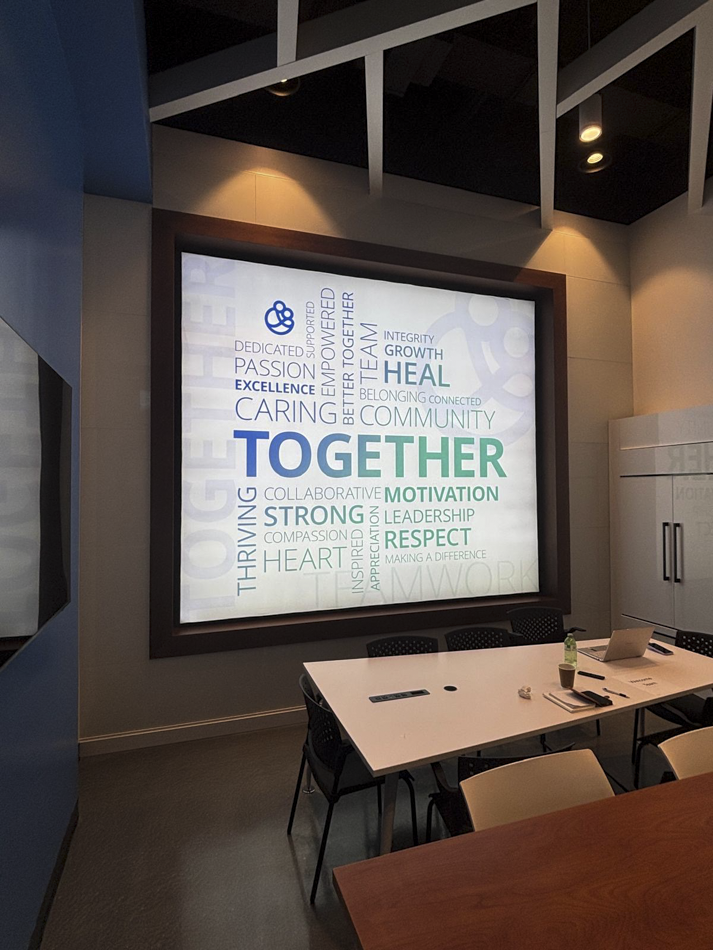
  • Celebrate the team (lunchroom). A graphic about team building and employee appreciation, for the one room where people go specifically to not think about work.
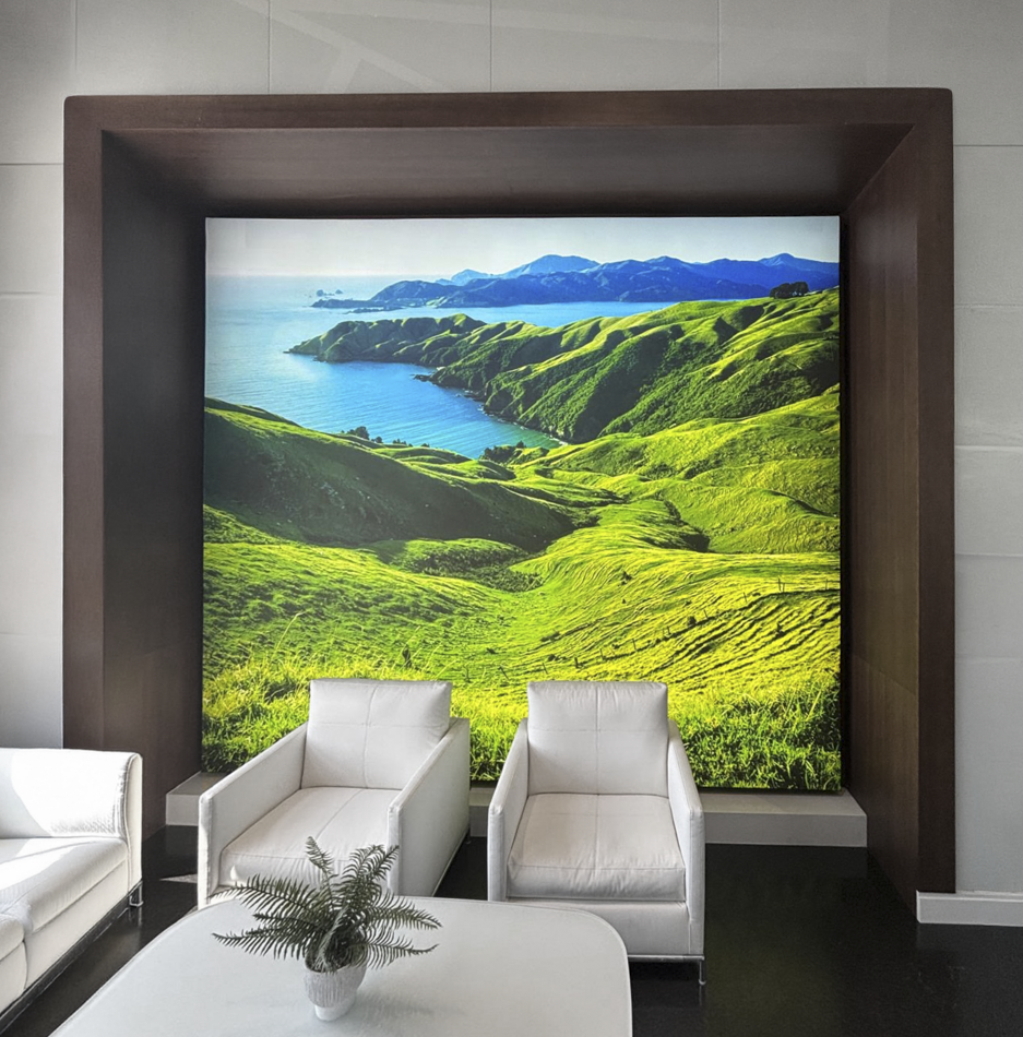
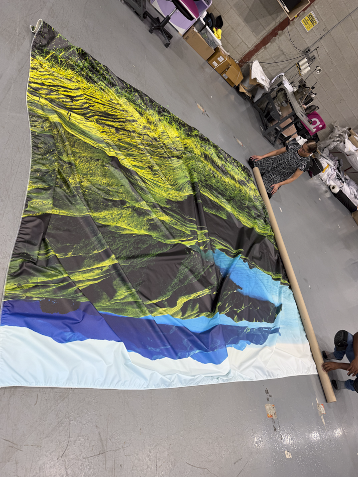
  • Bring in some calm (reception). Greenery, ideally a landscape, as a counterweight to an office that had committed fully to blue and white.

Questions first, pixels second.

The fastest way to burn through a design budget is to guess. So before opening a single file, we sent RNS a short list of questions for each space.

Text or icons? Photos or illustration? Celebratory or understated? Tropical or forest? We also asked for a few rough visual references, because one screenshot of something you like saves three rounds of something you don’t.

The answers came back clear: keep the values text-led, skip the team photos, and go forest or botanical.

Designed for the light

For the circular feature, we recommended white type on a coloured background. When the light comes from behind, white type glows and colour holds its ground, so the words read clearly from across the office.

From three concepts to five graphics.

RNS picked a favourite circle early and asked for more of it. In about three weeks the project grew from three graphics to five, which is the good kind of growth: the kind that happens because the client likes what they’re seeing.

Letting the logo lead (circular feature). RNS asked us to drop the company name from the centre and let the logo carry the circle on its own. We then added the value symbols from the RNS website, so each word got a mark of its own. Less a sign, more a seal.

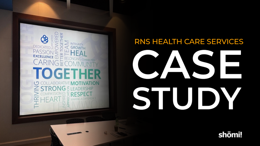
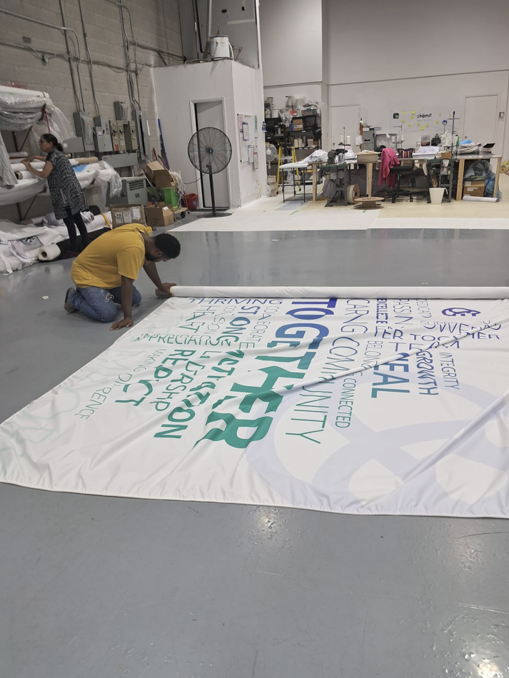
Words over faces (lunchroom). No team photos meant nobody had to chase down headshots. The lunchroom became a word cloud instead, with Together set large enough that nobody misses the point over lunch.

Greenery, after a second look (reception). RNS had a favourite landscape, then asked to see the wall behind reception before committing. After seeing it, they went back to an earlier option, which is exactly what a second look is for.

Two additions to the brief (reception wall and entrance). The wall behind reception wasn’t in the original ask. Once it surfaced, proofs went back the same day, in horizontal and vertical layouts plus a white-on-blue option. A second, smaller logo circle joined the project for the entrance.

Approved is not the same as print-ready.

Approval came twenty days after the brief. That’s when the less glamorous work starts, and it’s where a 13-foot mistake gets expensive.

Before anything reached the printer, we confirmed the approved version of every piece, double checked measurement, and checked whether the sizes included bleed. One of those checks turned up a conflict on the greenery wall: the client’s last email named one version and the final file list named another. We confirmed which was the correct file before it was printed more than 11 feet wide.

When a final size changed after approval, we rebuilt the file and moved the old ones out of the print folder, so nobody could grab the wrong one by accident. When a new size changed the greenery wall’s proportions, we recomposed the image instead of stretching it (because scale-to-fit has ruined more landscapes than every drought on record).

GraphicFinished size (W × H)
Core values circle156″ diameter
Logo circle72″ diameter
Lunchroom word cloud127″ × 110″
Greenery wall137″ × 120″
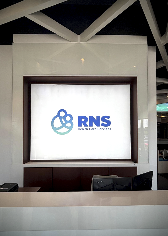
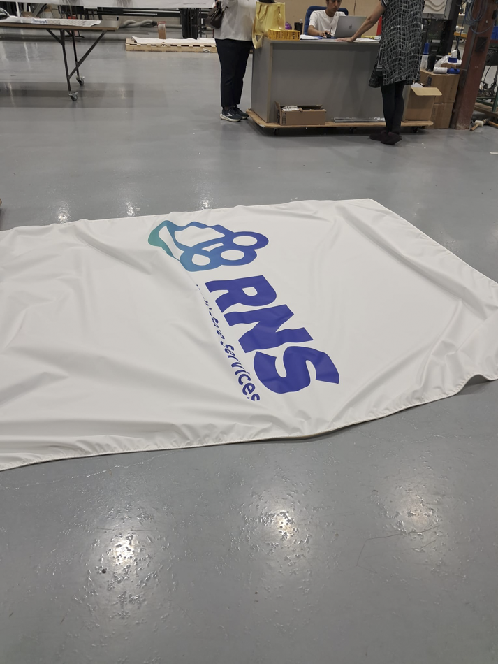
Reception logo wall110″ × 83″

Five graphics. One story.

The finished pieces carry the RNS blue-to-teal gradient from the entrance ceiling to the lunchroom wall. The brand stops being something hung on the walls and starts feeling like part of the building.

  • Core values. Four values and their symbols around an enlarged logo, in white type built to glow.
  • Entrance. The full-colour logo mark, lit overhead as people walk in.
  • Lunchroom. Teamwork and appreciation in words, with the word “Together” as the focal point.
  • Reception. Rolling green hills over a blue bay. Calm, and still on brand.
  • Front desk. The horizontal logo on white, framed behind reception.

Planning workplace graphics for a new space? Get in touch with our team to talk through your project.

RNS Health Care Services, Aurora, Ontario. Five graphics designed, printed and installed by shōmi!

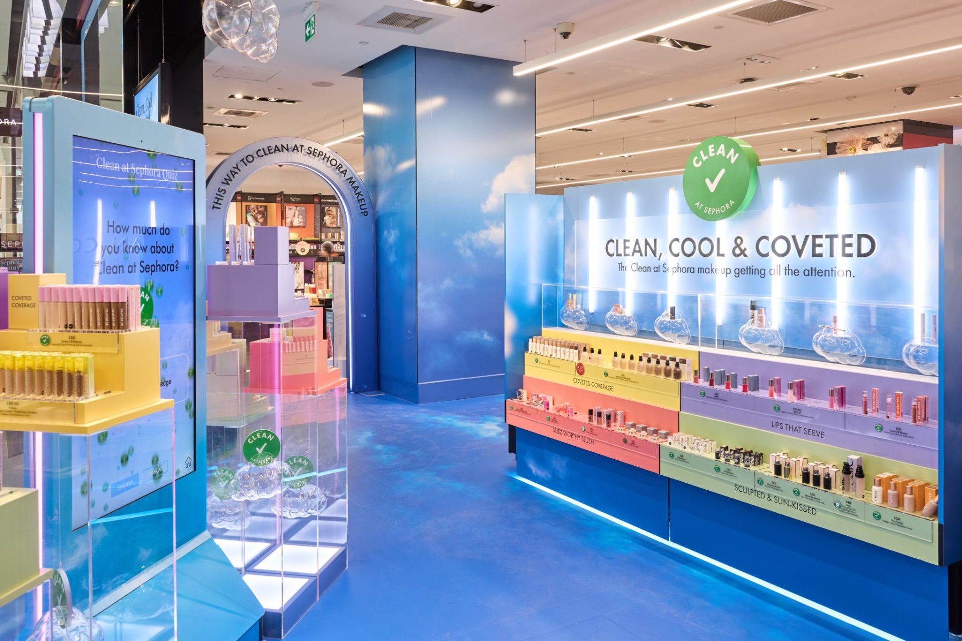
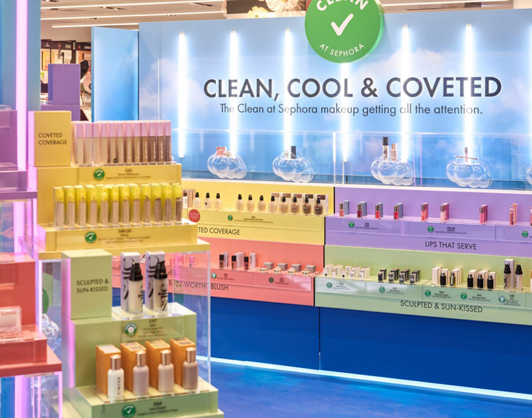
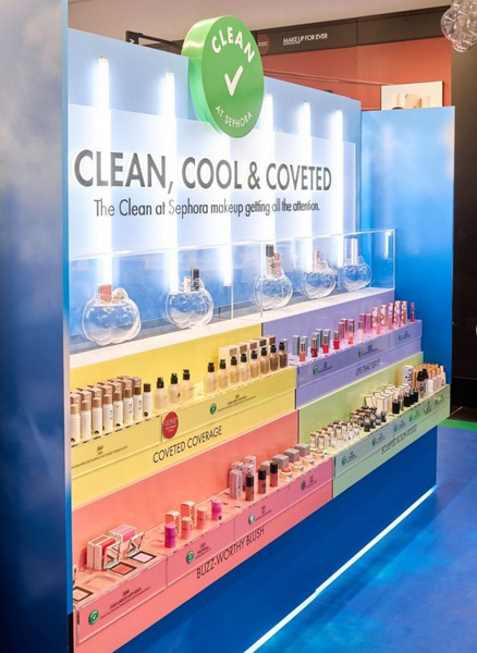
Text reading Sephora Clean Case Study with the shōmi logo, beside a Sephora Clean seal hanging above glass spheres.

Custom Pop-Up Fabrication: How to Build a Cloud You Can See Through

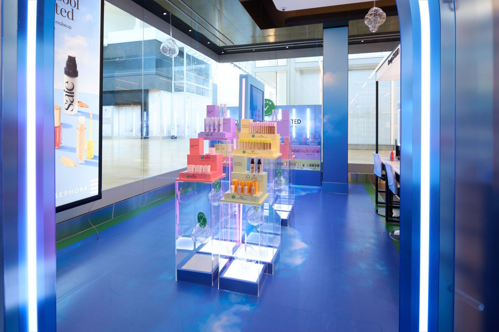
The question wasn’t how to build a cloud. It was how to build one that still looks clean after eight stores of foot traffic. Custom pop-up fabrication for Sephora’s Clean beauty pop-up meant building see-through clouds, a printed floor to match, product stands that light up from the base and a lit walk-through arch, across Canada. Park Creative Studio came up with the idea. shōmi! Custom fabricated it into reality. Here’s how it went together.

The Brief: Custom Pop-Up Fabrication for Sephora Clean

The idea from Park Creative Studio was to make the pop-up feel like walking on clouds, with a clean, airy look. Clouds are free if you’re the sky. For everyone else, it takes a mould.

Four kinds of asset carried the idea:

  • Three-dimensional cloud structures.
  • A printed floor.
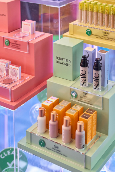
  • Illuminated product stands.
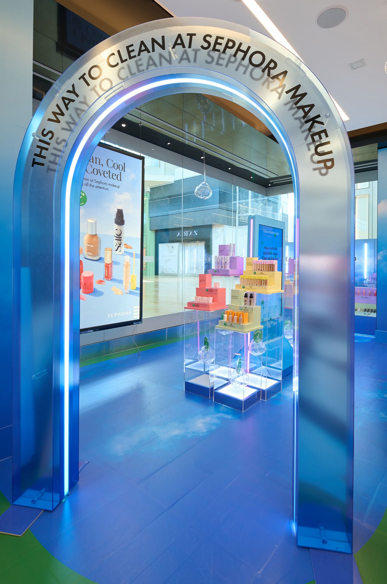
  • A lit walk-through arch.

The Engineering Challenges

Three problems, one pop-up.

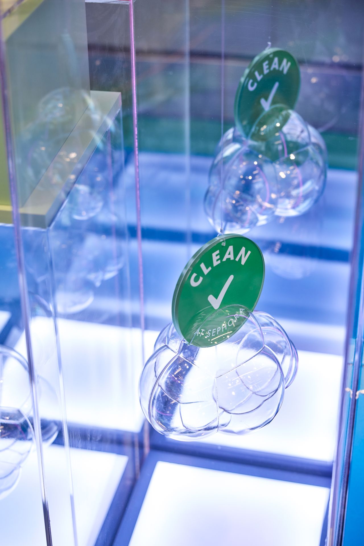
Make the clouds see-through. A solid white cloud was never going to match the clean look Sephora wanted, so the 3D clouds had to be transparent. That fit the look, and it meant every seam would show. 

Make it hold up in eight stores. The pop-up had to be durable and easy to install across every location, not just look good in the one where someone took the photos.

Light it so it looks clean. The lighting had to reinforce the clean look and still light the products properly. A product you can’t see is technically very clean, but not exactly helpful.

The Build

The clouds. A mould was made from the designed 3D cloud model, and the clouds were vacuum-formed in clear acrylic. They were made in two halves and glued together into one see-through structure. A solid cloud would have read as a heavy object in a room meant to feel airy. A clear one shows every seam, so the seams had to be designed in, not hidden. On a see-through cloud, there’s nowhere to hide.

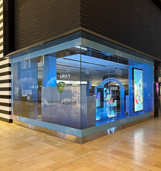
The floor. The floor was printed with a blue sky and clouds, so it blends seamlessly with the cloud structures. Yes, that puts the sky on the floor. Weird? Maybe, but that was the idea.

The light. LED modules were installed in the bases of the product stands, so the light shines through clear acrylic. That gives the products a soft, clean glow while lighting them.

The arch. A walk-through arch has to hold up when someone walks under it, survive being bumped, and still look like it belongs next to translucent graphics. The usual instinct is to build a solid shell and paint it. We’ve found that breaks down quickly: paint on a solid face shows every scuff, and a lit solid surface glows unevenly. So the arch was built in layers, each doing one job. The inside is an MDF substructure that gives the arch its strength and holds the lights and wiring. That is wrapped in silver mirror vinyl, so people looking in see a reflection of the interior instead of wood or paint. The outer layer is clear acrylic with a blue gradient on transparent vinyl: from the outside you see through the blue, and from the inside the reflection keeps it feeling light. The trade-off is planning. Every layer has to be sequenced so the lights, wiring and vinyl stay reachable until the next layer goes on, because the alternative is cutting into finished work to fix a wire.

The Real Lesson

Busy retail stores are not known for their gentleness toward clouds. Surviving them took a mould, clear acrylic, some well-placed LEDs and an arch built in layers. The idea comes from the creative studio. Getting it to survive a retail store is the part we’re paid for.

Planning a custom pop-up? Get in touch with our shomi! Custom team to talk through your build.

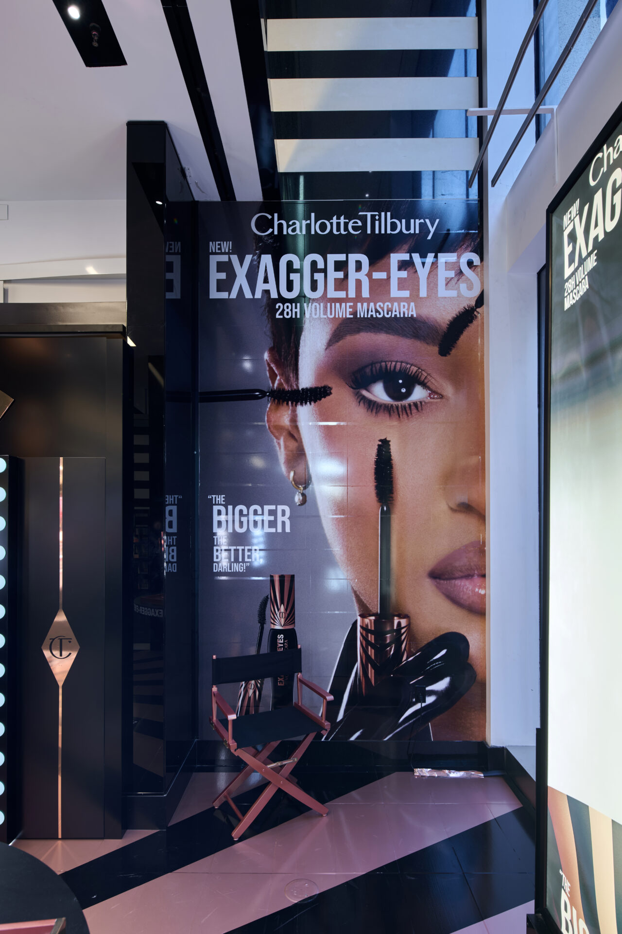
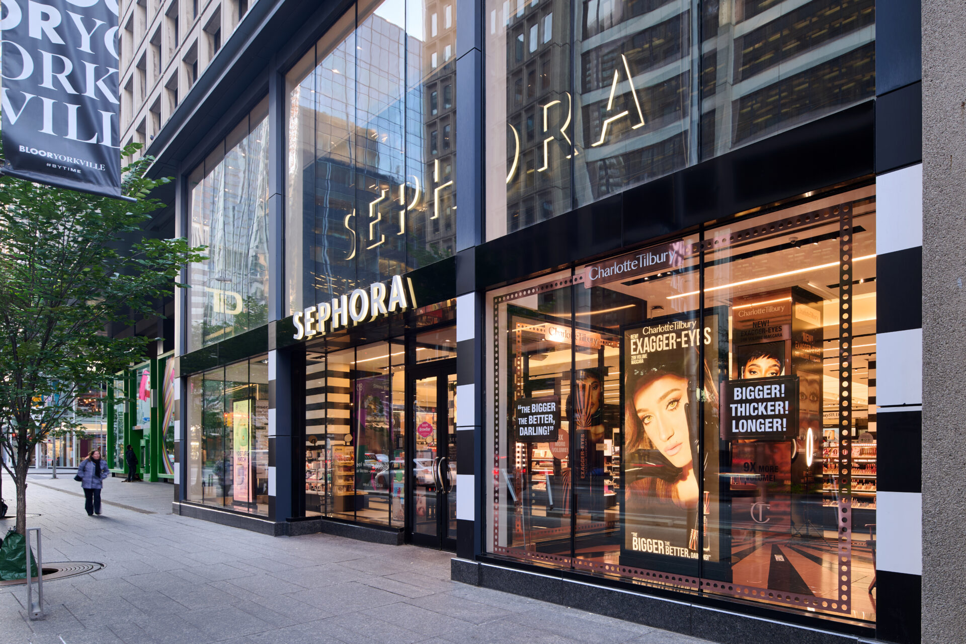
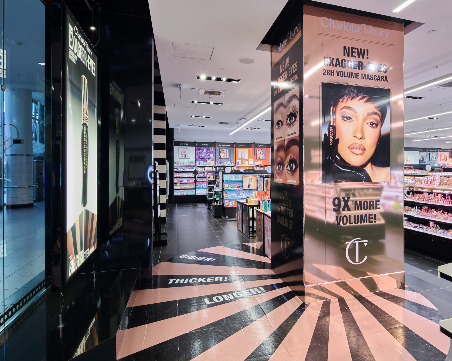
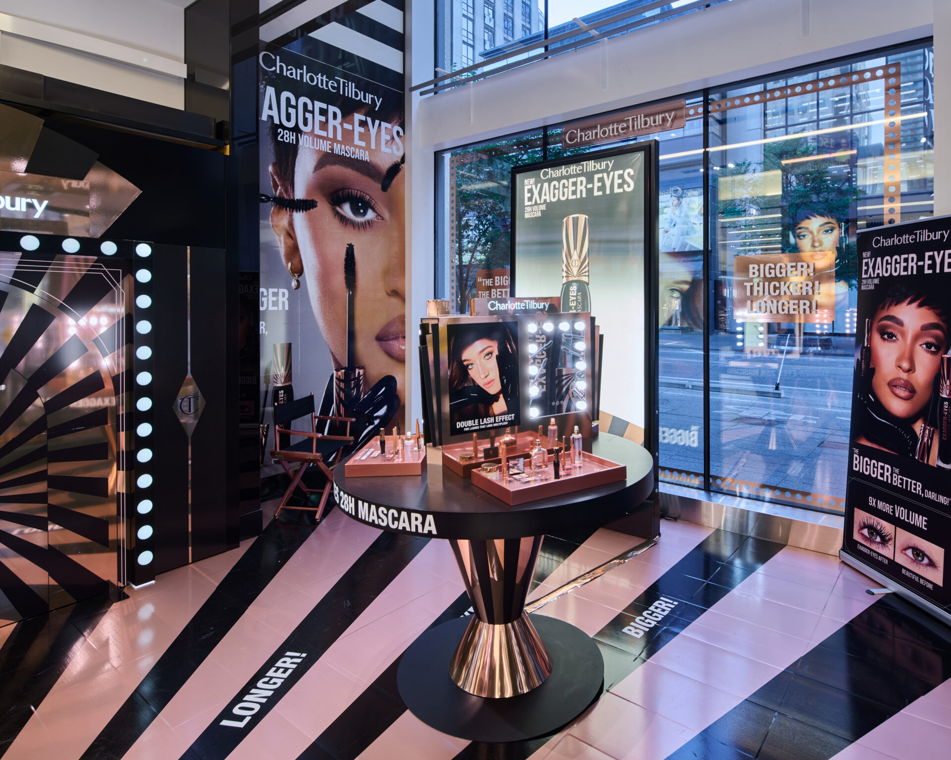
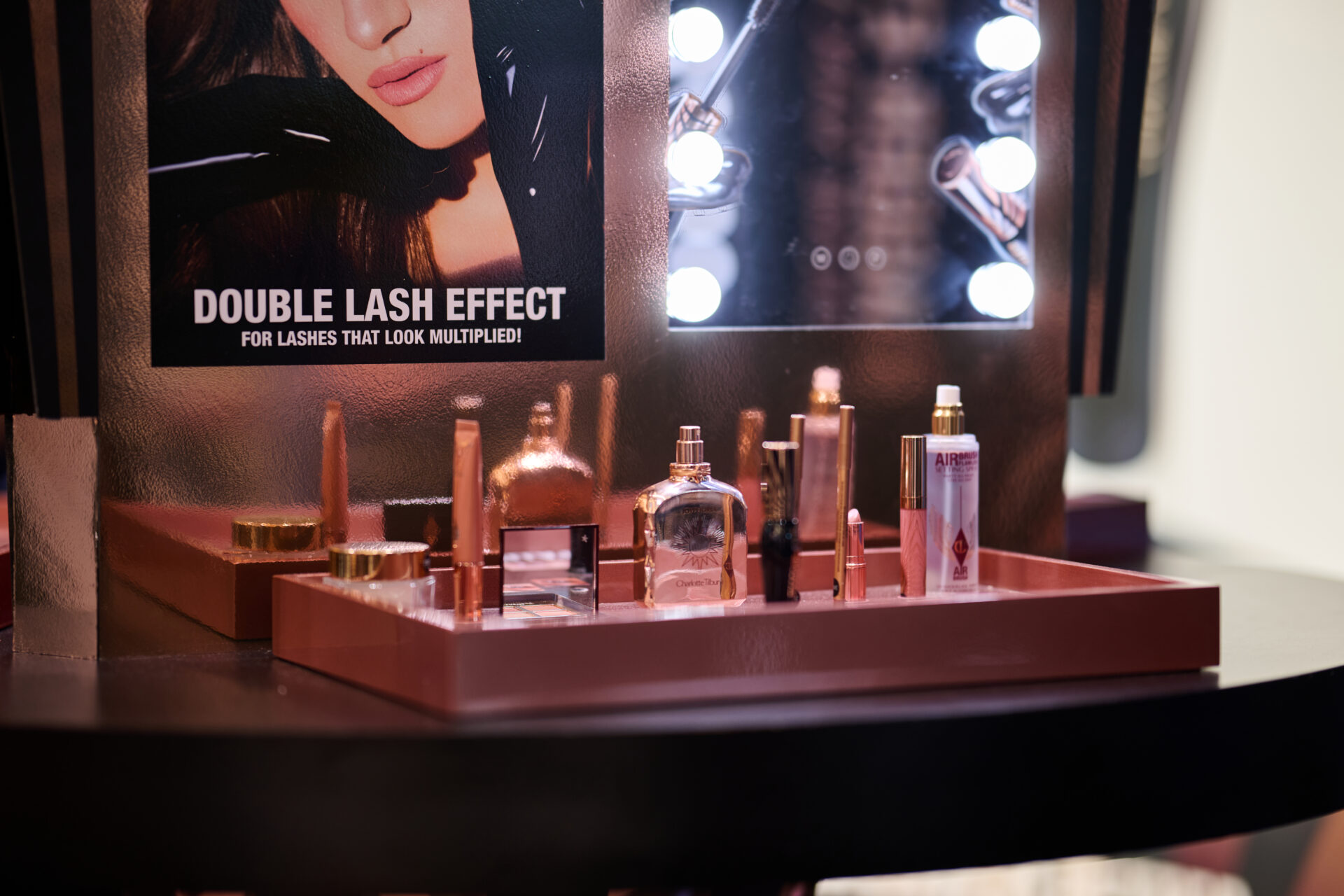
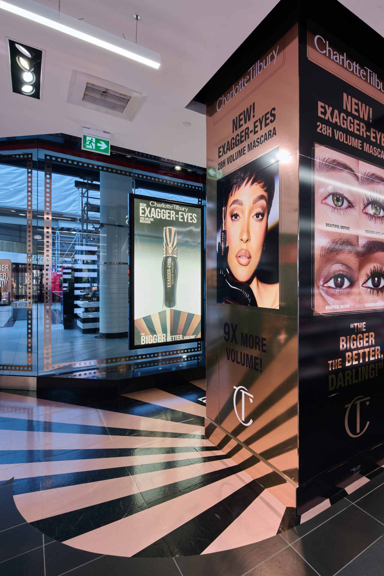
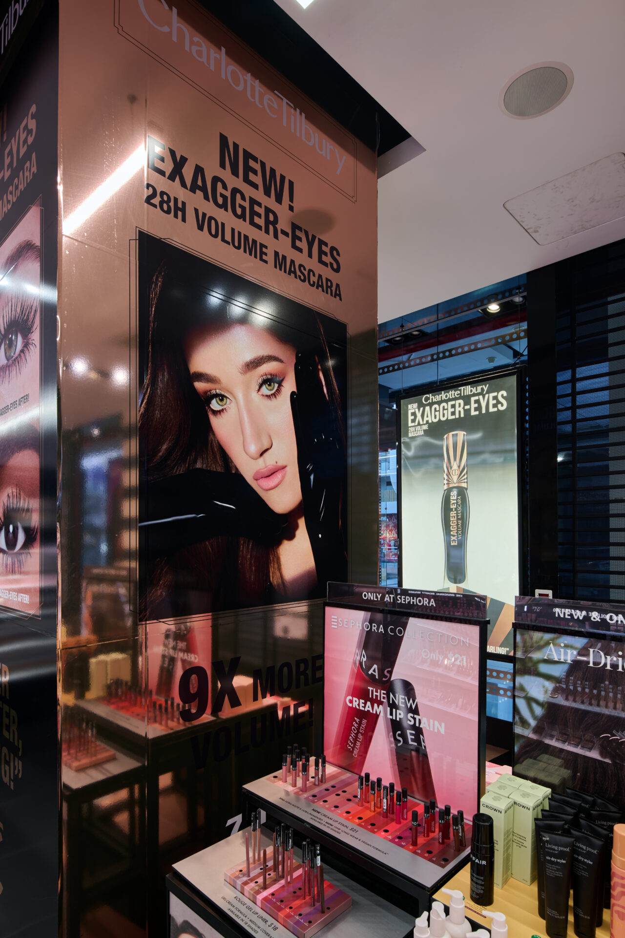
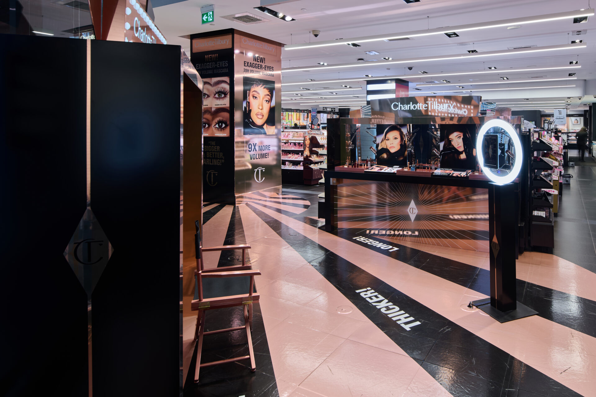
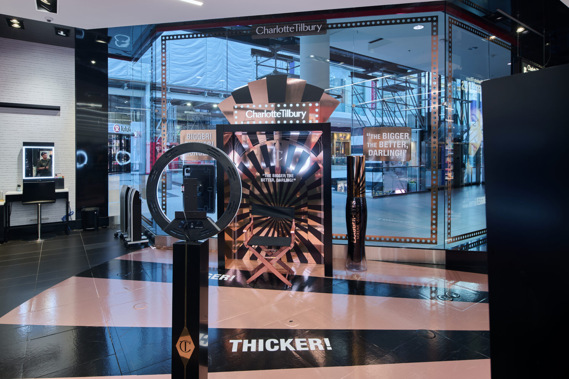
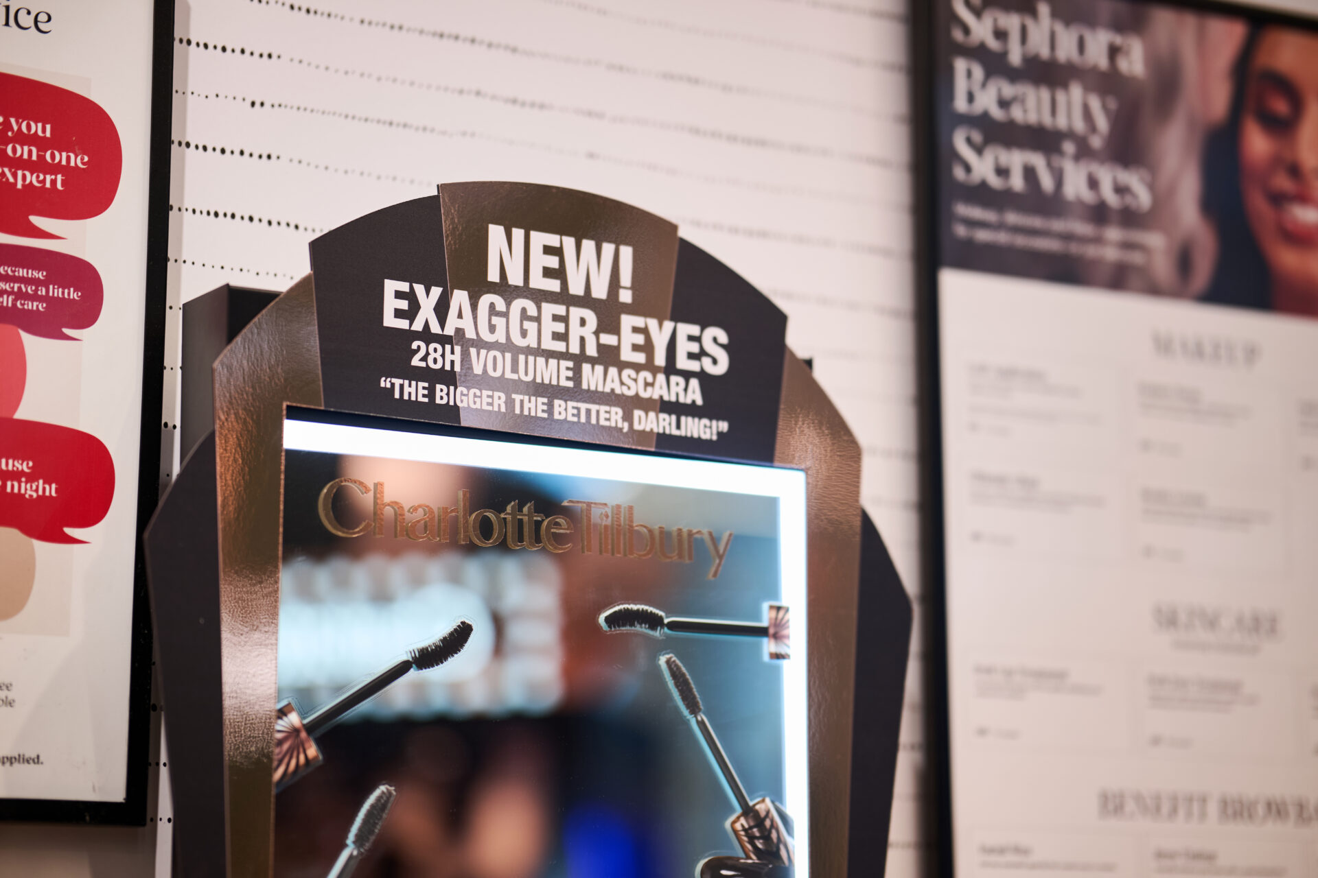
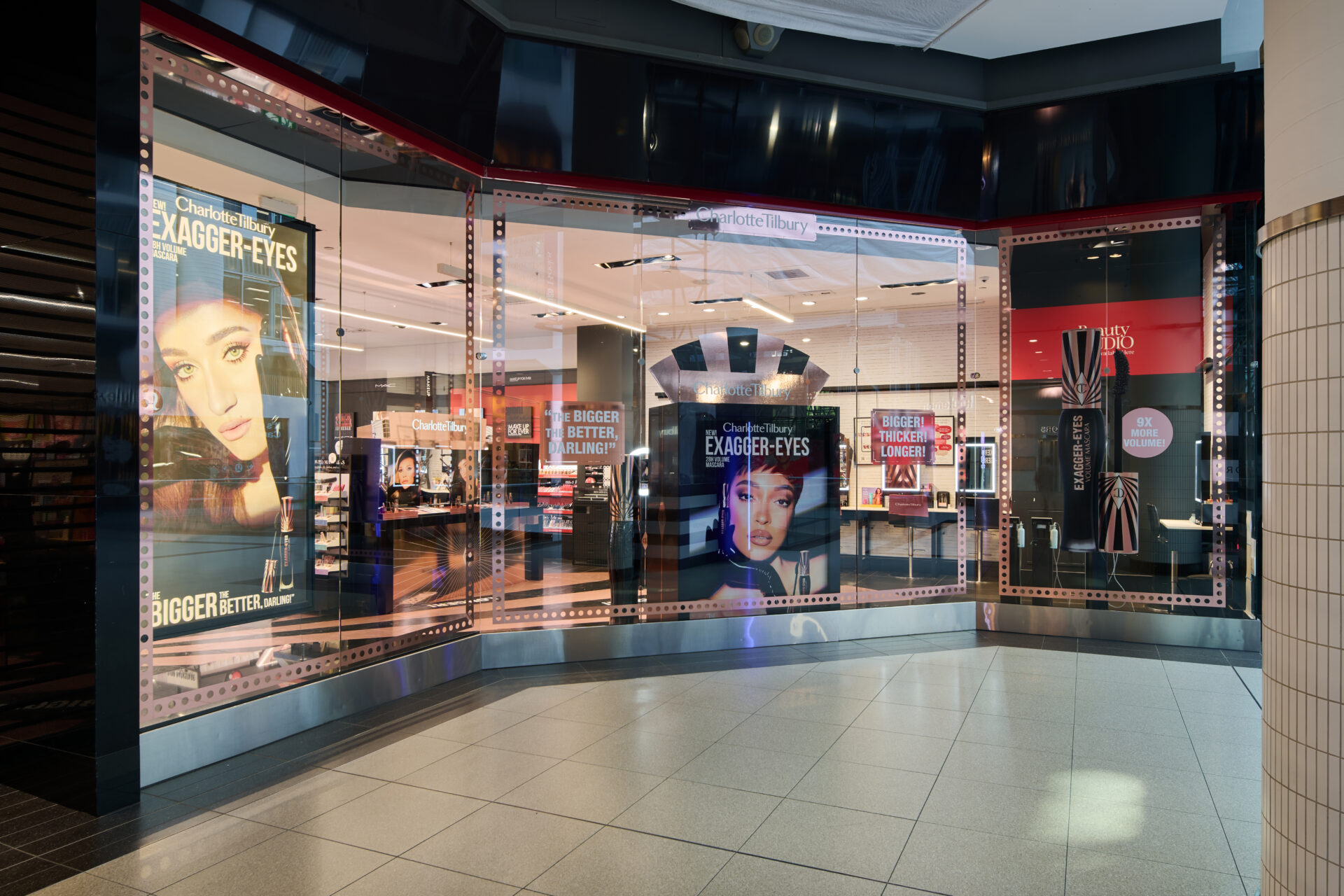
A Charlotte Tilbury cosmetic display stand in a Sephora store featuring mascara advertisements, custom retail display fabrication, the CHARLOTTE TILBURY CASE STUDY text, and the shōmi! logo.

How shōmi! delivered a brass-finish vanity and photo moment at retail scale

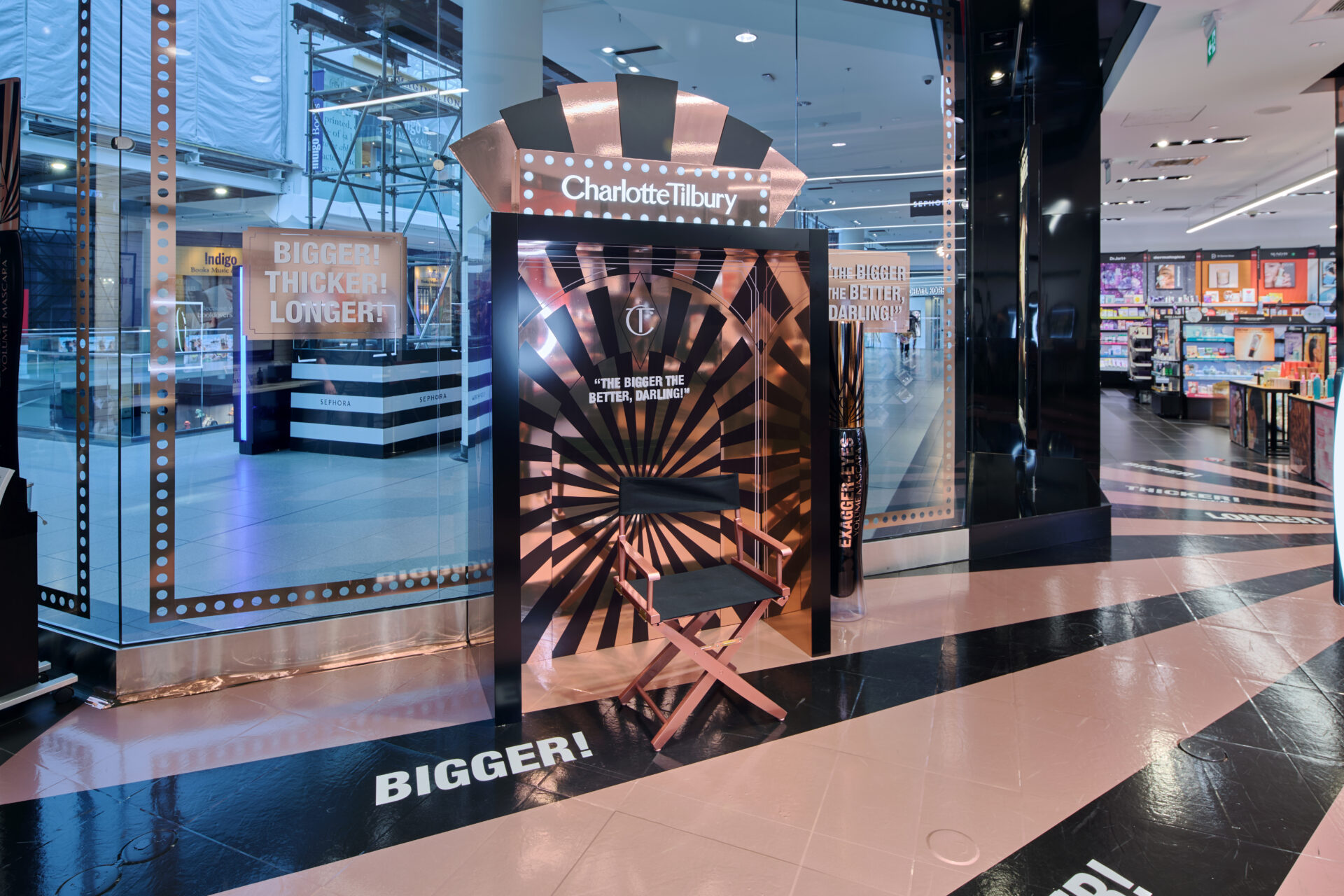
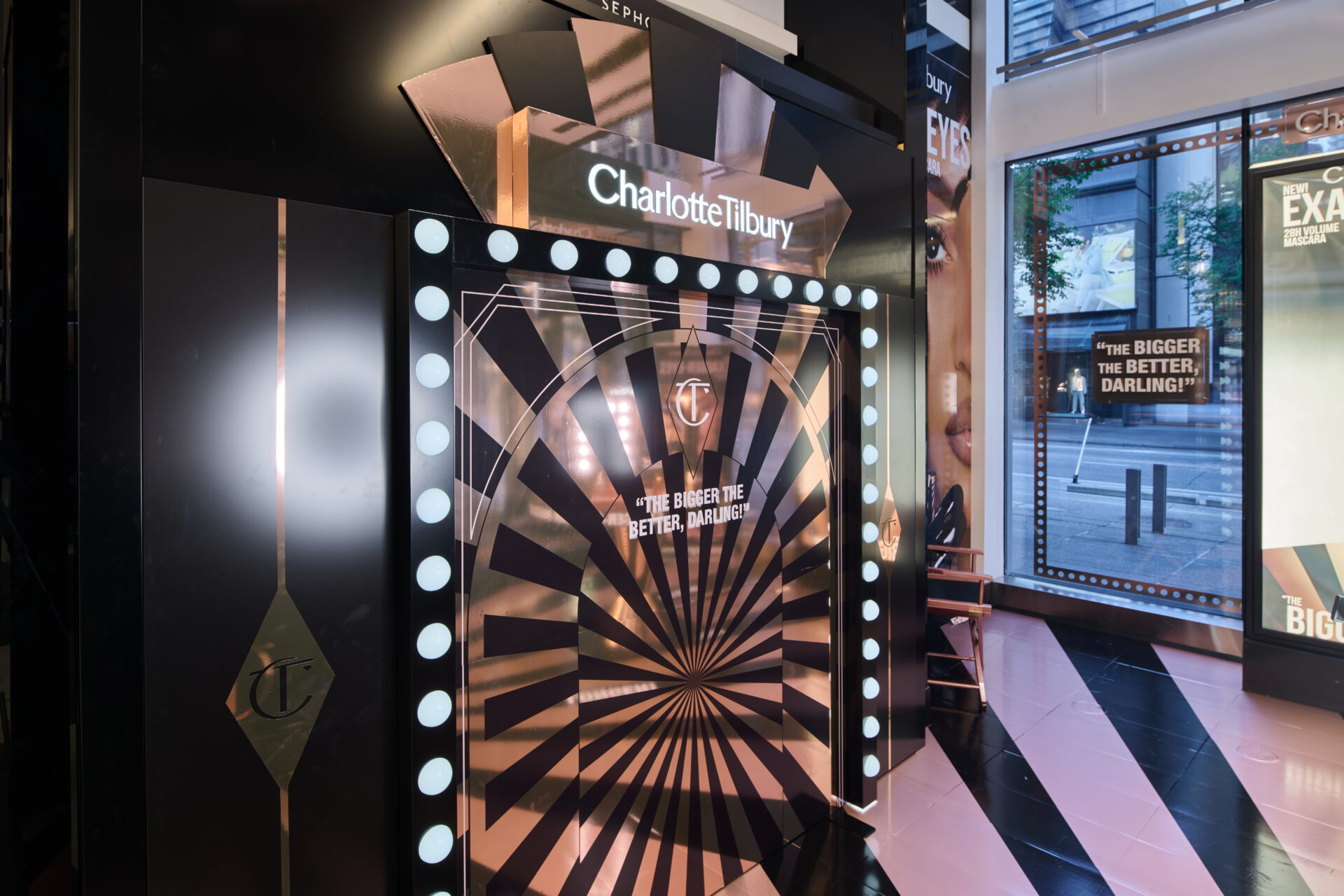
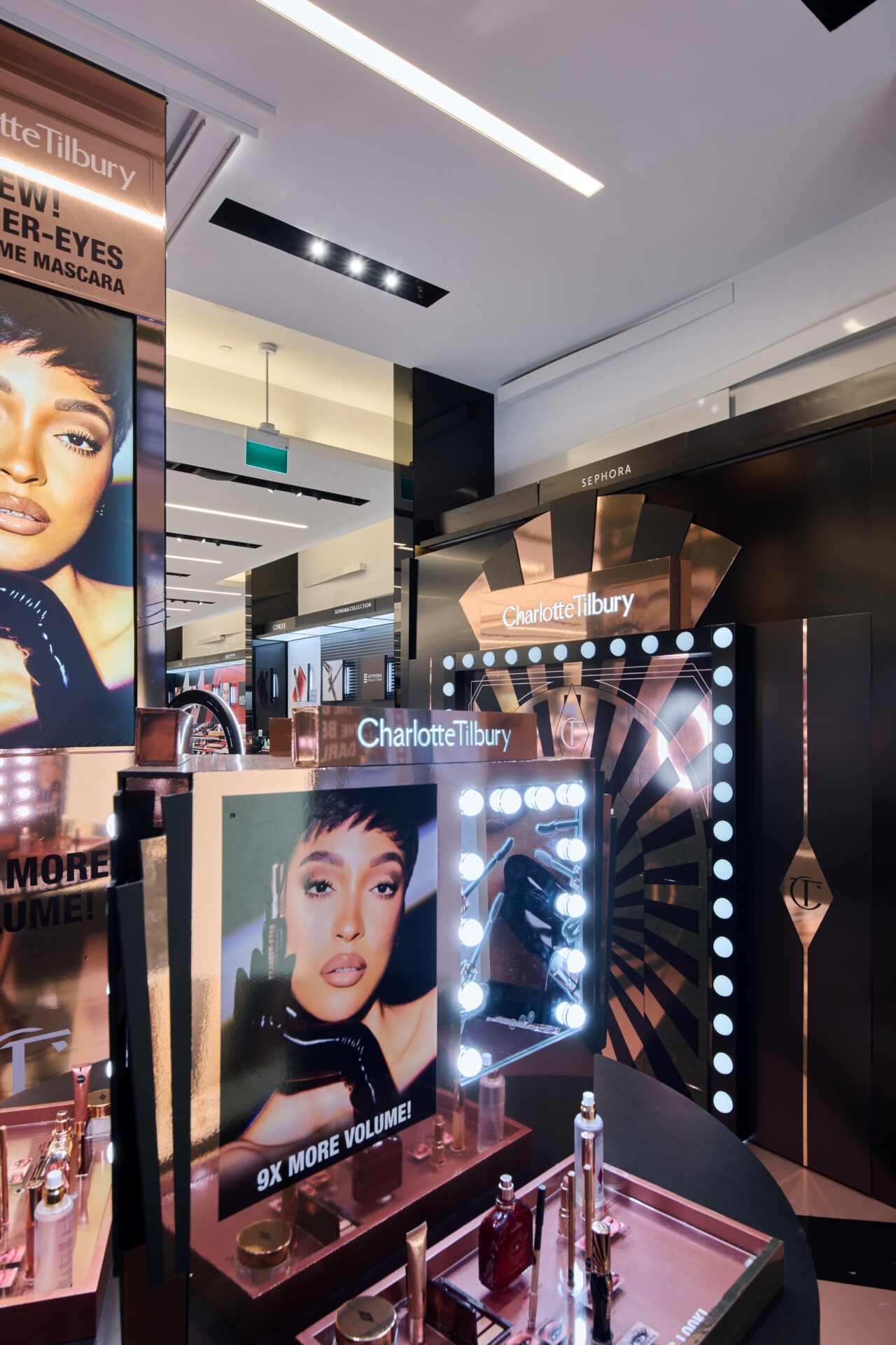
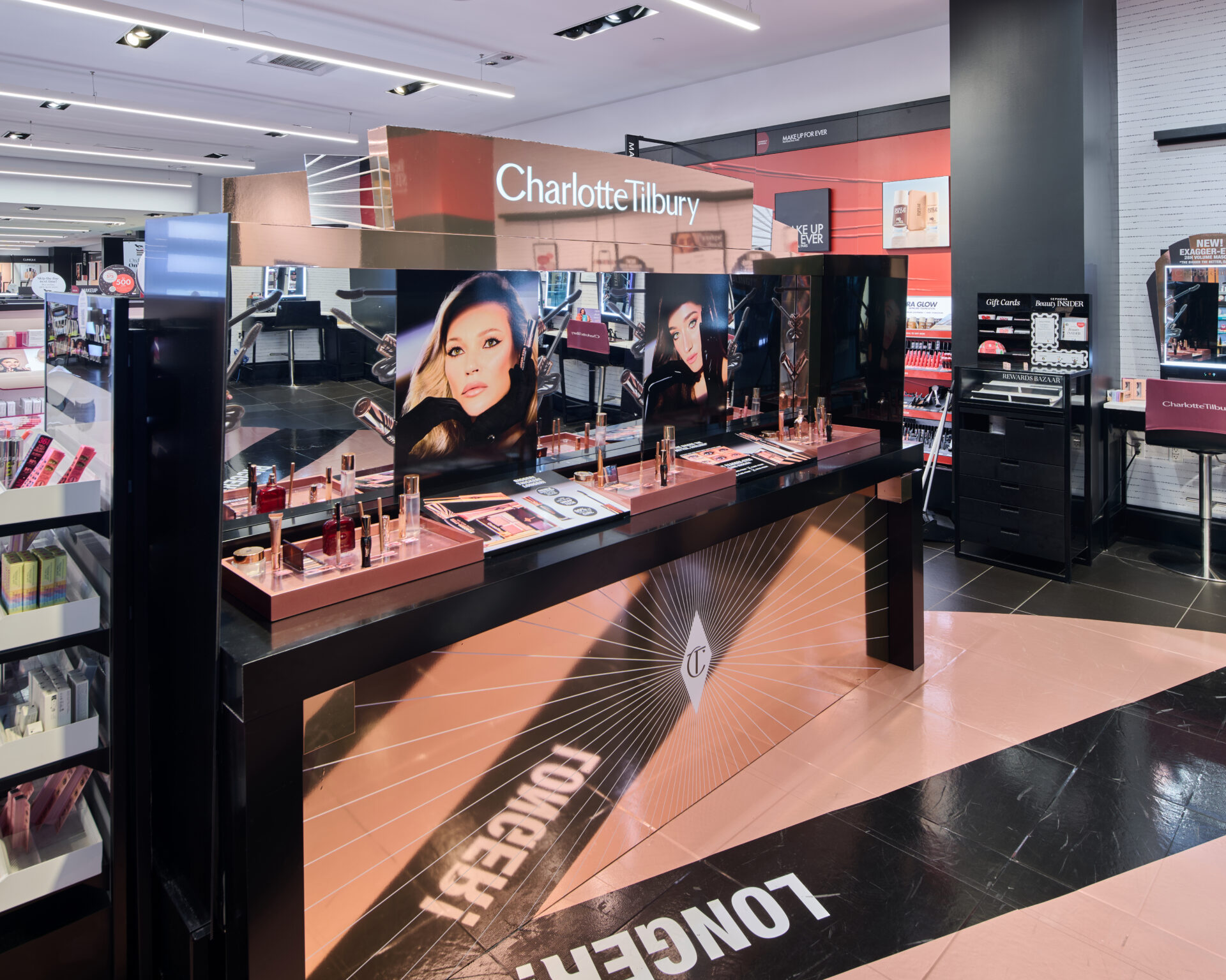
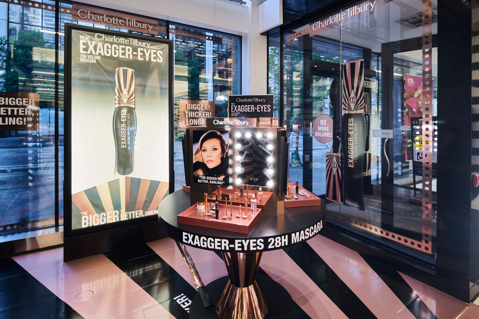
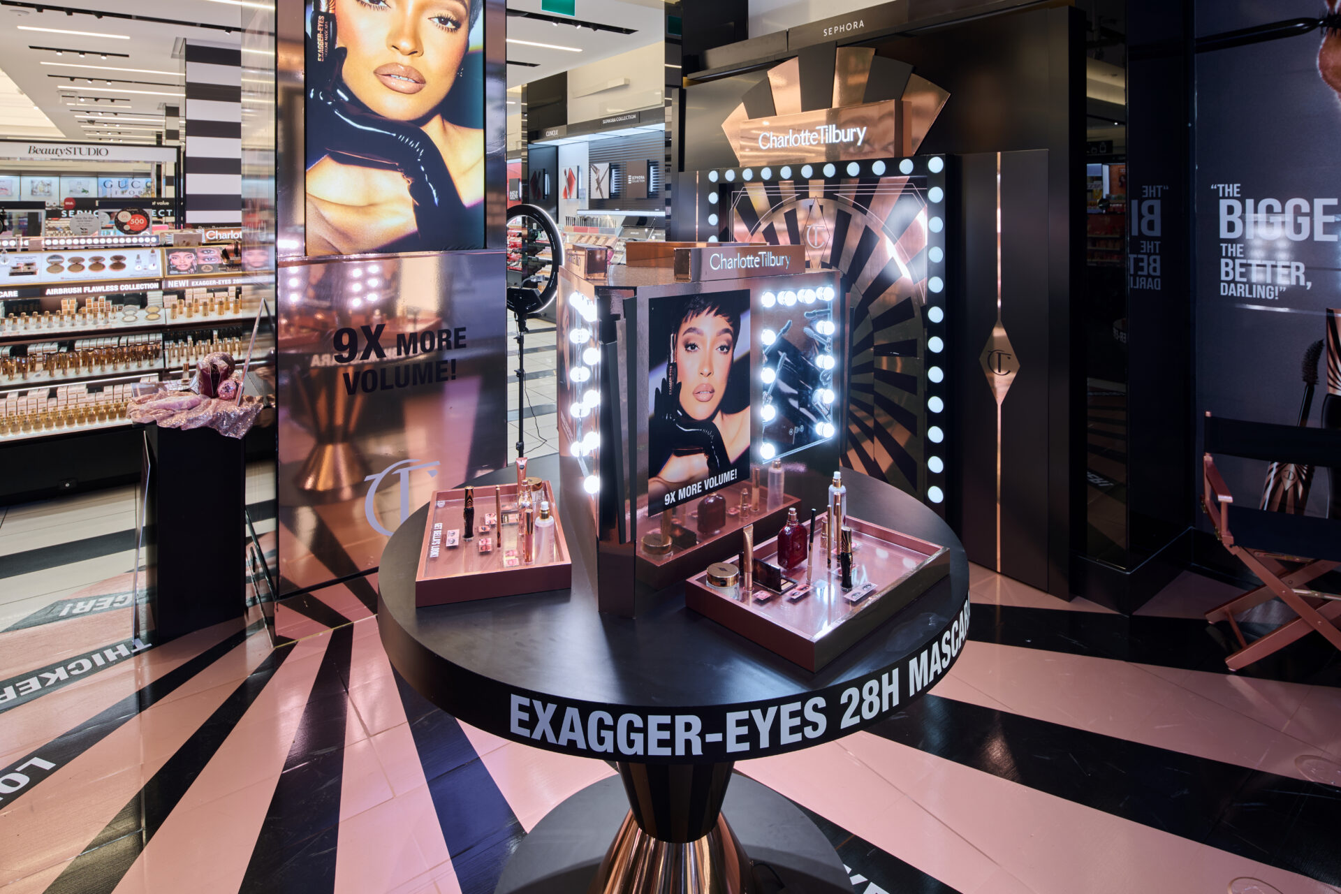
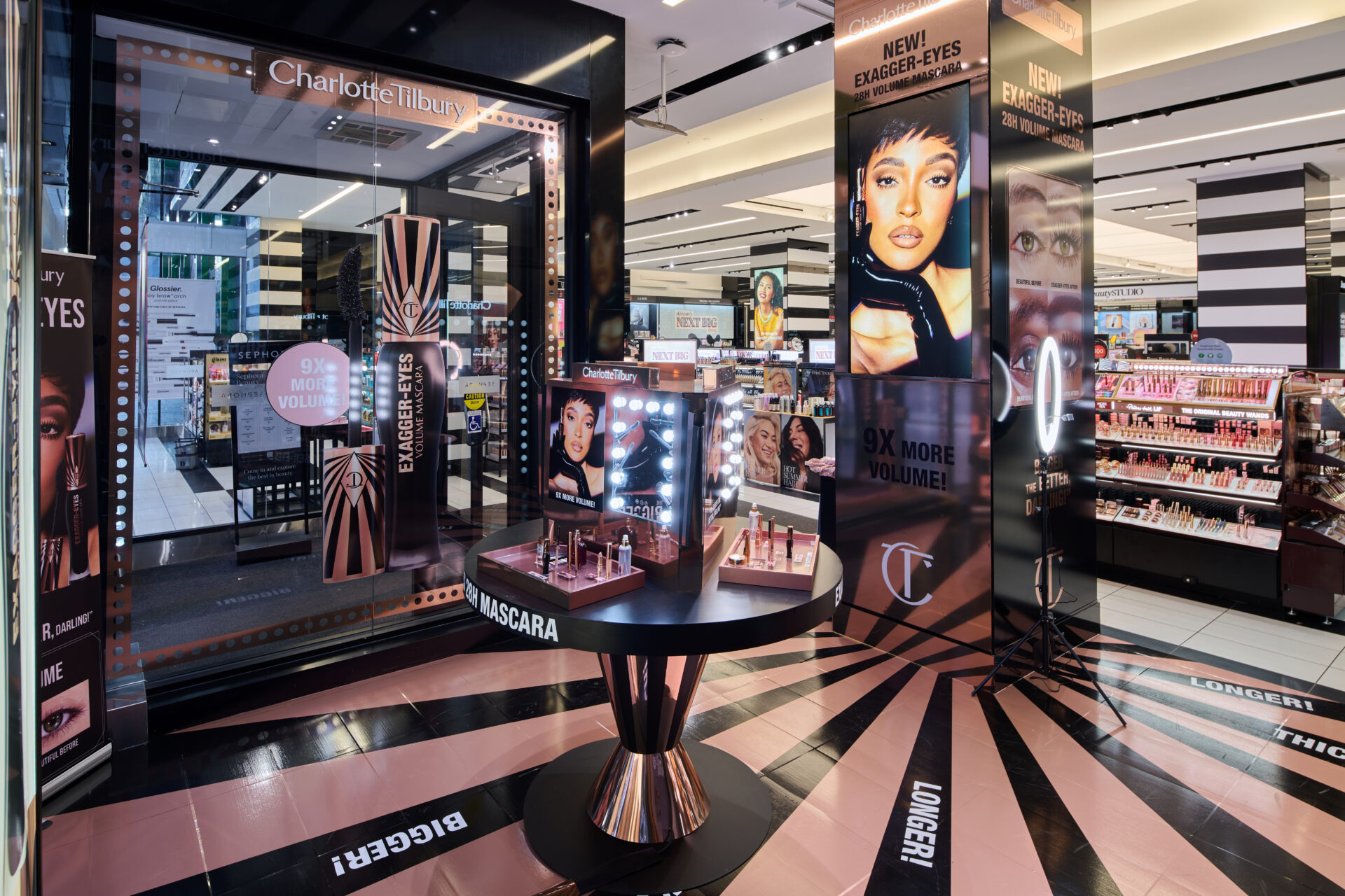
Charlotte Tilbury needed two centrepieces for its Sephora rollout: a round vanity table on a two-cone base, and a photo moment shaped like an oversized makeup mirror ringed in globe lights. Both in a shiny brass finish. Across multiple store locations, not one.

Park Creative Studio brought us the brief. shōmi! Custom built both pieces to spec, on budget, and durable enough to survive a retail floor. Here’s the custom retail display fabrication that made it happen.

The Brief

For Charlotte Tilbury’s Sephora footprint, that meant two centrepieces:

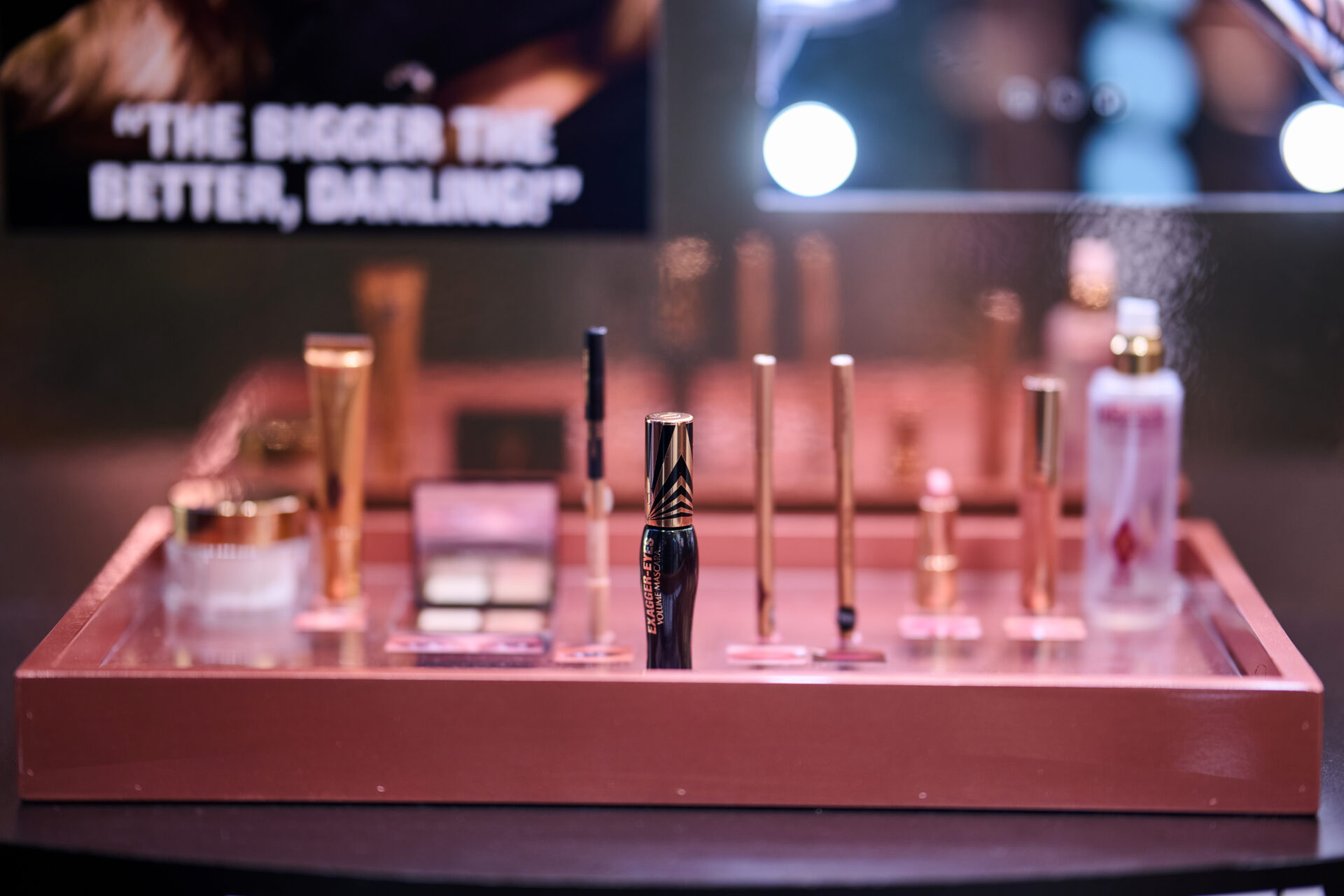
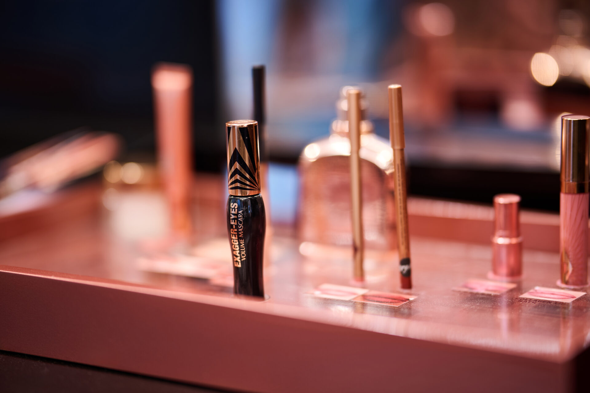
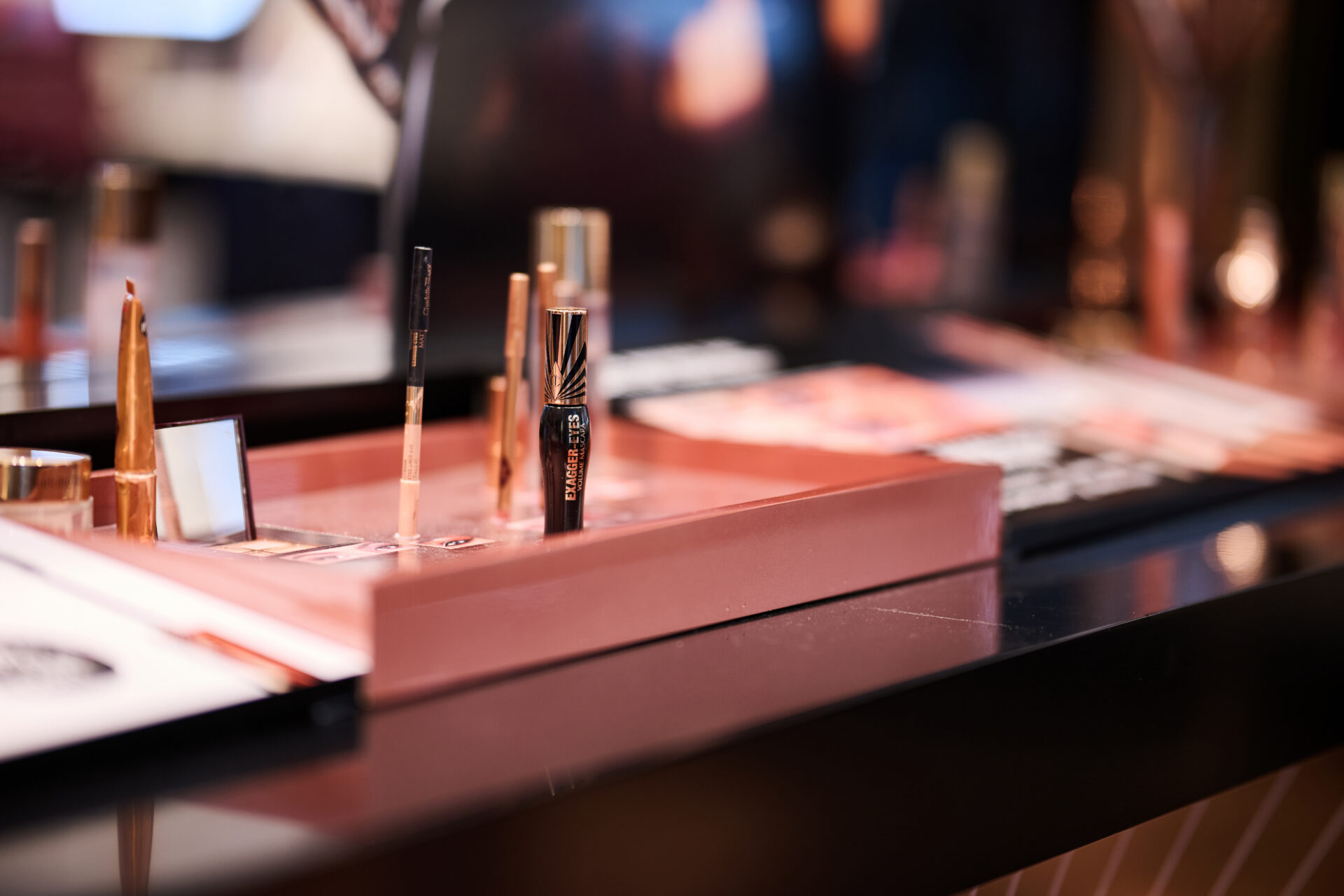
  • A round vanity table, base built from two inverted cones, topped with a custom tray drilled for security tethers to hold perfume bottles in place.
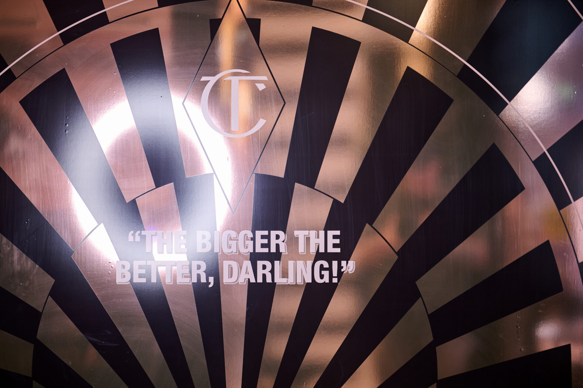
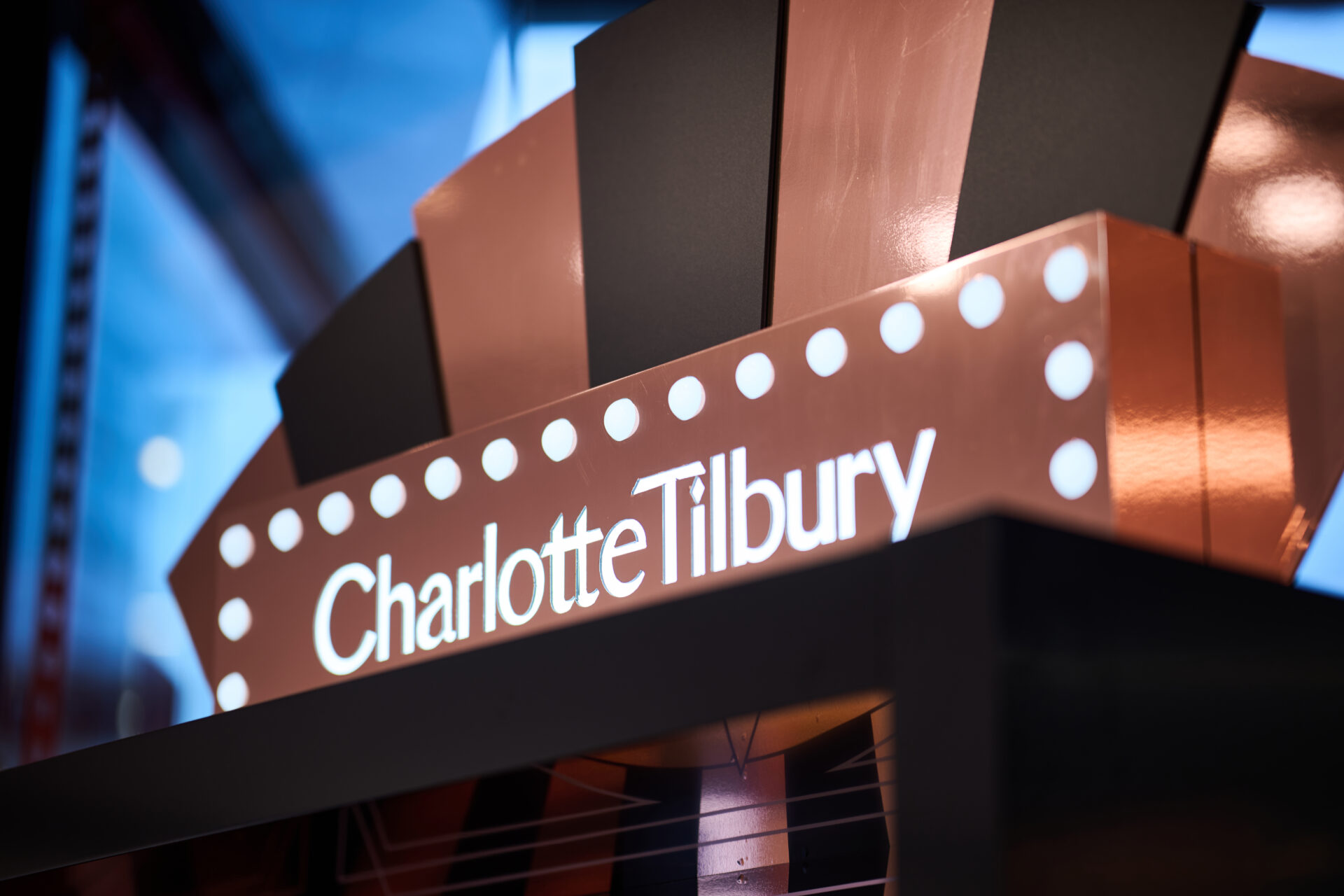
  • An Instagram photo moment built to resemble a massive makeup mirror ringed in globe lights.

Same finish on both: a shiny, warm brass. Same requirement on both: hold up across multiple stores, not just look good on install day.

The Engineering Challenges

Three problems, one project.

Get the brass look on budget. A two-cone table base is a lot of panels to keep consistent under one finish, and that has to happen across multiple locations, not once.

Build the base so it’s actually structurally sound, with a tray that keeps perfume bottles secured while customers can still pick them up and try them.

Build the mirror-and-globe-light photo moment so it’s durable and safe on a retail floor that gets bumped and leaned on daily, not just durable on install day.

The Build

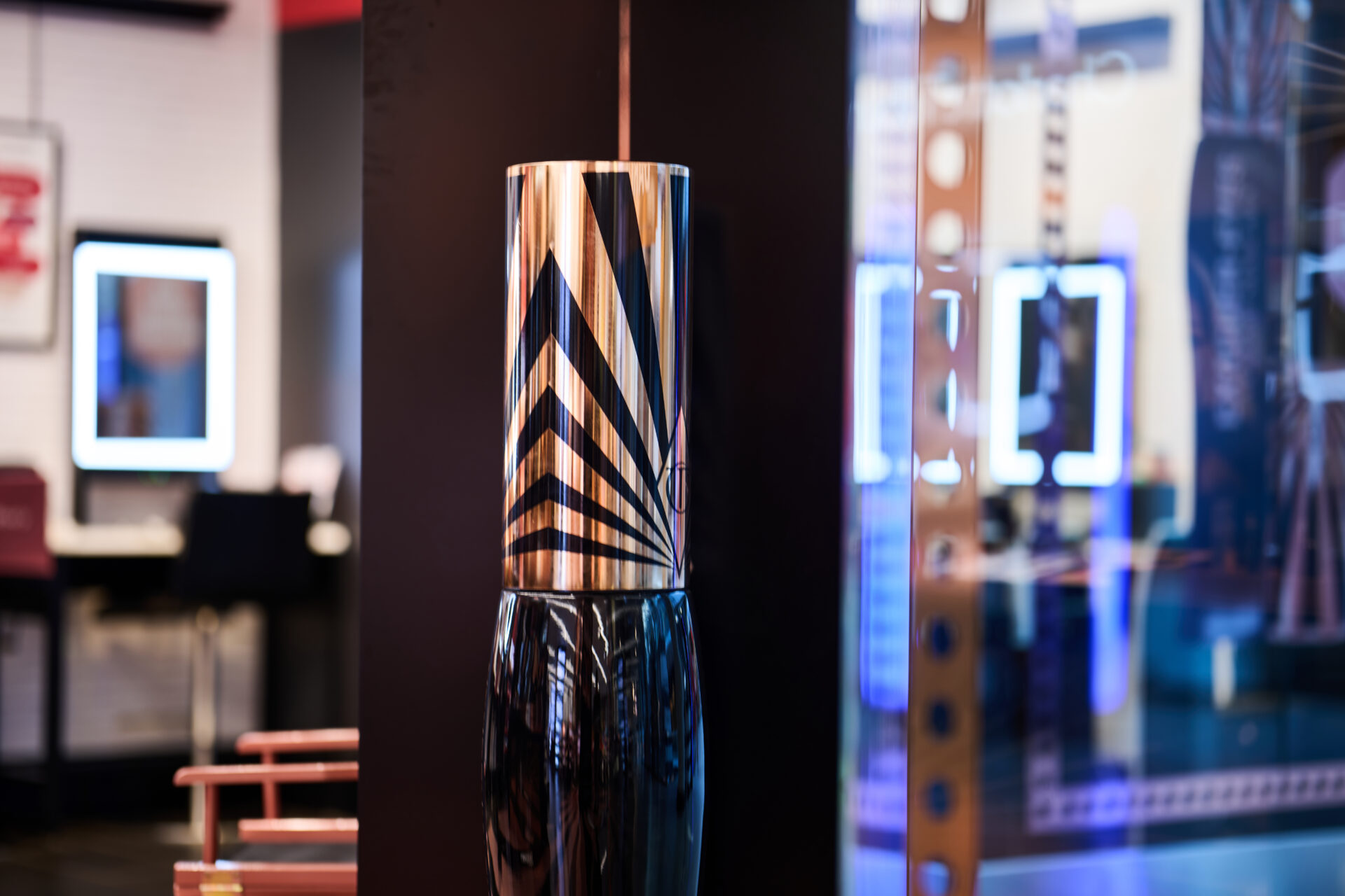
The finish. A pressure-sensitive metallic vinyl film, hand-applied and squeegeed carefully to avoid scuffing, delivered the brass look without plated metal parts.

The table. Two inverted cones instead of one moulded form kept the base buildable and stable while still delivering the sculptural look the brief called for. The tray on top was drilled with holes sized for security tethers, so perfume bottles could sit out for customers to try while staying secured to the fixture.

The photo moment. Instead of traditional light bulbs, the globe lights were built as vacuum-formed half domes of white translucent acrylic, set into a metal frame. The domes were engineered for durability and resistance to wear, creating a sturdy, break-resistant mirror effect without a bulb to replace or a socket to wire.

What Shipped

  • Budget: the brass finish, achieved with vinyl film rather than plated metal.
  • Structure and security: the two-cone table base and tethered tray, holding perfume bottles securely while staying fully accessible to customers.
  • Durability and safety: the makeup-mirror photo moment, built with acrylic domes in a metal frame engineered for wear and resistance to breakage, in place of exposed light bulbs.

The Real Lesson

A brass finish and a lit mirror moment don’t need plated metal or wired glass to read right at retail scale. They need the material and method that hits the look, the budget, and the durability bar the floor actually demands.

On this one, that was vinyl film and vacuum-formed acrylic. On the next one, it’ll be whatever the brief and the budget call for.

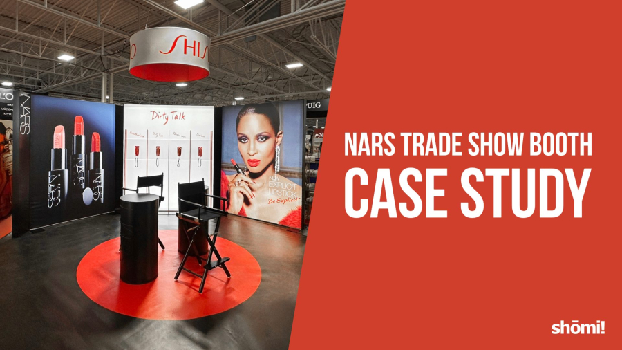
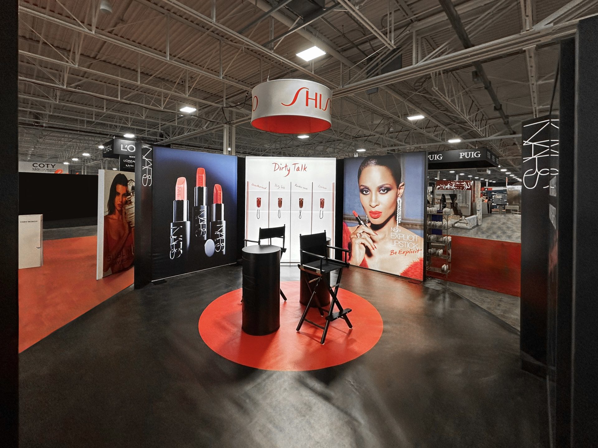
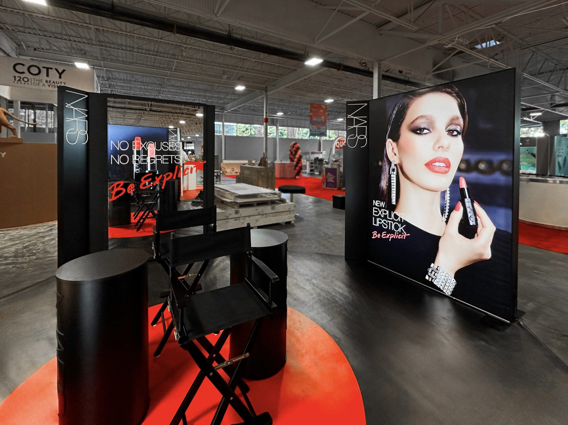
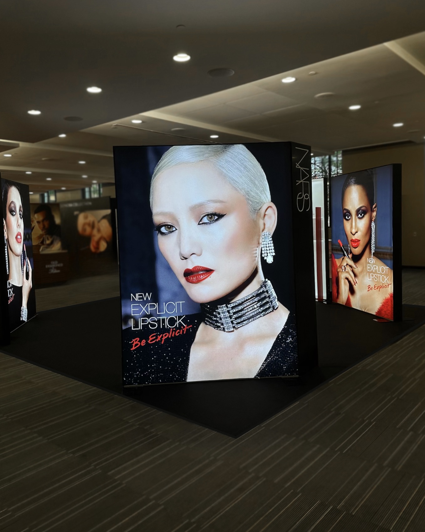
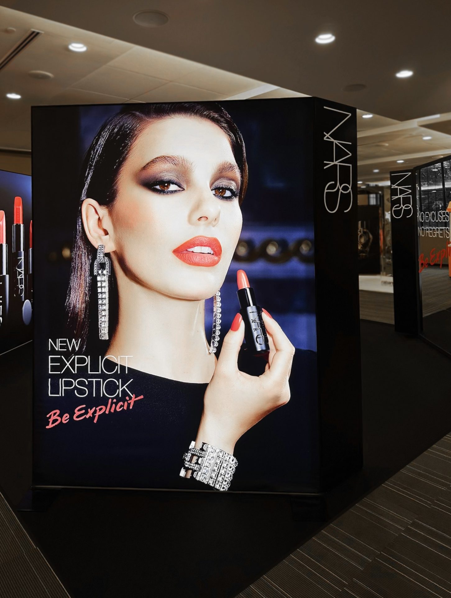
NARS trade show booth with branded displays, lipsticks, makeup posters, chairs, and a round table. Text on right reads “Case Study NARS Trade Show Booth.” Bright, professional event setting.

Case Study: NARS

Old Phones, New Guts: How Four Vintage Telephones Stole the Show at the NARS Booth

Most trade show briefs sound simple until you start building them.

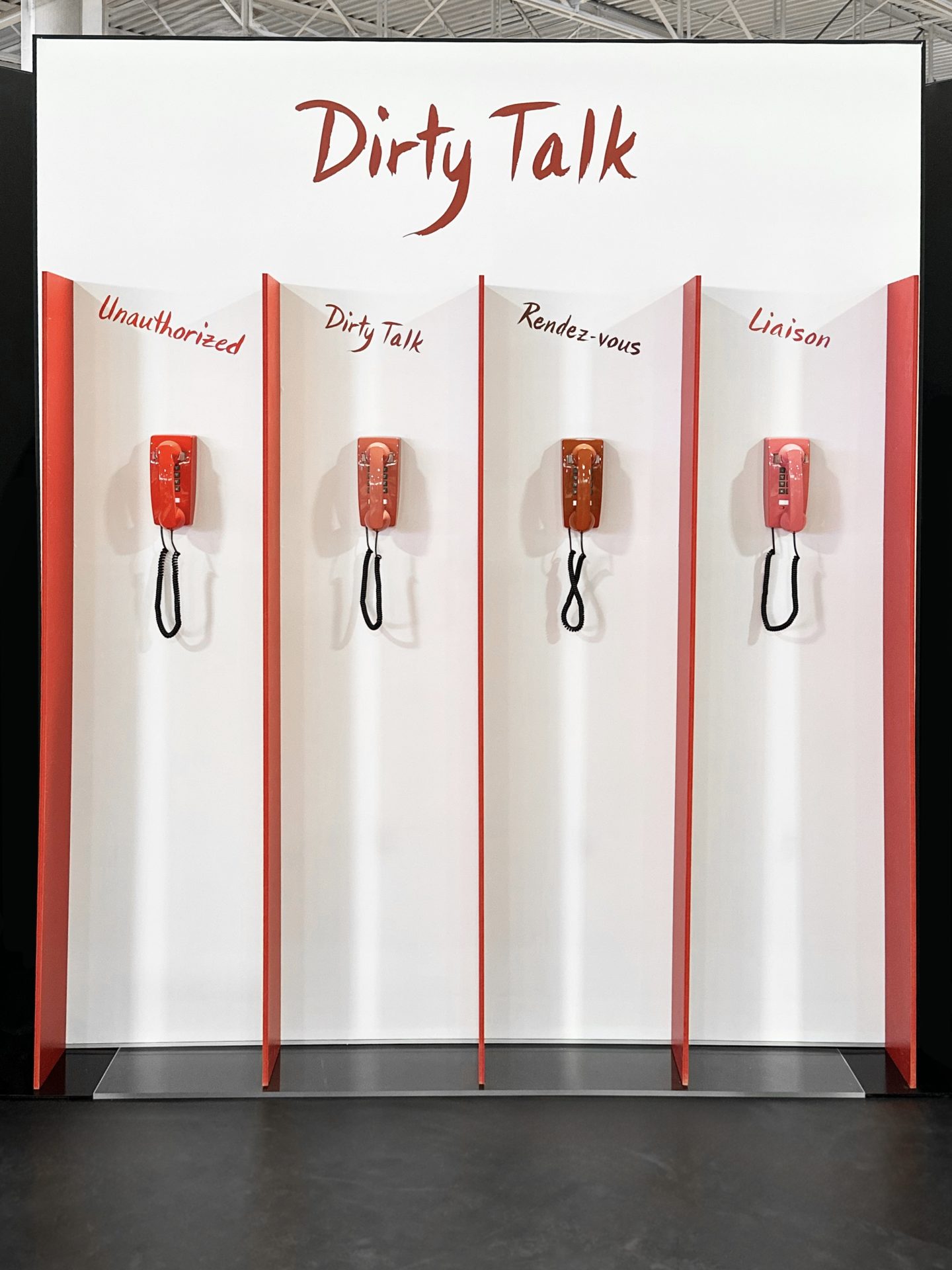
“Can you make old telephones interactive?” is one of those briefs. It sounds straightforward. Then you’re staring at a handset with no wiring inside it, no audio circuit, no way to know if lifting the receiver will do anything at all. That’s where the real work starts.

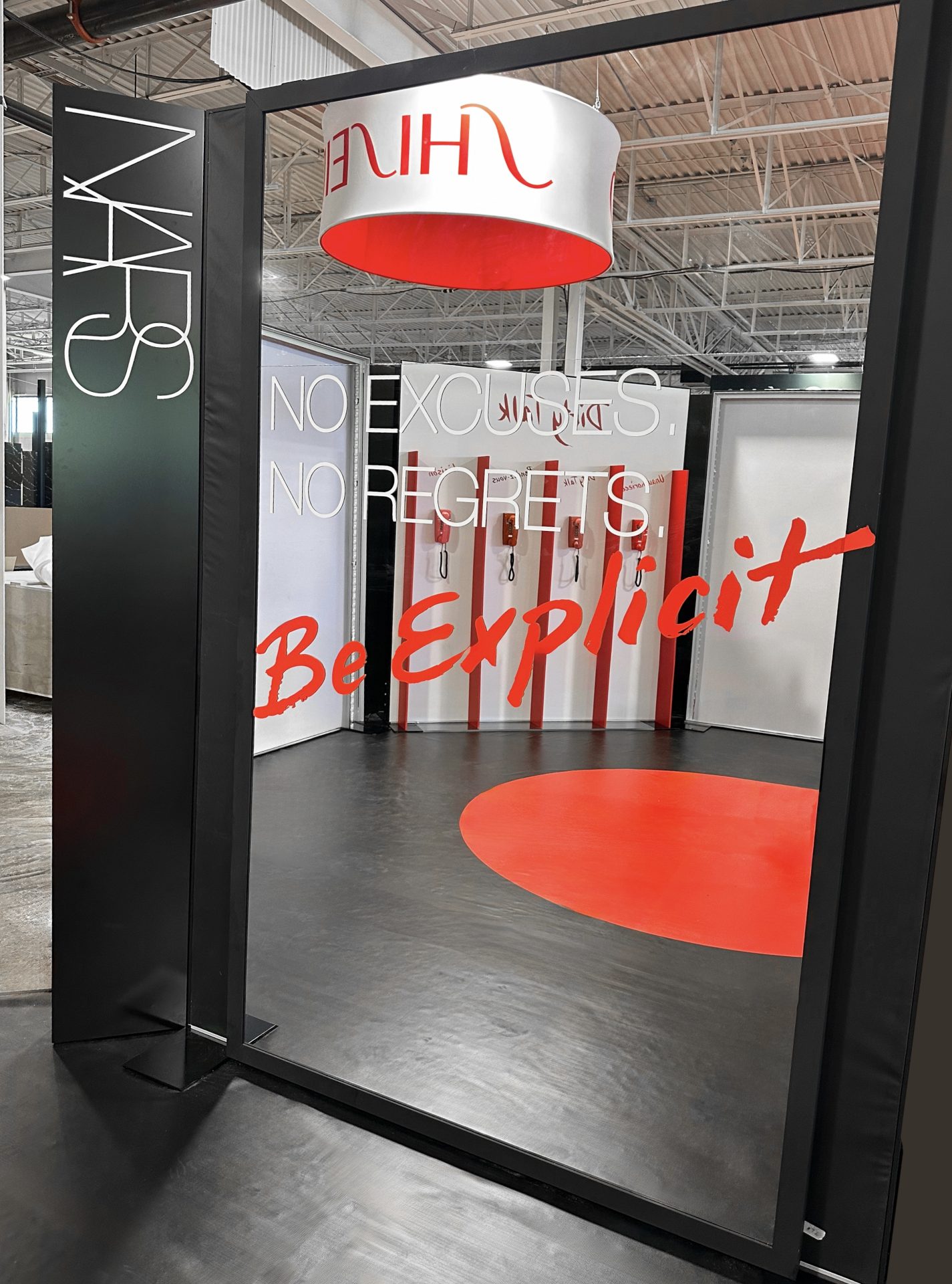
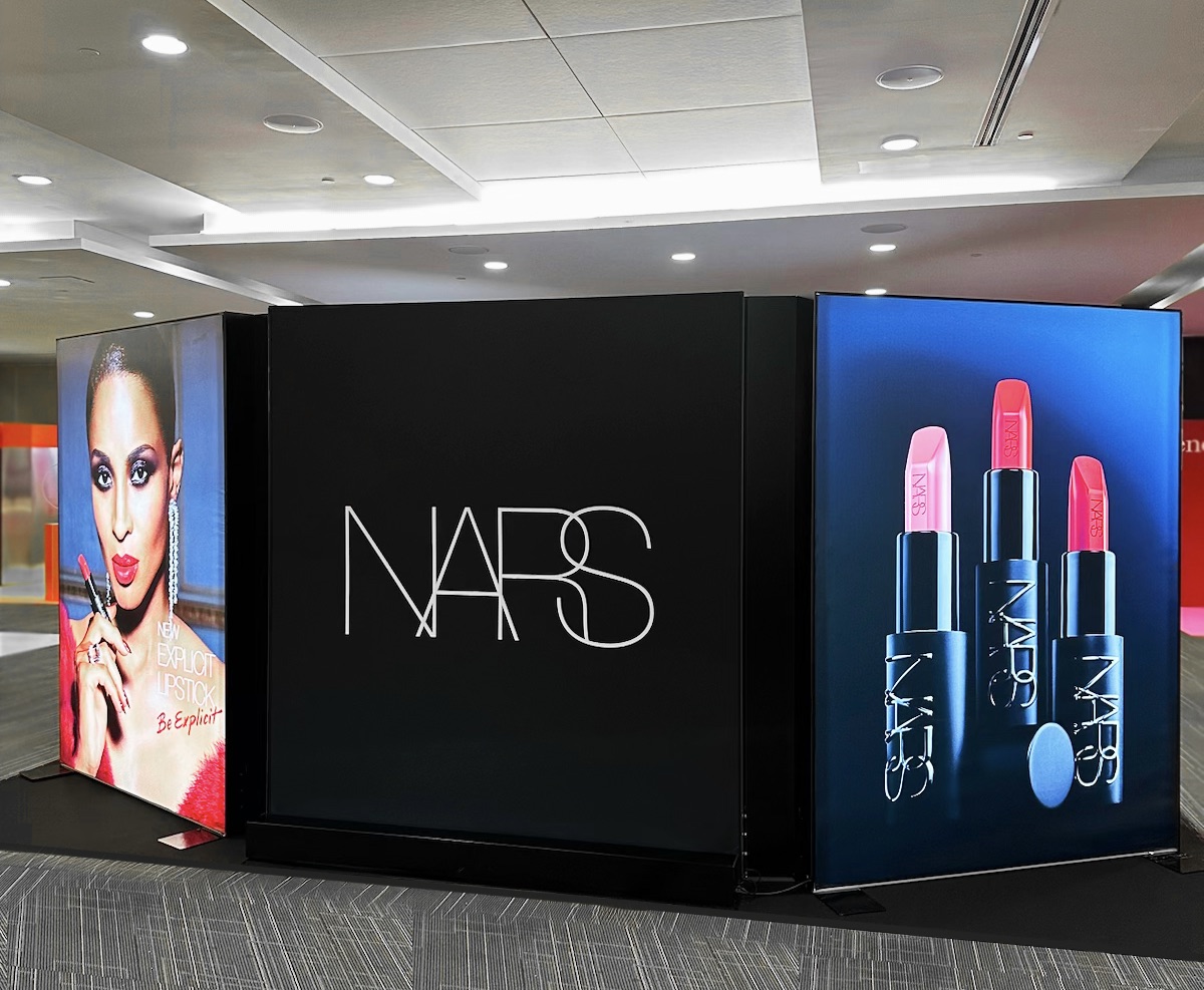
For a 20-foot by 20-foot booth for NARS (designed by Park Creative Studio), we rebuilt four vintage telephone handsets from the inside out. Each one had to play audio on cue, match a specific Pantone colour without chipping, and survive being picked up and hung up – repeatedly – across multiple trade shows. Then we built the whole structure on a modular octagon frame with backlit graphic walls.

Oh, and we had to do it on a budget that could cover custom electronics or a carpet. Not both.

The phone problem

Vintage handsets aren’t wired for interactive marketing. They were designed to hang on a wall and ring. That’s it.

But here’s what they had to do: each phone needed to play a different custom audio clip when someone picked it up, and stop playing when they hung it back down. Four phones. Four different clips. Four triggers.

That meant designing custom electronics that could live inside a vintage handset. We built a circuit around something that was already there: the hang-up clip. That little lever the receiver rests on? That’s a mechanical switch. When the handset sits in the cradle, the clip is compressed. Lift the phone, it releases. That release triggers our custom circuit to start playing the audio for that phone. Hang it up, the clip resets, the circuit cuts out.

We didn’t retrofit a new mechanism into the phone. We built custom electronics that leverage what was already built in.

Each phone also had to match a Pantone colour and look perfect after months of being manhandled at trade shows. Standard spray paint fails that test in weeks. We partnered with an automotive paint shop to get the Pantone match and durability in a single coat – the kind of finish engineered for car doors, not props.

A vintage telephone finished like a bumper. Not a sentence anyone expects to write, but here we are.

The structure

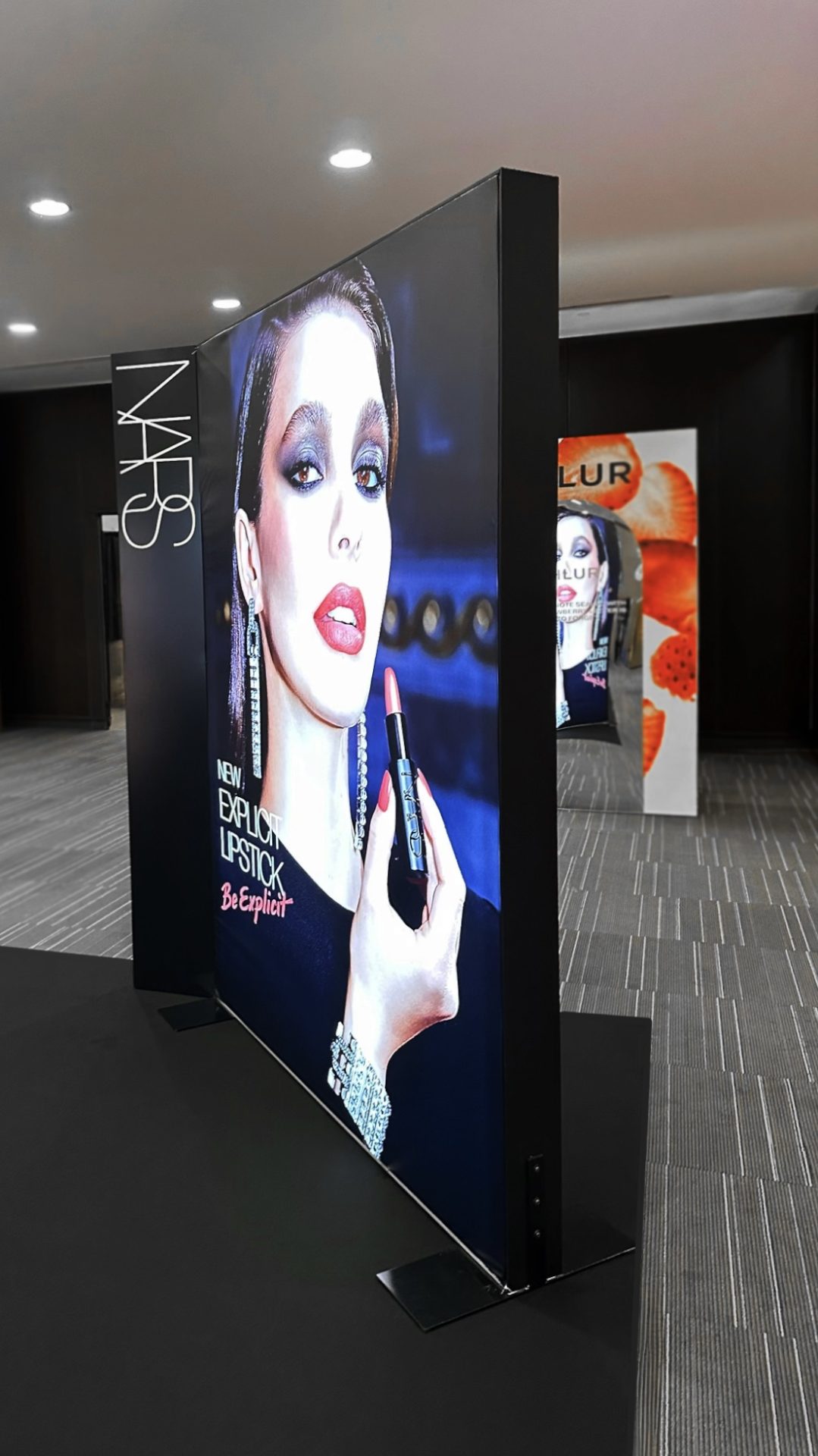
The booth ran on a modular octagon system – eight pieces that come together fast and break down faster, without looking like that was the whole idea. Four of those pieces carried graphic walls printed on fabric and mounted in SEG frames, edge-lit from inside with LEDs. The setup was built to travel and transform without announcing it.

The budget call

Partway through, the math got real. The budget wouldn’t stretch to both the custom phones and a carpeted floor. Every trade show project hits this moment: you choose what people will remember, or what’s under their feet.

The phones were the whole concept. So the floor became a printed vinyl banner – high-quality graphics standing in for carpet at a fraction of the cost. Nobody at the show missed the carpet. Almost everybody picked up the phones.

Why this matters

Interactive elements are the thing every brief asks for and the first thing most builders scope out when money gets tight. The assumption is that interesting problems require expensive solutions.

They don’t, if you’re willing to look before the quote gets locked in.

A switch that already exists inside a phone. A paint finish borrowed from automotive. A floor graphic doing carpet’s job. Those aren’t compromises. They’re solutions that cost less because someone thought about the actual problem instead of the obvious answer.

If your next booth brief has an idea that nobody’s worked out how to build yet, that’s a conversation worth having early. The interesting part isn’t proving it’s possible. It’s figuring out how to make it work without starting from scratch.

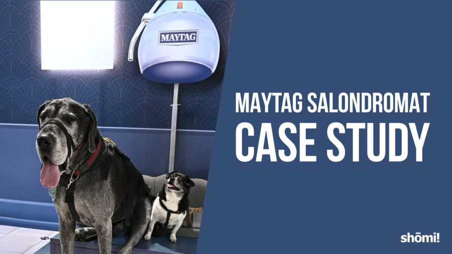
Two dogs sit under a blue Maytag hair dryer in a stylish salon. Text on the right reads: Maytag Salondromat Case Study, showcasing an innovative Maytag Case Study, with the shomi! logo at the bottom.

Maytag Case Study

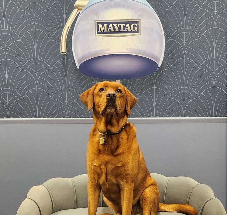
How do you build one photo op that works for a chihuahua and a great dane?

Project at a glance

Client: Maytag
Agency: prspktvMEDIA
Event: Canadian Pet Expo
Footprint: 10′ x 20′ trade show booth

Objective: Launch a pet-focused washer and dryer, engineered to remove five times more pet hair than other models, in a playful, premium environment built around that claim

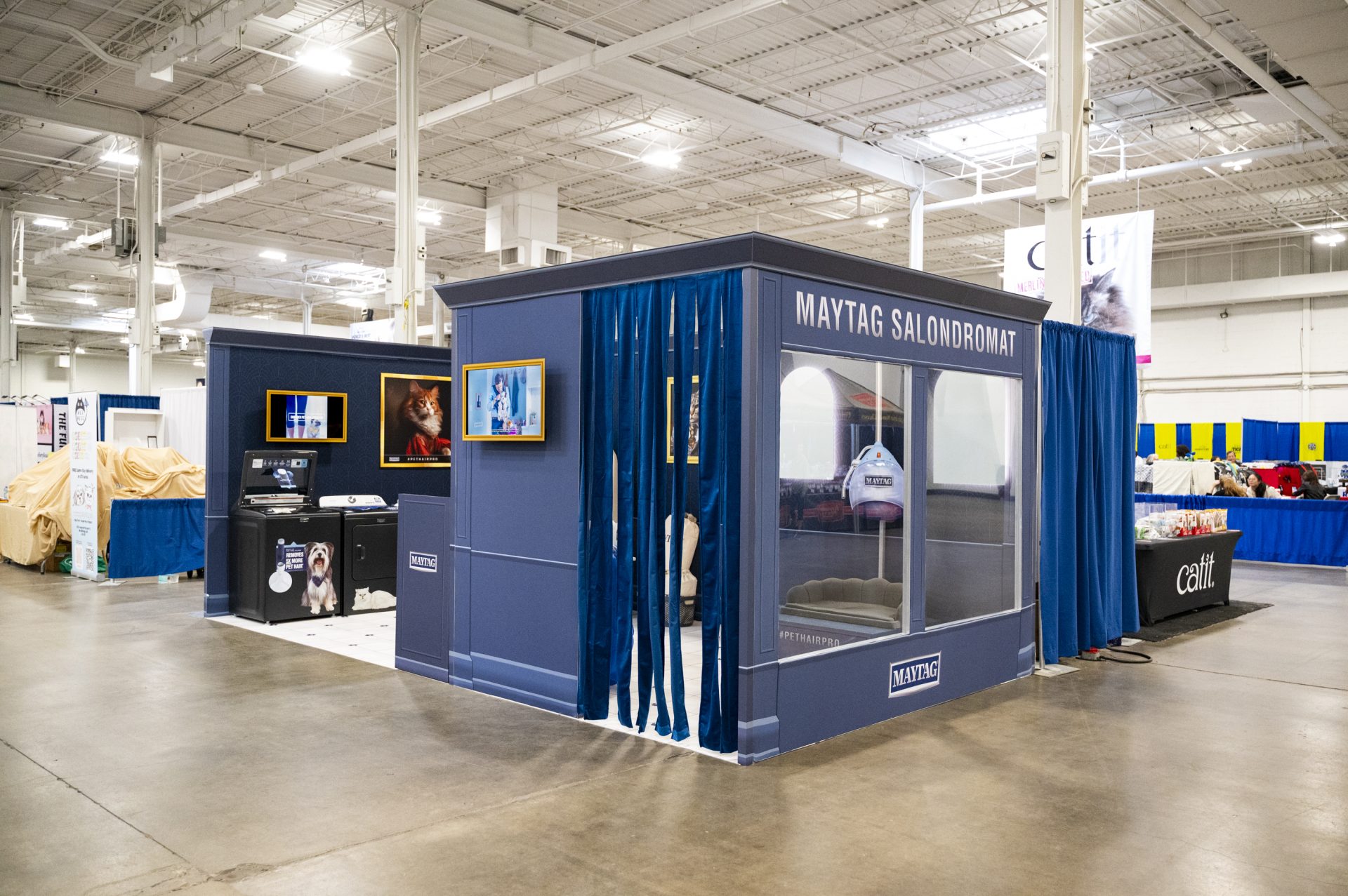
When Maytag launched a pet-focused washer and dryer at the Canadian Pet Expo, the booth had to land as a high-end pet salon, ship clean to a second city, and stay inside a real-world trade show budget. Here’s how shōmi! built it.

The brief: a luxury pet salon that ships flat

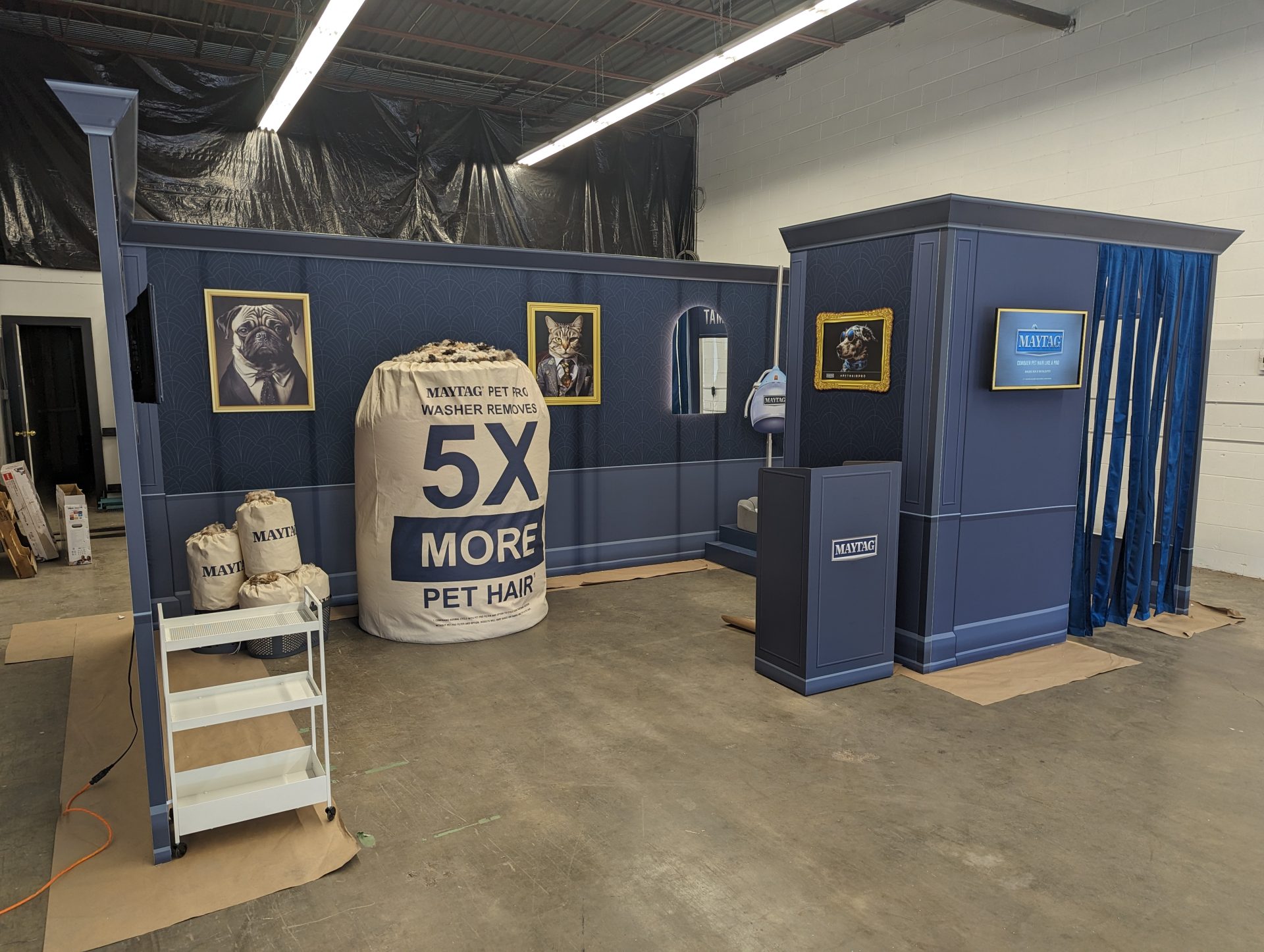
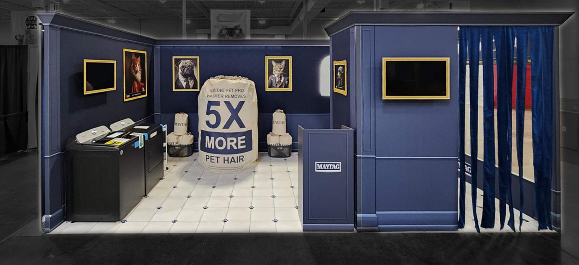
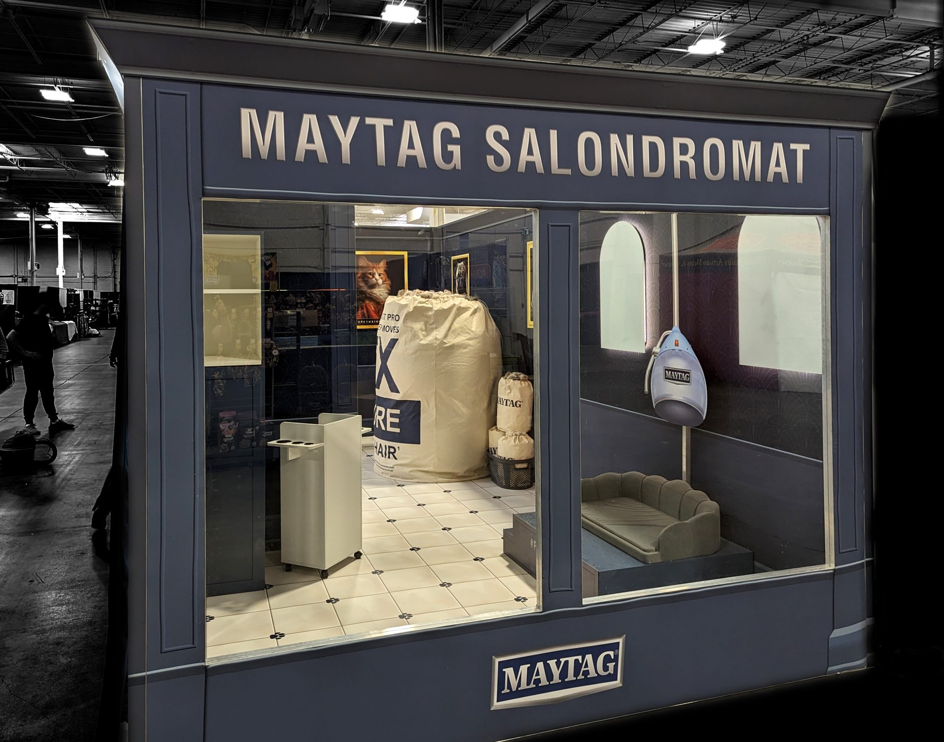
prspktvMEDIA came to shōmi! with a clear creative concept: a “Salondromat,” a tongue-in-cheek pet salon environment with crown molding, wainscoting, framed pet portraits, and a salon-style hairdryer photo op. The challenge wasn’t the concept. It was the reality of a 10×20 booth, a fixed budget, and a second-city deployment that ruled out anything heavy, fragile, or one-time-use.

Every element had to do three jobs at once: look premium on the show floor, ship in a manageable footprint, and set up fast.

Faking the architecture

The walls did the heavy lifting on the “luxury salon” read, but real wainscoting and crown molding were off the table. They blow trade show budgets, break in transit, and add days to install.

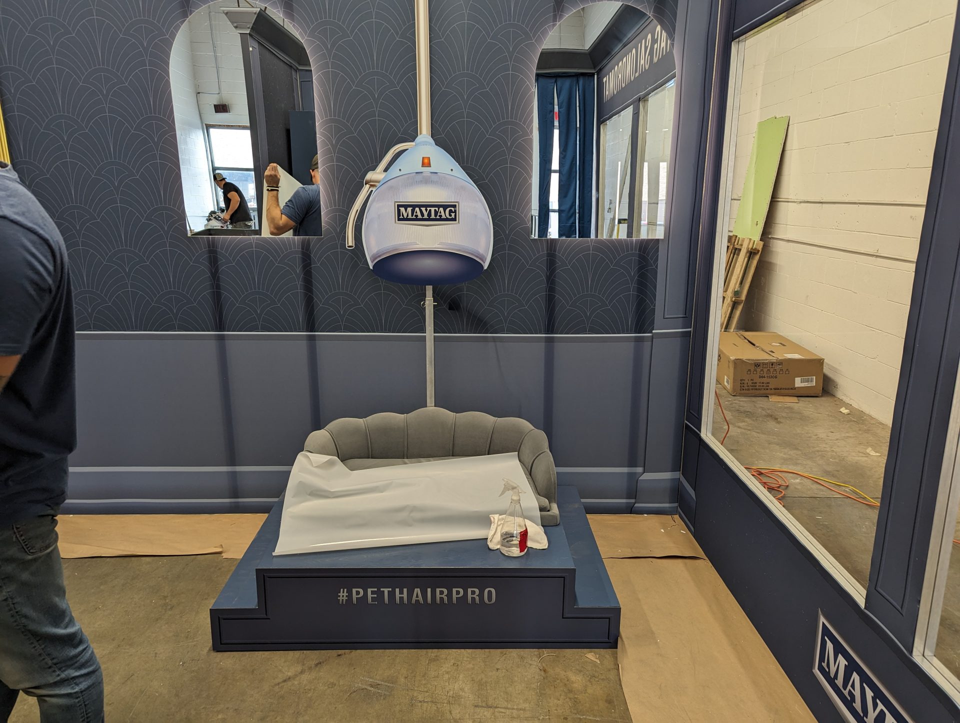
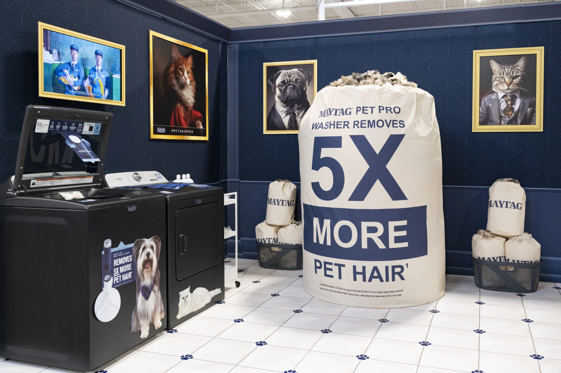
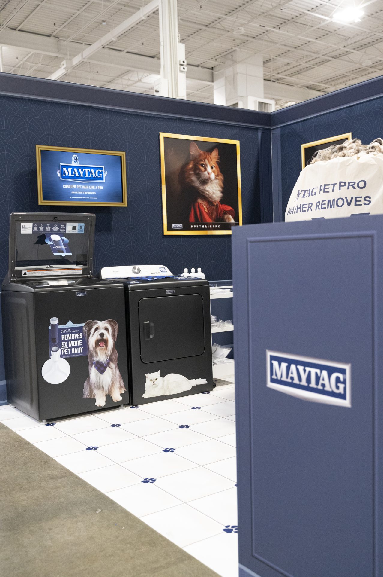
The solution was a two-layer approach. SEG stretch fabric panels were printed to simulate wainscoting and upscale paneling, giving the walls the depth and tone of a renovated salon at a fraction of the weight. The faux crown molding was achieved with printed pressure-sensitive vinyl applied to aluminum composite, delivering the architectural detail at a fraction of the cost. From the aisle, the walls read as a real space. From the crate, they read as flat panels.

The framed pet portraits used the same logic. Rather than building or sourcing actual frames, frame graphics were printed directly onto flat stock alongside the portrait images, giving the gallery-wall effect without the weight or breakage risk.

Solving the floor in a tube

A tile floor with embedded paw prints would have looked the part and added two days to install, plus a hard-to-ship footprint. The shōmi! graphic designer created a custom tile-and-paw-print pattern in-house and printed it on roll-up flooring. The visual story was identical to laid tile. Setup took minutes. The whole floor shipped in a tube.

The hair bags

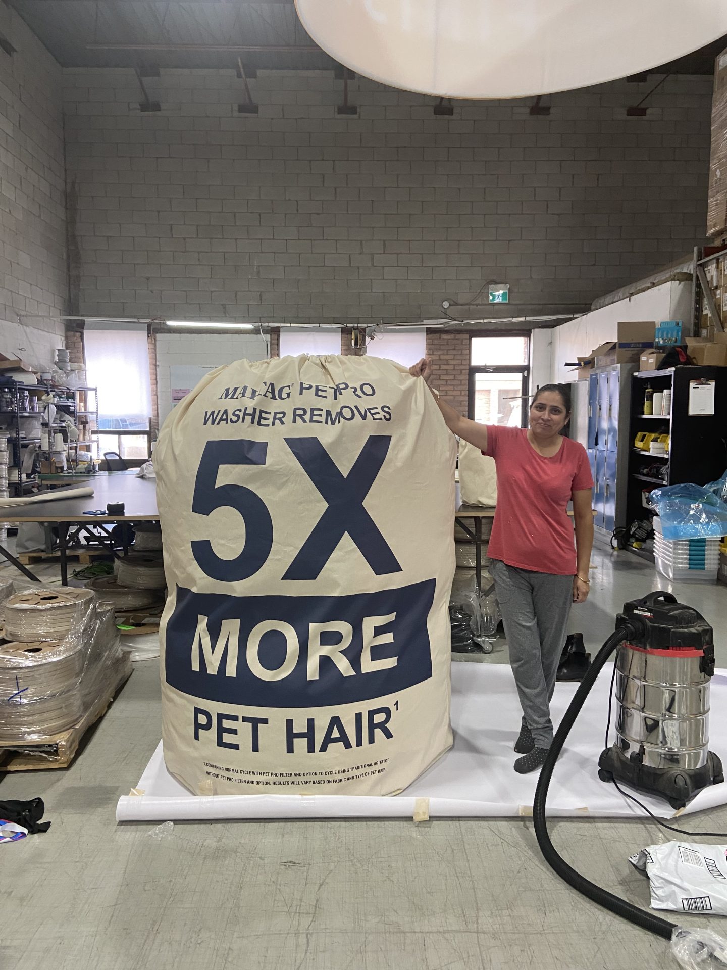
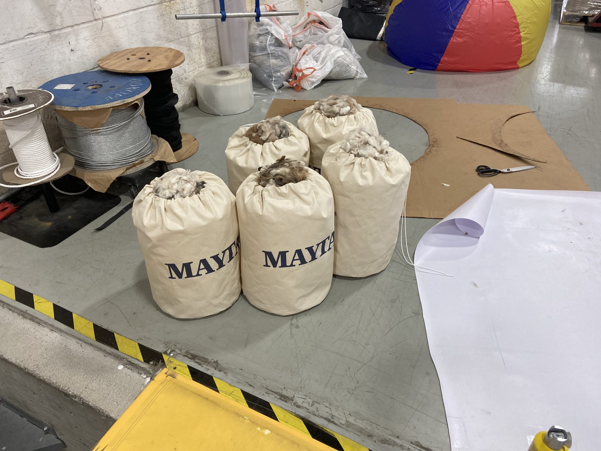
The hero prop of the booth was a pile of oversized pet hair bags sitting beside the washer and dryer, making Maytag’s claim, removing five times more pet hair than other models, impossible to miss. Filling them with real pet hair alone would have made them heavy and slow to ship between cities. Filling them with fake material would have lost the realism the concept depended on.

The shōmi! solution mixed real pet hair with bubble wrap for volume, giving the bags the right read at conversational distance without the weight. The largest hero bag was built around an inflatable core, allowing it to ship flat and inflate to full visual scale on site.

The hairdryer photo op

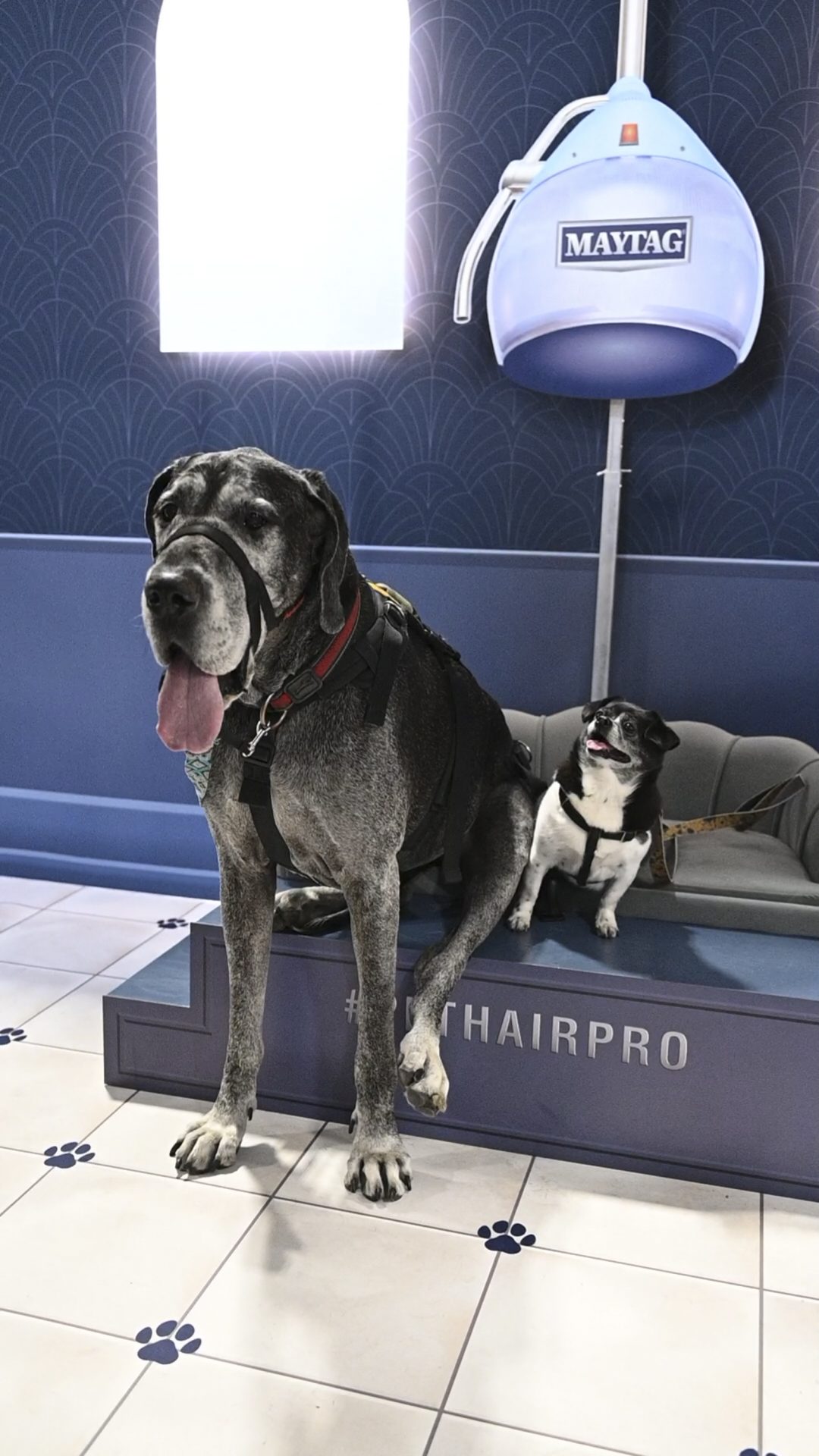
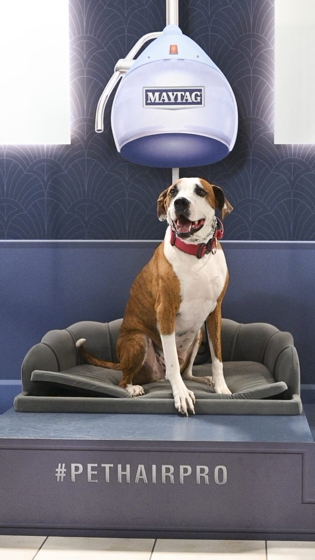
The salon-style hairdryer was the booth’s signature interactive moment, designed to draw attendees and their pets into a shareable photo. Because the booth had to work for a chihuahua and a labradoodle in the same hour, the hairdryer needed a height-adjustable frame that booth staff could operate quickly between takes.

The result was a working photo op rather than a decorative prop, which is how it generated the line, the social tags, and the conversations Maytag came to the show to start.

What this kind of build proves

Builds like this one come down to judgment about where to spend the money and where to fake it convincingly. Real architecture and tile would have eaten the budget and blown the timeline. Pure-fur hair bags would have been too heavy to ship and too bulky to move between cities. The decisions that made the Salondromat work weren’t about doing less. They were about knowing which details people actually remember.

For Maytag and prspktvMEDIA, that meant a booth that delivered a premium brand experience, travelled to a second city without rebuilding, and gave the Canadian Pet Expo a memorable corner of the floor.

Planning a similar build?

If you’re working on a trade show booth, retail install, or experiential build that needs to land as premium without the premium budget, we’re happy to talk through what’s possible and where the smart spends usually go.

Frequently asked questions

How can a trade show booth feel premium without a premium budget?

By choosing carefully where to spend and where to simulate. Real architectural detail (crown molding, laid tile, hardwood, lacquered finishes) usually breaks the budget and the timeline. The Maytag Salondromat booth achieved a high-end pet salon aesthetic by simulating the architecture: printed vinyl on aluminum composite for crown molding, SEG fabric for wainscoting, roll-up printed flooring for tile. The budget went to the moments people actually remembered, including the oversized hair bags and the height-adjustable salon hairdryer photo op. The judgment call is which details earn their cost.

Can a custom trade show booth ship to multiple cities without rebuilding?

Yes, if it’s engineered for travel from the start. The Maytag Salondromat booth was built for the Canadian Pet Expo and then a second city, which meant every component had to ship in a manageable footprint, set up fast, and survive a second handling without being remade. Achieving that meant flat-packing the walls as SEG fabric panels, rolling up the printed floor into a tube, and engineering the hero hair bag around an inflatable core that shipped flat and inflated on site.

What is SEG fabric and why is it used in trade show booths?

SEG fabric is silicone edge graphic fabric: a printed stretch fabric panel with a thin silicone bead sewn around its edge that locks into a recessed channel in an aluminum frame. It’s used in trade show booths because the graphics swap out easily, the panels ship flat, and the finished surface is tight, seamless, and dust-free. In the Maytag Salondromat booth, SEG fabric was printed to simulate wainscoting and upscale wall paneling, delivering the depth of a renovated room at a fraction of the weight.

How do you fake crown molding in a trade show booth?

With printed pressure-sensitive vinyl applied to aluminum composite. In the Maytag Salondromat build, this approach delivered the architectural detail of crown molding without the cost, weight, or fragility of the real thing. The vinyl carries the printed molding profile and shadow, and the rigid aluminum composite substrate gives the wall a clean, finished read from the aisle. It ships flat and survives transit.

Can printed flooring replace real tile in a trade show booth?

Yes, and for trade show and modular deployments it usually should. Laid tile is heavy, takes hours to install, and is hard to ship between cities. Roll-up printed flooring delivers the same visual story (in the Maytag Salondromat case, a custom tile and paw print pattern designed in-house), rolls into a tube for transport, and sets up in minutes. For shows with tight install windows or multi-city tours, printed flooring almost always wins on cost, install time, and reusability.

How do you build a 3D trade show prop that ships flat?

Engineer it around an inflatable core or collapsible armature, and use lightweight fill materials to add volume. The Maytag Salondromat’s hero pet hair bag had to read as a full sack of hair from across the aisle while shipping in a manageable footprint. The shōmi! solution was an inflatable membrane inside the bag plus a fill of real pet hair mixed with bubble wrap. The bubble wrap added volume without adding weight, and the inflatable core let the prop ship flat and reach full visual scale on site.

We’ve faked crown molding, shipped inflatable hair bags, and built a hairdryer for every size of dog. Whatever’s got you stuck, we’ve probably faked something weirder. Tell us about it.