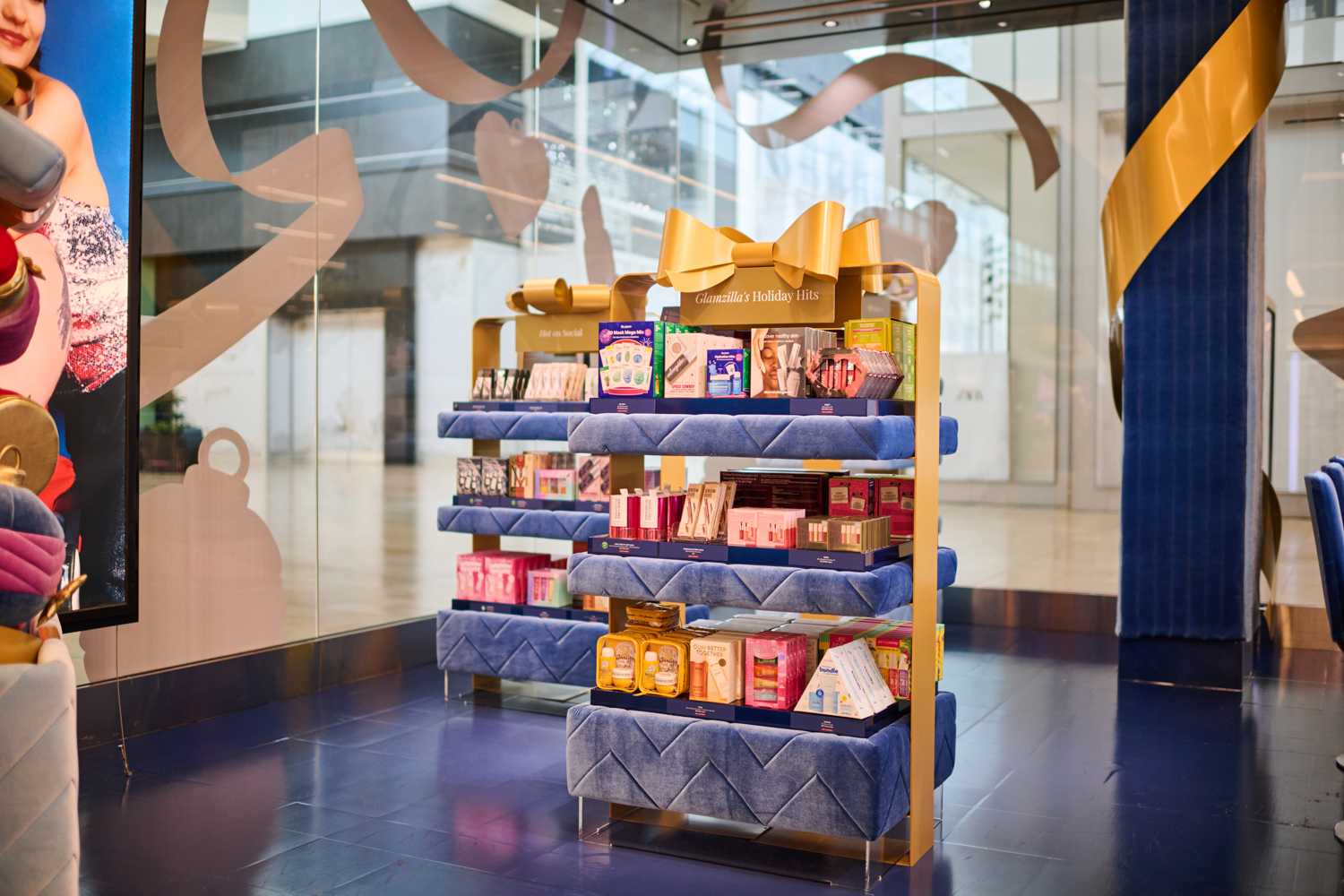
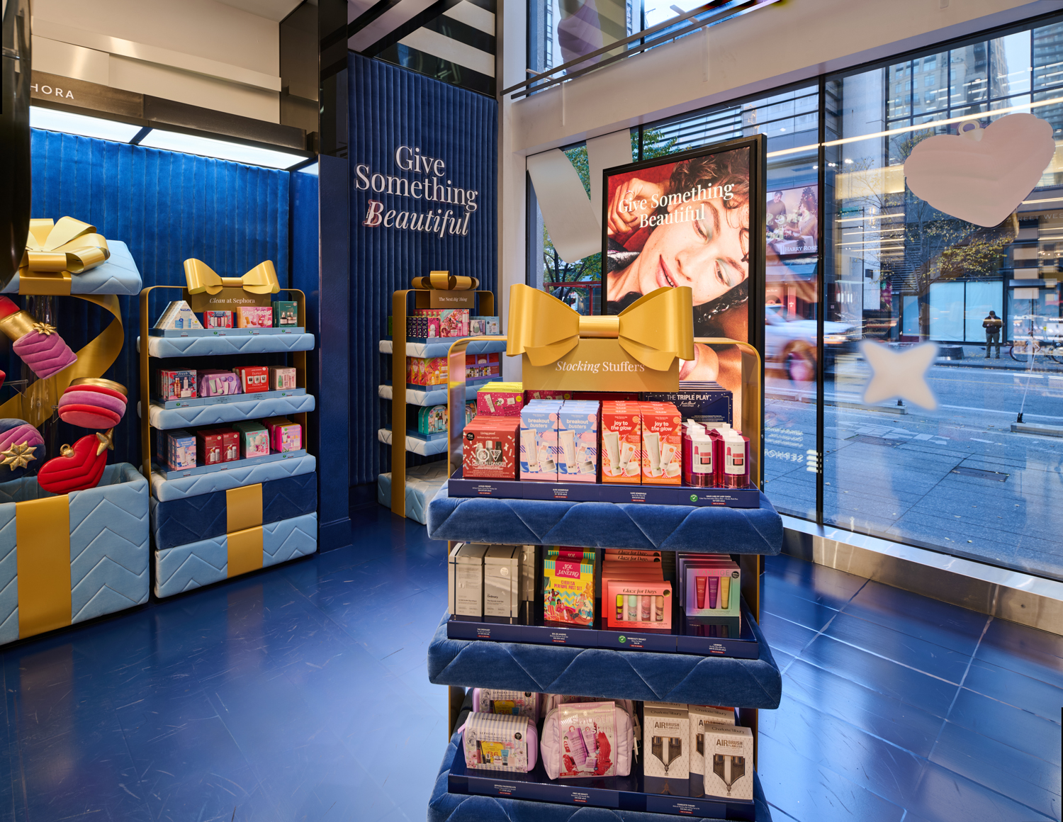
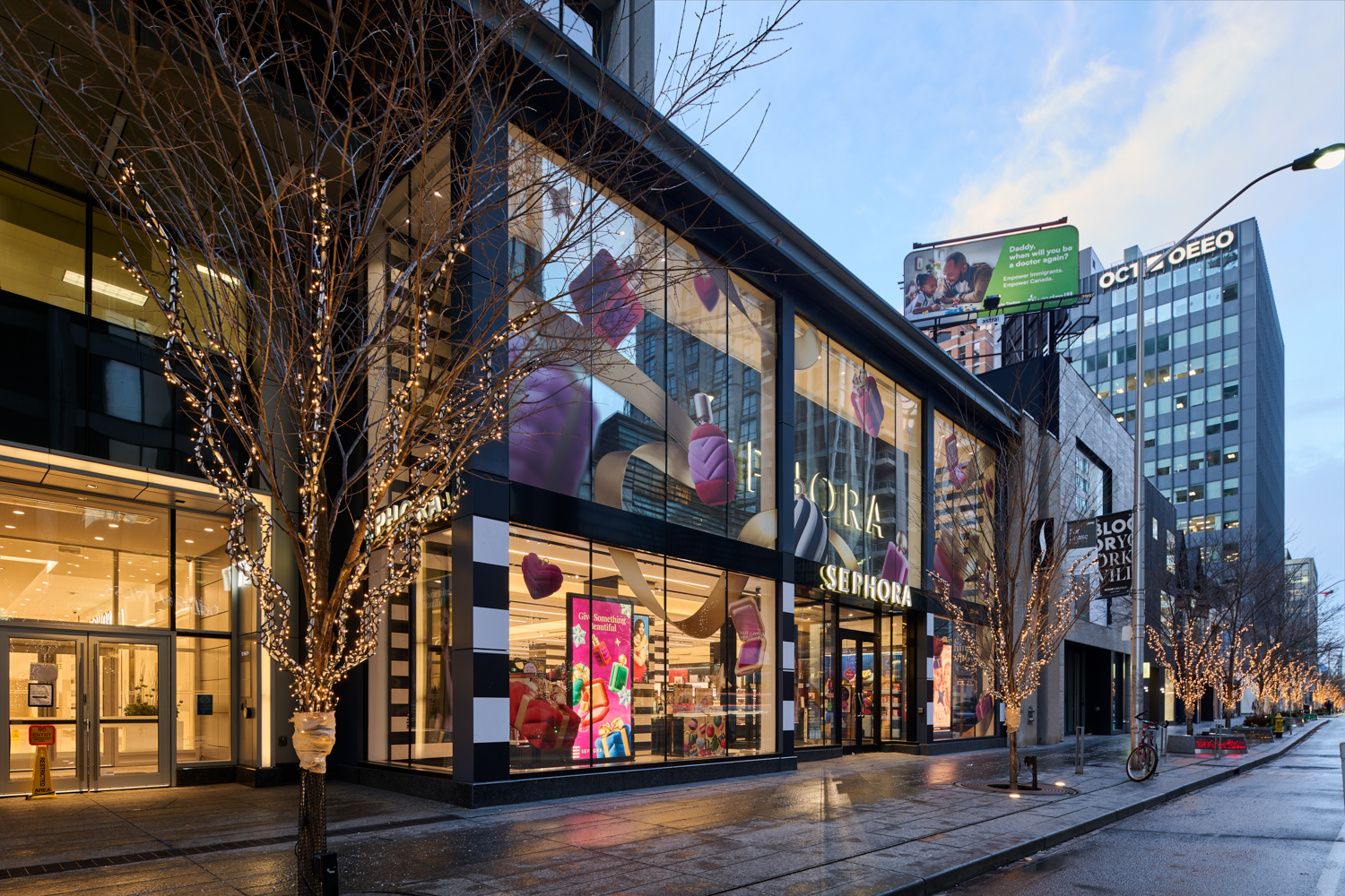
A Sephora retail display styled as gift boxes filled with beauty products, with the text Case Study: Sephora Holiday and the Shōmi logo.

Custom Holiday Displays: How We Made a Gift Box Explode for Sephora

Custom holiday displays for Sephora Canada came down to one question: how do you make a gift box explode with nothing visibly holding it up? Then make it last two months in eight stores, even when shoppers sat on parts that were never meant to hold a person. Park Creative Studio designed it. shōmi! Custom fabricated it, about eleven weeks from brief to ready. Here’s the fabrication behind it, and what the retail floor taught us after opening night.

The Brief: Custom Holiday Displays for Sephora

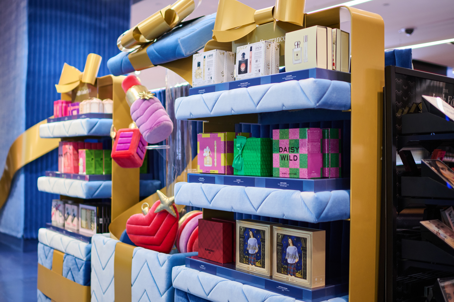
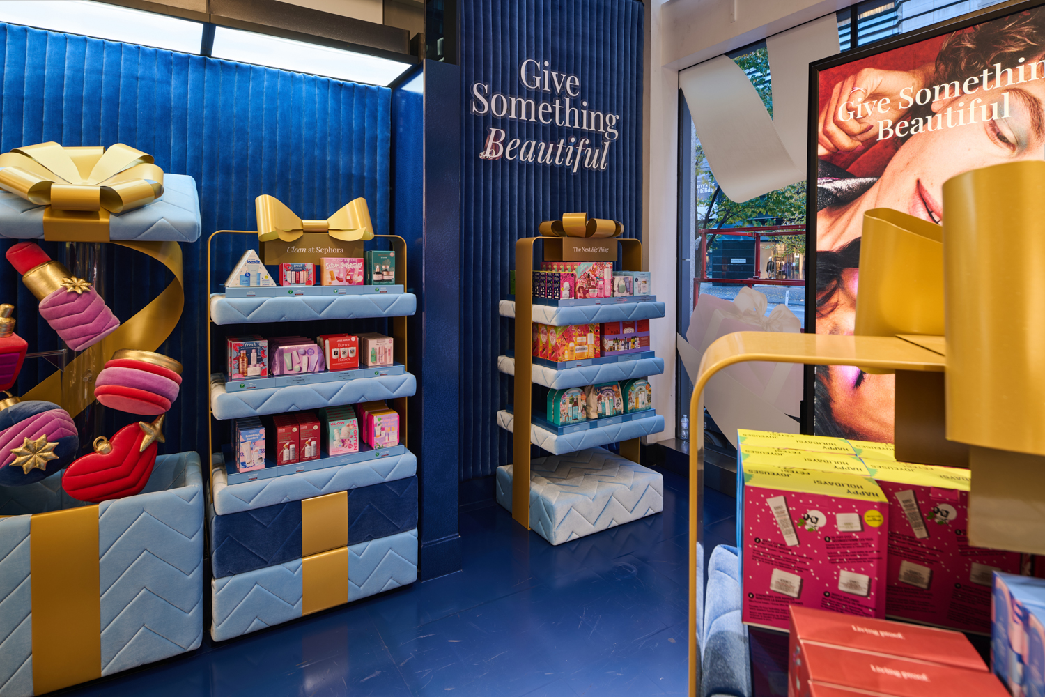
The idea from Park Creative Studio was an “Only at Sephora” holiday pop-up: gifts wrapped in navy and light blue quilted velvet, tied with gold ribbons and bows, and gift boxes bursting open with oversized beauty icons (a lipstick, a compact, an ornament, a heart, a cream jar). Headers on every fixture read “Only at Sephora”.

The same look had to work in eight stores of very different sizes, so the kit flexed: 24 fixtures in all, made up of five gondolas, three freestanding gift boxes, six four-tier shelves and ten three-tier shelves. We were briefed on August 12, 2024. Everything was ready between October 28 and 30. That’s eleven weeks, which is plenty of time right up until you add quilted velvet.

The Hard Part: A Gift Box That Explodes

The rendering showed a box on the floor, its lid levitating above it and very large product replicas flying out, as if the box had just burst open. It’s a great picture. But a rendering has no gravity and no shoppers. The real brief wasn’t “build a box.” It was: hold everything in mid-air with nothing anyone can see.

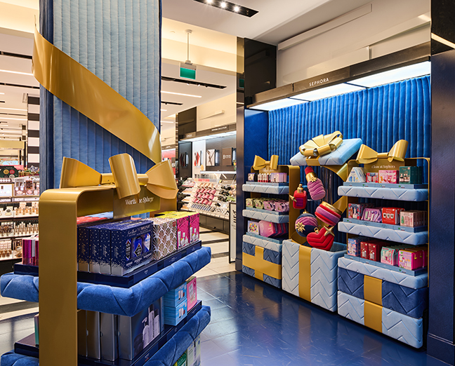
Two retail shelving units displaying white gift boxes, flanking a central pillar decorated with 3D icons of makeup and gift boxes, all wrapped with large gold bows.

We started with the obvious: hang the plush replicas. No hanging points allowed. Next we offered metal brackets from behind, hidden when you look straight on. Some would show from an angle, so that was a no too, and the same went for a bracket on the lid. That left clear acrylic: a clear acrylic tube up the centre, with acrylic rod arms branching out to hold each plush icon and the lid, kept as low-profile and invisible as acrylic gets. Acrylic disappears better than anything else we could use. It’s also the least forgiving. That trade-off comes back later.

We worked out how the oversized plush icons had to be built to sit on those arms, then commissioned our partner, a local plush artist, to make them. The finished box looks like it’s mid-explosion. Nothing you can see is holding it up.

The Build: Velvet, Quilted Like a Mattress

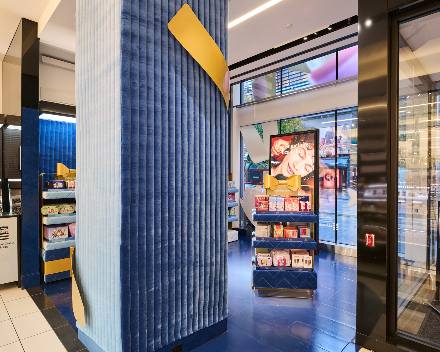
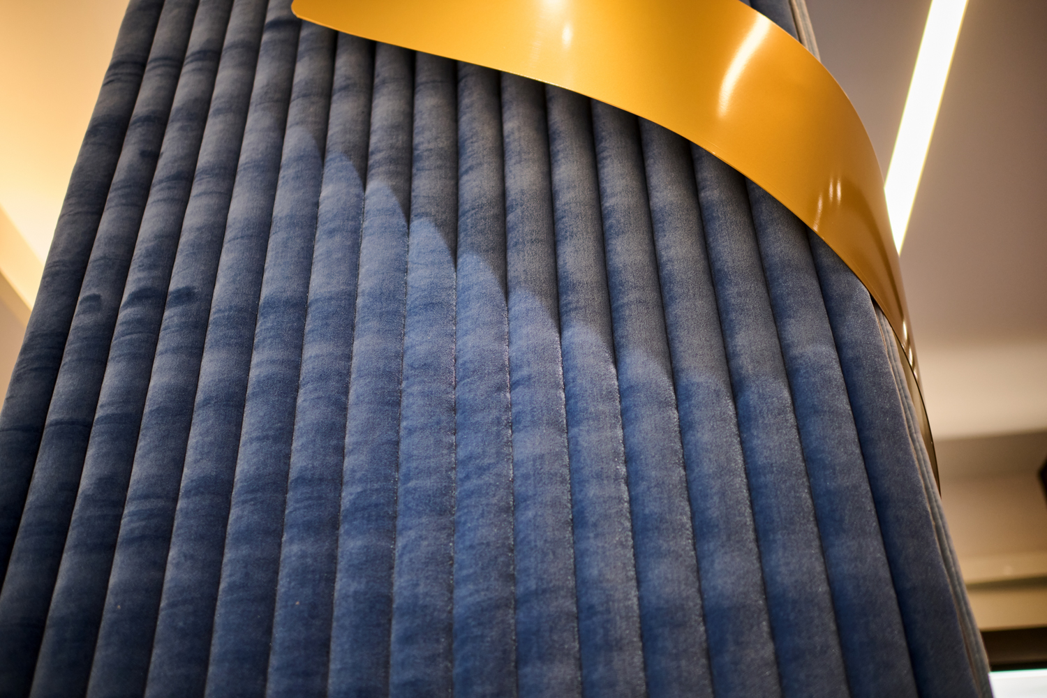
Velvet is soft and stretchy, which is another way of saying it’s hard to work with. The design called for long runs of it, channel-quilted over batting, and a regular sewing machine isn’t built for that. So we put it on the machine that is: a programmable multi-needle quilter, the kind mattress makers run, stitching rows of ribs in a single pass. Two layers of batting, a fabric backing, 3-inch ribs, dead straight over long runs. On an eleven-week timeline, that speed mattered.A series of blue, vertical, pleated fabric panels with a beige corner bracket in the upper right.

The fabric maxed out at 60 inches wide, and that set the width of every panel. We cut each panel on the nearest rib line so no rib was ever split, joined the panels on a heavy-duty lockstitch machine, sewed in 2-inch Velcro, and kept each one slightly short, because velvet stretches down over time. Every panel kept the same nap direction so the colour reads evenly, because velvet will tell on you.

The columns at Bloor, Eaton Centre and Yorkdale were square, with each of the four faces clad separately, from about 10.5 feet tall at Yorkdale to about 12 feet at Bloor (3.2 to 3.7 metres). Each panel has a flap of peel-and-stick Velcro that grabs the next face on site, so the four faces wrap the column as one piece, and the cladding comes down again without damaging the store. Seams overlap by one rib and are sewn along the rib line, so they disappear into the channel. The other stores got printed vinyl on their columns, which is much less dramatic to write about.Sephora store shelves and display tables decorated with large gold bows to resemble gift boxes, featuring various beauty gift sets.

Upholstery and the Gold

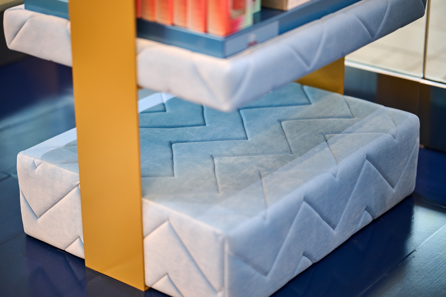
The upholstery. Every fixture got the velvet treatment: the cushion shelves, the cushion bases, the gift boxes, and the quilted back panels on the built-in gondolas, all in a 6-inch chevron quilt pattern. The velvet sits over half-inch foam on millwork, with broadcloth behind it to stabilize the stretch and carry the chevron layout. We sanded the millwork corners first so they wouldn’t wear through the fabric. We’ve upholstered enough fixtures to know velvet will find the one sharp edge you missed.

The gold. The ribbons and bows are steel and aluminum. The shelves are held by gold, ribbon-shaped frames with the shelf brackets built in, and topped with 40 metal bows in two styles (18 of one, 22 of the other). Add the headers and 78 steel shelf trays, and that’s a lot of gold to keep consistent. Aluminum ribbon strips, 96 inches long, were bent to wrap the gift box bases and the gondola bases. Before anything went to powder coat, we sprayed out eight metallic samples to match the gold, because gold turns out to be a whole family of colours.

Install, and What Shoppers Did to It

Everything shipped across Canada from our shop and went in overnight, installed by local partners in each market using store-by-store install guides we wrote. Crews of four to six people per store started at closing time and worked until it was done. Smaller stores were wrapped by 4 a.m. The larger ones ran until 8 a.m. Installs began on October 31, and we kept the displays maintained through January 8, 2025, which turned out to be useful.

Then shoppers arrived. They used the base of an exploding gift box as a seat and leaned back on the plush icons, and some of the acrylic rods cracked at three stores. Acrylic was the right call for staying invisible. It was never meant to be a backrest. We repaired them and sent spare parts to the sites. We also proposed clear acrylic shields and spare repair kits for the other stores. A retail floor will tell you exactly what looks like furniture.
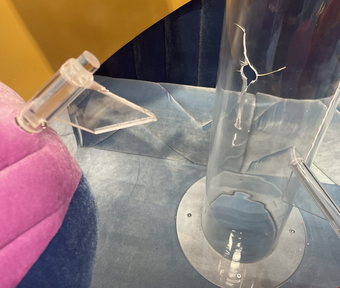
A clear acrylic tube with a visible crack stands on a blue surface next to a purple object and a yellow architectural element.

Two more things needed solving on the fly. The gold ribbon on each velvet column had to wrap around on top of the velvet, so we designed custom brackets that went through the velvet and fastened to the wall, with standoffs to carry the powder-coated sheet metal ribbon. And days before a Sephora leadership visit on November 20, a column ribbon at Bloor got scuffed. We made a new one and installed it after-hours on November 19.

By the Numbers

Eight stores. 24 fixtures. About eleven weeks from brief to ready. About 115 yards of velvet (roughly 105 metres), 40 metal bows and 78 steel shelf trays. Delivered on time and on budget.

The Real Lesson

A wrapped gift is a simple idea. Keeping it wrapped, in eight stores, from the first overnight install through January, with shoppers leaning on it, is not. Park Creative Studio drew a gift box that explodes. Keeping it exploding took clear acrylic, spare parts and a crew that doesn’t mind working through the night.  We build for January.

Planning a custom holiday build or a multi-store rollout, with something in the rendering that shouldn’t be able to stand up? That’s the kind of problem we like to work on. Talk to the shōmi! Custom team about your project.

Sephora Holiday 2024. Designed by Park Creative Studio. Fabricated by shōmi! Custom Photography by Robert Lowdon Photography.


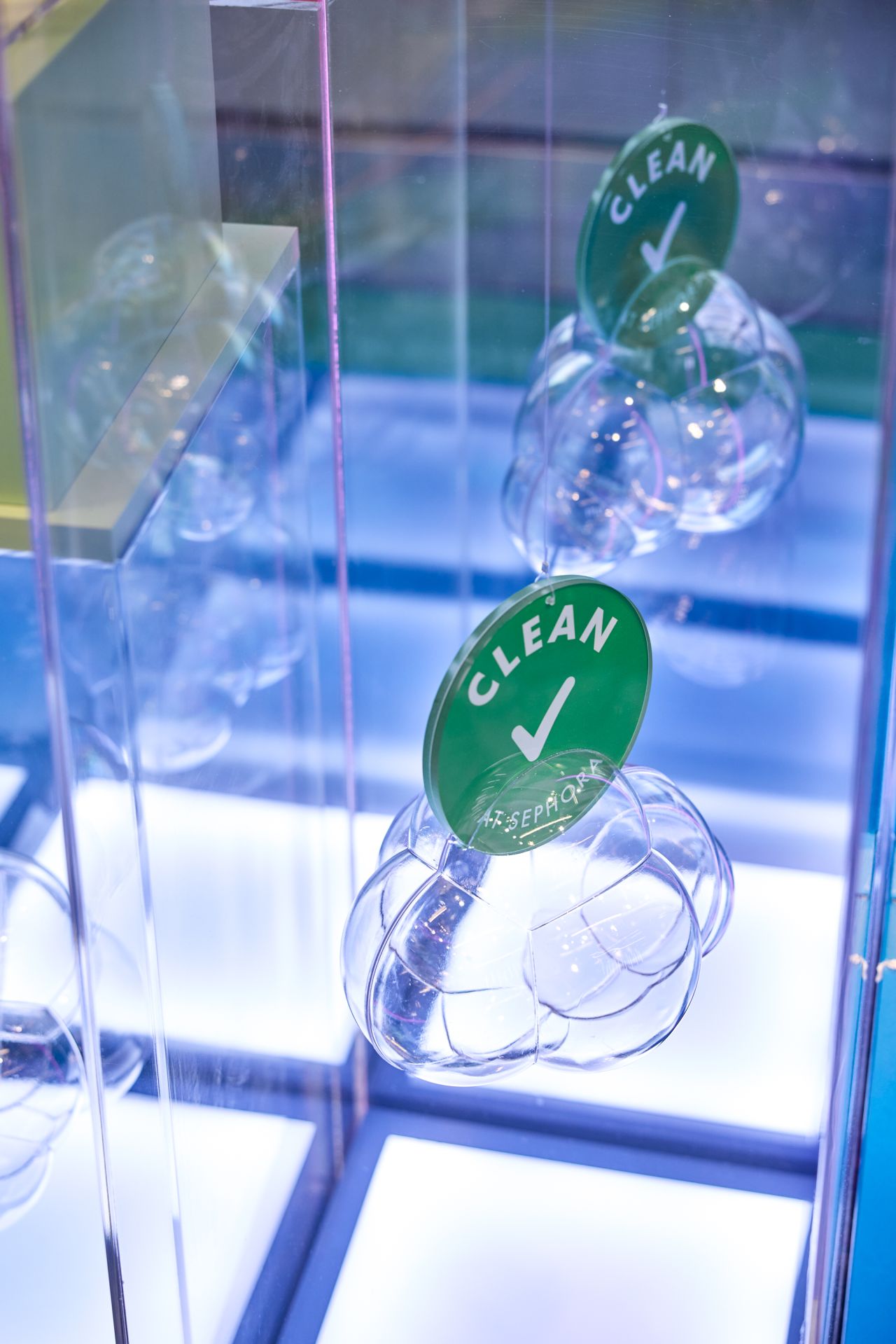
Text reading Sephora Clean Case Study with the shōmi logo, beside a Sephora Clean seal hanging above glass spheres.

Custom Pop-Up Fabrication: How to Build a Cloud You Can See Through

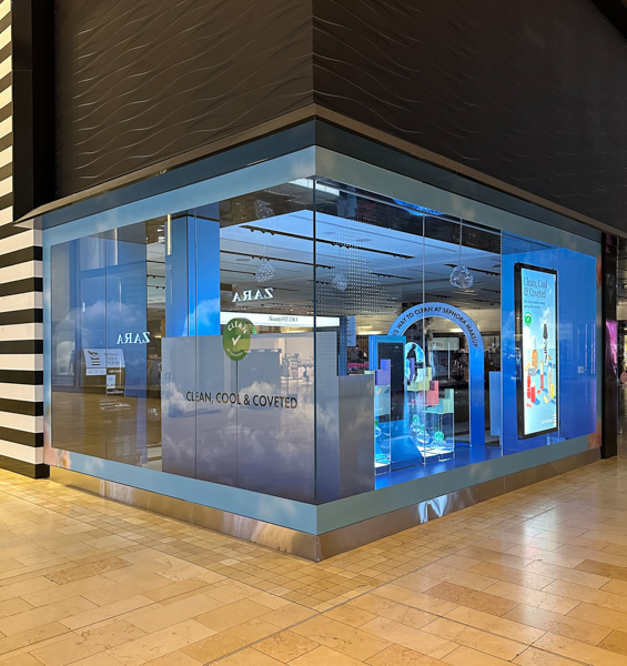
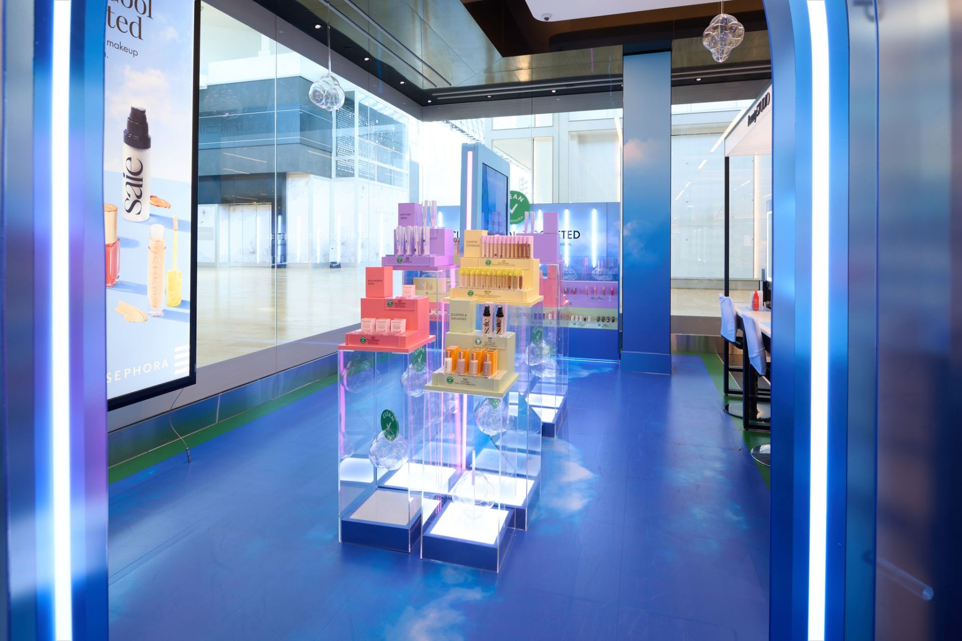
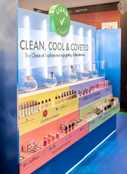
The question wasn’t how to build a cloud. It was how to build one that still looks clean after eight stores of foot traffic. Custom pop-up fabrication for Sephora’s Clean beauty pop-up meant building see-through clouds, a printed floor to match, product stands that light up from the base and a lit walk-through arch, across Canada. Park Creative Studio came up with the idea. shōmi! Custom fabricated it into reality. Here’s how it went together.

The Brief: Custom Pop-Up Fabrication for Sephora Clean

The idea from Park Creative Studio was to make the pop-up feel like walking on clouds, with a clean, airy look. Clouds are free if you’re the sky. For everyone else, it takes a mould.

Four kinds of asset carried the idea:

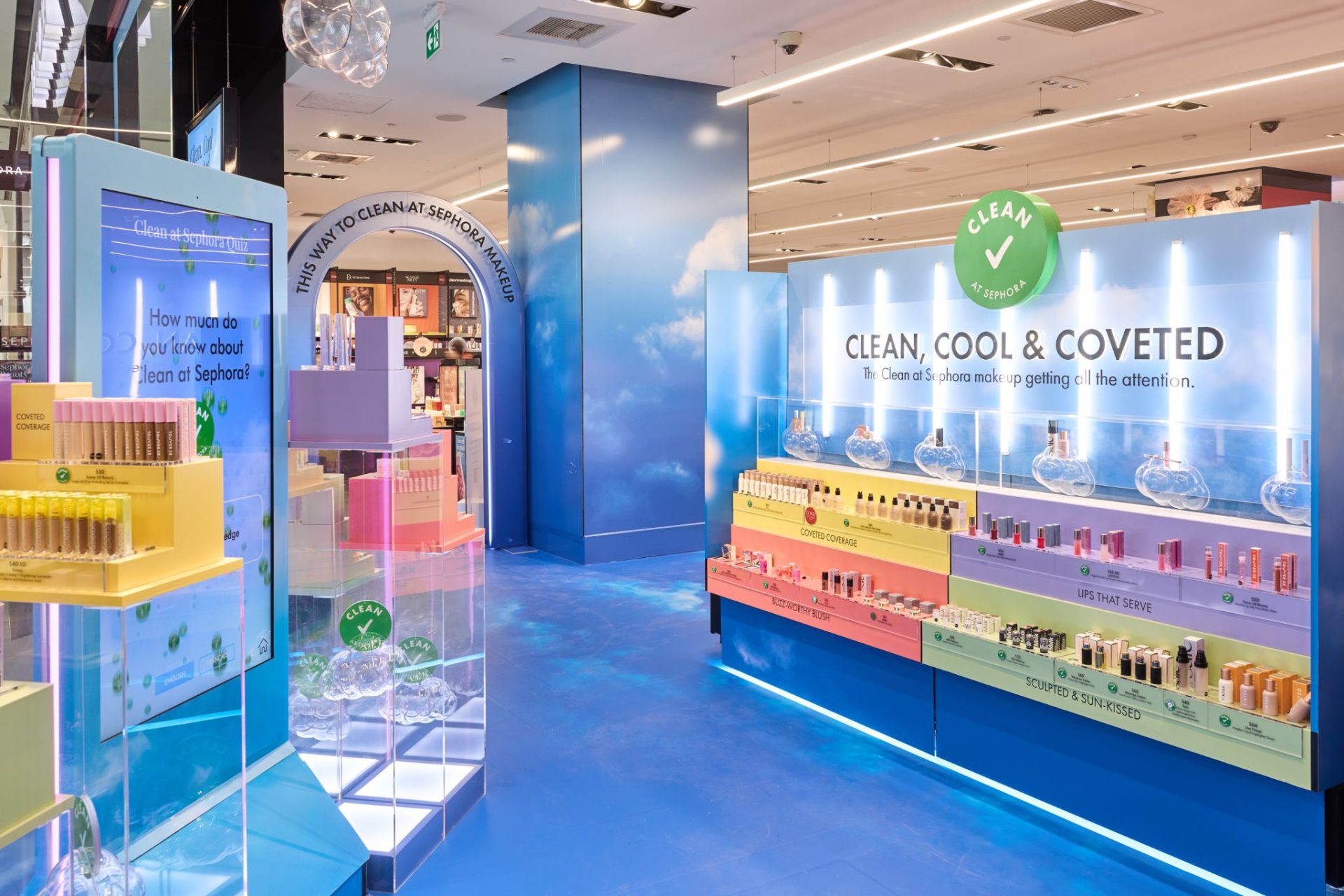
  • Three-dimensional cloud structures.
  • A printed floor.
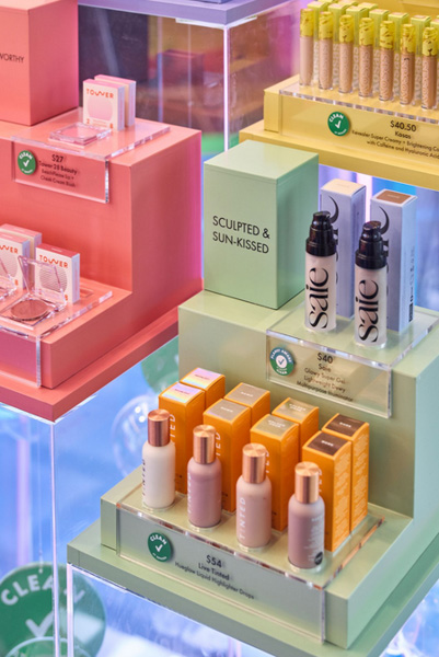
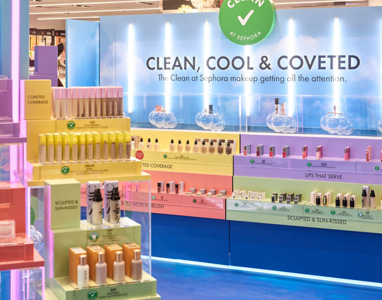
  • Illuminated product stands.
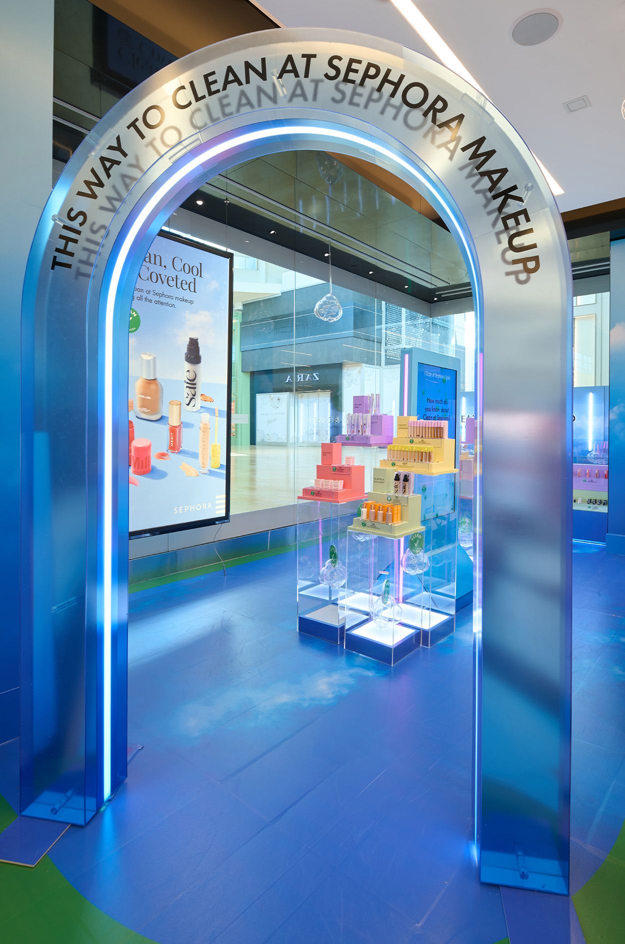
  • A lit walk-through arch.

The Engineering Challenges

Three problems, one pop-up.

Make the clouds see-through. A solid white cloud was never going to match the clean look Sephora wanted, so the 3D clouds had to be transparent. That fit the look, and it meant every seam would show. 

Make it hold up in eight stores. The pop-up had to be durable and easy to install across every location, not just look good in the one where someone took the photos.

Light it so it looks clean. The lighting had to reinforce the clean look and still light the products properly. A product you can’t see is technically very clean, but not exactly helpful.

The Build

The clouds. A mould was made from the designed 3D cloud model, and the clouds were vacuum-formed in clear acrylic. They were made in two halves and glued together into one see-through structure. A solid cloud would have read as a heavy object in a room meant to feel airy. A clear one shows every seam, so the seams had to be designed in, not hidden. On a see-through cloud, there’s nowhere to hide.

The floor. The floor was printed with a blue sky and clouds, so it blends seamlessly with the cloud structures. Yes, that puts the sky on the floor. Weird? Maybe, but that was the idea.

The light. LED modules were installed in the bases of the product stands, so the light shines through clear acrylic. That gives the products a soft, clean glow while lighting them.

The arch. A walk-through arch has to hold up when someone walks under it, survive being bumped, and still look like it belongs next to translucent graphics. The usual instinct is to build a solid shell and paint it. We’ve found that breaks down quickly: paint on a solid face shows every scuff, and a lit solid surface glows unevenly. So the arch was built in layers, each doing one job. The inside is an MDF substructure that gives the arch its strength and holds the lights and wiring. That is wrapped in silver mirror vinyl, so people looking in see a reflection of the interior instead of wood or paint. The outer layer is clear acrylic with a blue gradient on transparent vinyl: from the outside you see through the blue, and from the inside the reflection keeps it feeling light. The trade-off is planning. Every layer has to be sequenced so the lights, wiring and vinyl stay reachable until the next layer goes on, because the alternative is cutting into finished work to fix a wire.

The Real Lesson

Busy retail stores are not known for their gentleness toward clouds. Surviving them took a mould, clear acrylic, some well-placed LEDs and an arch built in layers. The idea comes from the creative studio. Getting it to survive a retail store is the part we’re paid for.

Planning a custom pop-up? Get in touch with our shomi! Custom team to talk through your build.

Black and white image of a man working in a factory or workshop with text overlaid: “Designing for production, not just approval.” Highlighting the importance of designing for production. The shömi logo appears in the bottom right corner.

Designing for Production, Not Just Approval

How to prevent beautiful ideas from becoming expensive problems

Most project problems aren’t design problems. They’re sequencing problems. When production thinking enters a project after approval instead of before it, the cost of every mistake multiplies. This article covers the most common disconnects, what regulations catch teams off guard, and what a real before-and-after looks like when production is brought in too late.

The moment things start to unravel

The client signs off. Everyone’s relieved. The file gets sent to production.

Then the questions start arriving. Can this actually be fabricated at that dimension? Who owns the structural connection detail? What does the mall criteria package require? Will this clear fire egress?The concept was strong. The approval was real. But the design was built for a screen, not a shop floor, and now the gap between the two is being paid for in rework, delays, and margin. This isn’t a failure of creativity. It’s a failure of sequencing. And it’s one of the most preventable problems in branded environments work.

Why beautiful concepts break down in production

Design and production aren’t in conflict by nature. But they operate on different assumptions, and when those assumptions don’t get reconciled early, someone pays for the gap later. A designer working in a presentation environment is optimizing for communication: making an idea legible, compelling, and approve-able. That’s exactly the right instinct for that stage. The problem is when the file moves to fabrication without ever being stress-tested against the physical world.

These aren’t gaps in the anyone’s skills, they’re gaps in process and communication. 

The most common disconnects show up in a predictable cluster:

  • Graphics can be printed perfectly and still fail at install. Silicone beading is structural. If the bead isn’t inserted at consistent depth and uniform tension, edges creep out of the frame, corners pull loose, and surface tension goes uneven. It’s not a problem you see in the proof — it’s a problem you see after the display has been up for a week, or after the first time it’s removed
  • Materials called out without confirming availability at the run quantity or lead time the project requires
  • Dimensional elements designed without any structural logic, leaving engineering to reverse-engineer the intent
  • Tolerances ignored entirely, because on a screen, everything fits

Tolerances: why a few millimetres can cost a full reprint

When a sign is designed, a few millimetres of deviation is invisible. When that sign is fabricated and standing next to the one beside it in a row, those millimetres are the difference between a clean system and one that looks like it came from different projects.

Tolerances aren’t a production afterthought. They’re a design input, and production’s job to provide them early enough to matter.

In SEG fabric displays, this becomes especially precise. The silicone edge has to fit the extrusion channel correctly. If the fabric is printed or cut outside of the tolerance range, the tension is wrong, the surface ripples or sags, and the visual integrity of the display collapses. A few millimetres, in the wrong place, costs a reprint across the full run.

The broader issue is that tolerances establish the relationship between design intent and production reality.

When that relationship isn’t defined in the design file, it gets defined by whoever’s standing at the machine. That’s not where you want that decision made.

Structural realities most designers never see

A rendering looks solid. It’s holding itself up, it’s casting the right shadows, the proportions feel right. What the rendering doesn’t show is what’s actually keeping it there.

Structural questions that have to be answered before fabrication:

  • How is the display anchored, and to what?
  • What’s the load rating of the ceiling or floor at the install location?
  • If it’s a hanging element, what are the rigging requirements and who certifies them?
  • If it’s freestanding, does it meet tip-over standards?
  • If it’s a counter or kiosk, does the substrate support the hardware being mounted to it?

These aren’t obscure questions. They’re questions that will be answered before the project ships regardless.

The only variable is whether they’re answered during design, when changes are cheap, or during fabrication, when they’re not. Branded environments are physical infrastructure. They have to behave like it.

The regulations that catch teams off guard

Three categories of regulation create the most friction when they’re discovered late.

ADA and provincial accessibility standards
Mounting heights, projection distances from circulation paths, character sizing, contrast ratios, these parameters govern a range of display and signage attributes. In Canada, provincial accessibility legislation adds requirements that don’t always align with what teams familiar with US standards might expect. A sign designed without these parameters can require repositioning at install, or in some cases, a full remount.

Fire code and material classification
Not every substrate, laminate, or fabric passes in every jurisdiction or occupancy type. A material acceptable in a trade show environment may not meet the classification required for a permanent retail installation. When the spec doesn’t account for this, the material gets flagged at permit stage, or worse, at inspection, with a live installation on the clock.

Venue and mall criteria packages
Landlords and mall management groups have their own design criteria, governing everything from maximum display heights to approved fastening methods to restrictions on illuminated elements. Getting those criteria into the design process at concept stage takes less than a day. Getting a design revised to meet them after approval can take weeks.

Engineering early vs. fixing later

It’s cheaper to think than to rebuild.

When engineering input enters a project at concept stage, it shapes decisions while they’re still inexpensive. A structural connection gets designed correctly the first time. A substrate gets confirmed against the hardware it needs to support. A tolerance gets set that production can actually hit.

When engineering input enters at the back end, after concept approval (often after fabrication has begun), it’s not shaping decisions anymore. It’s auditing them. And it’s usually finding problems that are now expensive to fix.

The cost of a production review at concept stage is a fraction of the cost of a redesign, a remade component, a delayed install, or a failed inspection.

A before-and-after: what late production input actually costs

The setup

A retail brand rolling out a new in-store display system across 22 locations. The display includes a freestanding tower with an illuminated SEG face, a  antilevered shelf system, and custom-printed header graphics. Three rounds of client review. Clean approval.

What production found

  •  SEG graphics printed perfectly and still failing at install because beading quality wasn’t there. Inconsistent bead depth, uneven tension, edges creeping out of the frame after the first removal.
  • The cantilevered shelf had no specified wall connection detail. Two of the 22 locations had concrete walls, which the spec didn’t anticipate.
  • The header graphic dimensions exceeded the maximum fixture height allowed by one of the mall operators on the list.
  • The specified fabric hadn’t been tested for the fire code classification required for the retail occupancy category.

What fixing it cost

  • The SEG graphic required a revised template and a reprint across the full run.
  • The shelf connection was re-engineered with a second bracket variant for concrete locations.
  • The header was redesigned and re-approved.
  • The fabric was substituted, which pushed lead time. The project shipped three weeks late and the cost overrun was absorbed through supplier negotiation and margin reduction.

What early production input would have changed

Every one of those issues would have been a one-line fix at the design development stage.

The SEG template would have been built correctly from the start. The shelf connection would have included wall-type variants as a standard scope item. The mall criteria package would have been pulled before the height was fixed. The fabric would have been confirmed against the fire classification before the spec was written.

What a production-first workflow actually looks like

It doesn’t require restructuring a project or adding weeks to the schedule. It requires a structured checkpoint at design development, before the file is locked, where fabrication, structural, and regulatory questions get reviewed while changes are still inexpensive.

The questions that surface at that checkpoint are the same questions that would surface in production regardless. The only variable is when they surface, and whether the answer costs an hour of review or a week of rework.

The best projects aren’t the ones where production finds no problems. They’re the ones where production was part of the conversation early enough that there were no surprises left to find.

If you’re on the agency side of that conversation, we’ve written a companion piece on the specific questions worth asking your fabricator before a design gets locked: What Agencies Should Ask Fabricators Before Finalizing a Design.