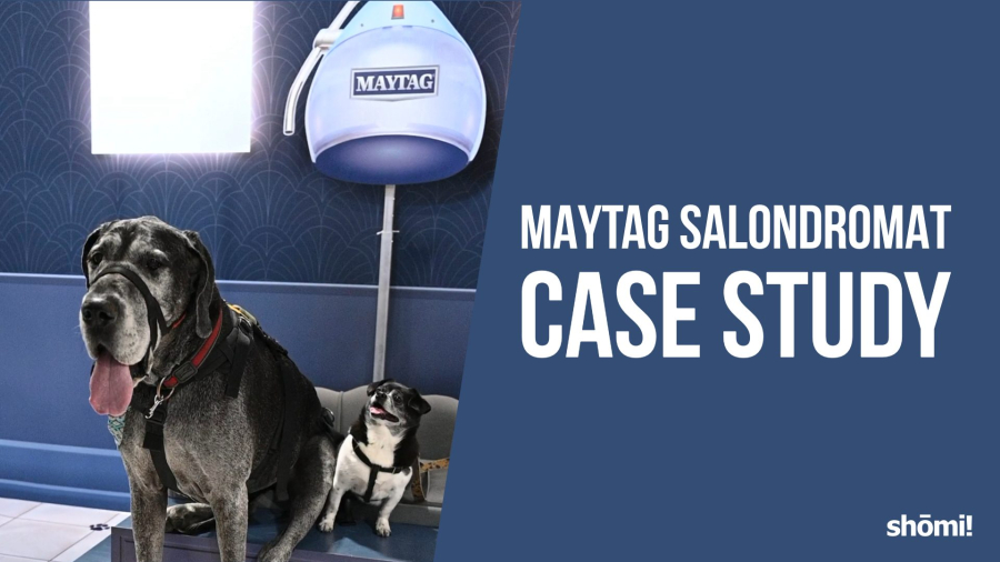
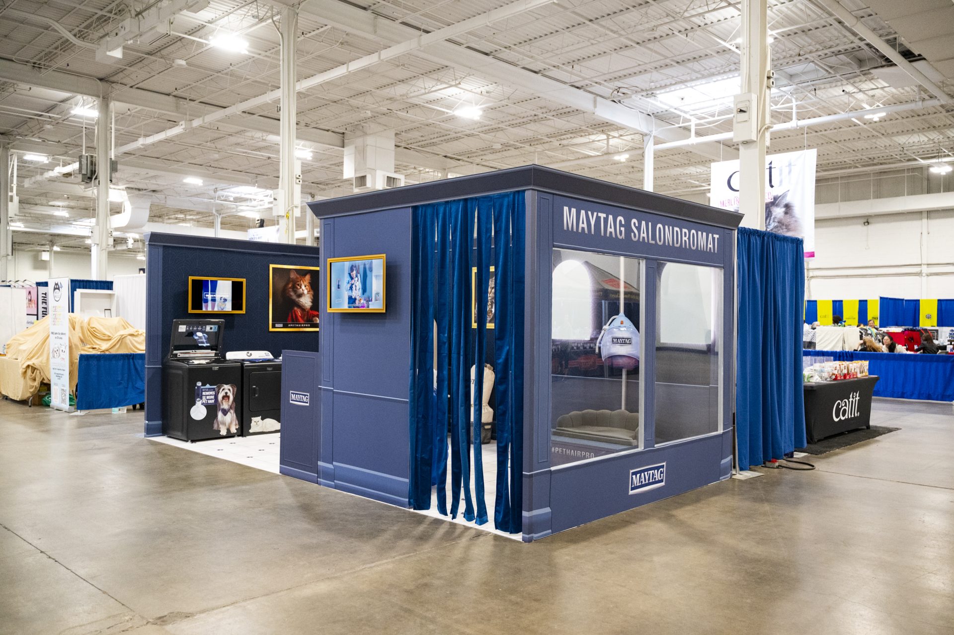
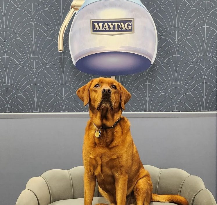
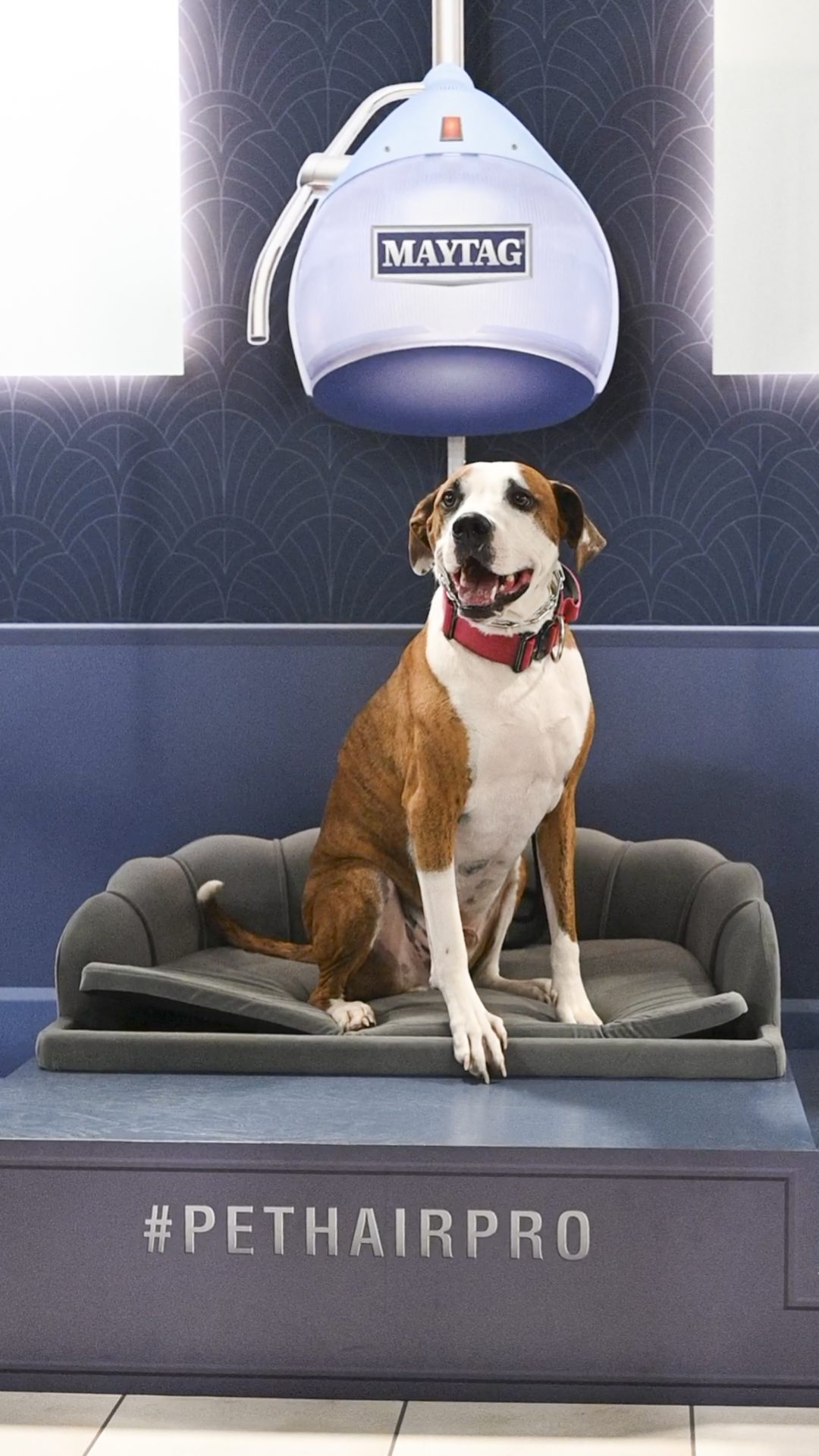
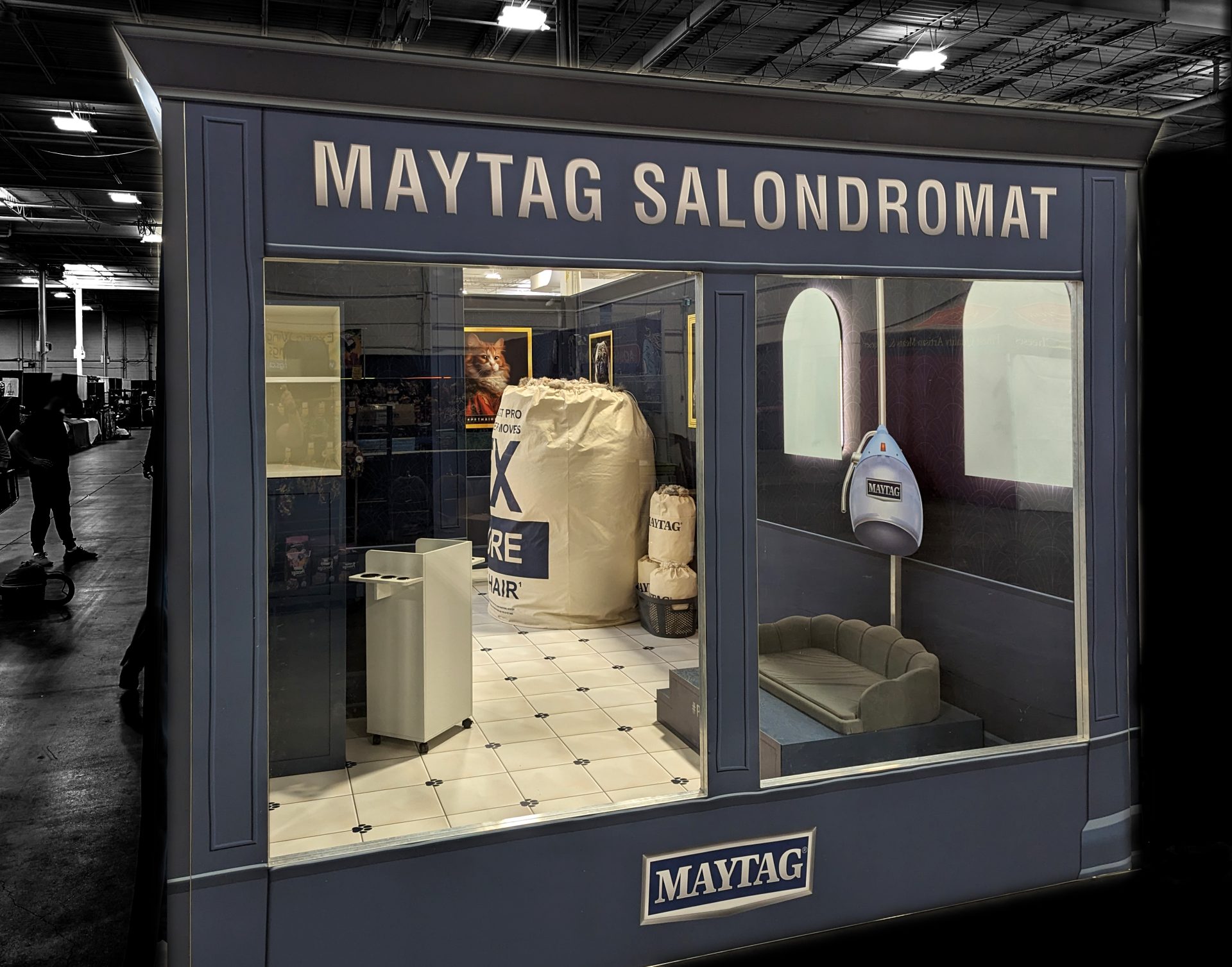
Two dogs sit on a bench under a vintage hair dryer in a salon. Text reads “Maytag Salondromat Case Study” on a blue background, highlighting the Maytag Case Study with the shomi! logo in the bottom right corner.

Maytag Case Study

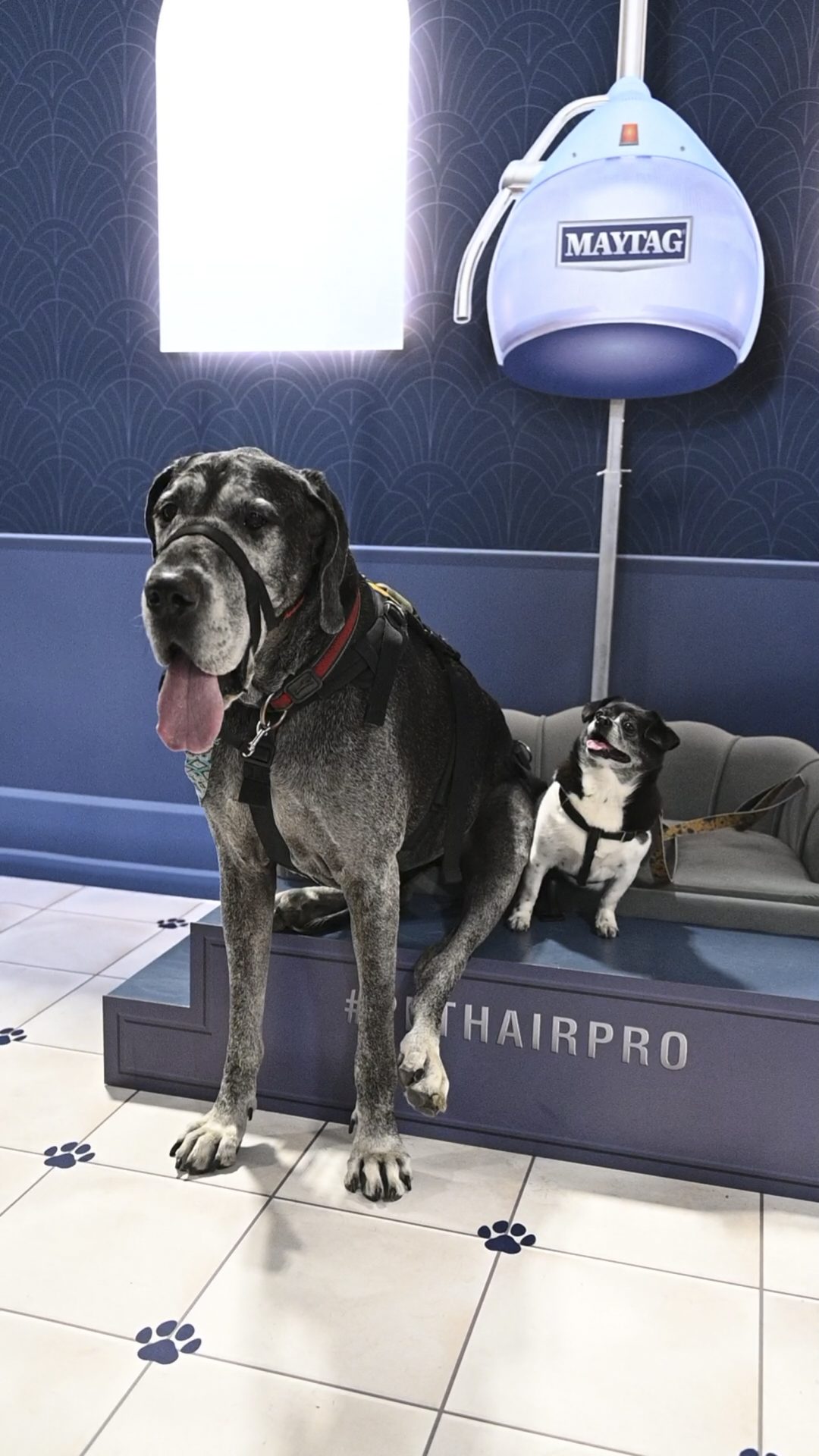
How do you build one photo op that works for a chihuahua and a great dane?

Project at a glance

Client: Maytag
Agency: prspktvMEDIA
Event: Canadian Pet Expo
Footprint: 10′ x 20′ trade show booth

Objective: Launch a pet-focused washer and dryer, engineered to remove five times more pet hair than other models, in a playful, premium environment built around that claim

When Maytag launched a pet-focused washer and dryer at the Canadian Pet Expo, the booth had to land as a high-end pet salon, ship clean to a second city, and stay inside a real-world trade show budget. Here’s how shōmi! built it.

The brief: a luxury pet salon that ships flat

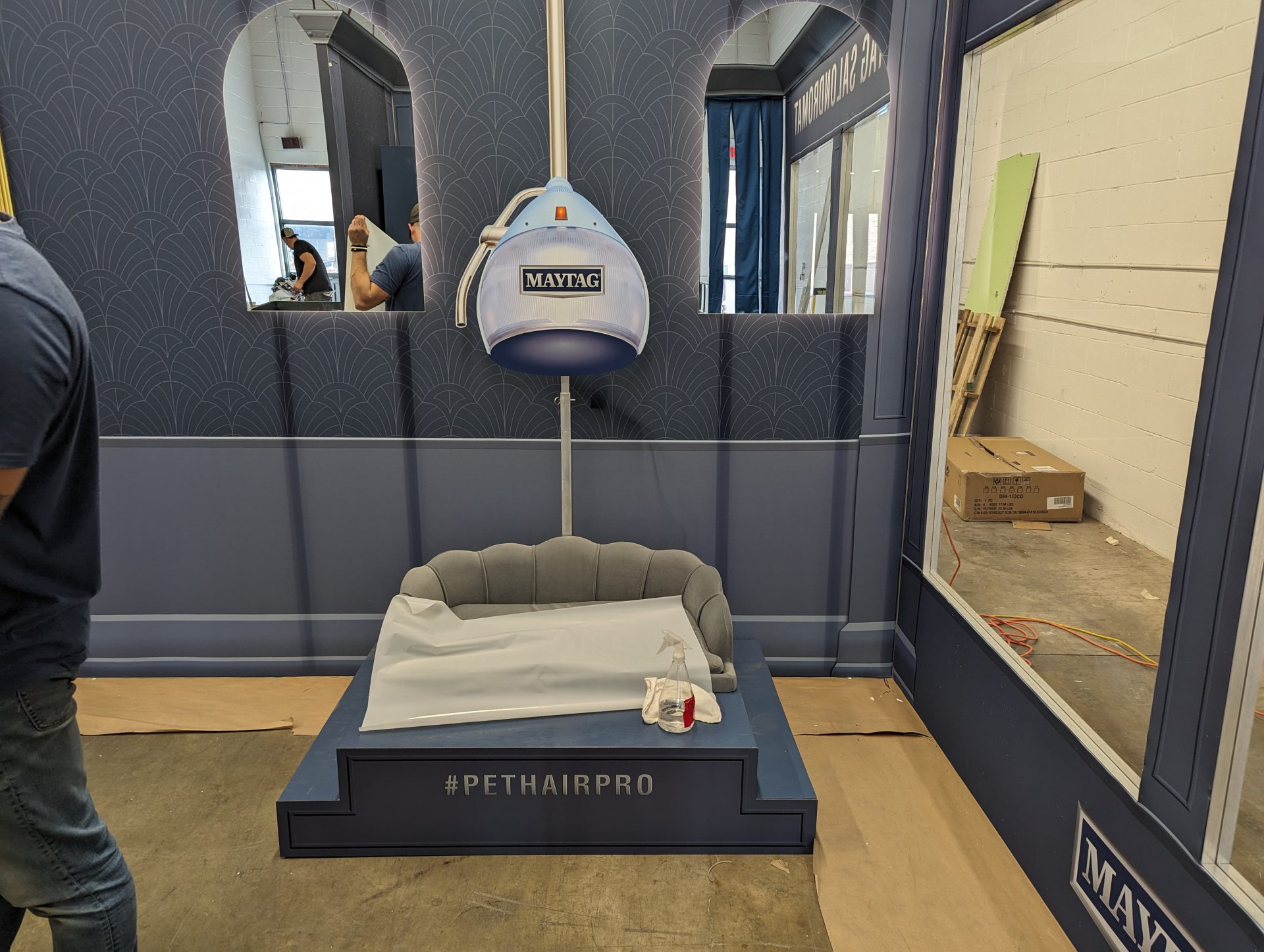
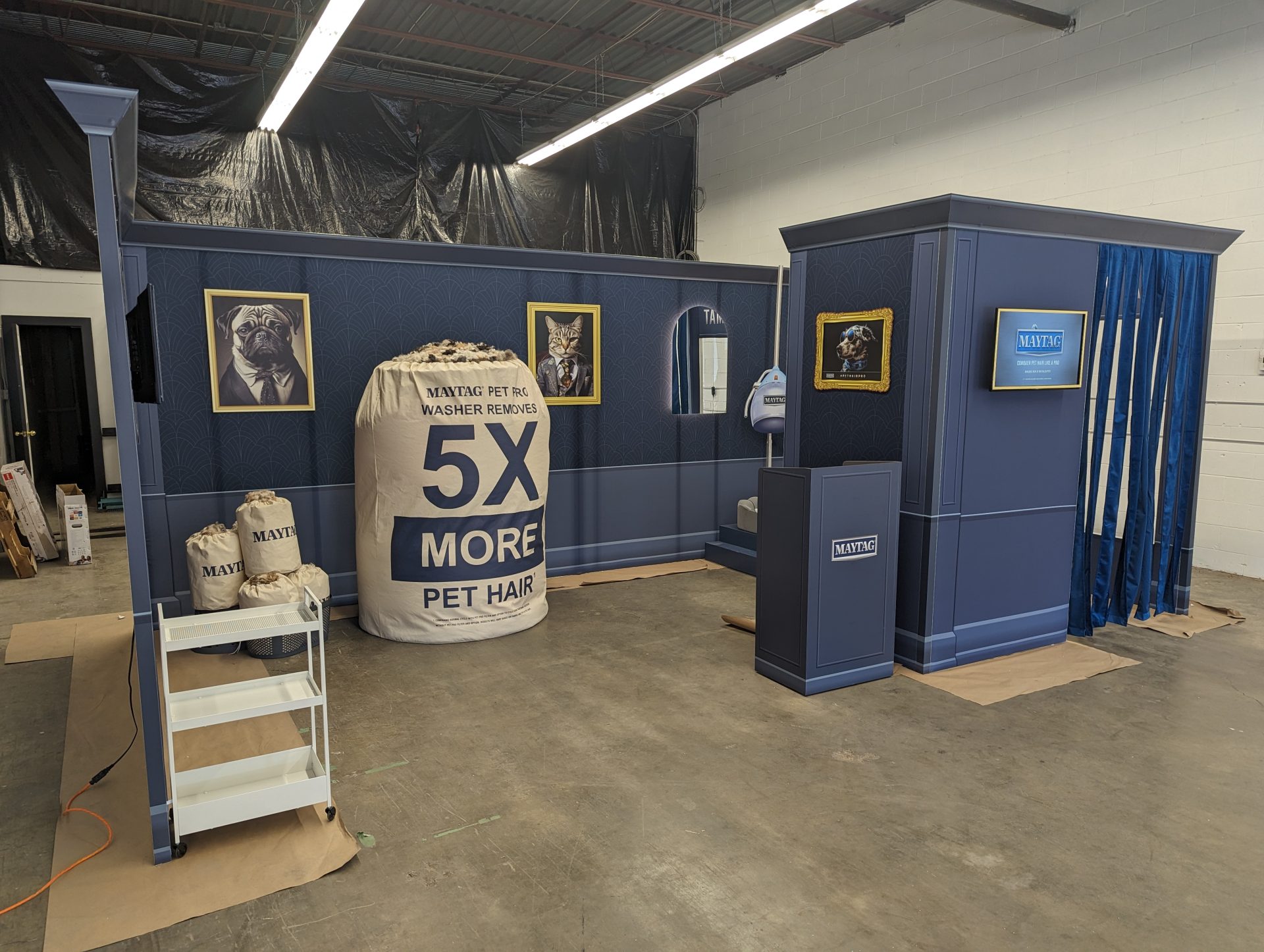
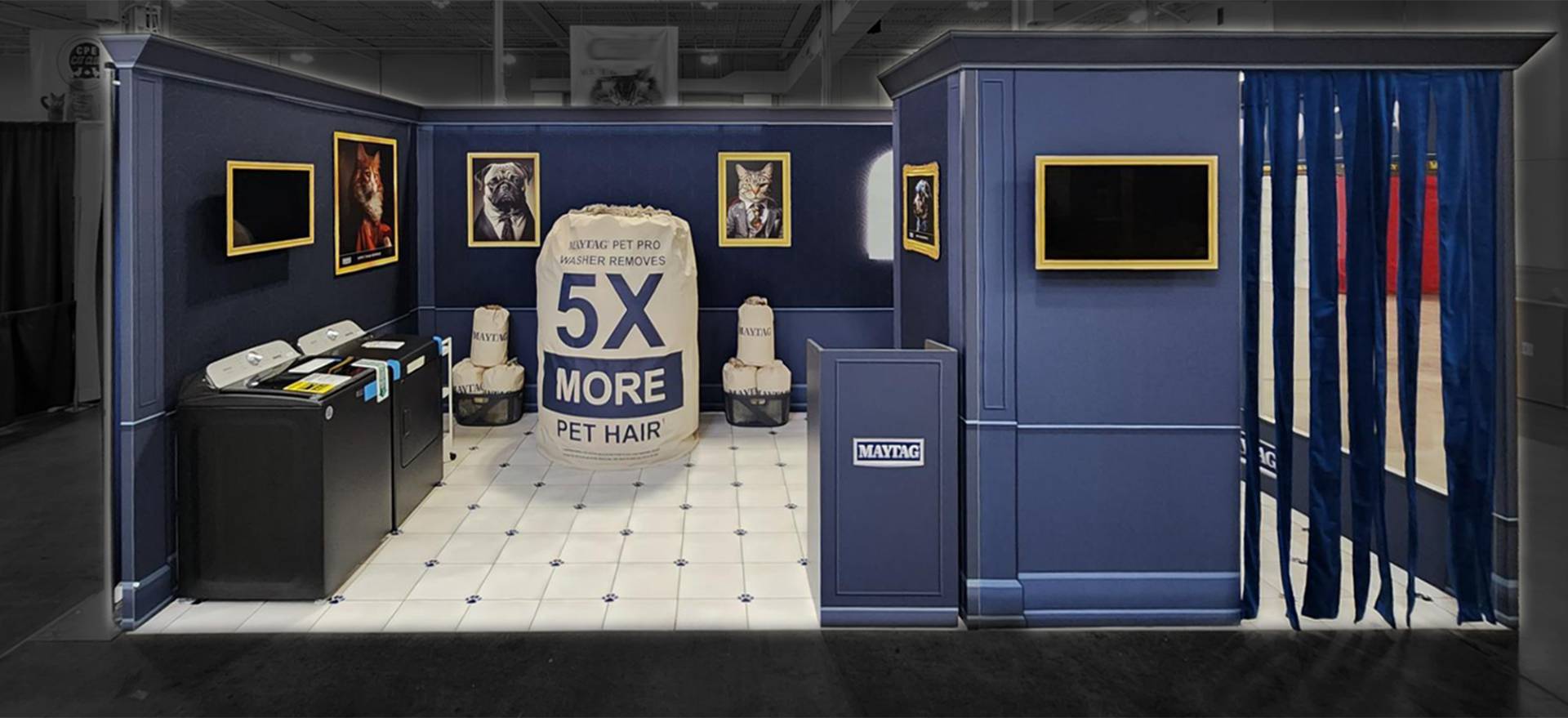
prspktvMEDIA came to shōmi! with a clear creative concept: a “Salondromat,” a tongue-in-cheek pet salon environment with crown molding, wainscoting, framed pet portraits, and a salon-style hairdryer photo op. The challenge wasn’t the concept. It was the reality of a 10×20 booth, a fixed budget, and a second-city deployment that ruled out anything heavy, fragile, or one-time-use.

Every element had to do three jobs at once: look premium on the show floor, ship in a manageable footprint, and set up fast.

Faking the architecture

The walls did the heavy lifting on the “luxury salon” read, but real wainscoting and crown molding were off the table. They blow trade show budgets, break in transit, and add days to install.

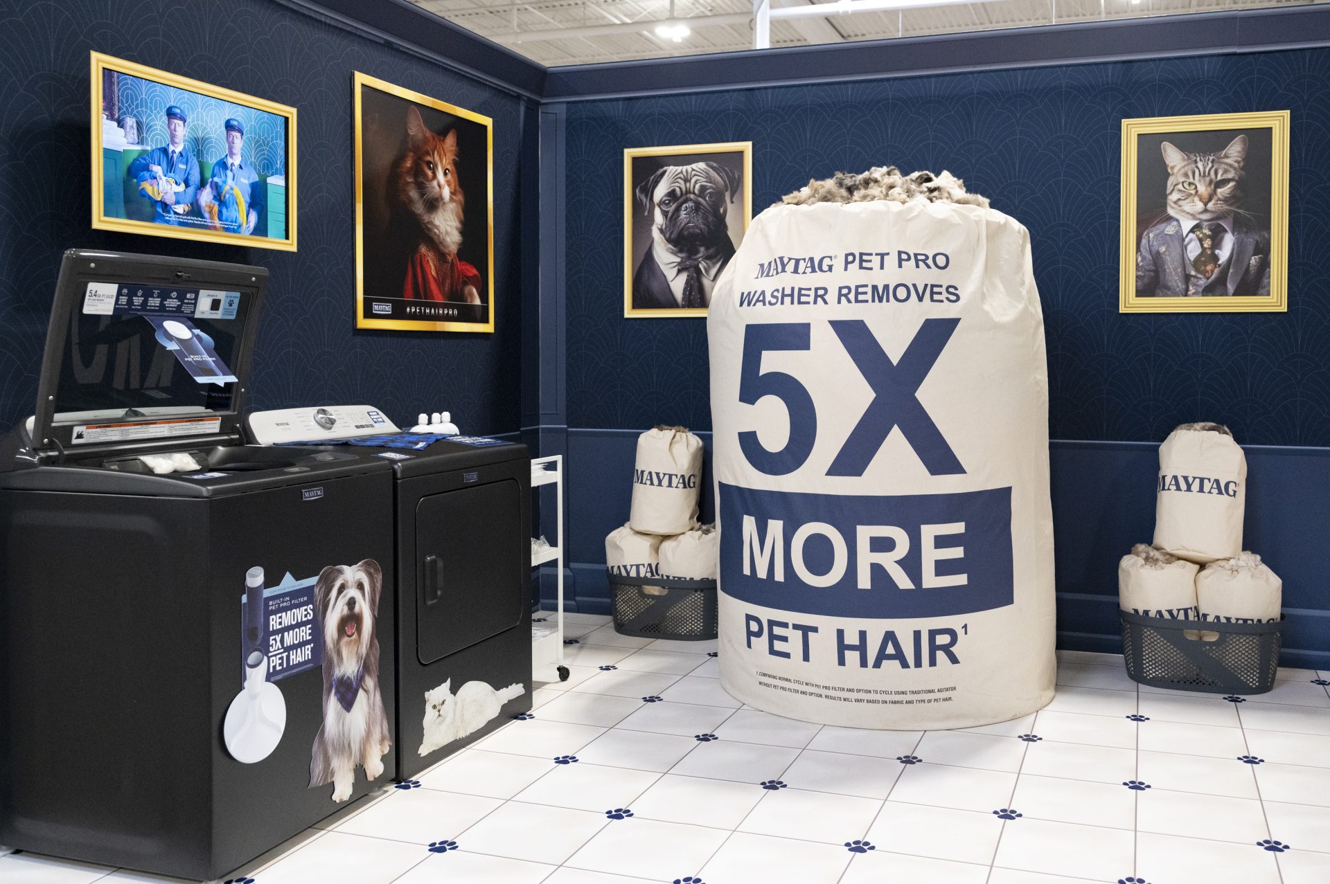
The solution was a two-layer approach. SEG stretch fabric panels were printed to simulate wainscoting and upscale paneling, giving the walls the depth and tone of a renovated salon at a fraction of the weight. The faux crown molding was achieved with printed pressure-sensitive vinyl applied to aluminum composite, delivering the architectural detail at a fraction of the cost. From the aisle, the walls read as a real space. From the crate, they read as flat panels.

The framed pet portraits used the same logic. Rather than building or sourcing actual frames, frame graphics were printed directly onto flat stock alongside the portrait images, giving the gallery-wall effect without the weight or breakage risk.

Solving the floor in a tube

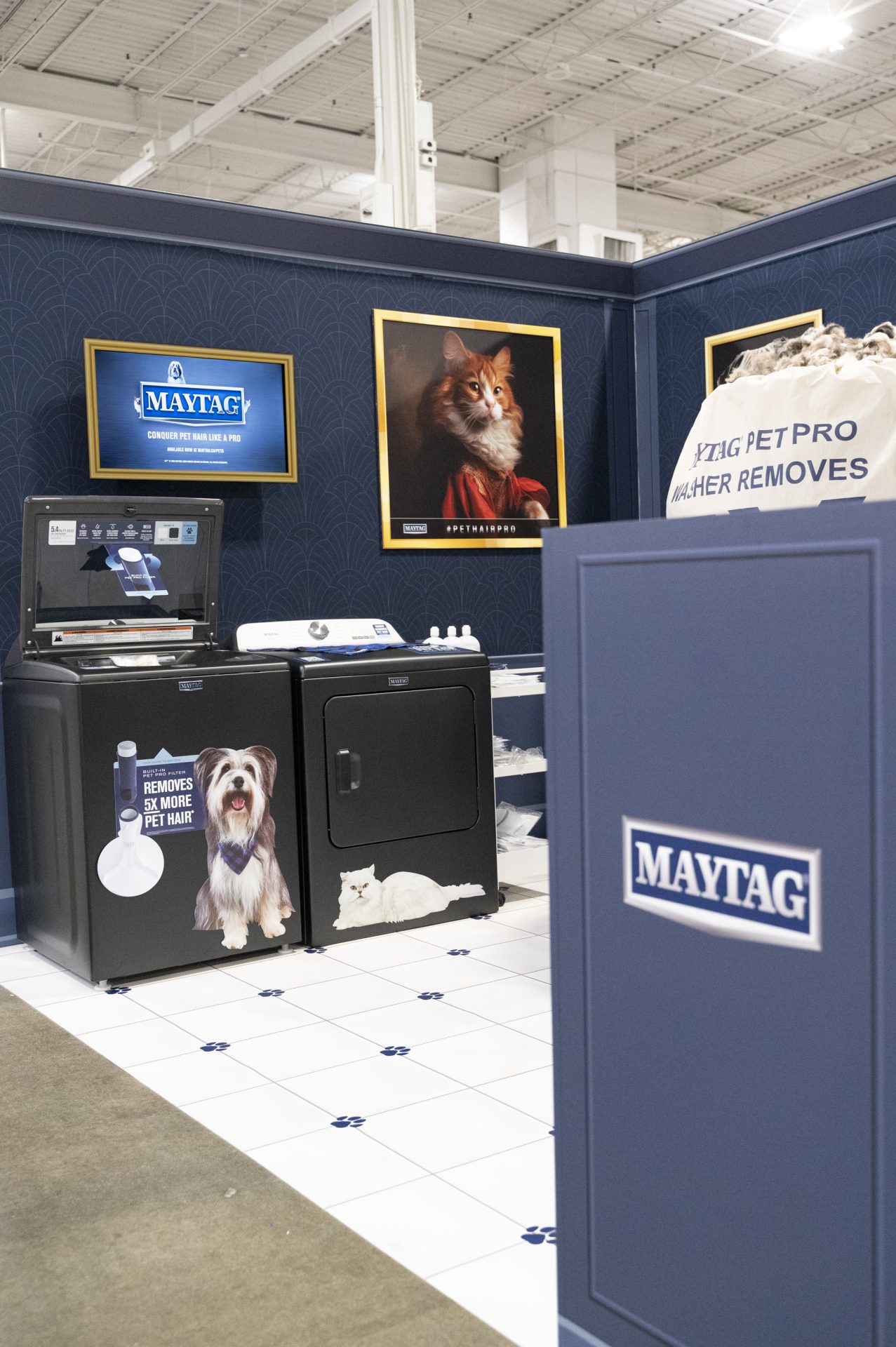
A tile floor with embedded paw prints would have looked the part and added two days to install, plus a hard-to-ship footprint. The shōmi! graphic designer created a custom tile-and-paw-print pattern in-house and printed it on roll-up flooring. The visual story was identical to laid tile. Setup took minutes. The whole floor shipped in a tube.

The hair bags

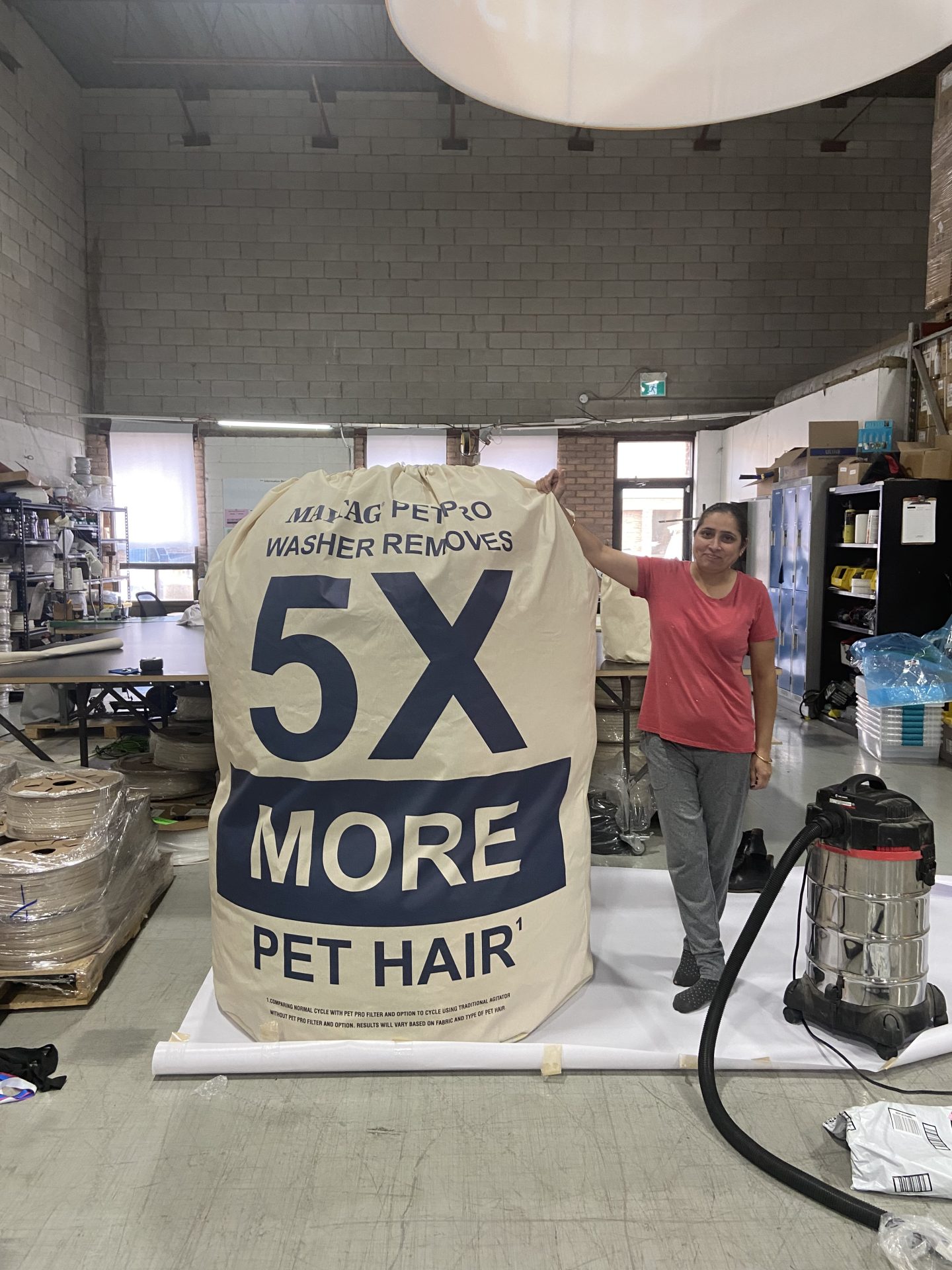
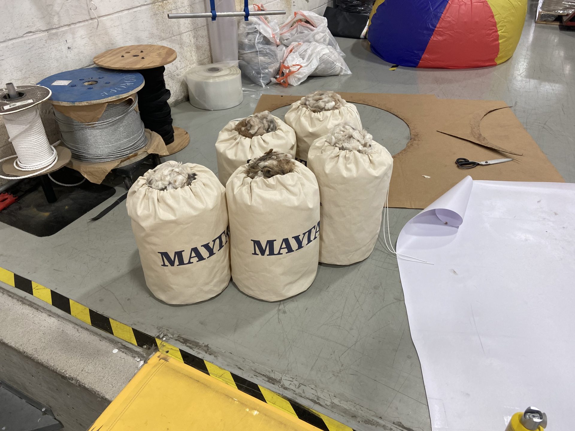
The hero prop of the booth was a pile of oversized pet hair bags sitting beside the washer and dryer, making Maytag’s claim, removing five times more pet hair than other models, impossible to miss. Filling them with real pet hair alone would have made them heavy and slow to ship between cities. Filling them with fake material would have lost the realism the concept depended on.

The shōmi! solution mixed real pet hair with bubble wrap for volume, giving the bags the right read at conversational distance without the weight. The largest hero bag was built around an inflatable core, allowing it to ship flat and inflate to full visual scale on site.

The hairdryer photo op

The salon-style hairdryer was the booth’s signature interactive moment, designed to draw attendees and their pets into a shareable photo. Because the booth had to work for a chihuahua and a labradoodle in the same hour, the hairdryer needed a height-adjustable frame that booth staff could operate quickly between takes.

The result was a working photo op rather than a decorative prop, which is how it generated the line, the social tags, and the conversations Maytag came to the show to start.

What this kind of build proves

Builds like this one come down to judgment about where to spend the money and where to fake it convincingly. Real architecture and tile would have eaten the budget and blown the timeline. Pure-fur hair bags would have been too heavy to ship and too bulky to move between cities. The decisions that made the Salondromat work weren’t about doing less. They were about knowing which details people actually remember.

For Maytag and prspktvMEDIA, that meant a booth that delivered a premium brand experience, travelled to a second city without rebuilding, and gave the Canadian Pet Expo a memorable corner of the floor.

Planning a similar build?

If you’re working on a trade show booth, retail install, or experiential build that needs to land as premium without the premium budget, we’re happy to talk through what’s possible and where the smart spends usually go.

Frequently asked questions

How can a trade show booth feel premium without a premium budget?

By choosing carefully where to spend and where to simulate. Real architectural detail (crown molding, laid tile, hardwood, lacquered finishes) usually breaks the budget and the timeline. The Maytag Salondromat booth achieved a high-end pet salon aesthetic by simulating the architecture: printed vinyl on aluminum composite for crown molding, SEG fabric for wainscoting, roll-up printed flooring for tile. The budget went to the moments people actually remembered, including the oversized hair bags and the height-adjustable salon hairdryer photo op. The judgment call is which details earn their cost.

Can a custom trade show booth ship to multiple cities without rebuilding?

Yes, if it’s engineered for travel from the start. The Maytag Salondromat booth was built for the Canadian Pet Expo and then a second city, which meant every component had to ship in a manageable footprint, set up fast, and survive a second handling without being remade. Achieving that meant flat-packing the walls as SEG fabric panels, rolling up the printed floor into a tube, and engineering the hero hair bag around an inflatable core that shipped flat and inflated on site.

What is SEG fabric and why is it used in trade show booths?

SEG fabric is silicone edge graphic fabric: a printed stretch fabric panel with a thin silicone bead sewn around its edge that locks into a recessed channel in an aluminum frame. It’s used in trade show booths because the graphics swap out easily, the panels ship flat, and the finished surface is tight, seamless, and dust-free. In the Maytag Salondromat booth, SEG fabric was printed to simulate wainscoting and upscale wall paneling, delivering the depth of a renovated room at a fraction of the weight.

How do you fake crown molding in a trade show booth?

With printed pressure-sensitive vinyl applied to aluminum composite. In the Maytag Salondromat build, this approach delivered the architectural detail of crown molding without the cost, weight, or fragility of the real thing. The vinyl carries the printed molding profile and shadow, and the rigid aluminum composite substrate gives the wall a clean, finished read from the aisle. It ships flat and survives transit.

Can printed flooring replace real tile in a trade show booth?

Yes, and for trade show and modular deployments it usually should. Laid tile is heavy, takes hours to install, and is hard to ship between cities. Roll-up printed flooring delivers the same visual story (in the Maytag Salondromat case, a custom tile and paw print pattern designed in-house), rolls into a tube for transport, and sets up in minutes. For shows with tight install windows or multi-city tours, printed flooring almost always wins on cost, install time, and reusability.

How do you build a 3D trade show prop that ships flat?

Engineer it around an inflatable core or collapsible armature, and use lightweight fill materials to add volume. The Maytag Salondromat’s hero pet hair bag had to read as a full sack of hair from across the aisle while shipping in a manageable footprint. The shōmi! solution was an inflatable membrane inside the bag plus a fill of real pet hair mixed with bubble wrap. The bubble wrap added volume without adding weight, and the inflatable core let the prop ship flat and reach full visual scale on site.

We’ve faked crown molding, shipped inflatable hair bags, and built a hairdryer for every size of dog. Whatever’s got you stuck, we’ve probably faked something weirder. Tell us about it.

An orange background with a red stop sign on the right. The text reads: shomi! Discover the science behind why your display isn't getting noticed.

The Science Behind Why Your Display Isn’t Getting Noticed

Motion, light, and dimensional builds aren't design trends. They're biology.

The human visual system is hardwired to detect motion, respond to light contrast, and interpret depth. The right display format matches those instincts to the demands of the environment it’s going into. Here’s the science behind it, and what it means for how you spec and build.

The Problem With “Pretty” Displays

Most branded displays are designed to look good in a photo. Clean lines, on-brand colours, sharp graphics. And then they get installed in a trade show hall or a retail environment, and they disappear.

Not because the design was bad. Because the environment ate them alive. Nobody told the display it was going to a trade show floor with 400 other displays, all of which also have great brand colours.

A busy trade show floor has hundreds of competing displays. A retail corridor has competing signage at every turn. A branded environment in a corporate lobby competes with phone screens, overhead lighting, and foot traffic. In that kind of sensory noise, a display that isn’t working with the visual system’s attention mechanisms is fighting an uphill battle.

The displays that actually get noticed share three characteristics: they move, they glow, or they come off the wall. Often all three.

That’s not a coincidence. It’s anatomy.

Motion: The Override Instinct

The human visual system didn’t evolve to admire graphics. It evolved to detect threats and opportunities. Your display is neither, but it can borrow from the same wiring. One of its most deeply wired functions is motion detection.

The retina has two primary types of photoreceptors: rods and cones. Rods are concentrated in the peripheral visual field and are specifically tuned to detect changes in light intensity over time, which is the biological basis for motion perception. This is why something moving at the edge of your vision captures your attention before you’ve consciously registered it. The response is involuntary.

Research in visual neuroscience consistently confirms that peripheral motion detection triggers involuntary attention shifts. Pratt, Radulescu, Guo, and Abrams documented this directly in their 2010 study “It’s Alive! Animate motion captures visual attention”, published in Psychological Science, finding that animate motion captures visual attention faster and more reliably than static stimuli. The brain’s superior colliculus, which handles orienting reflexes, responds to motion cues and redirects gaze before the cortex has a chance to evaluate the stimulus. In plain language: people look before they decide to look.

For display fabricators and brand managers, this has a direct implication. Animated content, whether it’s a looping LED sequence, an illuminated fabric frame with shifting backlighting, or a mechanically animated dimensional element, triggers a response that static displays simply cannot. You’re not trying to be interesting. You’re engaging a reflex.

The Nielsen Norman Group has documented related effects in digital environments. Their article “Animation for Attention and Comprehension” confirms that movement in peripheral vision triggers a stimulus-driven shift in visual attention, what they describe as bottom-up processing, distinct from the goal-directed attention a person chooses to give. The same principle applies in physical space.

“People look before they decide to look. Motion engages a reflex, not a preference.”

The iMPAKT in-motion Advantage

For environments where motion is the right tool, animated lightbox systems like the iMPAKT in-motion exist specifically for that application. The display itself moves. Not the graphic, not a screen embedded in a frame, the entire illuminated panel animates. The result is a motion cue that registers in peripheral vision from a distance, drawing viewers in before they’ve made a conscious decision to engage.

It’s an additional layer on top of the contrast advantage that any quality lightbox already delivers. In environments where foot traffic is high, dwell time is short, and competing displays are dense, that motion layer can be the difference between being noticed and being part of the background. In a quieter branded environment, a corporate reception area, a showroom, a permanent retail installation, a well-fabricated static lightbox is often exactly the right call.

Light: Contrast Is What the Eye Follows

Light doesn’t just illuminate a display. It creates the contrast that the visual system uses to parse its environment.

The eye doesn’t respond uniformly to all light. It responds to differences. The Mach band effect, described by physicist Ernst Mach in the 1860s and subsequently confirmed by neurophysiological research, demonstrates that the visual system actively enhances edges between light and dark regions. Lateral inhibition in retinal ganglion cells sharpens contrast perception so that the brain can quickly identify boundaries and objects. An illuminated display against a darker background is, quite literally, easier for the visual system to isolate from its surroundings.

This is why backlit displays consistently outperform front-lit or non-illuminated displays in terms of dwell time and recall. The 2023 OAAA/Solomon Partners U.S. Major Media Advertising Effectiveness Analysis — an aggregation of publicly available recall studies from 2017 to 2022 — found that illuminated and digital OOH formats generated the highest consumer recall of any measured media channel. The underlying mechanism is contrast detection, not aesthetic preference.

Lightboxes work because they create a controlled luminance differential. The graphic isn’t just lit; it’s made to be the brightest, most contrast-rich element in a viewer’s peripheral field. The eye finds it automatically.

The quality of that light matters, though. Even backlighting, consistent colour temperature, and high colour rendering are the difference between a display that reads clearly from across a room and one that looks washed out or patchy up close. This is a fabrication issue as much as a design issue. A low-quality light source undermines the very mechanism that makes the format effective.

“The eye doesn’t respond to light. It responds to contrast. Illuminated displays win because they’re the sharpest edge in the room.”

Dimensional Builds: The Depth Signal

The third mechanism is depth perception, and it operates through a different set of visual cues entirely.

The human visual system interprets three-dimensional space using a combination of binocular disparity (the slight difference in each eye’s view of an object), motion parallax (how objects shift relative to each other as you move), and monocular depth cues including relative size, overlap, and shadow. When an object occupies multiple depth planes, the brain registers it as physically present rather than as a surface to be scanned and categorized.

A flat wall graphic is processed differently than a dimensional build that extends off the wall. The dimensional build activates the brain’s object recognition systems, not just its pattern recognition systems. It reads as a thing rather than a sign.

Research in environmental psychology, including work by Paco Underhill documented in Why We Buy: The Science of Shopping (1999), has repeatedly shown that tactile and dimensional elements increase dwell time in retail environments. The visual system signals the body to slow down and gather more information about a complex three-dimensional object. A flat graphic doesn’t trigger the same response.

For branded environments specifically, dimensionality communicates something beyond the graphic content itself. A brand that builds in three dimensions is implying permanence, investment, and presence. The perception is partly subliminal. A foam-core pop-up reads as temporary. A fabricated dimensional installation reads as the real thing. The brain makes that call in about the same amount of time it takes someone to walk past.

“A dimensional build activates object recognition, not just pattern recognition. It reads as a thing rather than a sign.”

Matching Mechanisms to Environment

Motion, light, and dimension each work through separate visual pathways. Understanding which ones are active in your display is how you match the format to the environment it’s going into.

A well-fabricated SEG lightbox is doing serious work on the contrast pathway. It creates a controlled luminance differential that the eye finds automatically. In the right environment — a corporate lobby, a permanent retail installation, an exhibition space with controlled lighting — that’s precisely what’s needed and nothing more is required. The display looks authoritative, the graphic is vivid, and it does its job.

The question of whether to add motion or dimensionality isn’t about making a better display in the abstract. It’s about reading the environment. A busy trade show floor with hundreds of competing illuminated displays is a different problem than a flagship retail space with a single brand story to tell. The former rewards motion because peripheral attention is the only currency that matters when 400 other displays are fighting for the same eyes. The latter rewards craft, finish, and dimensional presence because the viewer has time to engage.

Add a dimensional component — a fabricated element that protrudes from the frame, a three-dimensional logo application, a tiered structure that creates shadow and depth — and the object recognition pathway activates alongside the contrast pathway. Add motion and you’ve engaged peripheral vision as well. These aren’t upgrades on a single scale. They’re different tools for different environments, and the right combination depends entirely on where the display is going and who it needs to stop.

This is the logic behind why well-specified branded environments outperform underspecified ones in brand recall and engagement. It’s not about spending more for the sake of it. It’s about honestly matching the mechanisms to the demands of the space.

Because in physical environments, attention isn’t won by decoration. It’s won by how the brain actually sees. The most effective experiential environments are designed with that in mind long before anything gets built.

What This Means for Production

Understanding the perceptual mechanisms behind effective displays should change how you approach production decisions, not just design decisions.

On motion: animation needs to be designed into the display at the fabrication stage. An animated lightbox system has to be specified early. Trying to retrofit motion into a static display system produces compromised results. Get the fabrication right from the start.

On light: the performance of a backlit display depends on the light source, the diffusion method, and the fabric or media in front of it. A graphic designed for a particular light output and colour temperature will look completely different behind a different system. These variables need to be coordinated across the design and production teams before anything gets built. This is the argument for early production involvement in every display project.

On dimension: dimensional builds require structural engineering, not just design intent. Weight distribution, wall attachment, shipping constraints, and installation access are fabrication considerations that have to be resolved before the design is locked. A dimensional build that can’t be safely installed or shipped intact is a design that exists only in a rendering. The production team has to be in the room when the concept is being developed.

The displays that capture attention aren’t accidents. They’re the result of applying known perceptual principles to fabrication decisions made early in the process.

The Right Question to Ask

Before any display budget gets approved, there’s one question worth asking: what does this environment actually demand?

A well-fabricated SEG lightbox in a controlled, lower-traffic space is engaging the contrast pathway precisely and effectively. That’s not a compromise. That’s correct specification. Adding motion or dimension to an environment that doesn’t need them doesn’t improve the display — it just adds cost and complexity.

In a high-traffic, high-competition environment — a major trade show floor, a flagship retail launch, a keynote-stage branded installation — the question becomes which additional mechanisms are worth activating. Motion for peripheral attention. Dimension for object recognition and perceived permanence. Both together for environments where the display needs to earn its place against serious competition.

There’s no universal right answer. But asking the question forces an honest conversation about whether the display is being specified for the environment it’s actually going into, or just for the rendering it’s going to look good in.

One of those outcomes shows up in post-show reports. The other shows up in the photo the intern took for the recap deck.


shomi! fabricates branded environments, lightbox display systems, and dimensional builds for trade shows, retail, and corporate spaces across Canada. The iMPAKT in-Motion animated lightbox is part of the iMPAKT display family.

Bright orange background with bold text: “Why Animated Lightboxes Outperform Static Displays.” Two SEG Lightboxes feature a vivid beach scene and a grayscale beach with a sad face. Shomi! logo sits at the top left, highlighting animated lightboxes.

Why Animated Lightboxes Outperform Static Displays

Static Displays Blend in. 
Animated Lightboxes Don’t.

Let’s be honest about the state of physical environments.

Retail floors are crowded. Trade shows are louder than ever. Experiential spaces are designed to overwhelm. In that context, most static displays aren’t competing, they’re blending in.

That doesn’t mean static is “bad.” It means the environment has changed.

And the brands that haven’t adjusted are paying for square footage that no one truly sees.

Motion Is No Longer a Gimmick.
It’s a Baseline Advantage.

There was a time when animation in physical displays felt like a novelty. Flashy. Overused. Easy to get wrong.

That era is over.

Today, the most effective animated lightboxes aren’t trying to impress. They’re doing something far more valuable: interrupting visual autopilot.

Subtle fades. Gentle sequencing. Controlled highlights.

Nothing loud. Nothing desperate.

Just enough motion to make the eye stop pretending it didn’t see the display.

Static Relies on Permission.
Motion Takes It.

A static display waits for someone to choose it.

Animated lightboxes don’t.

They earn attention passively, without demanding interaction, sound, or screens. In high-traffic environments where no one is browsing casually, that distinction is everything.

If your display needs a viewer’s goodwill to work, it’s already losing.

Premium Brands Can’t Afford to Look Static

For premium brands, this isn’t about “standing out.” It’s about signaling relevance and investment.

Animation, when done properly, communicates:

  • Intentional design
  • Considered execution
  • Confidence in restraint


It doesn’t scream innovation. It suggests control.

And control is what premium brands are actually selling.

Why Screens Aren’t the Answer

This is where many teams over-correct.

Screens solve attention problems by dominating the space. Animated lightboxes solve them by integrating into it.

They maintain materiality. They respect architecture. They don’t turn physical environments into digital billboards.

In many cases, animated lightboxes do the job brands want screens to do but without the downsides.

More Brands Should Be Using Fewer Displays, With More Thought

Here’s the uncomfortable truth:

If everything is static, nothing is special. If one element moves, it becomes the anchor.

Animated lightboxes allow brands to design hierarchy back into environments that have lost it. They help teams say more by showing less, over time.

That’s not a creative trend. That’s communication fundamentals catching up with reality.

Good Execution Is the Entire Ball Game

Animated lightboxes only work when the build is solid.

Motion adds pressure behind the scenes; power, durability, installation, and long-term reliability. If those details aren’t solved early, animation doesn’t elevate the display. It exposes its weaknesses.

That’s why animation can’t be an afterthought. When it’s planned from the start, motion feels effortless and premium. When it’s added late, it becomes fragile.

The best animated displays don’t come from bigger ideas. They come from execution that’s been thought through before anything is built.

The Bottom Line

Static displays still exist because they’re easy and useful in the right circumstances.

Animated lightboxes are winning because they’re intentional.

They don’t try to out-shout the environment. They out-think it.

And in today’s physical spaces, the brands that win attention aren’t the loudest ones.

They’re the ones that don’t wait for attention; they interrupt it!

Tradeshow Design(1)

Acquiring and Using Sustainable Materials in Trade Show Design

Most trade show builds aren’t built to last. Single-use materials, oversized crates, energy-hungry setups, and a dumpster waiting in the parking lot when it’s all done. It’s the industry default, and it’s getting harder to defend with a straight face.

The good news: sustainable trade show design has caught up. The materials look as good as the conventional ones, install as cleanly, and ship lighter. Here’s how to source and use them without compromising on what the booth actually needs to do.

What “sustainable material” actually means

Sustainable materials are renewable, recyclable, biodegradable, or made from recycled content. When you’re evaluating options for a trade show build, the useful questions are:

  • Recyclability and reusability. Can this material live another life after the event, or is it heading straight to landfill?
  • Biodegradability. If it does end up in waste, does it decompose, or is it still around when your grandkids are explaining what trade shows were?
  • Sustainable sourcing. Where did it come from, and can the supplier prove it?
  • Energy efficiency. What’s the embodied energy in production, and what’s the energy load during the booth’s run?

Sourcing the right materials

Sourcing sustainably isn’t about slapping an “eco” sticker on whatever you were going to use anyway and calling it a day. Three things to look for.

1. Work with vendors who can back up the claim

Some vendors are genuinely sustainable. Others have a marketing department and a green colour palette. The difference shows up in their certifications. Look for:

  • FSC (Forest Stewardship Council) for wood and paper products from responsibly managed forests.
  • Cradle to Cradle for materials designed to be reclaimed and reused at end-of-life.
  • GREENGUARD for low chemical emissions, especially relevant for indoor environments.

2. Recycled and upcycled materials

Recycled aluminum, reclaimed wood, and upcycled fabrics deliver the same finish as new materials with a fraction of the environmental cost. For booth fixtures and structural elements, recycled aluminum extrusions are the workhorse: strong, light, and infinitely recyclable, which is more than you can say for most things on a trade show floor.

3. Modular and lightweight systems

Modular displays built from aluminum frame systems and tensioned fabric (SEG) pack down efficiently, ship light, and reconfigure for different shows. Lower shipping emissions, lower freight bills, less waste at end-of-program. FABRiK Frames are a useful example: the aluminum frames are reusable across years, and the fabric graphics swap out cleanly when the messaging changes.

Designing for longevity, not just one show

A booth designed for a single use is the most expensive booth you can build, environmentally and financially. The smarter approach is to design for reconfiguration from the start.

1. Build for multiple activations

Modular systems that scale up and down, swap out graphics, and reconfigure for different footprints earn back their investment across two or three shows. Aluminum extrusion plus tensioned fabric is the most flexible system for this, and it’s why the same backwall can quietly do five years of duty under three different campaign skins.

2. Use energy-efficient lighting

LED lighting has become the default for backlit displays and accent lighting, and for good reason: dramatically lower energy use than fluorescents or halogens, longer lifespan, less heat. Most iMPAKT lightboxes use LED strips that draw a fraction of the power of older lit displays. The booth doesn’t double as a space heater, which event planners and HVAC systems both appreciate.

3. Reduce waste with smart logistics

  • Stackable, compact designs. Fewer trucks, less fuel, less freight cost.
  • Return and reuse programs. Components that get a second life instead of a dumpster.
  • Local sourcing where possible. Shorter supply chains, lower shipping emissions, easier reorders.

4. Talk about it

If you’ve made sustainable choices, tell the visitors who care. A small panel on the booth, a QR code linking to a sourcing breakdown, or a line in the booth signage costs almost nothing and adds real credibility for the audience that’s looking for it. Just resist the urge to put “eco-friendly” on a vinyl banner.

The business case, briefly

Sustainable trade show design isn’t just good for the planet. It’s good for the build budget over time, it shortens freight bills, it future-proofs the program against tightening regulations, and it gives the brand something honest to talk about on the booth floor.

At shōmi!, we’d rather build a display once and use it for three years than build it three times in a row. If you’re planning a trade show program and want to think through what a longer-life, lower-waste build could look like, we’re happy to take a look.