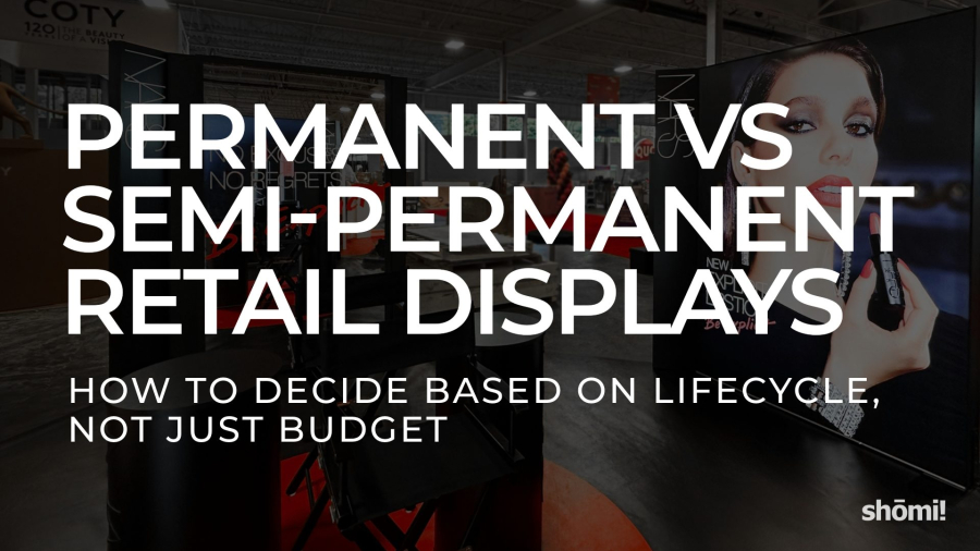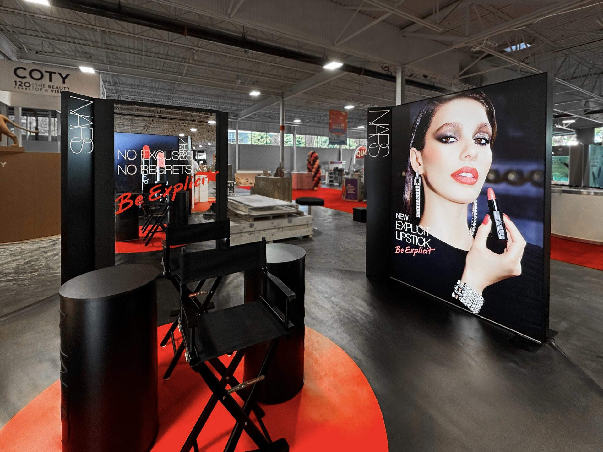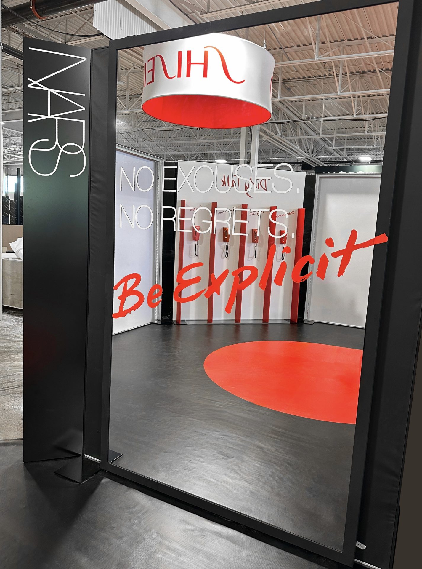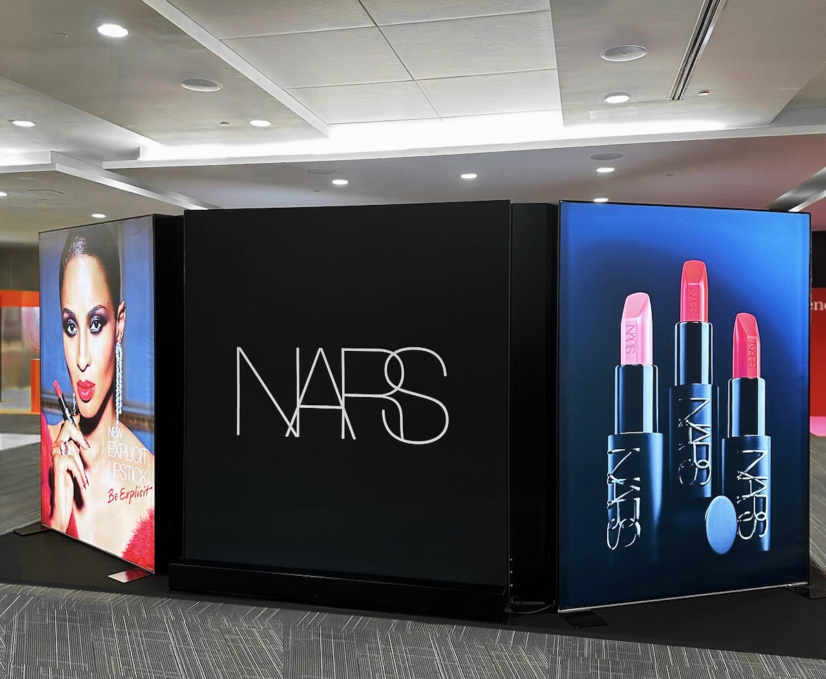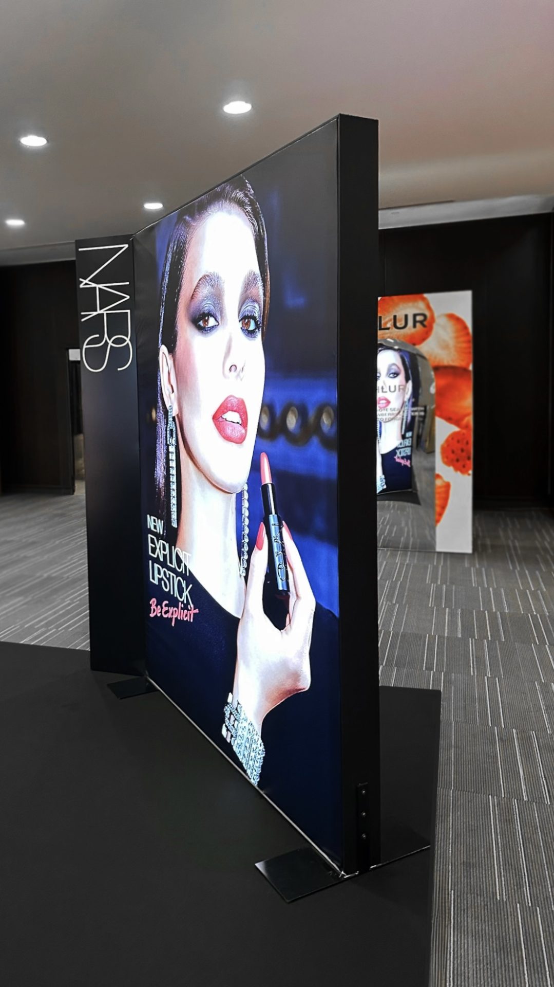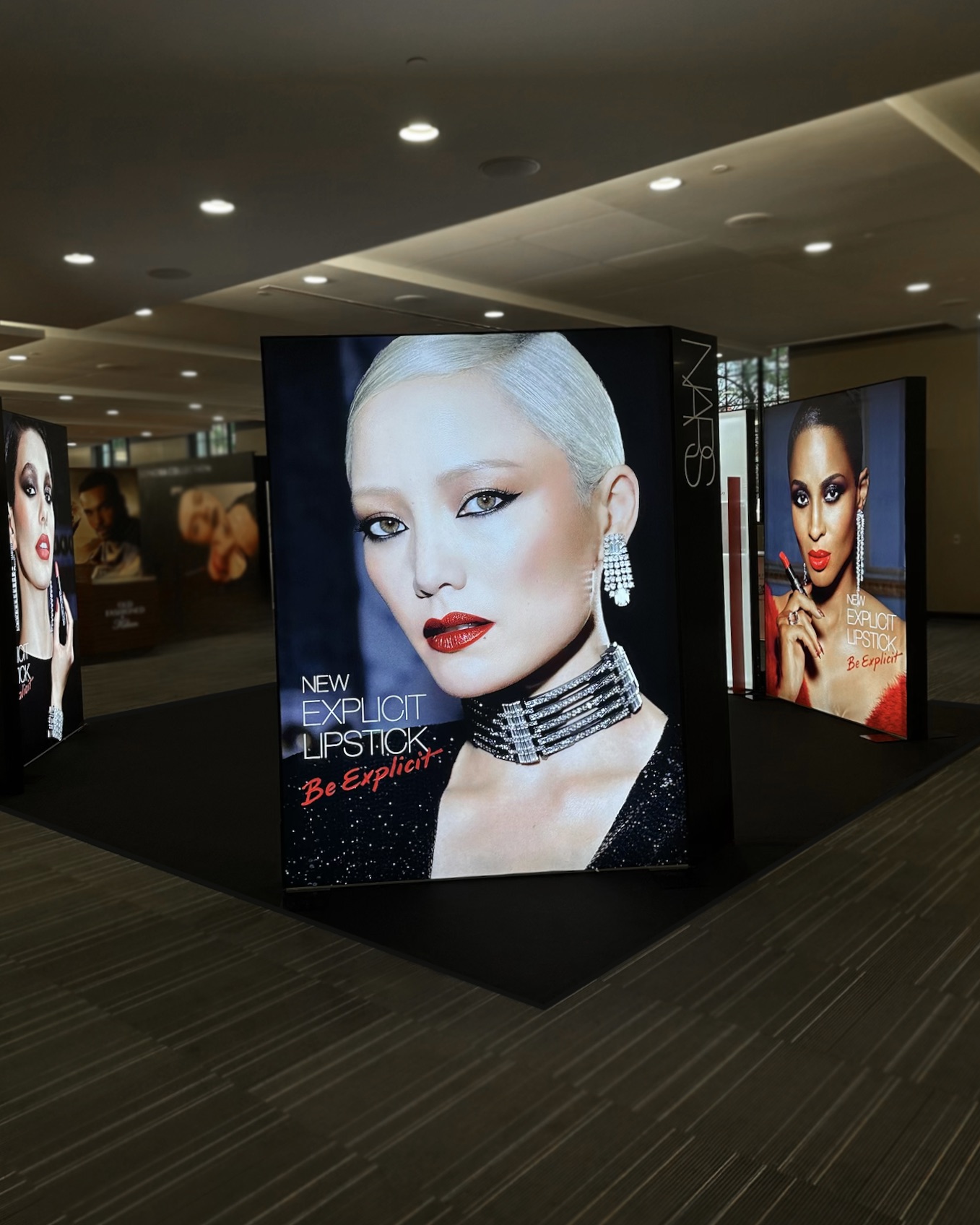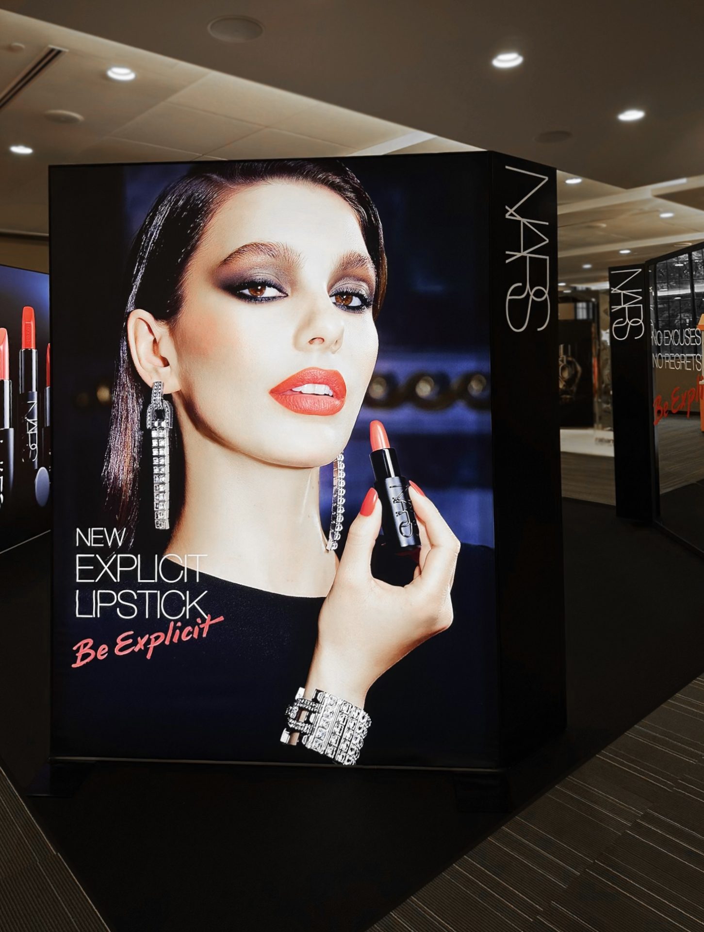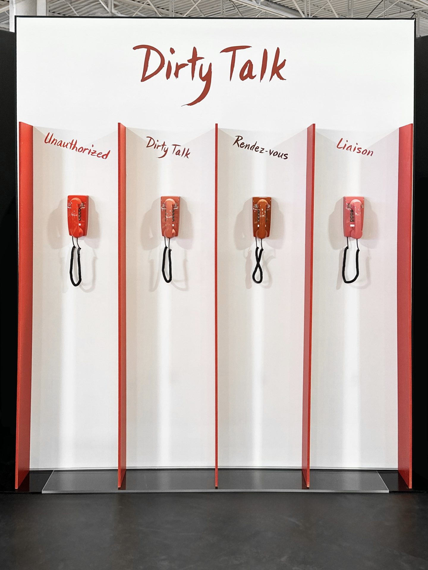
Large white text over a blurred makeup retail display reads: PERMANENT VS SEMI-PERMANENT RETAIL DISPLAYS – HOW TO DECIDE BASED ON LIFECYCLE, NOT JUST BUDGET. A woman applies lipstick on a screen in the background, highlighting permanent vs semi-permanent retail displays.

Permanent vs Semi-Permanent Retail Displays

How to decide based on lifecycle, not just budget

The best display decision isn’t permanent vs semi-permanent. It’s whether the build matches the intended lifespan. Define that first, and the rest of the spec, including budget, tends to clarify itself.

When teams come to us, the first question we ask isn’t how much they want to spend. It’s how long the display actually needs to perform. Those are very different questions, and confusing them is one of the more reliably expensive mistakes we see at shōmi!.

Not the most expensive. That honour usually goes to approving a build without a site survey, and discovering on install day that the freight elevator is six inches too short.

This article is about making that distinction clearly. The smarter decision tends to follow.

The real question: what’s the intended lifespan?

What you actually need to define is intended lifespan. The labels permanent and semi-permanent describe construction method, not the business need.

A display built for a three-month campaign window isn’t a semi-permanent display that happens to come down early. It’s a three-month display.

A display anchoring a flagship retail environment for three-plus years is a different animal entirely. Briefing it as though it were a pop-up is how you end up with a very expensive pop-up.

The problem is that most teams default to “cheaper” when the timeline is vague or short, and “more premium” when a space feels important. Nobody writes down how long the thing actually needs to stand up. The result is either a flimsy build in a space that needed durability, or an overbuilt structure for a campaign that ended in Q2.

The question that unlocks everything else: how many months will this display be in active use, and under what conditions?

Cost per month of use: a smarter metric

The metric that actually matters: total cost (build + maintenance + any refresh costs) divided by months of active use. Do that calculation for both options before you decide.

Budget conversations tend to focus on upfront cost. That’s reasonable. Upfront cost is the number everyone can see. Cost per month of use is the number that tends to surface later, usually during a budget review nobody was looking forward to.

A modular lightbox system with a higher upfront cost that performs reliably across 36 months works out significantly cheaper per month than a lower-cost build that needs to be replaced or repaired at month 14. Conversely, a well-engineered semi-permanent solution purpose-built for a four-month activation is almost always the right call over a permanent structure that gets torn down before it has paid for itself.

This re-frame also changes how you evaluate maintenance and refresh costs. A display that’s nominally cheaper but requires significant upkeep, or that can’t accommodate graphic swaps without a partial rebuild, often has a higher effective cost per month than it appears on a quote.

Durability vs flexibility: knowing the trade-off

Permanent and semi-permanent systems involve a real trade-off between durability and flexibility, and it’s worth being direct about that rather than pretending one solution does everything equally well.

Permanent or long-lifecycle builds are designed to hold up. Welded frames, hardwired lighting, heavier substrates, site-specific installation. They’re built with the assumption that the environment and the brand direction will remain reasonably stable. When that assumption holds, they perform exceptionally. When it doesn’t, you’re looking at significant cost to modify or remove them, plus a fairly uncomfortable conversation with whoever approved the brief, who is suddenly very hard to find on the org chart.

Semi-permanent and modular systems trade some of that raw durability for adaptability. Graphic changeouts. Reconfigurable footprints. Easier decommissioning. Modular systems, designed well, are still highly durable within their intended use range. But they’re built with change in mind, and that’s a fundamentally different design philosophy.

Neither approach is superior in the abstract. The right question is: how stable is the brand direction, the space, and the product assortment over the display’s intended lifespan? The more stable the answers, the stronger the case for a permanent build. The more variable, the stronger the case for a system that can move with you.

Environmental exposure considerations

Lifespan isn’t just a function of time. It’s a function of what the display is exposed to during that time.

A display in a controlled interior retail environment faces very different demands than one in a high-traffic trade show context, a window installation with direct sun exposure, or an exterior or semi-exterior activation. Materials degrade at different rates. Lighting systems behave differently under temperature variation. Fabric graphics can fade, stretch, or attract particulate in ways that affect how the display reads from even a short distance.

These aren’t edge cases. They are standard variables that should inform material selection, construction method, and anticipated maintenance intervals from the outset. A display spec that ignores environmental exposure is an incomplete spec. It will complete itself eventually, just not in a way you’ll enjoy.

Relevant questions to address before finalizing any build: interior or exterior? Direct sunlight exposure? Temperature range? Expected foot traffic proximity? Cleaning frequency and method? If any of those answers are “we aren’t sure yet,” that uncertainty belongs in the brief, not buried in assumptions.

Planning your refresh strategy before you build

One of the more consistent gaps we see in display planning is that the refresh strategy is treated as a later problem. It isn’t. It directly affects what you should build.

If a display is intended to run for 18 months but the creative direction will change every six months, that’s a modular display with a graphic swap schedule. If it’s intended to run for 18 months with a single consistent visual, the build brief looks quite different. Both are legitimate scenarios. But they require different construction approaches, different materials, and different budget planning.

Mapping your refresh cadence at the briefing stage also surfaces hidden costs that often get missed. Graphic production. Install labour for each swap. Storage or disposal of retired materials. These are real line items, and they’re much easier to plan for when the refresh strategy is defined before a supplier is engaged, not after the display is already built. Discovering them after the fact is a rite of passage nobody needs to repeat.

A display that was never designed to accommodate a graphic change will cost more to update than one that was. That cost is avoidable with planning.

When modular systems outperform fully custom builds

Custom builds have an obvious appeal. They’re purpose-designed for a specific space, they can achieve effects that off-the-shelf systems can’t, and they read as considered and intentional when executed well. For flagship environments with stable long-term briefs, they’re often the right answer.

Modular systems, however, outperform custom builds in a specific and important set of circumstances.

When the display footprint needs to flex across different retail or event locations, a modular system that can be reconfigured to fit multiple footprints will consistently outperform a custom build designed for a single space. When graphic content changes frequently, systems built around tool-free fabric or panel swaps reduce both labour cost and install time. When the client is operating across multiple markets or store formats simultaneously, the logistics and maintenance advantages of a standardized modular system are substantial.

The case for modular also strengthens whenever there’s meaningful uncertainty about the long-term direction of the space. A custom build locks you into a decision that was correct on the day it was specified. Brands change their minds. Spaces get repurposed. Priorities shift after someone attends a competitor’s trade show. A modular system gives you room to adjust.

It’s worth noting that modular doesn’t mean generic. Systems like iMPAKT lightbox and HORiZON Frameless are engineered to deliver high-impact visuals within frameworks that are genuinely flexible. The trade-off between custom and modular is narrower than it used to be.

The permanent vs semi-permanent framing is a reasonable shorthand, but it shouldn’t be doing the work that a proper lifecycle analysis does. Get the lifespan defined, run the cost-per-month numbers, and map the refresh cadence before you brief a supplier.

That’s how you avoid building the wrong thing at the right price.

Frequently asked questions

What's the difference between permanent and semi-permanent retail displays?

The terms describe construction method, not intended lifespan. Permanent displays are typically built with welded frames, hardwired lighting, heavier substrates, and site-specific installation, designed for stable, long-term use. Semi-permanent and modular displays trade some of that raw durability for adaptability, with graphic swap capability, reconfigurable footprints, and easier decommissioning. The right choice depends less on the label and more on how long the display actually needs to perform, in what environment, and how often the creative will change.

How do I decide between a permanent and semi-permanent display?

Start with intended lifespan, not budget. Define how many months the display needs to be in active use, under what environmental conditions, and how often the creative will refresh. Then calculate total cost (build, maintenance, expected refresh) divided by months of active use for both options on the table. A modular system with a higher upfront cost often works out cheaper per month over 36 months than a low-cost build that needs replacing at month 14. The reverse is also true: a well-engineered semi-permanent display is almost always the right call over a permanent build that gets decommissioned before it has paid for itself.

What is “cost per month of active use” in retail display planning?

Cost per month of active use is total project cost (build, maintenance, and any anticipated refresh costs) divided by the number of months the display will actually perform. It’s a more useful planning metric than upfront cost alone because it surfaces hidden costs that don’t appear on the original quote, including maintenance, graphic refresh production, install labour for each swap, and storage or disposal at end of life. Running this calculation for both permanent and semi-permanent options at the briefing stage usually clarifies which build is actually the better value.

When does a modular display outperform a fully custom build?

A modular display outperforms a custom build when the footprint needs to flex across different locations, when graphic content changes frequently, or when the client is operating across multiple markets simultaneously. Modular also wins when there’s meaningful uncertainty about the long-term direction of the space, since a custom build locks in a decision that was correct only on the day it was specified. Modular doesn’t mean generic. Systems like shōmi!’s iMPAKT lightbox and HORiZON Frameless deliver high-impact visuals within frameworks that are genuinely flexible.

How does environmental exposure affect retail display lifespan?

Materially. A display in a controlled interior retail environment faces very different demands than one in a high-traffic trade show context, a window installation with direct sun exposure, or an exterior activation. Materials degrade at different rates, lighting systems behave differently under temperature variation, and fabric graphics can fade, stretch, or attract particulate in ways that affect how the display reads at distance. Environmental exposure should inform material selection, construction method, and maintenance intervals from the start, not be addressed after the build is delivered.

What should a retail display brief include?

A complete retail display brief should define intended lifespan in months, planned refresh cadence and graphic swap schedule, environmental conditions (interior or exterior, sunlight exposure, temperature range, foot traffic proximity), cleaning frequency and method, and budget. If any of those answers are unknown, that uncertainty belongs in the brief itself rather than buried in assumptions. The clearer the brief, the more accurate the cost per month of use calculation, and the more confident the build recommendation that follows.

A graphic with the text Before you budget: The real cost of retail displays beside a magnifying glass focusing on a retail store entrance. The shomi! logo is in the lower right corner.

Before You Budget: The Real Cost of Retail Displays

Where budgets actually go, and where they fall apart

Most clients come in with a number in mind. That number is usually wrong, not because they’re uninformed, but because nobody ever told them what retail display cost is actually paying for. This guide is an attempt to fix that.

The Quote Is Not the Cost

When a fabricator sends a quote, it’s easy to read it as a price for stuff. Materials. Some labour. Maybe shipping. That’s not what you’re buying. You’re buying a set of coordinated decisions about engineering, lead time, logistics, site conditions, and risk, wrapped in a dollar figure that assumes everything goes reasonably well. When things don’t go reasonably well, the number changes. And it always changes upward.

What Drives Retail Display Cost

Most clients assume materials are the main variable. They’re not. Here’s where retail display cost actually goes:

Materials (25-35%)

Fabric, extrusions, LEDs, substrate, hardware. It’s the most predictable part. What shifts it in Canada is import duty on components sourced from the US or overseas, which doesn’t always show up until the invoice arrives.

Labour and Fabrication (30-40%)

Cutting, welding, finishing, assembly, quality control. In Ontario, skilled trades wages are among the highest in the country, before you factor in statutory holidays, vacation pay, and benefits baked into shop rates. This is where Canadian custom builds often come in above what clients expect if they’ve been quoted on US-produced work. Engineering Structural drawings, load calculations, hardware specifications, revision cycles. In Canada, anything ceiling-hung or structurally attached in a commercial space will typically need to meet provincial building code requirements and, in some cases, require a stamped engineer’s drawing. It’s the first thing that gets cut when budgets tighten. It’s also how you end up with a beautiful display that can’t pass inspection.

Logistics, Crating, and Freight (8-15%)

Cross-border shipments between Canada and the US add brokerage fees, customs clearance, and possible duties depending on where components were manufactured. Shipping to Western Canada or remote locations adds meaningful cost over Ontario-to-Ontario runs.

Installation

Where the most budget surprises live. See the section below.

Why Custom Fabrication Is Rarely ‘Just Materials’

The complicated part isn’t the frame. It’s building something that ships in four pieces, arrives intact, assembles in 45 minutes without a fabricator on-site, fits within 1/8″ of a wall that was measured six weeks ago, and still looks like the render when it’s done. Custom retail display fabrication charges for the thinking behind the object, the decisions that make it buildable, shippable, installable, and replaceable. When those decisions are made well, the build feels effortless. When they’re skipped to hit a price, you find out during install.

Prototype vs. Rollout: The Math Most Clients Miss

A prototype costs more per unit than a rollout. What’s less expected is how much more, and what that gap is paying for. The prototype carries the full cost of figuring things out: testing material selections, refining assembly sequences, tightening tolerances. The per-unit cost on a rollout of 40 isn’t 40 times the prototype. It might be 40 times 60% of the prototype, or less, depending on complexity. That savings only materializes if the prototype was done right. A prototype that cuts corners to look affordable usually produces a rollout that costs more to fix than the savings were worth.

The Costs Nobody Budgets For

These aren’t line items on most quotes. They’re what shows up on change orders.

Site conditions

Walls that aren’t plumb. Ceilings 3″ lower than the drawing said. Electrical not where the plan shows it. Discovered on install day. Resolved in real time, at real cost.

Union labour

Major Canadian venues, including convention centres in Toronto, Vancouver, and Montreal, have their own trade jurisdiction agreements. Rigging, electrical, and certain structural work must often be performed by the venue’s own trades. Not knowing this before you bid a project is expensive.

Permits

In Ontario and most Canadian provinces, anything structurally attached, suspended from a ceiling, or installed in a public-facing commercial space can trigger a permit requirement under the provincial building code. Permit timelines don’t care about your install schedule.

Freight damage

It happens. Recovery speed depends entirely on whether spare components were built and whether anyone thought about this before the truck left the building.

Change orders

These aren’t a fabricator tactic. They’re what happens when design-phase decisions collide with reality. Front-load the right conversations about tolerances, site conditions, logistics, and access, before anything is built.

What Retail Display Cost Looks Like in CAD

All figures in Canadian dollars. Every project is different, but rough ideas are useful.

Budget (CAD)Typical ScopeKey Risks
$50KModular systems: SEG frames, standard lightbox profiles, pre-engineered hardware. Graphic-driven, not structure-driven.Little room for site surprises or cross-border shipping complications.
$150KGenuine custom becomes accessible. Prototype plus limited rollout, or one well-executed flagship.Scope creep in the design phase. Budget explicitly for engineering sign-off and Canadian permits.
$500KFull environment: multiple display systems, engineered structures, immersive elements, multi-trade logistics.Timeline. Scope changes at this scale don’t just cost money, they cost weeks.

What This Means for How You Plan

Budget conversations work better when they start with scope, not a number. What does this display need to survive? One season or five years? One location or forty? A single graphic or monthly updates?

The builds that stay on budget aren’t the ones with the most conservative quotes. They’re the ones where the right questions were asked early enough that the quote actually reflected what was being built. That’s the conversation worth having before anything gets designed.

If you’re early in a project and want to understand what your budget can realistically do, get in touch before anything is locked in.

shomi.ca | info@shomi.ca | 1-866-667-4664

An orange background with a red stop sign on the right. The text reads: shomi! Discover the science behind why your display isn't getting noticed.

The Science Behind Why Your Display Isn’t Getting Noticed

Motion, light, and dimensional builds aren't design trends. They're biology.

The human visual system is hardwired to detect motion, respond to light contrast, and interpret depth. The right display format matches those instincts to the demands of the environment it’s going into. Here’s the science behind it, and what it means for how you spec and build.

The Problem With “Pretty” Displays

Most branded displays are designed to look good in a photo. Clean lines, on-brand colours, sharp graphics. And then they get installed in a trade show hall or a retail environment, and they disappear.

Not because the design was bad. Because the environment ate them alive. Nobody told the display it was going to a trade show floor with 400 other displays, all of which also have great brand colours.

A busy trade show floor has hundreds of competing displays. A retail corridor has competing signage at every turn. A branded environment in a corporate lobby competes with phone screens, overhead lighting, and foot traffic. In that kind of sensory noise, a display that isn’t working with the visual system’s attention mechanisms is fighting an uphill battle.

The displays that actually get noticed share three characteristics: they move, they glow, or they come off the wall. Often all three.

That’s not a coincidence. It’s anatomy.

Motion: The Override Instinct

The human visual system didn’t evolve to admire graphics. It evolved to detect threats and opportunities. Your display is neither, but it can borrow from the same wiring. One of its most deeply wired functions is motion detection.

The retina has two primary types of photoreceptors: rods and cones. Rods are concentrated in the peripheral visual field and are specifically tuned to detect changes in light intensity over time, which is the biological basis for motion perception. This is why something moving at the edge of your vision captures your attention before you’ve consciously registered it. The response is involuntary.

Research in visual neuroscience consistently confirms that peripheral motion detection triggers involuntary attention shifts. Pratt, Radulescu, Guo, and Abrams documented this directly in their 2010 study “It’s Alive! Animate motion captures visual attention”, published in Psychological Science, finding that animate motion captures visual attention faster and more reliably than static stimuli. The brain’s superior colliculus, which handles orienting reflexes, responds to motion cues and redirects gaze before the cortex has a chance to evaluate the stimulus. In plain language: people look before they decide to look.

For display fabricators and brand managers, this has a direct implication. Animated content, whether it’s a looping LED sequence, an illuminated fabric frame with shifting backlighting, or a mechanically animated dimensional element, triggers a response that static displays simply cannot. You’re not trying to be interesting. You’re engaging a reflex.

The Nielsen Norman Group has documented related effects in digital environments. Their article “Animation for Attention and Comprehension” confirms that movement in peripheral vision triggers a stimulus-driven shift in visual attention, what they describe as bottom-up processing, distinct from the goal-directed attention a person chooses to give. The same principle applies in physical space.

“People look before they decide to look. Motion engages a reflex, not a preference.”

The iMPAKT in-motion Advantage

For environments where motion is the right tool, animated lightbox systems like the iMPAKT in-motion exist specifically for that application. The display itself moves. Not the graphic, not a screen embedded in a frame, the entire illuminated panel animates. The result is a motion cue that registers in peripheral vision from a distance, drawing viewers in before they’ve made a conscious decision to engage.

It’s an additional layer on top of the contrast advantage that any quality lightbox already delivers. In environments where foot traffic is high, dwell time is short, and competing displays are dense, that motion layer can be the difference between being noticed and being part of the background. In a quieter branded environment, a corporate reception area, a showroom, a permanent retail installation, a well-fabricated static lightbox is often exactly the right call.

Light: Contrast Is What the Eye Follows

Light doesn’t just illuminate a display. It creates the contrast that the visual system uses to parse its environment.

The eye doesn’t respond uniformly to all light. It responds to differences. The Mach band effect, described by physicist Ernst Mach in the 1860s and subsequently confirmed by neurophysiological research, demonstrates that the visual system actively enhances edges between light and dark regions. Lateral inhibition in retinal ganglion cells sharpens contrast perception so that the brain can quickly identify boundaries and objects. An illuminated display against a darker background is, quite literally, easier for the visual system to isolate from its surroundings.

This is why backlit displays consistently outperform front-lit or non-illuminated displays in terms of dwell time and recall. The 2023 OAAA/Solomon Partners U.S. Major Media Advertising Effectiveness Analysis — an aggregation of publicly available recall studies from 2017 to 2022 — found that illuminated and digital OOH formats generated the highest consumer recall of any measured media channel. The underlying mechanism is contrast detection, not aesthetic preference.

Lightboxes work because they create a controlled luminance differential. The graphic isn’t just lit; it’s made to be the brightest, most contrast-rich element in a viewer’s peripheral field. The eye finds it automatically.

The quality of that light matters, though. Even backlighting, consistent colour temperature, and high colour rendering are the difference between a display that reads clearly from across a room and one that looks washed out or patchy up close. This is a fabrication issue as much as a design issue. A low-quality light source undermines the very mechanism that makes the format effective.

“The eye doesn’t respond to light. It responds to contrast. Illuminated displays win because they’re the sharpest edge in the room.”

Dimensional Builds: The Depth Signal

The third mechanism is depth perception, and it operates through a different set of visual cues entirely.

The human visual system interprets three-dimensional space using a combination of binocular disparity (the slight difference in each eye’s view of an object), motion parallax (how objects shift relative to each other as you move), and monocular depth cues including relative size, overlap, and shadow. When an object occupies multiple depth planes, the brain registers it as physically present rather than as a surface to be scanned and categorized.

A flat wall graphic is processed differently than a dimensional build that extends off the wall. The dimensional build activates the brain’s object recognition systems, not just its pattern recognition systems. It reads as a thing rather than a sign.

Research in environmental psychology, including work by Paco Underhill documented in Why We Buy: The Science of Shopping (1999), has repeatedly shown that tactile and dimensional elements increase dwell time in retail environments. The visual system signals the body to slow down and gather more information about a complex three-dimensional object. A flat graphic doesn’t trigger the same response.

For branded environments specifically, dimensionality communicates something beyond the graphic content itself. A brand that builds in three dimensions is implying permanence, investment, and presence. The perception is partly subliminal. A foam-core pop-up reads as temporary. A fabricated dimensional installation reads as the real thing. The brain makes that call in about the same amount of time it takes someone to walk past.

“A dimensional build activates object recognition, not just pattern recognition. It reads as a thing rather than a sign.”

Matching Mechanisms to Environment

Motion, light, and dimension each work through separate visual pathways. Understanding which ones are active in your display is how you match the format to the environment it’s going into.

A well-fabricated SEG lightbox is doing serious work on the contrast pathway. It creates a controlled luminance differential that the eye finds automatically. In the right environment — a corporate lobby, a permanent retail installation, an exhibition space with controlled lighting — that’s precisely what’s needed and nothing more is required. The display looks authoritative, the graphic is vivid, and it does its job.

The question of whether to add motion or dimensionality isn’t about making a better display in the abstract. It’s about reading the environment. A busy trade show floor with hundreds of competing illuminated displays is a different problem than a flagship retail space with a single brand story to tell. The former rewards motion because peripheral attention is the only currency that matters when 400 other displays are fighting for the same eyes. The latter rewards craft, finish, and dimensional presence because the viewer has time to engage.

Add a dimensional component — a fabricated element that protrudes from the frame, a three-dimensional logo application, a tiered structure that creates shadow and depth — and the object recognition pathway activates alongside the contrast pathway. Add motion and you’ve engaged peripheral vision as well. These aren’t upgrades on a single scale. They’re different tools for different environments, and the right combination depends entirely on where the display is going and who it needs to stop.

This is the logic behind why well-specified branded environments outperform underspecified ones in brand recall and engagement. It’s not about spending more for the sake of it. It’s about honestly matching the mechanisms to the demands of the space.

Because in physical environments, attention isn’t won by decoration. It’s won by how the brain actually sees. The most effective experiential environments are designed with that in mind long before anything gets built.

What This Means for Production

Understanding the perceptual mechanisms behind effective displays should change how you approach production decisions, not just design decisions.

On motion: animation needs to be designed into the display at the fabrication stage. An animated lightbox system has to be specified early. Trying to retrofit motion into a static display system produces compromised results. Get the fabrication right from the start.

On light: the performance of a backlit display depends on the light source, the diffusion method, and the fabric or media in front of it. A graphic designed for a particular light output and colour temperature will look completely different behind a different system. These variables need to be coordinated across the design and production teams before anything gets built. This is the argument for early production involvement in every display project.

On dimension: dimensional builds require structural engineering, not just design intent. Weight distribution, wall attachment, shipping constraints, and installation access are fabrication considerations that have to be resolved before the design is locked. A dimensional build that can’t be safely installed or shipped intact is a design that exists only in a rendering. The production team has to be in the room when the concept is being developed.

The displays that capture attention aren’t accidents. They’re the result of applying known perceptual principles to fabrication decisions made early in the process.

The Right Question to Ask

Before any display budget gets approved, there’s one question worth asking: what does this environment actually demand?

A well-fabricated SEG lightbox in a controlled, lower-traffic space is engaging the contrast pathway precisely and effectively. That’s not a compromise. That’s correct specification. Adding motion or dimension to an environment that doesn’t need them doesn’t improve the display — it just adds cost and complexity.

In a high-traffic, high-competition environment — a major trade show floor, a flagship retail launch, a keynote-stage branded installation — the question becomes which additional mechanisms are worth activating. Motion for peripheral attention. Dimension for object recognition and perceived permanence. Both together for environments where the display needs to earn its place against serious competition.

There’s no universal right answer. But asking the question forces an honest conversation about whether the display is being specified for the environment it’s actually going into, or just for the rendering it’s going to look good in.

One of those outcomes shows up in post-show reports. The other shows up in the photo the intern took for the recap deck.


shomi! fabricates branded environments, lightbox display systems, and dimensional builds for trade shows, retail, and corporate spaces across Canada. The iMPAKT in-Motion animated lightbox is part of the iMPAKT display family.

Bright orange background with bold text: “Why Animated Lightboxes Outperform Static Displays.” Two SEG Lightboxes feature a vivid beach scene and a grayscale beach with a sad face. Shomi! logo sits at the top left, highlighting animated lightboxes.

Why Animated Lightboxes Outperform Static Displays

Static Displays Blend in. 
Animated Lightboxes Don’t.

Let’s be honest about the state of physical environments.

Retail floors are crowded. Trade shows are louder than ever. Experiential spaces are designed to overwhelm. In that context, most static displays aren’t competing, they’re blending in.

That doesn’t mean static is “bad.” It means the environment has changed.

And the brands that haven’t adjusted are paying for square footage that no one truly sees.

Motion Is No Longer a Gimmick.
It’s a Baseline Advantage.

There was a time when animation in physical displays felt like a novelty. Flashy. Overused. Easy to get wrong.

That era is over.

Today, the most effective animated lightboxes aren’t trying to impress. They’re doing something far more valuable: interrupting visual autopilot.

Subtle fades. Gentle sequencing. Controlled highlights.

Nothing loud. Nothing desperate.

Just enough motion to make the eye stop pretending it didn’t see the display.

Static Relies on Permission.
Motion Takes It.

A static display waits for someone to choose it.

Animated lightboxes don’t.

They earn attention passively, without demanding interaction, sound, or screens. In high-traffic environments where no one is browsing casually, that distinction is everything.

If your display needs a viewer’s goodwill to work, it’s already losing.

Premium Brands Can’t Afford to Look Static

For premium brands, this isn’t about “standing out.” It’s about signaling relevance and investment.

Animation, when done properly, communicates:

  • Intentional design
  • Considered execution
  • Confidence in restraint


It doesn’t scream innovation. It suggests control.

And control is what premium brands are actually selling.

Why Screens Aren’t the Answer

This is where many teams over-correct.

Screens solve attention problems by dominating the space. Animated lightboxes solve them by integrating into it.

They maintain materiality. They respect architecture. They don’t turn physical environments into digital billboards.

In many cases, animated lightboxes do the job brands want screens to do but without the downsides.

More Brands Should Be Using Fewer Displays, With More Thought

Here’s the uncomfortable truth:

If everything is static, nothing is special. If one element moves, it becomes the anchor.

Animated lightboxes allow brands to design hierarchy back into environments that have lost it. They help teams say more by showing less, over time.

That’s not a creative trend. That’s communication fundamentals catching up with reality.

Good Execution Is the Entire Ball Game

Animated lightboxes only work when the build is solid.

Motion adds pressure behind the scenes; power, durability, installation, and long-term reliability. If those details aren’t solved early, animation doesn’t elevate the display. It exposes its weaknesses.

That’s why animation can’t be an afterthought. When it’s planned from the start, motion feels effortless and premium. When it’s added late, it becomes fragile.

The best animated displays don’t come from bigger ideas. They come from execution that’s been thought through before anything is built.

The Bottom Line

Static displays still exist because they’re easy and useful in the right circumstances.

Animated lightboxes are winning because they’re intentional.

They don’t try to out-shout the environment. They out-think it.

And in today’s physical spaces, the brands that win attention aren’t the loudest ones.

They’re the ones that don’t wait for attention; they interrupt it!

Designing for Accessibility-2

Designing for Accessibility: How to Create Inclusive Signage and Displays

Accessibility isn’t a checkbox. It’s the difference between signage that reaches every customer and signage that quietly excludes a portion of them. The good news: most of what makes a display accessible also makes it better for everyone else who walks past it.

Here’s what to think about when you’re designing signage and displays that work for the widest possible audience, with specific examples drawn from the kinds of builds we work on every day.

Start with what accessibility actually means

Accessibility in signage isn’t only about permanent disability. It’s about designing for people with visual, mobility, cognitive, and hearing differences, and for everyone navigating temporary or situational impairments: trade show floor glare, dim retail lighting, crowded aisles, a phone in one hand, a kid pulling on the other.

Design for the hardest case and the easy ones take care of themselves. A FABRiK Frame that reads clearly from a wheelchair in a busy expo hall reads clearly for everyone else, too.

Prioritise contrast for legibility

The most basic rule of accessible design: if no one can read it, it doesn’t matter how good the message is. Contrast between text and background does more for legibility than almost any other variable, especially for people with low vision or colour blindness.

This is where lightbox graphics have a built-in advantage. iMPAKT Lightboxes are backlit, which dramatically improves contrast and readability compared to printed signage in ambient light, especially in environments with mixed or low lighting. But backlighting doesn’t fix a low-contrast graphic. Pale type on a busy background looks worse when it’s lit, not better. The graphic file has to do the work first.

For large-format builds (backwalls, retail end-caps, suspended FABRiK Frames), keep contrast high and unambiguous, and check the graphic at full size before committing. What reads fine at 11×17 inches can disappear at 8 feet wide.

Choose typefaces that hold up at a glance

Decorative or heavily stylised typefaces can look distinctive, but they fail when readers have dyslexia, low vision, or just a few seconds to scan a trade show aisle. Stick to clean sans-serifs like Helvetica, Arial, or Verdana. Avoid italics and long stretches of all caps; both slow comprehension.

Size matters too. Booth headlines on a 10-foot FABRiK Frame need to read from across the aisle, which is typically 15 to 20 feet. Retail signage usually needs to be legible from at least 10 to 15 feet. The rule of thumb: 1 inch of cap height for every 10 feet of viewing distance, then go bigger if you can.

Place signage where people can actually see it

A perfectly designed sign mounted too high, tucked into a corner, or blocked by a fixture isn’t doing its job. This is where the placement strategy across a build matters: suspended Lanterns and iNTERPOLE hanging displays carry messaging above the crowd for distance visibility, while wall-mount FABRiK Frames and HORiZON Frameless displays handle the close-range, eye-level read.

For tactile and Braille signage on permanent retail builds, Canadian accessibility standards (CSA B651) place the baseline of text between 1220 and 1525 mm (48 to 60 inches) from the floor. That range works for standing users, seated users, and wheelchair users alike.

Lighting matters too. A well-designed sign in shadow is an invisible sign. This is another reason backlit displays earn their place in accessibility-conscious builds: they bring their own light, which means they don’t depend on whether the venue lighting cooperates.

Use symbols and icons alongside text

Text isn’t always the fastest way to communicate. Universally recognised symbols (a phone for service, the international symbol of accessibility, restroom pictograms) get understood faster than words and cross language barriers. On a trade show booth or retail wayfinding system, pairing text with symbols speeds comprehension for everyone, including readers who are rushed, distracted, or reading in a second language.

Where you have the real estate (a FABRiK Frame backwall, a large iMPAKT lightbox), give symbols room to breathe. Don’t crowd them up against the type.

Include Braille and tactile signage where it counts

For blind and low-vision users, tactile signage and Braille on directional signs, room identifiers, and key wayfinding signage are essential, not optional. Braille should sit below the corresponding visual text, be crisp, and be reachable at the heights noted above.

Most temporary trade show and pop-up signage doesn’t include Braille, but permanent retail builds and long-running pop-ups should. If you’re rolling out fixtures across 40 stores, accessibility-compliant tactile wayfinding is the kind of thing to spec in the design phase, not retrofit after a complaint.

Don’t overlook hearing accessibility

If a display includes audio (an iMPAKT in-motion animated lightbox paired with a soundtrack, an interactive screen, a video wall), it needs a visual equivalent. Captions, on-screen text, or visual cues mean the experience isn’t gated behind sound. This matters less for purely visual lightboxes and fabric frames, more for any build that integrates motion, screens, or audio elements.

Multi-sensory design isn’t only an accessibility win. It generally creates a richer experience for everyone, including the majority of trade show attendees who can’t hear your booth audio over the noise of the hall anyway.

Test with real users

The fastest way to find what isn’t working is to put a display in front of someone who’ll encounter it differently than you do. Feedback from users with visual, mobility, or cognitive differences turns up problems that no design review will catch: a graphic that’s perfectly legible at desk size and unreadable at booth size, a sign placed at exactly the wrong height for a seated user, a high-contrast palette that loses its punch under the venue’s specific lighting.

Accessibility simulation tools (colour-blindness filters, low-vision simulators) are a useful supplement during the design phase, but they don’t replace real users.

Why this matters for the brand, not just the build

Accessible signage isn’t only a compliance question. It’s a signal of who the brand is designed for. Customers notice when a space has been thought through, and they notice when it hasn’t. The brands that get this right tend to find that accessibility improvements quietly make their displays better for every shopper, not just the ones who needed the change.

At shōmi!, accessibility isn’t always the starting point of a build, and we’d be lying if we said it was. But it’s a conversation that’s a lot cheaper to have during design than after install. If you’re planning a retail rollout, trade show build, or pop-up and want a second set of eyes on the accessibility side before the design is locked, we’re happy to take a look.

Blog header titled "The Evolution of Retail Displays"

A Brief History of Retail Displays

The Evolution of Retail Displays: ​

From Hand-Painted Boards to Digital Visual Displays​

Retail signage didn’t start with digital screens. It started with painted symbols on Roman walls, ivy bushes nailed above tavern doors, and elaborate hand-painted boards that doubled as small works of art. The technology has changed dramatically over the last two thousand years. The job hasn’t: get people to stop, look, and walk in.

Here’s how retail displays got from there to here, and where they’re heading next.

Pre-19th century: hand-painted boards and the original visual language

The earliest retail signage goes back to ancient civilisations. Egyptians, Greeks, and Romans used painted symbols and terracotta plaques to advertise shops and services, and the Romans in particular were prolific about it. Taverns hung ivy bushes above their doors to signal wine. Bakeries used loaves. The whole vocabulary of “we sell the thing this picture shows” was already in place.

By the Middle Ages, hand-painted signs had become the standard in European trade districts. Most people couldn’t read, so the signs relied on imagery, and innkeepers in particular got creative: signs were elaborate, often humorous, and frequently the first impression a traveller had of a business. The craft of sign-painting required real skill, and good signs were considered a serious commercial asset.

Worth noting: the basic logic hasn’t changed. “Symbol that communicates what we sell, visible from the street, designed to interrupt the passing eye” is the same brief today. The materials are just different.

19th century: the printing press and the rise of consistency

Printing technology transformed retail signage by making it reproducible. The first known printed advertising poster came earlier than most people guess: William Caxton printed an advertisement for the Ordinale ad Usum Sarum, a priest’s handbook, in 1477. But mass adoption took another few centuries, and the real shift came in the 19th century when lithography arrived and made colour printing practical at scale.

For the first time, businesses could produce signs that looked identical across multiple locations. Brand consistency, which today is treated as a baseline expectation, was a new and powerful idea. Small businesses could now afford professional-looking signs that competed visually with bigger players, and storefronts started to look more designed and less improvised.

1920s to 1960s: the neon era

If the printing press standardised signage, neon made it impossible to ignore. The first neon sign in the United States was installed in 1923 in Los Angeles, advertising a Packard dealership. It cost $24,000, the equivalent of several hundred thousand dollars today, which is a remarkable amount of money to spend on a sign and also entirely explains why the technology spread the way it did.

Through the middle decades of the 20th century, neon defined the visual identity of urban retail. Bent glass tubes filled with different gases produced colours and shapes that nothing else could match, and entire districts (Times Square, the Las Vegas Strip, downtown Tokyo) became globally recognisable largely because of their neon. The signs weren’t just advertising. They became the architecture.

2000s to present: digital displays and interactive signage

The digital revolution changed two things about retail signage at the same time: what the sign could show, and how often it could change. LED displays, digital billboards, and interactive kiosks meant a single piece of hardware could run an unlimited number of campaigns, update in real time, and respond to the person standing in front of it.

That flexibility opened up possibilities that earlier formats couldn’t approach: dynamic pricing displays, time-of-day-specific promotions, interactive product browsers, personalised content driven by customer data. The trade-off is that digital signage requires ongoing management in a way a painted sign never did. A neon sign from 1955 still works if you replace the gas tubes. A digital display from 2015 may already be running on hardware nobody supports.


2010s to present: the pop-up era

Around the early 2010s, pop-up shops became a serious retail strategy rather than a novelty. Brands realised that temporary retail spaces could create exactly the kind of urgency, exclusivity, and experiential design that permanent stores struggle to maintain. The first pop-up retail concepts go back further (the agency Vacant set up temporary spaces in 1999, and the general idea is older still), but the 2010s is when the format went mainstream.

A well-designed pop-up does several things at once: launches a product, generates social media content, gives existing customers a reason to show up, and reaches new audiences in foot-traffic locations the brand wouldn’t normally operate in. Done badly, it’s a folding table with a vinyl banner. Done well, it’s the kind of installation that ends up on design blogs for months.

Where retail displays are heading

The next decade of retail signage looks like it’s being shaped by three forces.

AR, VR, and AI. Augmented and virtual reality let customers visualise products in their own homes before buying, and AI personalises both digital content and physical experiences based on customer behaviour. The use cases that have actually stuck (virtual try-on for cosmetics and eyewear, AR product visualisation for furniture) suggest the technology works best when it solves a specific problem, not when it’s a marketing layer.

Sustainability. Retail signage is moving toward materials that have a future after the campaign ends: biodegradable substrates, recycled aluminum, FSC-certified wood, energy-efficient LED lighting that uses up to 75% less power than older alternatives. Both for environmental reasons and because brands are increasingly being asked to account for what they throw away.

Physical and digital working together. The most interesting current builds aren’t choosing between physical and digital signage. They’re using each for what it does best: physical for atmosphere, scale, and brand expression you can stand inside; digital for responsiveness, personalisation, and content that changes with the audience.

The through-line

Two thousand years of retail signage history boil down to a fairly simple observation: the technology changes, but the question doesn’t. How do you make a passerby stop, look, and decide to come in? Roman shopkeepers, medieval innkeepers, lithographers, neon benders, and digital designers have all been answering the same question with the tools of their century. The next era will look different from this one, the way every era has looked different from the one before it. The question will be the same.