An orange background with a red stop sign in the top right corner. White text reads why your display isn't getting noticed: The science behind it, and shomi! appears in the top left.

The Science Behind Why Your Display Isn’t Getting Noticed

Motion, light, and dimensional builds aren't design trends. They're biology.

The human visual system is hardwired to detect motion, respond to light contrast, and interpret depth. The right display format matches those instincts to the demands of the environment it’s going into. Here’s the science behind it, and what it means for how you spec and build.

The Problem With “Pretty” Displays

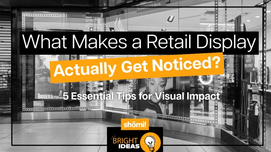
Most branded displays are designed to look good in a photo. Clean lines, on-brand colours, sharp graphics. And then they get installed in a trade show hall or a retail environment, and they disappear.

Not because the design was bad. Because the environment ate them alive. Nobody told the display it was going to a trade show floor with 400 other displays, all of which also have great brand colours.

A busy trade show floor has hundreds of competing displays. A retail corridor has competing signage at every turn. A branded environment in a corporate lobby competes with phone screens, overhead lighting, and foot traffic. In that kind of sensory noise, a display that isn’t working with the visual system’s attention mechanisms is fighting an uphill battle.

The displays that actually get noticed share three characteristics: they move, they glow, or they come off the wall. Often all three.

That’s not a coincidence. It’s anatomy.

Motion: The Override Instinct

The human visual system didn’t evolve to admire graphics. It evolved to detect threats and opportunities. Your display is neither, but it can borrow from the same wiring. One of its most deeply wired functions is motion detection.

The retina has two primary types of photoreceptors: rods and cones. Rods are concentrated in the peripheral visual field and are specifically tuned to detect changes in light intensity over time, which is the biological basis for motion perception. This is why something moving at the edge of your vision captures your attention before you’ve consciously registered it. The response is involuntary.

Research in visual neuroscience consistently confirms that peripheral motion detection triggers involuntary attention shifts. Pratt, Radulescu, Guo, and Abrams documented this directly in their 2010 study “It’s Alive! Animate motion captures visual attention”, published in Psychological Science, finding that animate motion captures visual attention faster and more reliably than static stimuli. The brain’s superior colliculus, which handles orienting reflexes, responds to motion cues and redirects gaze before the cortex has a chance to evaluate the stimulus. In plain language: people look before they decide to look.

For display fabricators and brand managers, this has a direct implication. Animated content, whether it’s a looping LED sequence, an illuminated fabric frame with shifting backlighting, or a mechanically animated dimensional element, triggers a response that static displays simply cannot. You’re not trying to be interesting. You’re engaging a reflex.

The Nielsen Norman Group has documented related effects in digital environments. Their article “Animation for Attention and Comprehension” confirms that movement in peripheral vision triggers a stimulus-driven shift in visual attention, what they describe as bottom-up processing, distinct from the goal-directed attention a person chooses to give. The same principle applies in physical space.

“People look before they decide to look. Motion engages a reflex, not a preference.”

The iMPAKT in-motion Advantage

For environments where motion is the right tool, animated lightbox systems like the iMPAKT in-motion exist specifically for that application. The display itself moves. Not the graphic, not a screen embedded in a frame, the entire illuminated panel animates. The result is a motion cue that registers in peripheral vision from a distance, drawing viewers in before they’ve made a conscious decision to engage.

It’s an additional layer on top of the contrast advantage that any quality lightbox already delivers. In environments where foot traffic is high, dwell time is short, and competing displays are dense, that motion layer can be the difference between being noticed and being part of the background. In a quieter branded environment, a corporate reception area, a showroom, a permanent retail installation, a well-fabricated static lightbox is often exactly the right call.

Light: Contrast Is What the Eye Follows

Light doesn’t just illuminate a display. It creates the contrast that the visual system uses to parse its environment.

The eye doesn’t respond uniformly to all light. It responds to differences. The Mach band effect, described by physicist Ernst Mach in the 1860s and subsequently confirmed by neurophysiological research, demonstrates that the visual system actively enhances edges between light and dark regions. Lateral inhibition in retinal ganglion cells sharpens contrast perception so that the brain can quickly identify boundaries and objects. An illuminated display against a darker background is, quite literally, easier for the visual system to isolate from its surroundings.

This is why backlit displays consistently outperform front-lit or non-illuminated displays in terms of dwell time and recall. The 2023 OAAA/Solomon Partners U.S. Major Media Advertising Effectiveness Analysis — an aggregation of publicly available recall studies from 2017 to 2022 — found that illuminated and digital OOH formats generated the highest consumer recall of any measured media channel. The underlying mechanism is contrast detection, not aesthetic preference.

Lightboxes work because they create a controlled luminance differential. The graphic isn’t just lit; it’s made to be the brightest, most contrast-rich element in a viewer’s peripheral field. The eye finds it automatically.

The quality of that light matters, though. Even backlighting, consistent colour temperature, and high colour rendering are the difference between a display that reads clearly from across a room and one that looks washed out or patchy up close. This is a fabrication issue as much as a design issue. A low-quality light source undermines the very mechanism that makes the format effective.

“The eye doesn’t respond to light. It responds to contrast. Illuminated displays win because they’re the sharpest edge in the room.”

Dimensional Builds: The Depth Signal

The third mechanism is depth perception, and it operates through a different set of visual cues entirely.

The human visual system interprets three-dimensional space using a combination of binocular disparity (the slight difference in each eye’s view of an object), motion parallax (how objects shift relative to each other as you move), and monocular depth cues including relative size, overlap, and shadow. When an object occupies multiple depth planes, the brain registers it as physically present rather than as a surface to be scanned and categorized.

A flat wall graphic is processed differently than a dimensional build that extends off the wall. The dimensional build activates the brain’s object recognition systems, not just its pattern recognition systems. It reads as a thing rather than a sign.

Research in environmental psychology, including work by Paco Underhill documented in Why We Buy: The Science of Shopping (1999), has repeatedly shown that tactile and dimensional elements increase dwell time in retail environments. The visual system signals the body to slow down and gather more information about a complex three-dimensional object. A flat graphic doesn’t trigger the same response.

For branded environments specifically, dimensionality communicates something beyond the graphic content itself. A brand that builds in three dimensions is implying permanence, investment, and presence. The perception is partly subliminal. A foam-core pop-up reads as temporary. A fabricated dimensional installation reads as the real thing. The brain makes that call in about the same amount of time it takes someone to walk past.

“A dimensional build activates object recognition, not just pattern recognition. It reads as a thing rather than a sign.”

Matching Mechanisms to Environment

Motion, light, and dimension each work through separate visual pathways. Understanding which ones are active in your display is how you match the format to the environment it’s going into.

A well-fabricated SEG lightbox is doing serious work on the contrast pathway. It creates a controlled luminance differential that the eye finds automatically. In the right environment — a corporate lobby, a permanent retail installation, an exhibition space with controlled lighting — that’s precisely what’s needed and nothing more is required. The display looks authoritative, the graphic is vivid, and it does its job.

The question of whether to add motion or dimensionality isn’t about making a better display in the abstract. It’s about reading the environment. A busy trade show floor with hundreds of competing illuminated displays is a different problem than a flagship retail space with a single brand story to tell. The former rewards motion because peripheral attention is the only currency that matters when 400 other displays are fighting for the same eyes. The latter rewards craft, finish, and dimensional presence because the viewer has time to engage.

Add a dimensional component — a fabricated element that protrudes from the frame, a three-dimensional logo application, a tiered structure that creates shadow and depth — and the object recognition pathway activates alongside the contrast pathway. Add motion and you’ve engaged peripheral vision as well. These aren’t upgrades on a single scale. They’re different tools for different environments, and the right combination depends entirely on where the display is going and who it needs to stop.

This is the logic behind why well-specified branded environments outperform underspecified ones in brand recall and engagement. It’s not about spending more for the sake of it. It’s about honestly matching the mechanisms to the demands of the space.

Because in physical environments, attention isn’t won by decoration. It’s won by how the brain actually sees. The most effective experiential environments are designed with that in mind long before anything gets built.

What This Means for Production

Understanding the perceptual mechanisms behind effective displays should change how you approach production decisions, not just design decisions.

On motion: animation needs to be designed into the display at the fabrication stage. An animated lightbox system has to be specified early. Trying to retrofit motion into a static display system produces compromised results. Get the fabrication right from the start.

On light: the performance of a backlit display depends on the light source, the diffusion method, and the fabric or media in front of it. A graphic designed for a particular light output and colour temperature will look completely different behind a different system. These variables need to be coordinated across the design and production teams before anything gets built. This is the argument for early production involvement in every display project.

On dimension: dimensional builds require structural engineering, not just design intent. Weight distribution, wall attachment, shipping constraints, and installation access are fabrication considerations that have to be resolved before the design is locked. A dimensional build that can’t be safely installed or shipped intact is a design that exists only in a rendering. The production team has to be in the room when the concept is being developed.

The displays that capture attention aren’t accidents. They’re the result of applying known perceptual principles to fabrication decisions made early in the process.

The Right Question to Ask

Before any display budget gets approved, there’s one question worth asking: what does this environment actually demand?

A well-fabricated SEG lightbox in a controlled, lower-traffic space is engaging the contrast pathway precisely and effectively. That’s not a compromise. That’s correct specification. Adding motion or dimension to an environment that doesn’t need them doesn’t improve the display — it just adds cost and complexity.

In a high-traffic, high-competition environment — a major trade show floor, a flagship retail launch, a keynote-stage branded installation — the question becomes which additional mechanisms are worth activating. Motion for peripheral attention. Dimension for object recognition and perceived permanence. Both together for environments where the display needs to earn its place against serious competition.

There’s no universal right answer. But asking the question forces an honest conversation about whether the display is being specified for the environment it’s actually going into, or just for the rendering it’s going to look good in.

One of those outcomes shows up in post-show reports. The other shows up in the photo the intern took for the recap deck.


shomi! fabricates branded environments, lightbox display systems, and dimensional builds for trade shows, retail, and corporate spaces across Canada. The iMPAKT in-Motion animated lightbox is part of the iMPAKT display family.

Text on a white background reads: shōmi! WHY SOME SEG ENVIRONMENTS FEEL CHEAP AND HOW TO AVOID IT with shōmi! in gray, the main headline in bold orange, and the subheadline in black.

Why Some SEG Environments Feel Cheap (and How to Avoid It)

When SEG environments miss the mark, it’s rarely because the system itself failed. It’s because SEG was asked to do work it was never designed to do, or because key details were treated as optional.

SEG isn’t the problem. Bad decisions around it are. 
Here’s where things usually go sideways.

Treating SEG as structure

SEG carries imagery, not weight.

When it’s used as a substitute for framing, backing, or architectural support, it starts to feel flimsy. Flex becomes visible. Edges telegraph movement. The environment loses authority.

Example: A large floor-to-ceiling SEG wall is mounted directly to drywall, skipping sub-framing or rigid backing. During graphic changes, the frame twists slightly. Corners soften. The surface never quite feels solid again — even though nothing is technically “wrong.”

Ignoring depth

Flat is fast. Depth is intentional.

SEG installations that sit flush to the wall with no reveal or setback tend to feel temporary. Even minor wall irregularities show through the fabric, and from an angle the graphic loses presence.

Example: A wall-mounted SEG frame installed flush to drywall looks fine head-on, but under overhead retail lighting every wall imperfection telegraphs through, flattening the graphic.

Poor seam strategy

Seams are inevitable. How they’re planned determines whether they disappear or dominate.

When seam placement is driven by printer width instead of sightlines, the surface stops reading as continuous. The eye finds the interruption before it finds the message.

Example: A seam lands directly in the primary entrance sightline because it matched printer width. Shoppers pause there naturally, and the seam becomes the first thing the eye resolves.

But placement is only half the issue. Execution matters just as much.

Seams that aren’t properly tensioned, aligned, and finished amplify the problem. Slight vertical drift, inconsistent tension, or colour shift between panels makes the break visible from across the room. What should disappear becomes structural.

This is where finishing becomes critical.

Finishing isn’t just cutting and adding silicone. It’s controlling tolerances, sequencing tension correctly, and ensuring multi-panel graphics resolve as a single visual field once installed. When finishing is treated as an afterthought, seams look like compromises. When it’s treated as production discipline, seams virtually disappear.

Underestimating lighting

Lighting is not an accessory, it’s half the system.

Uneven illumination, hot spots, or the wrong colour temperature can quietly undo great artwork.

Example: An SEG lightbox uses generic LEDs. Skin tones skew cool, brand colours flatten, and brightness varies across the surface — even though the print and files were approved.

Weak finishing at edges and corners

Edges are where quality shows up.

Loose silicone, soft corners, exposed tolerances, or inconsistent tension don’t scream error. They whisper impermanence.

Example: Silicone edges bunch slightly at the corners. Most people can’t articulate what’s wrong, but the display never feels as resolved as the millwork beside it.

This isn’t about cosmetics. It’s about control.

Corners require calculated relief cuts. Silicone needs to seat cleanly without distortion. Fabric tension has to be balanced across the entire frame, not forced into place at the end. When installers are compensating for production shortcuts, the result shows up at the perimeter first.

Finishing is what determines whether the system reads as engineered or improvised.

When finishing is rushed, edges telegraph it. When finishing is deliberate, the frame disappears and the graphic holds authority.

Overusing SEG

SEG is powerful…until it’s everywhere.

When every surface carries fabric, hierarchy disappears and nothing feels intentional.

Example: Walls, columns, and dividers are all wrapped in SEG. Individually fine, collectively loud. The space starts to feel disposable instead of designed.

How to get SEG right

SEG feels premium when it’s:

  • Supported, not stressed

  • Given depth, not flattened

  • Lit intentionally, not generically

  • Finished with controlled tolerances, not field adjustments

  • Used where change is expected, not everywhere

When structure is solid, seams are planned, lighting is calibrated, and finishing is disciplined, the system disappears and the environment takes over.

That’s the goal.

SEG isn’t cheap by nature. It’s precise. It reflects the level of control behind it.

When decisions are intentional and execution is tight, SEG doesn’t feel temporary. It feels engineered.

Get the fundamentals right, and SEG becomes one of the most efficient and effective tools in retail environments today.

Exhibit entrance at Arcadia Earth in Toronto featuring underwater themed decor and text overlay: Behind the Build—an immersive retail installation Toronto.

Engineering the Immersive Coral Reef Experience | Arcadia Earth Toronto

Turning 17,000 square feet of raw retail space into a fully immersive underwater world in less than 16 weeks.

No pressure, right?

That was the brief for Arcadia Earth – The Well Toronto. The goal was ambitious: create a walk-through coral reef experience that completely surrounds guests in 360 degrees of ocean-inspired visuals across floors, walls, and ceilings. It had to feel transportive, educational, and unforgettable.

And it had to actually work in the real world. Here’s how we made it happen.

The Challenge: Big Vision, Tight Constraints

Arcadia Earth secured a raw 17,000 sq ft retail unit at The Well in downtown Toronto. The vision was clear. Guests would step inside and feel like they were walking through a living coral reef.

The reality was a little more complicated.

  • Oversized 3D coral structures had to fit through a relatively small front entrance.
  • Large-scale lightboxes and printed fabrics needed to integrate seamlessly with projection mapping.
  • Lighting had to enhance the underwater vibe without washing out projected content.
  • Everything had to come together quickly.

This wasn’t just about building something impressive. It was about making something immersive technically feasible.

The Strategy: Modularity First, Ego Never

To bring Arcadia Earth’s creative vision to life, we leaned into three things:

1. Modularity
2. Precision lighting control
3. Fabrication expertise

Every large-scale element, including 3D wood coral installations, SEG lightboxes, and printed stretch fabric visuals, was engineered in transportable sections. Everything was staged at shomi!, broken down into manageable components, and reassembled on-site.

Big impact. Small access point. No problem.

The goal wasn’t to overpower the space with brightness or compete with projection mapping. It was to collaborate closely with Arcadia Earth’s creative team and build a physical environment that enhanced their storytelling.

Execution Details

Timeline:
Less than 16 weeks from concept to completed installation.

Footprint:
17,000 sq ft raw retail space at The Well, downtown Toronto.

Scope:
A full-space transformation into an underwater walk-through experience featuring:

  • Modular 3D coral reef elements
  • Large-scale SEG lightboxes
  • Printed fabric environments
  • Integrated projection mapping

Key Design and Engineering Elements

Modular Coral Reef Installations

The 3D wood coral structures were fabricated and staged at our facility, then broken down for transport through limited access points. Once inside, they were reassembled into a cohesive reef environment built for durability and longevity.

This wasn’t just scenic. It was engineered for real-world use.

SEG Lightboxes and Printed Fabric

Floor-to-ceiling SEG lightboxes wrapped in printed stretch fabric created immersive visual surfaces throughout the space.

Every printed fabric panel was modular. That means easier installation, cleaner removals, and the ability to reuse core elements in the future. Immersive doesn’t have to mean disposable.

Realistic Underwater Lighting

Lighting was critical. Too bright, and the projections lose impact. Too dim, and the space feels flat.

We designed custom dimmable LED systems to mimic real underwater conditions:

  • More light concentrated at the top
  • Gradual dimming toward the bottom to simulate ocean depth

All lighting levels were adjustable, allowing the team to fine-tune the atmosphere as the environment evolved.

It may sound like a subtle detail, but it makes a massive difference.

Projection Mapping Integration

Projection mapping was central to the experience. So everything we built had to respect that.

Fabrics were printed and installed with precision light control in mind. LED brightness levels were carefully calibrated so projected content remained a focal point, never washed out by ambient light.

The result was balanced visibility across both mediums. Physical and digital elements worked together instead of fighting for attention.

That’s where immersive environments either succeed or quietly fall apart.

The Outcome: Fully Immersive, Fully Executable

The final result:

  • A complete transformation of a 17,000 sq ft retail shell into a fully immersive ocean environment
  • Large-scale assets built modularly for seamless installation despite tight access constraints
  • Clean integration between projection mapping and fabric visuals
  • Custom lighting that delivered a hyper-realistic underwater atmosphere
  • Core elements designed with reuse in mind, supporting long-term sustainability goals

Most importantly, the space reinforced Arcadia Earth’s mission of combining immersive storytelling with environmental education.

What This Project Taught Us

Immersive environments aren’t just creative exercises. They’re production challenges.

You can design the most beautiful experience in the world, but if it doesn’t fit through the door, integrate with lighting, assemble cleanly, or install on schedule, it stays a render.

Projects like Arcadia Earth work because creativity and execution move together. Modularity is planned from day one. Lighting is engineered, not guessed. Fabric, projection, structure, and access constraints are all solved before install week.

That’s the difference between something that looks impressive in theory and something that performs in the real world.

This project was delivered through our custom builds division, shomi! Custom, where large-scale retail and experiential environments are engineered for clarity, feasibility, and repeatable execution.

If you’re planning an immersive environment, make sure it’s engineered to work, not just designed to impress.

Explore Custom Builds →

Bright orange background with bold text: “Why Animated Lightboxes Outperform Static Displays.” Two SEG Lightboxes feature a vivid beach scene and a grayscale beach with a sad face. Shomi! logo sits at the top left, highlighting animated lightboxes.

Why Animated Lightboxes Outperform Static Displays

Static Displays Blend in. 
Animated Lightboxes Don’t.

Let’s be honest about the state of physical environments.

Retail floors are crowded. Trade shows are louder than ever. Experiential spaces are designed to overwhelm. In that context, most static displays aren’t competing, they’re blending in.

That doesn’t mean static is “bad.” It means the environment has changed.

And the brands that haven’t adjusted are paying for square footage that no one truly sees.

Motion Is No Longer a Gimmick.
It’s a Baseline Advantage.

There was a time when animation in physical displays felt like a novelty. Flashy. Overused. Easy to get wrong.

That era is over.

Today, the most effective animated lightboxes aren’t trying to impress. They’re doing something far more valuable: interrupting visual autopilot.

Subtle fades. Gentle sequencing. Controlled highlights.

Nothing loud. Nothing desperate.

Just enough motion to make the eye stop pretending it didn’t see the display.

Static Relies on Permission.
Motion Takes It.

A static display waits for someone to choose it.

Animated lightboxes don’t.

They earn attention passively, without demanding interaction, sound, or screens. In high-traffic environments where no one is browsing casually, that distinction is everything.

If your display needs a viewer’s goodwill to work, it’s already losing.

Premium Brands Can’t Afford to Look Static

For premium brands, this isn’t about “standing out.” It’s about signaling relevance and investment.

Animation, when done properly, communicates:

  • Intentional design
  • Considered execution
  • Confidence in restraint


It doesn’t scream innovation. It suggests control.

And control is what premium brands are actually selling.

Why Screens Aren’t the Answer

This is where many teams over-correct.

Screens solve attention problems by dominating the space. Animated lightboxes solve them by integrating into it.

They maintain materiality. They respect architecture. They don’t turn physical environments into digital billboards.

In many cases, animated lightboxes do the job brands want screens to do but without the downsides.

More Brands Should Be Using Fewer Displays, With More Thought

Here’s the uncomfortable truth:

If everything is static, nothing is special. If one element moves, it becomes the anchor.

Animated lightboxes allow brands to design hierarchy back into environments that have lost it. They help teams say more by showing less, over time.

That’s not a creative trend. That’s communication fundamentals catching up with reality.

Good Execution Is the Entire Ball Game

Animated lightboxes only work when the build is solid.

Motion adds pressure behind the scenes; power, durability, installation, and long-term reliability. If those details aren’t solved early, animation doesn’t elevate the display. It exposes its weaknesses.

That’s why animation can’t be an afterthought. When it’s planned from the start, motion feels effortless and premium. When it’s added late, it becomes fragile.

The best animated displays don’t come from bigger ideas. They come from execution that’s been thought through before anything is built.

The Bottom Line

Static displays still exist because they’re easy and useful in the right circumstances.

Animated lightboxes are winning because they’re intentional.

They don’t try to out-shout the environment. They out-think it.

And in today’s physical spaces, the brands that win attention aren’t the loudest ones.

They’re the ones that don’t wait for attention; they interrupt it!

A thoughtful man in glasses looks up at question marks next to bold text: What agencies should ask fabricators like Fabrication Canada before finalizing a design. The image has an orange background with shömil and Bright Ideas logos at the bottom.

What Agencies Should Ask Fabricators Before Finalizing a Design

Most production problems don’t start on the shop floor. They start after the design is locked.

By the time a fabricator sees the final files, the biggest decisions are already baked in. Dimensions, materials, finishes, and assembly methods are treated as fixed. At that point, the only options left are expensive, rushed, or risky.

The smarter move is not asking for quotes earlier.
It’s asking better questions earlier.

Not “Can this be built?”
But “How tight are the tolerances before this breaks at scale?”

Not “Will this ship?”
But “How does it ship, how many pieces, and what happens when one arrives damaged?”

Not “Can installers handle this?”
But “How long does install take per store, and what tools or training does it require?”

Not “What if something fails?”
But “How easy is it to replace one component without remaking the whole unit?”

These are not constraints on creativity. They are what protect it.

When agencies bring fabricators into the conversation before designs are finalized, the work gets stronger. Concepts survive contact with reality. Budgets stay intact. Timelines stop slipping.

That is the difference between treating a fabricator like a vendor and working with one like a collaborator.

The best retail builds do not come from perfect drawings.They come from the right conversations happening early enough to matter.

This is how we collaborate at shomi!

Early conversations. Fewer surprises. Stronger builds.

Designing for Accessibility-2

Designing for Accessibility: How to Create Inclusive Signage and Displays

In today’s world, the need for inclusivity and accessibility is more important than ever. Brands have a responsibility—not just an opportunity—to ensure that their visual displays and signage are designed with everyone in mind, ensuring that they are easy to understand, navigate, and interact with. Creating accessible designs isn’t just about meeting legal requirements, it’s about fostering an environment where everyone feels welcome

Let’s explore how to design signage and displays that are inclusive and effective for all audiences.

Understand the Basics of Accessibility

Before diving into the creative process, it’s essential to understand what accessibility actually means in the context of signage and visual displays. Accessibility refers to the design of products, devices, services, or environments for people with disabilities. But it goes beyond that. It’s about making your content clear, easy to navigate, and welcoming for everyone, including those with temporary impairments or people who might face difficulties due to situational factors like low light or loud environments.

For signage, accessibility involves considering factors like visual impairment, mobility restrictions, cognitive disabilities, and hearing impairments. And while it might sound complex, creating accessible designs isn’t rocket science—it’s about empathy, thoughtfulness, and a few design best practices.

2. Prioritizing Contrast for Legibility

The most basic rule of accessible design is ensuring readability. Your message can be powerful, but if no one can read it, it’s lost. Contrast between text and background is a critical factor for readability, especially for people with visual impairments or color blindness.

Ensure a high level of contrast between text and background. Dark text on a light background (or vice versa) typically works best. For instance, think bold black letters on a clean white surface or light text on a rich, dark background—simple but highly effective.

Avoid subtle color differences or decorative backgrounds that can obscure the message. Clear, bold visuals are essential, particularly when designing large-scale displays for environments like trade shows or storefronts.

3. Font Matters: Choose Wisely

When it comes to typography, not all fonts are created equal. Decorative or overly stylized fonts may look unique, but they can be difficult to read, especially for individuals with dyslexia or visual impairments. Stick to simple, sans-serif fonts like Arial, Helvetica, or Verdana, which are clean and easy to decipher at a glance.

Additionally, avoid using italics or all caps for long text, as these styles can be harder to read for people with cognitive or visual disabilities. And don’t forget about size! Your text should be large enough to be read comfortably from a reasonable distance. For example, in a retail environment, signage needs to be legible from at least 10-15 feet away.

Text that’s too small or cramped can be difficult for anyone to read, especially from a distance. Large, well-spaced text ensures readability for everyone, including people with low vision or cognitive disabilities. It’s also a good idea to avoid using all caps for longer messages, as that can make it harder for the eye to process the information.

4. Strategic Placement and Layout

The physical placement of your signage is just as important as the design itself. If a person in a wheelchair can’t see your signage because it’s too high, or if it’s tucked away in a corner that’s hard to access, then it’s not serving its purpose.

When designing for accessibility, place signs where they are easily visible and reachable. For example, signs at entrances should be at a height that can be easily seen by all users, including those who are standing, seated, or using mobility devices. As a general rule, positioning signage between 48 and 60 inches from the ground works for most people, including those in wheelchairs.

Don’t forget about lighting! Adequate lighting is essential for visibility, and reflective surfaces can make signs easier to spot in both well-lit and dim environments. The last thing you want is your message getting lost because it’s shrouded in shadows.

5. Incorporating Symbols and Icons

Text alone isn’t always the best way to communicate your message—sometimes, symbols and pictograms can be more effective. This is especially true in environments where language barriers may exist or for people with cognitive disabilities.

For instance, universally recognized symbols like a phone for customer service or a wheelchair symbol for accessibility are clear and instantly understandable.

Combining text with symbols not only makes your display more accessible but also speeds up comprehension for everyone, including those in a rush or those who speak a different language.

6. Braille and Tactile Signage for the Visually Impaired

For individuals who are blind or visually impaired, tactile signage and Braille are essential. Including Braille on directional signs, room identifiers, or other important signage ensures that everyone can navigate a space with ease. Tactile signage should be installed at a height that is comfortable to reach, similar to visual signage, ensuring it’s accessible to all users.

Braille should be crisp and well-placed, typically below the corresponding text on a sign. Including Braille, especially in public and retail spaces, ensures that no one is left out of the experience, regardless of visual ability.

7. Considering Hearing Impairments in Display Design

While accessibility is often seen as a visual issue, it’s important to consider those with hearing impairments, especially when your displays incorporate sound. Subtitles or captioning are effective ways to communicate audio information visually. In spaces where announcements or audio cues are important, including written or visual equivalents ensures everyone can access the content.

Interactive displays that rely on sound should include visual cues or allow for a tactile interaction as well. Incorporating multiple senses into a display not only improves accessibility but also enhances the overall experience for a broader audience.

8. Testing with Real Users

One of the most effective ways to ensure that signage and displays are truly accessible is to test them with users who have disabilities. This can provide insight into potential barriers or design oversights that might not be obvious during the initial stages of development. Whether it’s someone with a visual impairment or a mobility challenge, gathering feedback from diverse users helps fine-tune the design to be more inclusive.

It’s also a good idea to use accessibility tools during the design phase to simulate how your display might be experienced by people with different impairments. Tools that replicate color blindness or visual impairments can offer valuable perspective.

Why Accessibility Matters in Branding

Making your signage and displays accessible isn’t just a nice thing to do—it’s a smart business move. More and more consumers are choosing to support brands that prioritize inclusivity, and an accessible display sends a clear message that your brand cares about all its customers. Plus, accessibility often leads to better usability for everyone, which can improve engagement and customer satisfaction overall.

In an age where inclusivity is both a social and business imperative, designing accessible signage and displays sets a powerful example of thoughtfulness, empathy, and forward-thinking design. By making a few mindful choices—like prioritizing contrast, using simple fonts, and ensuring signage is easy to navigate for everyone—you can create environments where no one feels left out. And in doing so, you make your message, your brand, and your experience more powerful for everyone.

Whether you’re planning your next big pop-up, outfitting a retail space, or rolling out a trade show booth, keep accessibility at the forefront of your design strategy. Let’s work together to create displays that speak to everyone.

Tradeshow Design(1)

Acquiring and Using Sustainable Materials in Trade Show Design

Trade shows are a vital marketing tool, offering brands a platform to engage with customers and showcase their products. But let’s be honest—traditional trade show designs are about as eco-friendly as a plastic straw convention. Single-use materials, waste galore, and energy-hungry setups are the norm. Fortunately, sustainability is no longer just a buzzword; it’s a movement. So, let’s talk about how to create show-stopping exhibits without leaving a carbon footprint the size of a T-Rex.

Understanding Sustainable Materials in Trade Show Design

Sustainable materials are like the superheroes of the design world—they fight waste, lower emissions, and still look fabulous doing it. These materials are renewable, recyclable, biodegradable, or made from recycled content. When picking your trade show materials, ask yourself:

  • Recyclability & Reusability – Can this material live another life after the event, or will it end up in landfill purgatory?
  • Biodegradability – Will it gracefully decompose like a rom-com protagonist’s heartache?
  • Sustainable Sourcing – Was this sourced responsibly, or did it sneak out the back door of an unethical supply chain?
  • Energy Efficiency – Is this material a gas guzzler or a lean, green, energy-saving machine?


Acquiring Sustainable Materials

Finding the right materials isn’t just about hopping on the green bandwagon—it’s about making smart choices that don’t compromise on quality or aesthetics. Here’s how to source eco-friendly options:

1. Work with Sustainable Vendors

Not all suppliers are created equal. Some are as green as a spring meadow, while others just slap an “eco” label on things and call it a day. Look for vendors with legit certifications like:

  • FSC (Forest Stewardship Council) – Because trees deserve ethical treatment too.
  • Cradle to Cradle Certification – For materials that keep coming back like your favorite TV show.
  • LEED Compliance – So your booth is as green as your marketing team’s dreams.

2. Opt for Recycled and Upcycled Materials

Why create new waste when you can turn old materials into something fabulous? Recycled aluminum, reclaimed wood, and upcycled fabrics are your best friends here. Think of it as trade show design with a redemption arc.

3. Consider Modular and Lightweight Materials

Think IKEA, but make it eco-friendly. Modular displays made from bamboo, aluminum, and fabric tension systems not only look sleek but also pack up efficiently, reducing shipping emissions (and saving your team from hauling around a ton of stuff).

Implementing Sustainable Materials in Trade Show Design

Now that you’ve sourced your materials, it’s time to use them like an eco-warrior with impeccable taste.

1. Design for Longevity and Reusability

Disposable booths? That’s so last century. Go modular, invest in high-quality materials, and create displays that can shapeshift for different events—like a chameleon, but make it chic.

2. Use Energy-Efficient Lighting

If your booth is lighting up like a Christmas tree, make sure it’s with energy-efficient LEDs. Better yet, solar-powered lighting? Now we’re talking next-level sustainability.

3. Reduce Waste with Smart Logistics

  • Stackable, compact designs = fewer trucks, less fuel, and more savings.
  • Return programs = materials that get a second life instead of a dumpster fate.
  • Local sourcing = supporting communities while slashing shipping emissions.

4. Communicate Your Sustainability Efforts

You’re making an effort, so shout it from the rooftops (or at least your booth signage). Use digital displays or QR codes to tell your sustainability story—because being green is cool, and everyone should know about it.

Going green in trade show design isn’t just good for the planet—it’s good for business. Customers love a brand that cares, and making sustainable choices means your exhibits will look stunning without harming the environment. Plus, let’s be real—showcasing a sustainable, innovative booth makes you stand out from the crowd (and not just because of your fantastic lighting setup). So go forth, design responsibly, and let’s make trade shows greener—one reusable display at a time.

Holiday Storefront

Holiday Display Trends for 2025

sephora-holiday

What to Expect This Festive Season

As the holiday season approaches, brands and retailers are gearing up to create displays that captivate, inspire, and, most importantly, stand out. Each year, new trends emerge that shape how businesses approach their holiday decor and visual marketing strategies. For 2025, it’s all about blending innovation with  heartwarming nostalgia, pushing the boundaries of what a holiday display can be.

Here are the top trends you can expect to see lighting up the retail world this year:

1. Minimalism with a Sprinkle of Magic: Less is More

While the holidays are often associated with lavish, over-the-top decorations, the trend for 2025 is steering toward minimalism. Sleek, clean lines paired with strategic pops of colour will dominate retail displays this coming holiday. Imagine window displays where a few carefully placed, elegant elements create a sense of wonder. The goal here isn’t to overwhelm but to captivate with simplicity. Think eye-catching displays that say “we’ve got style,” not “we’ve got everything.”

2. Let There Be Light! Immersive Lighting That Transports You

to a Winter Wonderland

Lighting will continue to play a major role in holiday displays, but in 2025, it’s all about immersion. Expect more brands to use interactive, dynamic lighting to evoke a magical winter atmosphere. Think twinkling LEDs that mimic snowfall or colour-changing lightboxes that create shifting moods—from a cozy hearth to a frosty winter night. shomi!’s iMPAKT-in-Motion lightboxes are perfect for brands looking to add that extra layer of immersion to their displays. By using programmable lighting effects, you can create a dynamic experience that draws customers in and keeps them engaged.

3. Eco-Friendly Displays That Don’t Skimp on Style

Let’s face it—customers are more eco-conscious than ever, and 2025 is all about decking the halls without decking the planet. From recycled materials to reusable displays, sustainability is where it’s at this holiday season. The good news? Being green doesn’t mean sacrificing style. At shomi!, we offer sustainable display solutions, from reusable SEG fabric banners to energy- efficient lightboxes. This trend allows your brand to be both festive and mindful of the environment—something today’s consumers are increasingly looking for.

4. Retro Holiday Vibes, with a Modern Twist

Nostalgia is in the air! This year, you’ll see plenty of retro-inspired displays—think vintage fonts, classic holiday colours, and old-school ornaments—but with a fresh, modern twist. It’s all about blending timeless holiday cheer with contemporary flair.

5. Personalized, Interactive Experiences

Personalization continues to be a driving force in consumer behaviour, and this holiday season, interactive and personalized displays will be a huge trend. Think augmented reality (AR) holiday experiences, customizable signage that allows shoppers to see their names or messages in lights, or touchpoints where customers can interact with the display.

6. Cozy Comfort: Because Everyone Wants to Feel at Home for  the Holidays

Holidays are about comfort and joy, and this year, displays are leaning into that cozy vibe. Think warm lighting, soft textures, and displays that make you feel like you’ve just stepped into a cabin by the fire. This trend is all about creating a welcoming space that wraps customers in a hug (metaphorically, of course).

7. Futuristic Festivities: High-Tech Holiday Displays on the Rise

While cozy is one direction, some brands are looking to the future with high-tech elements like digital screens and 3D-like effects that draw in a younger crowd. Although fully interactive holograms and 3D projections are still a bit further off from mainstream retail, brands experimenting with cutting-edge tech are gaining attention.

8. Multi-Sensory Displays: Beyond Visuals

In 2025, holiday displays will go beyond just visuals—brands will be looking to  engage multiple senses. This includes everything from the scent of pine and  cinnamon incorporated into the display space to soft, festive background music that enhances the ambiance. These multi-sensory elements will work together to create a complete holiday experience that lingers in the minds of customers.

As the 2025 holiday season approaches, staying ahead of these display trends will not only help your brand to embrace the holiday spirit but also create innovative, memorable experiences that resonate long after the season ends. Whether you’re looking for sustainable solutions, immersive lighting, or interactive displays, shomi! has the tools and expertise to bring your vision to life. Let’s work together to create a holiday display that  captivates and delights your customers.