An orange graphic with black and white text reads, “What is SEG and other FAQ. All about silicone edge graphics.” A hand pulls fabric with a silicone edge from a frame, showing how seg tension fabric displays work; a dog’s face is in the background.

SEG Fabric Displays – FAQ

What is SEG and other FAQ

Silicone Edge Graphics (SEG) shows up in almost every retail, trade show, and event environment we work in. Most clients haven’t been told how the format actually works until they’re mid-project. These are the questions worth answering before that point

SEG lightbox peeled back SEG lightbox with taught fabric

Frequently asked questions

What does SEG stand for in SEG fabric displays?

SEG stands for Silicone Edge Graphics. The display is a printed fabric panel with a thin silicone strip sewn along its edges. The strip presses into a matching groove in an aluminum frame, holding the fabric taut and edge to edge with no visible hardware.

What are the advantages of SEG over rigid signage or vinyl banners?

Three things separate SEG from rigid signage and vinyl banners: the finish, the workflow, and the lifecycle. The silicone edge gives a flush, frameless look with no visible seams or hardware. Aluminum frames are lightweight enough for one-person assembly and dismantle. Graphics can be swapped without replacing the frame, which makes SEG more cost-effective across multiple campaigns or store rollouts.

Are SEG fabric displays reusable?

Yes. The aluminum frame is the long-lived component, designed for repeated assembly cycles. The fabric graphic is washable and replaceable, so when the campaign changes the frame stays and only the graphic gets reprinted. This is the main reason SEG works well for retailers running seasonal or rotating displays.

Can SEG fabric displays be customized in size and shape?

Yes. SEG can be built wall-mounted, freestanding, suspended, curved, angled, or backlit, in custom sizes. The fabric flexes around shaped frames, which makes SEG one of the more adaptable display formats for non-rectangular or oversized environments.

How are SEG fabric displays installed?

The aluminum frame has a continuous channel running along its inside edge. To install, press the silicone strip on the fabric into that channel, working around the perimeter. The fabric pulls taut as it seats. No tools, no fasteners, no exposed hardware. Removing it is the same process in reverse.

Are SEG fabric displays suitable for outdoor use?

Standard SEG is designed for indoor use. Outdoor-rated SEG exists and uses different fabric, ink, and frame materials engineered for UV, moisture, and wind exposure. If the install is outdoor, this needs to be specified at the design phase, not adapted afterward.

What kind of printing technology is used for SEG fabric displays?

Dye-sublimation. The ink is heat-transferred into the fabric fibres rather than sitting on top of the surface, which is why SEG graphics resist fading and do not crack or peel with handling. The trade-off is that colour matching is slightly different from standard offset or inkjet printing, so brand colours should be approved on a fabric proof rather than a paper proof.

How portable are SEG fabric displays?

Very. Aluminum frame components are lightweight, and SEG fabric folds without permanently creasing, so a frame and its graphic typically ship in a soft case or compact crate. Most SEG displays are set up by one or two people without specialized tools.

Can SEG fabric displays be illuminated?

Yes. Backlit SEG uses an LED-edge or LED-array lightbox frame in place of a standard SEG frame. Light passes evenly through the fabric, creating a glowing display with no visible bulbs or hot spots. This is the format used in retail, transit, and trade show environments where the display needs to read at distance or in low light.

Do LED lights in SEG fabric displays consume a lot of electricity?

No. LEDs draw substantially less power than fluorescent or incandescent lighting at equivalent brightness output. Exact wattage depends on the size of the box and the LED array configuration, but for retailers running illuminated displays many hours per day, a backlit SEG lightbox is generally one of the lower-power options available among illuminated display formats.

When should I choose SEG over rigid signage?

When the message changes more than once a year, when the install needs to ship and reinstall multiple times, or when the environment calls for a frameless, oversized, or backlit look. Rigid signage still wins on permanent installations where the graphic never changes and weight is not a concern.

How long do SEG fabric displays last?

The aluminum frame is built for years of repeated use. The fabric graphic itself depends on handling, washing frequency, and lighting conditions, but a properly stored SEG graphic typically lasts through multiple campaign cycles before colour or surface degradation becomes visible.

Are SEG fabric displays suitable for different industries or events?

Yes. SEG is used across retail stores, pop-ups, and mall installations, trade shows and exhibitions, corporate environments, museums, conferences, and event spaces. The format works in any environment where a clean, frameless graphic surface is needed and the install conditions are predictable. The fabric weight, frame depth, and lighting configuration may change between use cases, but the underlying SEG system is the same.

Do you still have questions? We’d be happy to answer them. Email us at info@shomi.ca for more information.

A graphic with the text Before you budget: The real cost of retail displays beside a magnifying glass focusing on a retail store entrance. The shomi! logo is in the lower right corner.

Before You Budget: The Real Cost of Retail Displays

Where budgets actually go, and where they fall apart

Most clients come in with a number in mind. That number is usually wrong, not because they’re uninformed, but because nobody ever told them what retail display cost is actually paying for. This guide is an attempt to fix that.

The Quote Is Not the Cost

When a fabricator sends a quote, it’s easy to read it as a price for stuff. Materials. Some labour. Maybe shipping. That’s not what you’re buying. You’re buying a set of coordinated decisions about engineering, lead time, logistics, site conditions, and risk, wrapped in a dollar figure that assumes everything goes reasonably well. When things don’t go reasonably well, the number changes. And it always changes upward.

What Drives Retail Display Cost

Most clients assume materials are the main variable. They’re not. Here’s where retail display cost actually goes:

Materials (25-35%)

Fabric, extrusions, LEDs, substrate, hardware. It’s the most predictable part. What shifts it in Canada is import duty on components sourced from the US or overseas, which doesn’t always show up until the invoice arrives.

Labour and Fabrication (30-40%)

Cutting, welding, finishing, assembly, quality control. In Ontario, skilled trades wages are among the highest in the country, before you factor in statutory holidays, vacation pay, and benefits baked into shop rates. This is where Canadian custom builds often come in above what clients expect if they’ve been quoted on US-produced work. Engineering Structural drawings, load calculations, hardware specifications, revision cycles. In Canada, anything ceiling-hung or structurally attached in a commercial space will typically need to meet provincial building code requirements and, in some cases, require a stamped engineer’s drawing. It’s the first thing that gets cut when budgets tighten. It’s also how you end up with a beautiful display that can’t pass inspection.

Logistics, Crating, and Freight (8-15%)

Cross-border shipments between Canada and the US add brokerage fees, customs clearance, and possible duties depending on where components were manufactured. Shipping to Western Canada or remote locations adds meaningful cost over Ontario-to-Ontario runs.

Installation

Where the most budget surprises live. See the section below.

Why Custom Fabrication Is Rarely ‘Just Materials’

The complicated part isn’t the frame. It’s building something that ships in four pieces, arrives intact, assembles in 45 minutes without a fabricator on-site, fits within 1/8″ of a wall that was measured six weeks ago, and still looks like the render when it’s done. Custom retail display fabrication charges for the thinking behind the object, the decisions that make it buildable, shippable, installable, and replaceable. When those decisions are made well, the build feels effortless. When they’re skipped to hit a price, you find out during install.

Prototype vs. Rollout: The Math Most Clients Miss

A prototype costs more per unit than a rollout. What’s less expected is how much more, and what that gap is paying for. The prototype carries the full cost of figuring things out: testing material selections, refining assembly sequences, tightening tolerances. The per-unit cost on a rollout of 40 isn’t 40 times the prototype. It might be 40 times 60% of the prototype, or less, depending on complexity. That savings only materializes if the prototype was done right. A prototype that cuts corners to look affordable usually produces a rollout that costs more to fix than the savings were worth.

The Costs Nobody Budgets For

These aren’t line items on most quotes. They’re what shows up on change orders.

Site conditions

Walls that aren’t plumb. Ceilings 3″ lower than the drawing said. Electrical not where the plan shows it. Discovered on install day. Resolved in real time, at real cost.

Union labour

Major Canadian venues, including convention centres in Toronto, Vancouver, and Montreal, have their own trade jurisdiction agreements. Rigging, electrical, and certain structural work must often be performed by the venue’s own trades. Not knowing this before you bid a project is expensive.

Permits

In Ontario and most Canadian provinces, anything structurally attached, suspended from a ceiling, or installed in a public-facing commercial space can trigger a permit requirement under the provincial building code. Permit timelines don’t care about your install schedule.

Freight damage

It happens. Recovery speed depends entirely on whether spare components were built and whether anyone thought about this before the truck left the building.

Change orders

These aren’t a fabricator tactic. They’re what happens when design-phase decisions collide with reality. Front-load the right conversations about tolerances, site conditions, logistics, and access, before anything is built.

What Retail Display Cost Looks Like in CAD

All figures in Canadian dollars. Every project is different, but rough ideas are useful.

Budget (CAD)Typical ScopeKey Risks
$50KModular systems: SEG frames, standard lightbox profiles, pre-engineered hardware. Graphic-driven, not structure-driven.Little room for site surprises or cross-border shipping complications.
$150KGenuine custom becomes accessible. Prototype plus limited rollout, or one well-executed flagship.Scope creep in the design phase. Budget explicitly for engineering sign-off and Canadian permits.
$500KFull environment: multiple display systems, engineered structures, immersive elements, multi-trade logistics.Timeline. Scope changes at this scale don’t just cost money, they cost weeks.

What This Means for How You Plan

Budget conversations work better when they start with scope, not a number. What does this display need to survive? One season or five years? One location or forty? A single graphic or monthly updates?

The builds that stay on budget aren’t the ones with the most conservative quotes. They’re the ones where the right questions were asked early enough that the quote actually reflected what was being built. That’s the conversation worth having before anything gets designed.

If you’re early in a project and want to understand what your budget can realistically do, get in touch before anything is locked in.

shomi.ca | info@shomi.ca | 1-866-667-4664

A hand holds a small shopping cart against an orange background with bold black and white text: THE CUSTOMER IS ALWAYS RIGHT BUT WHICH ONE? Highlighting how millennials and Gen Z shop differently, the shomi! logo appears in the lower right corner.

The Customer Is Always Right — But Which One?

How Millennials and Gen Z Shop Differently — and What That Means for Your Store Design​

There’s a moment every retailer eventually has, standing in their own store, watching two shoppers side by side and realizing they’re not actually shopping in the same reality.

One is scrolling their phone to compare prices while reaching for a product. The other walked in specifically because they saw your store on TikTok, took a photo near your display before touching anything, and is now reading your brand’s mission statement on the wall like they’re deciding whether to trust you with their firstborn.

Both are under 45. Both have money to spend. And they want almost entirely different things from you.

This is the Millennial/Gen Z split. If your store design isn’t accounting for it, you’re probably leaving one of them cold.

First, a surprising fact that changes the whole conversation

Let’s get the counterintuitive part out of the way early, because it reshapes everything else: Gen Z — the generation that grew up with smartphones surgically attached to their hands — is actually more likely to prefer shopping in physical stores than Millennials are.

According to a 2024 study by global strategy consultancy L.E.K., about two-thirds of Gen Z (64%) prefer shopping in-store to online, and 92% do research before they make a purchase. Meanwhile, Millennials trail at a distant 43% on that same in-store preference measure.

And it’s not a passive preference. Almost three-quarters of Gen Z shop in-person at least once a week, and the majority consider it an experience.

The generation everyone assumed would kill physical retail is, in many ways, keeping it alive. They just need you to hold up your end of the deal.

We covered a lot of Gen Z’s broader consumer psychology in our earlier piece, Gen Z: The Trailblazers of Retail’s Evolution. This article gets more specific about what their in-store behaviour actually demands from your physical environment — and how that compares to the Millennials shopping right beside them.

Who they actually are right now

Before getting into design implications, it helps to anchor these generations in where they actually are in life.

Millennials were born between 1981 and 1996, making them 29 to 44 years old today. They’re established in their careers, giving them greater spending power, and are more likely to be going through major life milestones: getting married, moving into a home, having children. They are, in short, the people buying furniture, appliances, and everything that goes in a nursery.

Gen Z, born 1997 to 2012, are still in college or early careers. They have less disposable income individually, but their spending power is expected to grow to $12 trillion by 2030. They’re not who they’ll be yet. Retailers who write them off today are going to have a rough decade.

The Millennial shopper: experience matters, but don’t waste their time

Millennials are comfortable shoppers. They’ve been buying things online since dial-up was a reasonable option, so they don’t need a physical store to browse. What they do need is a reason to be there.

70% of Millennials report that the quality of the shopping experience influences where they shop. That’s not a small number. It means the majority of this cohort is actively making location decisions based on how good the experience feels — not just what’s in stock.

They’re also prone to impulse buying, with 74% reporting they do so regularly, and nearly as likely to make an impulse purchase on their phone as in-store. The journey from “seeing something” to “buying it” is short, but the environment still has to trigger the impulse in the first place.

For store design, this translates into a need for clear, confidence-inspiring visual environments. Millennials aren’t going to stand and read a product paragraph on a cluttered display. They’ve already read reviews at home. Your job in-store is to confirm that the brand lives up to what they researched — and to make the space feel worth the trip.

The Gen Z shopper: the store is the content

Gen Z’s relationship with physical retail is completely different in motivation, even if the destination is the same.

They’re not there because the experience is pleasant. They’re there because shopping has become social and visual in a way that only a physical space can deliver. Hashtags like #mallhaul and #shopwithme generate millions of views, turning stores into content studios. Your store isn’t just a place to sell things — it’s a backdrop, a set, and a credibility signal.

41% of Gen Z cite the ability to touch and see products as their primary reason for shopping in-store — up significantly from the year before. They want the tactile and the tangible, which no amount of AR try-on technology has fully replaced yet.

But here’s where the paradox gets interesting: Gen Z shoppers are actually more cautious spenders than Millennials, with 47% saying they prefer to wait a few days before making a purchase. They’re in your store, absorbing everything. They may not buy today. They’ll go home, research more, and come back — or they’ll convert someone else through the content they create while standing in your space.

The store has to earn that second visit, and it has to be worth photographing in the meantime.

There’s also a patience threshold retailers should take seriously: 3 in 5 Gen Z shoppers will abandon a purchase if the checkout line is long, and more than a quarter will leave if their preferred payment method isn’t available. They’ll give you a great deal of enthusiasm on the way in and zero tolerance on the way out.

A note on music - from the generation you're probably ignoring

The research on in-store music volume is pretty unambiguous, and it goes back further than you’d think. A 1966 study in the Journal of Applied Psychology found that loud music caused shoppers to exit the store more quickly than soft music — correlated directly with lower sales. A 1982 Journal of Marketing study backed that up, finding that slow background music produced a 32% increase in sales. The mechanism isn’t mysterious: when the music is slower, quieter, and familiar, people tend to stay in the store longer. Music researcher Jasmine Moradi puts it plainly: “The best retail store music is actually music you don’t really remember.”

The generation most at risk of being driven out by a bad playlist? Gen X — born 1965 to 1980, largely ignored by retail marketing, and quietly responsible for 31% of all in-store and online retail spending despite representing only 19% of the population. They have the highest revenue per shopper across nearly every major category. They notice your environment. They respond to it emotionally. And they leave when it’s wrong.

Your playlist is part of your store design. Treat it that way.

Gen X deserves a lot more than a callout box. We’ll be covering them properly in an upcoming piece.

What this means for your physical environment

The two cohorts actually want the same core things: a space that feels intentional, a brand that looks like it means it, and an environment that matches the promise made online. Where they diverge is in what specifically trips the wire.

For Millennials, the environment needs to communicate quality and ease. Clear navigation, strong visual hierarchy, and lighting that makes products look the way they’re supposed to look. They’re not there to be surprised by your brand — they know it already. The store has to confirm the decision they’d already half made.

For Gen Z, the environment needs moments. Not necessarily gimmicks, but visual anchors worth pausing at, worth photographing, worth showing someone. A well-lit display, a bold graphic wall, an illuminated product showcase — these aren’t decorations, they’re content infrastructure. Gen Z’s path to purchase is non-linear: they might discover a product on social media, price compare in-app, and transact in-store. Your store is one node in a longer journey, and it needs to play its part clearly.

Both generations are showing up. Gen Z and Millennials are projected to fuel 60% of retail sales growth by 2030. That’s not a niche demographic consideration — that’s most of where retail growth is coming from.

The stores that’ll win with both cohorts aren’t going to be the ones with the cleverest loyalty apps or the most aggressive social media strategy. They’ll be the ones that understood something fairly simple: when someone walks through your door, the environment itself is doing the selling. The graphics, the lighting, the spatial flow, the way a display makes you feel when you’re standing in front of it.

That’s not a new idea. It’s just one that’s become impossible to ignore.

shomi! builds the displays, frames, and illuminated environments that make retail spaces worth walking into — and worth staying in. If you’re rethinking your store environment, we’re happy to help you figure out what makes sense for your space.

Sources
L.E.K. Consulting (2024) • Adyen/Retail Dive (2025) • Attentive (2024) • Circana (2025) • PwC 2025 Holiday Outlook • Journal of Applied Psychology (1966) • Journal of Marketing (1982) • Soundtrack Your Brand/Jasmine Moradi • ICSC/Alexander Babbage (October 2025) • RetailCustomerExperience.com • Parcel Pending/Quadient (2025)

Designing for Accessibility-2

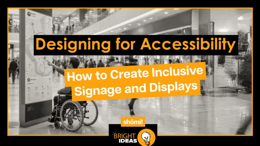
Designing for Accessibility: How to Create Inclusive Signage and Displays

Accessibility isn’t a checkbox. It’s the difference between signage that reaches every customer and signage that quietly excludes a portion of them. The good news: most of what makes a display accessible also makes it better for everyone else who walks past it.

Here’s what to think about when you’re designing signage and displays that work for the widest possible audience, with specific examples drawn from the kinds of builds we work on every day.

Start with what accessibility actually means

Accessibility in signage isn’t only about permanent disability. It’s about designing for people with visual, mobility, cognitive, and hearing differences, and for everyone navigating temporary or situational impairments: trade show floor glare, dim retail lighting, crowded aisles, a phone in one hand, a kid pulling on the other.

Design for the hardest case and the easy ones take care of themselves. A FABRiK Frame that reads clearly from a wheelchair in a busy expo hall reads clearly for everyone else, too.

Prioritise contrast for legibility

The most basic rule of accessible design: if no one can read it, it doesn’t matter how good the message is. Contrast between text and background does more for legibility than almost any other variable, especially for people with low vision or colour blindness.

This is where lightbox graphics have a built-in advantage. iMPAKT Lightboxes are backlit, which dramatically improves contrast and readability compared to printed signage in ambient light, especially in environments with mixed or low lighting. But backlighting doesn’t fix a low-contrast graphic. Pale type on a busy background looks worse when it’s lit, not better. The graphic file has to do the work first.

For large-format builds (backwalls, retail end-caps, suspended FABRiK Frames), keep contrast high and unambiguous, and check the graphic at full size before committing. What reads fine at 11×17 inches can disappear at 8 feet wide.

Choose typefaces that hold up at a glance

Decorative or heavily stylised typefaces can look distinctive, but they fail when readers have dyslexia, low vision, or just a few seconds to scan a trade show aisle. Stick to clean sans-serifs like Helvetica, Arial, or Verdana. Avoid italics and long stretches of all caps; both slow comprehension.

Size matters too. Booth headlines on a 10-foot FABRiK Frame need to read from across the aisle, which is typically 15 to 20 feet. Retail signage usually needs to be legible from at least 10 to 15 feet. The rule of thumb: 1 inch of cap height for every 10 feet of viewing distance, then go bigger if you can.

Place signage where people can actually see it

A perfectly designed sign mounted too high, tucked into a corner, or blocked by a fixture isn’t doing its job. This is where the placement strategy across a build matters: suspended Lanterns and iNTERPOLE hanging displays carry messaging above the crowd for distance visibility, while wall-mount FABRiK Frames and HORiZON Frameless displays handle the close-range, eye-level read.

For tactile and Braille signage on permanent retail builds, Canadian accessibility standards (CSA B651) place the baseline of text between 1220 and 1525 mm (48 to 60 inches) from the floor. That range works for standing users, seated users, and wheelchair users alike.

Lighting matters too. A well-designed sign in shadow is an invisible sign. This is another reason backlit displays earn their place in accessibility-conscious builds: they bring their own light, which means they don’t depend on whether the venue lighting cooperates.

Use symbols and icons alongside text

Text isn’t always the fastest way to communicate. Universally recognised symbols (a phone for service, the international symbol of accessibility, restroom pictograms) get understood faster than words and cross language barriers. On a trade show booth or retail wayfinding system, pairing text with symbols speeds comprehension for everyone, including readers who are rushed, distracted, or reading in a second language.

Where you have the real estate (a FABRiK Frame backwall, a large iMPAKT lightbox), give symbols room to breathe. Don’t crowd them up against the type.

Include Braille and tactile signage where it counts

For blind and low-vision users, tactile signage and Braille on directional signs, room identifiers, and key wayfinding signage are essential, not optional. Braille should sit below the corresponding visual text, be crisp, and be reachable at the heights noted above.

Most temporary trade show and pop-up signage doesn’t include Braille, but permanent retail builds and long-running pop-ups should. If you’re rolling out fixtures across 40 stores, accessibility-compliant tactile wayfinding is the kind of thing to spec in the design phase, not retrofit after a complaint.

Don’t overlook hearing accessibility

If a display includes audio (an iMPAKT in-motion animated lightbox paired with a soundtrack, an interactive screen, a video wall), it needs a visual equivalent. Captions, on-screen text, or visual cues mean the experience isn’t gated behind sound. This matters less for purely visual lightboxes and fabric frames, more for any build that integrates motion, screens, or audio elements.

Multi-sensory design isn’t only an accessibility win. It generally creates a richer experience for everyone, including the majority of trade show attendees who can’t hear your booth audio over the noise of the hall anyway.

Test with real users

The fastest way to find what isn’t working is to put a display in front of someone who’ll encounter it differently than you do. Feedback from users with visual, mobility, or cognitive differences turns up problems that no design review will catch: a graphic that’s perfectly legible at desk size and unreadable at booth size, a sign placed at exactly the wrong height for a seated user, a high-contrast palette that loses its punch under the venue’s specific lighting.

Accessibility simulation tools (colour-blindness filters, low-vision simulators) are a useful supplement during the design phase, but they don’t replace real users.

Why this matters for the brand, not just the build

Accessible signage isn’t only a compliance question. It’s a signal of who the brand is designed for. Customers notice when a space has been thought through, and they notice when it hasn’t. The brands that get this right tend to find that accessibility improvements quietly make their displays better for every shopper, not just the ones who needed the change.

At shōmi!, accessibility isn’t always the starting point of a build, and we’d be lying if we said it was. But it’s a conversation that’s a lot cheaper to have during design than after install. If you’re planning a retail rollout, trade show build, or pop-up and want a second set of eyes on the accessibility side before the design is locked, we’re happy to take a look.

Generation Z kids standing with social media signs covering their faces

Gen Z: The Authenticity Era in Retail Branding and Marketing

Gen Z, Redefining the Future of Retail Part 2: Seven Brands That Got It Right

Gen Z doesn’t shop the way previous generations did, and they don’t respond to the same marketing playbook. They’re more diverse than any generation before them, more attuned to authenticity, and quicker to call out a brand that’s faking it. They expect the brands they support to mean what they say, which is a higher bar than the marketing industry has historically had to clear.

The brands that have figured this out aren’t following a checklist. They’re operating on a few clear principles. Here are seven that have done it well, and what each of them gets right.

1. Patagonia: putting the money where the mission is

Patagonia has built its brand around environmental responsibility, and unlike most companies that talk about sustainability, it backs the claim with action: recycled materials, fair labour practices, a percentage of sales donated to environmental causes, and a willingness to tell customers not to buy things they don’t need. That last one alone is enough to disqualify roughly 95% of brands from copying the strategy.

The lesson isn’t “be sustainable.” It’s that Gen Z can tell the difference between a sustainability statement and an actual commitment, and they reward the second one.

2. Nike: standing for something, knowing the risk

Nike’s “Dream Crazy” campaign with Colin Kaepernick was a calculated bet that taking a clear position on social justice would resonate more than it would alienate. The campaign generated significant backlash from older demographics and significant loyalty from younger ones. Nike chose its audience, which is a different exercise than trying to keep everyone happy and ending up with no one’s attention.

The lesson: Gen Z respects brands with a point of view more than brands trying to be liked by everyone. Trying to please all demographics tends to please none of them.

3. Billie: rewriting the category, not just the messaging

Billie, a women’s razor brand, ran ads showing real body hair on women: a small choice that quietly contradicted decades of category convention. The category had been showing women shaving already-smooth skin for so long that nobody noticed how strange it was. Billie did, and made a brand out of pointing it out.

The brand was acquired by Procter & Gamble in 2021. The lesson: Gen Z notices when a brand is willing to make its competitors look behind the times. Body positivity isn’t a marketing layer here; it’s the product positioning.

4. Fenty Beauty: setting the standard the category has to catch up to

When Fenty Beauty launched in 2017 with 40 foundation shades, it didn’t just expand its own product line. It redefined what an acceptable shade range looked like for the entire beauty industry. Competitors that had been shipping ranges of 20 or 25 shades suddenly looked behind the curve, and most of them spent the following years quietly catching up and hoping nobody asked what took them so long.

The lesson: diversity isn’t a campaign, it’s a product decision. Gen Z notices the difference between a brand that adds an inclusive ad to an exclusive product line and a brand that builds inclusion into the product itself.

5. Spotify: personalisation as the product

Spotify’s Wrapped campaign turns user data into a shareable annual moment, which is to say it convinced millions of people to voluntarily post their listening habits to social media every December. The personalisation isn’t a feature on top of the product. It’s a core part of why people use Spotify in the first place.

The lesson: Gen Z expects experiences that adapt to them, not the other way around. Personalisation done well doesn’t feel like targeting. It feels like the product knows you, in a flattering way, and not in the way that prompts you to check your phone permissions.

6. Liquid Death: taking the brand seriously by refusing to take itself seriously

A canned water company with a heavy metal aesthetic and the tagline “Murder Your Thirst” shouldn’t work. It works. Liquid Death turned the most boring product category in retail into a brand people actually want on their fridge, and they did it by committing harder to the bit than anyone thought was reasonable.

The aluminum cans are also infinitely recyclable, which makes the sustainability story real, but the sustainability story isn’t the lead. The lead is that the brand is fun, and the sustainability is what’s quietly true underneath. The lesson: Gen Z responds to brands that have a sense of humour about themselves, and they’re suspicious of brands that don’t. Being earnest about a mission and irreverent about everything else turns out to be a stronger position than being earnest about absolutely everything, which is what most brand decks recommend.

7. Lush: making the physical store the brand

Walk into a Lush store and the experience is immediately different from every other beauty retailer: products sold without packaging, sales associates demoing soaps on your hands at a sink in the middle of the store, signage that reads more like a manifesto than a price tag. The brand’s anti-corporate, anti-packaging, anti-conventional-retail positioning isn’t a marketing message you read about online. It’s the store. You can smell it from across the mall, which is also part of the strategy.

The lesson: physical retail is one of the strongest brand expressions available, and most brands underuse it. For Gen Z, who get most of their brand impressions through screens, a physical space that genuinely commits to a point of view stands out by default.

What these brands have in common

Seven different categories, seven different stories, but the underlying principles repeat:

  • Authenticity beats polish. Gen Z can spot a focus-grouped statement at fifty paces. Brands that sound like real organisations with real positions outperform brands that sound like brand decks.
  • Diversity and inclusion are baseline, not differentiators. Showing up with products and imagery that reflect a diverse audience is the floor, not the ceiling. Brands that treat it as a campaign rather than a product-level commitment tend to get caught.
  • Social media is the conversation, not the megaphone. Instagram, TikTok, YouTube, and Snapchat reward brands that engage like community members, not advertisers. User-generated content and creator collaboration outperform polished brand content most of the time.
  • Storytelling beats specs. Gen Z is drawn to brands with a narrative they want to be part of, whether that’s sustainability, social justice, self-expression, or craft. Transactional messaging doesn’t build loyalty here.
  • Sustainability and social responsibility have to be real. Surface-level “green” claims get flagged fast. Genuine commitments, communicated honestly (including the parts that aren’t perfect yet), build trust.
  • Personalisation is expected, not impressive. Gen Z grew up with algorithms that knew their preferences. Generic shopping experiences feel dated by comparison.
  • A sense of humour is a feature. Brands that take themselves too seriously read as out of touch. Brands that are willing to be funny, weird, or self-aware tend to feel more human, and humans are what Gen Z wants to buy from.
  • Physical space is part of the brand, not separate from it. Stores, pop-ups, and activations are some of the most memorable brand impressions available, and they’re often the most underused.

How this plays out in physical retail

Most of these examples live in digital marketing, product design, or brand campaigns. But the same principles translate directly to physical retail environments. A pop-up that tells a clear story, a fixture program that uses materials a Gen Z shopper would actually want to ask about, a trade show booth that doesn’t look like every other booth in the row: all of these are physical expressions of the same ideas.

Lush figured this out. So did Liquid Death, in their own way, every time they show up at a festival or grocery aisle and refuse to look like the rest of the shelf. The brands that build retail environments worth posting about have figured it out too.

At shōmi!, we work with brands and agencies thinking about how their physical presence reflects what they actually stand for. If you’re planning a retail rollout, pop-up, or activation aimed at a younger audience and want a second set of eyes on the build, we’re happy to take a look.

multiethnic group of teenagers holding tiktok, facebook, youtube, snapchat and instagram signs over their faces

Gen Z: The Trailblazers of Retail’s Evolution

Gen Z: Redefining the Future of Retail – Part 1

Generation Z is the cohort currently in their teens and twenties: people born roughly between 1997 and 2012, depending on which definition you trust. They’re also the first generation in history to have never known a world without smartphones, which has turned out to matter a lot more for retail than most brands initially expected.

Gen Z is now flexing real purchasing power, and they’re spending it differently than the generations that came before. They’re not just changing what brands sell. They’re changing what brands have to be, which is a less convenient development for the brands that had already figured out the previous version.

What makes this generation different

Three things separate Gen Z from the millennials, Gen Xers, and boomers retail has spent decades learning to sell to.

They’re digitally fluent in a way nobody else is

Previous generations watched the internet and social media arrive. Gen Z grew up with them, the way previous generations grew up with television, except more so and with worse posture. They research products before they walk into a store, read reviews while they’re standing in the aisle, and watch unboxing videos as a normal part of the buying decision. The phone isn’t a tool they use to shop. It’s the room the shopping happens in, and the store is one of several places they consult.

They expect brands to mean something

This is the shift older brands struggle with most. Gen Z doesn’t just want products that work and prices that are fair. They want to know what the brand stands for, whether the brand’s actions match what it says, and whether the company is run by people they’d trust if they met them. Brands that engage in performative activism or greenwashing get caught quickly, and the call-outs spread faster than the original campaign ever did.

This isn’t about politics. It’s about consistency. A brand that says it cares about something and then quietly does the opposite is more damaging to itself than a brand that never made the claim in the first place. The safest play is meaning what you say, which is also, as it happens, the cheapest one.

They expect to see themselves represented

Gen Z is the most racially and ethnically diverse generation in North American history, and they expect the brands they support to reflect that. Tokenistic representation gets noticed and dismissed, usually before the campaign has finished rolling out. Genuine inclusivity, built into the product and not just the ad campaign, gets rewarded with loyalty.

The role of social media

Social platforms aren’t where Gen Z hears about brands. They’re where Gen Z forms opinions about brands, with or without the brand’s involvement.

Instagram, TikTok, YouTube, and Snapchat all function as parallel storefronts: spaces where products get discovered, evaluated, and recommended by people who don’t work for the brand selling them. Influencer recommendations and peer reviews carry more weight than traditional advertising for a Gen Z audience. The trade-off for brands: less control over the narrative, more leverage when the narrative goes well, and a learning curve for anyone who built their career on the assumption that brands set the conversation.

Why this matters for retail

It would be easy to read all of this and conclude that physical retail is the loser in a Gen Z world. The opposite is closer to true. Gen Z still shops in person, and they value the in-store experience, but they evaluate it against a much higher bar than previous generations did. A store that doesn’t deliver something a screen can’t (atmosphere, expertise, a brand expression you can stand inside of) struggles to justify the trip, because the alternative is sitting on a couch.

The brands winning with Gen Z aren’t choosing between digital and physical. They’re using physical retail to do what digital can’t: build a memorable, sharable, three-dimensional version of the brand that customers can experience with their whole body, then post about with their phone.

Coming up in Part 2

In Part 2, we’ll look at seven brands that have figured this out, and the specific principles they’re operating on. Patagonia, Nike, Fenty Beauty, Spotify, Liquid Death, and others have each found a different way to earn Gen Z’s attention, and the lessons translate well beyond their original categories.

Blog header titled "The Evolution of Retail Displays"

A Brief History of Retail Displays

The Evolution of Retail Displays: ​

From Hand-Painted Boards to Digital Visual Displays​

Retail signage didn’t start with digital screens. It started with painted symbols on Roman walls, ivy bushes nailed above tavern doors, and elaborate hand-painted boards that doubled as small works of art. The technology has changed dramatically over the last two thousand years. The job hasn’t: get people to stop, look, and walk in.

Here’s how retail displays got from there to here, and where they’re heading next.

Pre-19th century: hand-painted boards and the original visual language

The earliest retail signage goes back to ancient civilisations. Egyptians, Greeks, and Romans used painted symbols and terracotta plaques to advertise shops and services, and the Romans in particular were prolific about it. Taverns hung ivy bushes above their doors to signal wine. Bakeries used loaves. The whole vocabulary of “we sell the thing this picture shows” was already in place.

By the Middle Ages, hand-painted signs had become the standard in European trade districts. Most people couldn’t read, so the signs relied on imagery, and innkeepers in particular got creative: signs were elaborate, often humorous, and frequently the first impression a traveller had of a business. The craft of sign-painting required real skill, and good signs were considered a serious commercial asset.

Worth noting: the basic logic hasn’t changed. “Symbol that communicates what we sell, visible from the street, designed to interrupt the passing eye” is the same brief today. The materials are just different.

19th century: the printing press and the rise of consistency

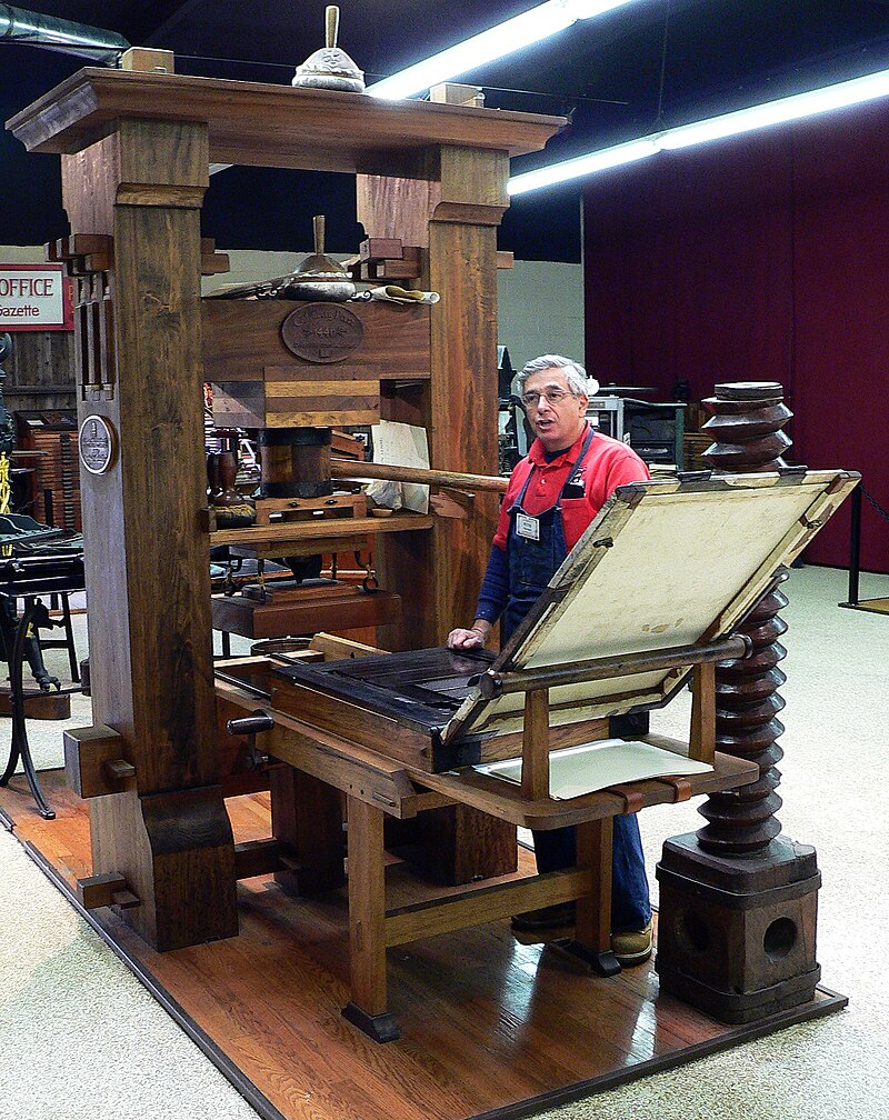
Printing technology transformed retail signage by making it reproducible. The first known printed advertising poster came earlier than most people guess: William Caxton printed an advertisement for the Ordinale ad Usum Sarum, a priest’s handbook, in 1477. But mass adoption took another few centuries, and the real shift came in the 19th century when lithography arrived and made colour printing practical at scale.

For the first time, businesses could produce signs that looked identical across multiple locations. Brand consistency, which today is treated as a baseline expectation, was a new and powerful idea. Small businesses could now afford professional-looking signs that competed visually with bigger players, and storefronts started to look more designed and less improvised.

1920s to 1960s: the neon era

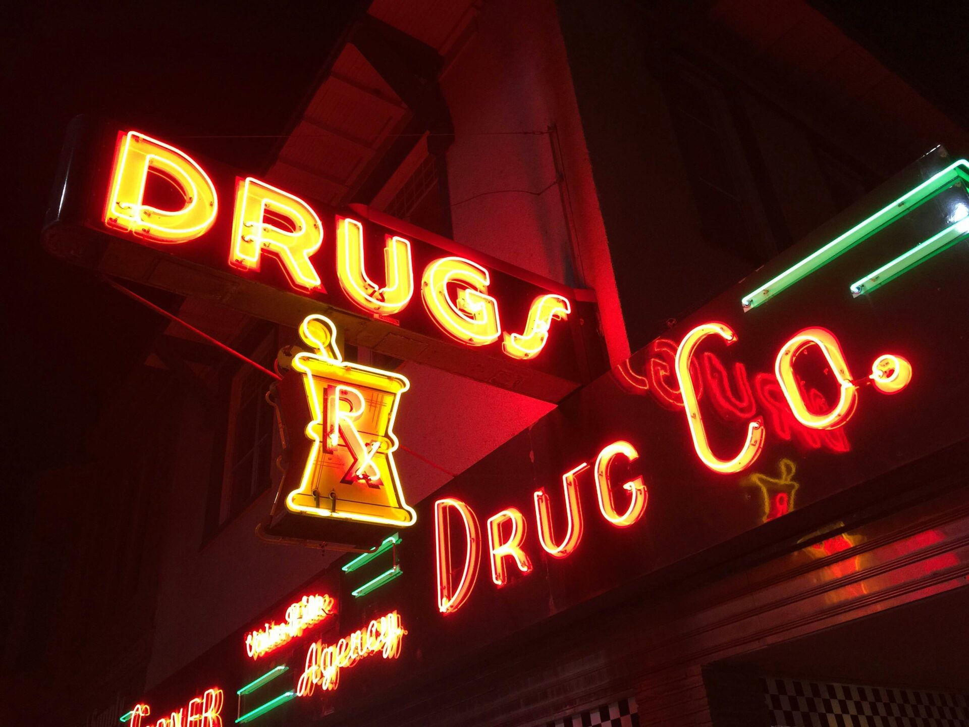
If the printing press standardised signage, neon made it impossible to ignore. The first neon sign in the United States was installed in 1923 in Los Angeles, advertising a Packard dealership. It cost $24,000, the equivalent of several hundred thousand dollars today, which is a remarkable amount of money to spend on a sign and also entirely explains why the technology spread the way it did.

Through the middle decades of the 20th century, neon defined the visual identity of urban retail. Bent glass tubes filled with different gases produced colours and shapes that nothing else could match, and entire districts (Times Square, the Las Vegas Strip, downtown Tokyo) became globally recognisable largely because of their neon. The signs weren’t just advertising. They became the architecture.

2000s to present: digital displays and interactive signage

The digital revolution changed two things about retail signage at the same time: what the sign could show, and how often it could change. LED displays, digital billboards, and interactive kiosks meant a single piece of hardware could run an unlimited number of campaigns, update in real time, and respond to the person standing in front of it.

That flexibility opened up possibilities that earlier formats couldn’t approach: dynamic pricing displays, time-of-day-specific promotions, interactive product browsers, personalised content driven by customer data. The trade-off is that digital signage requires ongoing management in a way a painted sign never did. A neon sign from 1955 still works if you replace the gas tubes. A digital display from 2015 may already be running on hardware nobody supports.


2010s to present: the pop-up era

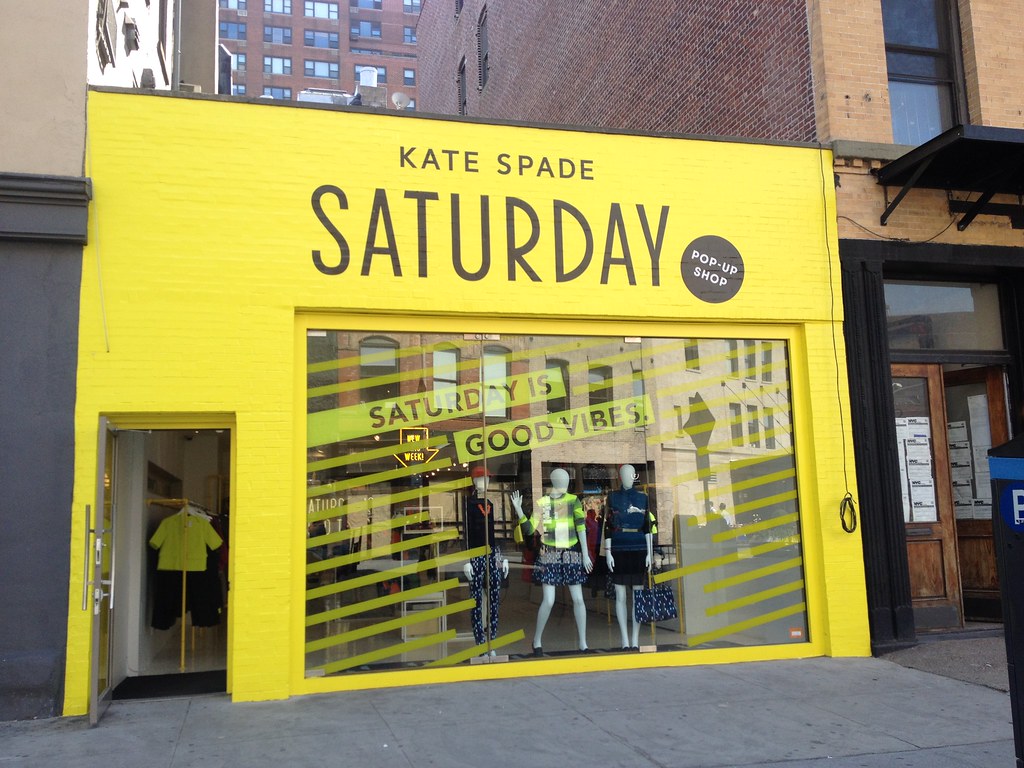
Around the early 2010s, pop-up shops became a serious retail strategy rather than a novelty. Brands realised that temporary retail spaces could create exactly the kind of urgency, exclusivity, and experiential design that permanent stores struggle to maintain. The first pop-up retail concepts go back further (the agency Vacant set up temporary spaces in 1999, and the general idea is older still), but the 2010s is when the format went mainstream.

A well-designed pop-up does several things at once: launches a product, generates social media content, gives existing customers a reason to show up, and reaches new audiences in foot-traffic locations the brand wouldn’t normally operate in. Done badly, it’s a folding table with a vinyl banner. Done well, it’s the kind of installation that ends up on design blogs for months.

Where retail displays are heading

The next decade of retail signage looks like it’s being shaped by three forces.

AR, VR, and AI. Augmented and virtual reality let customers visualise products in their own homes before buying, and AI personalises both digital content and physical experiences based on customer behaviour. The use cases that have actually stuck (virtual try-on for cosmetics and eyewear, AR product visualisation for furniture) suggest the technology works best when it solves a specific problem, not when it’s a marketing layer.

Sustainability. Retail signage is moving toward materials that have a future after the campaign ends: biodegradable substrates, recycled aluminum, FSC-certified wood, energy-efficient LED lighting that uses up to 75% less power than older alternatives. Both for environmental reasons and because brands are increasingly being asked to account for what they throw away.

Physical and digital working together. The most interesting current builds aren’t choosing between physical and digital signage. They’re using each for what it does best: physical for atmosphere, scale, and brand expression you can stand inside; digital for responsiveness, personalisation, and content that changes with the audience.

The through-line

Two thousand years of retail signage history boil down to a fairly simple observation: the technology changes, but the question doesn’t. How do you make a passerby stop, look, and decide to come in? Roman shopkeepers, medieval innkeepers, lithographers, neon benders, and digital designers have all been answering the same question with the tools of their century. The next era will look different from this one, the way every era has looked different from the one before it. The question will be the same.

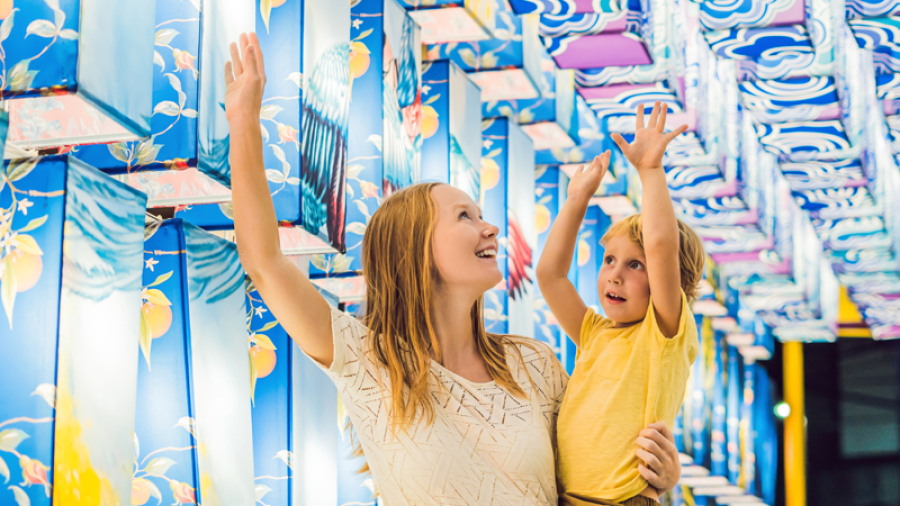
photo of mom holding up child to see colourful displays

What is Retailtainment?

“Retailtainment” is one of those marketing words that sounds invented because it is. But the concept it describes is real and getting more important. It’s what happens when a retail space stops being just a place to buy things and starts being a place worth visiting for its own sake.

The brands doing this well aren’t selling harder. They’re inviting customers into something that’s interesting on its own terms, and letting the buying happen as part of the experience rather than the point of it.

What retailtainment actually is

The short definition: retailtainment is retail designed to be experienced, not just transacted. In-store events, interactive installations, immersive environments, workshops, performances, themed spaces, anything that gives a customer a reason to enter the store that isn’t strictly “I need to buy something today.”

The longer answer is that retailtainment is a response to a problem: ecommerce is faster, cheaper, and more convenient than physical retail for most transactions. Physical stores can’t win on convenience, so they have to win on something else. Experience is the most reliable answer the industry has found.

Four brands doing it well

Arcadia Earth: art, technology, and a point of view

Arcadia Earth is an immersive exhibit that blends art and technology to show the planet’s beauty and the impact of human action on it. Visitors don’t just walk through. They participate, and the experience is designed to leave them thinking about sustainability long after they’ve left the building.

What makes it work as retailtainment isn’t just the spectacle. It’s that the experience has a point of view, and the point of view is connected to the brand. Visitors leave with a feeling, not just photos.

shōmi! helped bring the exhibit to life, and the project remains one of the clearest examples we’ve worked on of what immersive retail can do when it’s designed with intent.

LEGO House: turning the product into the destination

LEGO House in Billund, Denmark is a 12,000-square-metre building dedicated to letting people play with LEGO. Themed zones, interactive installations, opportunities to build at scale, and a level of design ambition that treats the product as a creative medium rather than a toy aisle.

The lesson: when the product is genuinely good, the retailtainment can be an honest celebration of it. LEGO House doesn’t try to convince you LEGO is fun. It gives you several hours to discover that for yourself.

Glossier: the store as the brand

Glossier’s flagship stores are designed to be photographed. Pink-saturated interiors, interactive installations, themed rooms that change between locations. The retail experience is a piece of the brand identity, not a service layer underneath it.

This is also where retailtainment shades into social media strategy. A Glossier store is a place customers want to post from, which means every visit produces content the brand didn’t have to make. The marketing budget effectively rebates itself.

REI: the brand lifestyle, not just the brand product

REI’s outdoor experiences include guided hikes, outdoor skills classes, and workshops. The retailtainment isn’t inside the store. It’s the broader idea that REI is the entry point to an outdoor lifestyle, not just a place that sells outdoor gear.

The lesson: retailtainment doesn’t always have to happen inside four walls. Sometimes the experience is what surrounds the product, and the store is one stop in a larger ecosystem the brand offers.

What these examples have in common

Four very different brands, four different formats, but a few principles repeat:

  • The experience has a point of view. It’s not entertainment for its own sake. It’s entertainment connected to what the brand actually believes or stands for.
  • The customer is a participant, not an audience. Passive viewing doesn’t stick. Interaction does.
  • The experience generates content. Customers post about it, talk about it, send friends to it. The brand gets reach it didn’t pay for.
  • The experience earns the visit. A customer doesn’t have to buy anything to leave satisfied, which makes them more likely to come back, and more likely to buy when they do.

Getting started

Retailtainment doesn’t require a $20 million immersive exhibit. A small pop-up, a thoughtfully designed in-store event, a workshop series, an interactive display that does something more than show product photos: all of these are entry points. The question is less “how much can we spend?” and more “what would actually be worth visiting?”

At shōmi!, we work with brands and agencies on immersive retail builds of every scale, from large permanent installations like Arcadia Earth down to single-event pop-ups. If you’re thinking about how to turn a retail space into a place worth visiting, we’re happy to talk through what that could look like.

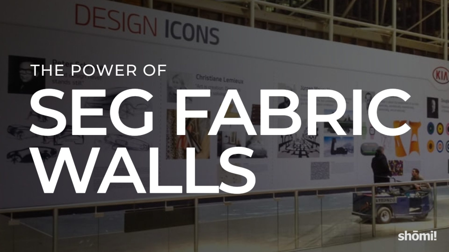
A large printed fabric wall display featuring the words The Power of SEG Fabric Walls in bold text stands out in a modern exhibition space, where people interact and explore the impressive fabric walls nearby.

Transforming Spaces: The Power of SEG Fabric Walls

SEG fabric walls have quietly become one of the most-used display systems in retail, trade shows, and corporate environments, and most of the people standing in front of them have no idea what they’re looking at. They just notice the graphic is huge, the edges are perfectly clean, and there’s no visible frame.

Here’s what the system actually is, why it’s become the default for large-format display work, and where it earns its place.

What SEG actually is

SEG stands for Silicone Edge Graphics. The system is straightforward once you’ve seen it once: a printed fabric graphic has a thin silicone bead sewn into its perimeter, and that bead pushes into a channel that runs around the inside of an aluminum frame. When the fabric tensions into the channel, it pulls completely flat and disappears the edge. No visible frame edge, no wrinkles, no exposed hardware. Just a clean, taut, frameless-looking graphic.

The aluminum frame stays. The fabric graphic swaps out. That single fact is most of why the system has taken over the industry.

Why it’s become the default for large-format display

Graphics swap, frame stays

A traditional rigid printed panel is a one-time-use object. When the campaign changes, the panel gets replaced and the old one heads to a dumpster. With SEG, the frame stays in place across years and campaigns. You ship a folded piece of fabric instead of a 4-by-8-foot rigid panel. The freight savings alone justify the system on most repeat-campaign builds, and the environmental case is a real one.

The visual quality is hard to beat

The dye-sublimated print on a properly tensioned fabric reads as a single continuous surface. In most cases, large-format fabric can be printed in one piece at sizes that would require seaming multiple rigid panels together, which means no visible joins breaking up the graphic. Compared to a rigid panel with visible edges and seams, or a vinyl banner with corner grommets, an SEG wall reads as more deliberate, more designed, and more premium. It’s the closest a large-format display gets to looking like it was always part of the architecture.

It scales

SEG works at almost any size: a 2-foot accent panel, a 30-foot trade show backwall, a curved feature wall in a retail space, a suspended fabric structure over a corporate lobby. The aluminum frame system is modular, which means a single graphic library can be assembled in different configurations as a space or campaign demands.

Installation is faster than the system has any right to be

This is the part most people don’t believe until they’ve watched it happen. A correctly designed SEG wall goes up in a fraction of the time a rigid panel installation takes. The frame snaps together, the fabric pushes in around the perimeter, and the wall is finished. When we helped Canadian Tire transform a hotel conference room into a fully branded space for their 100th anniversary, the entire build happened overnight. Try that with rigid panels.

Where SEG earns its place

The systems are versatile, but they shine brightest in a few specific applications:

  • Trade show backwalls and exhibits. Light to ship, fast to install, dramatic at scale, and the graphic refreshes each show without rebuilding the frame.
  • Immersive retail environments. Curved walls, themed spaces, and full-room takeovers that require the graphic to read seamlessly across large surfaces. Arcadia Earth is one example we worked on: large-scale fabric installations were a core part of the immersive build.
  • Backlit displays. SEG fabric over an internal LED array produces a frameless lightbox with even illumination across the full surface. Useful anywhere ambient light is low, or where the display needs to compete visually with brighter surroundings like windows, screens, or other backlit signage.
  • Corporate lobbies and office environments. Branded fabric panels create a permanent-looking architectural feature that can still be updated when the brand evolves.
  • Pop-ups and short-run activations. A pop-up that needs to look brand-new in a different city next month is exactly the case SEG was designed for.

A few honest caveats

SEG isn’t always the right call. The frame system has a real upfront cost, which doesn’t pay back on a one-time build that’s never being reused. Very small graphics (under a couple of feet) often look better in rigid materials. Outdoor installations need specific fabric and frame specs, since standard indoor SEG isn’t built for wind and weather.

Fabric choice also matters more than most people realize. Backlit, dye-sublimated stretch and non-stretch, black-back fabric for blocking light bleed-through, UV-printed non-stretch: each has a use case, and using the wrong one for the application is a common source of disappointing results. Stretch fabric on a tight curve, non-stretch on a flat panel, backlit on anything that needs to be lit from behind: the match-ups aren’t interchangeable.

The general rule: SEG is the right call when the graphic is going to change, when the install needs to be clean and fast, when scale matters, or when the space has design ambitions beyond a printed sign. It’s not the right call when none of those are true.

How shōmi! works with SEG

SEG is the underlying technology behind several of our product lines. FABRiK Frames are the unlit version: wall-mounted, suspended, free-standing, and custom configurations for retail, trade shows, corporate, and experiential builds. iMPAKT Lightboxes are the backlit version, using the same SEG fabric system over an internal LED light array for displays that need to read in low light or compete with bright surrounding environments. iMPAKT in-motion takes the lightbox further with programmable LED sequencing, so the graphic itself can animate and shift while the fabric stays static.

We work across the full fabric range (dye-sublimated stretch and non-stretch, backlit, non-lit black-back, UV-printed non-stretch), so the fabric gets matched to what the build actually needs, rather than what’s easiest to source.

If you’re considering SEG for an upcoming project and want a second opinion on whether the system fits, or how to spec it for what you’re trying to do, we’re happy to take a look.