
Walk into a Target, open Amazon, or step into an Apple store, and one thing hits you before the price tags do: colour. Shoppers form an impression of a product in seconds, and research suggests up to 90% of that initial assessment is based on colour alone. Your palette isn’t a design choice. It’s a sales strategy in disguise.
At shōmi!, we know colour doesn’t sit in the background. It leads the conversation, sets the mood, and nudges customers toward action. The right choice makes people stop, shop, and buy. The wrong one makes you invisible.
The science: why colour sells
Colour psychology in marketing isn’t theory, it’s a well-documented field. Colours evoke specific emotions and shape perceptions of quality, trust, urgency, and value, often before a shopper has consciously registered what they’re looking at.
Here’s what colour does for retailers that get it right:
- Pulls shoppers in. Target’s signature red signals urgency and energy.
- Sets the mood. Starbucks leans into green for freshness and trust.
- Communicates value. Apple’s crisp black-and-white world makes every product feel premium.
- Drives action. Amazon’s orange “Add to Cart” button is engineered to be clicked.
Lessons from retail giants: colour in action
Top brands choose palettes that align with their core promise. Here’s how five of them do it.
1. Target: the power of urgent red
Red is one of the most psychologically stimulating colours, linked to heightened energy, appetite, and urgency. Research shows it increases heart rate and draws attention faster than any other hue, which is why it’s the default for sales and promotions. Target’s bright red branding aligns with this effect: quick decisions, excitement, deals.
🧠 Psych takeaway: Red amplifies attention and drives immediate action. Effective for sales, callouts, and impulse-buy zones.
📚 Sources: CCICOLOR Institute for Color Research; Frontiers in Psychology (2015); Marketing Letters (2012).
2. Starbucks: the trustworthy green
Green is associated with nature, balance, and calm. Research in environmental and consumer psychology shows green tones promote feelings of safety, relaxation, and trust. Starbucks’ green identity reinforces freshness and wellbeing inside its stores, and supports its messaging around sustainability and ethical sourcing.
🧠 Psych takeaway: Green evokes trust and balance. Ideal for brands that want to feel relaxed, dependable, and natural.
📚 Sources: Elliot & Maier, Annual Review of Psychology (2014); Color Research & Application (2010).
3. IKEA: the engaging blue and yellow combination
Blue and yellow together form one of retail’s most psychologically balanced palettes. Blue builds trust, reliability, and calm. Yellow evokes energy, optimism, and affordability. IKEA’s pairing communicates both functionality and friendliness, which is exactly the brand promise.
🧠 Psych takeaway: Blue reassures, yellow energises. Together they create engagement through balance: stability with positivity.
📚 Sources: Journal of Business Research (2018); Color Research & Application (2006).
4. Apple: black for luxury and focus
Black is strongly associated with sophistication, control, and exclusivity. In visual marketing it defines contrast, focus, and perceived value. Apple’s restrained use of black and white reinforces simplicity, clarity, and innovation, and makes products appear cleaner and more premium.
🧠 Psych takeaway: Black communicates luxury and precision. Powerful for brands emphasising quality, focus, and design leadership.
📚 Sources: Labrecque & Milne, Marketing Letters (2012); Psychology & Marketing (2018).
5. McDonald’s: appetite and action in red and yellow
Red and yellow are among the most attention-grabbing colours in marketing. Red stimulates appetite and excitement. Yellow increases visibility and warmth. Combined, they’re psychologically effective at creating energy and hunger, which makes them the default palette for quick-service environments. McDonald’s use of the pair signals speed, comfort, and satisfaction.
🧠 Psych takeaway: Red energises, yellow invites. Together they create an emotional shortcut to appetite and approachability.
📚 Sources: Singh, Management Decision (2006); Bellizzi & Hite, Journal of the Academy of Marketing Science (1992).
The emotions behind the hues
Every shade tells a story. Here’s what customers hear when they see your colours.
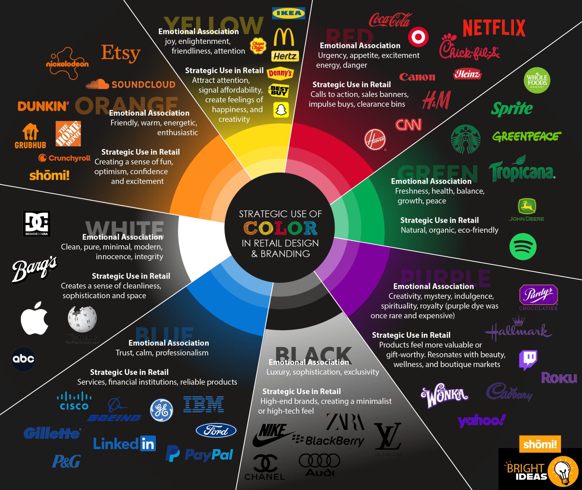
There’s no universal “right” colour. The trick is aligning your palette with your audience and your brand’s promise.
Turn colour into your sales engine
Four steps to apply this to your own retail environment:
- Understand your brand identity. Your colours should extend your brand’s core message: luxury, speed, affordability, craft.
- Know your audience. Different demographics respond differently. Mature shoppers often prefer muted tones; Gen Z responds to saturated, high-contrast palettes.
- Audit your current palette. Look critically at your branding and store design. Are your colours consistent? Are they saying what you think they’re saying?
- Apply strategically. Guide the shopper journey (Sephora’s black-and-white funnels), match the season (Nike’s seasonal shifts), and make key products pop (grocery chains layering green around produce).
Mistakes that cost sales
- Too many shades. A chaotic palette confuses instead of converts.
- Cultural blind spots. Red means luck in China and danger in the West. Context matters.
- Not testing in real life. A colour that shines on screen can look flat under fluorescent lighting.
- Skipping the test phase. A/B test colour schemes on your site, ads, and packaging. Watch sales, engagement, and feedback.
Final word: colour is your weapon
Retail moves fast. Colour moves faster.
The world’s top brands don’t just use colour, they weaponise it. It’s the split-second advantage that captures attention, builds trust, and moves product. Understood properly, your palette turns a store into a sales engine.
At shōmi!, we design displays and campaigns that use colour to work harder for you. If you’re planning a project and want to think through what your palette should be doing, we’re happy to take a look.