
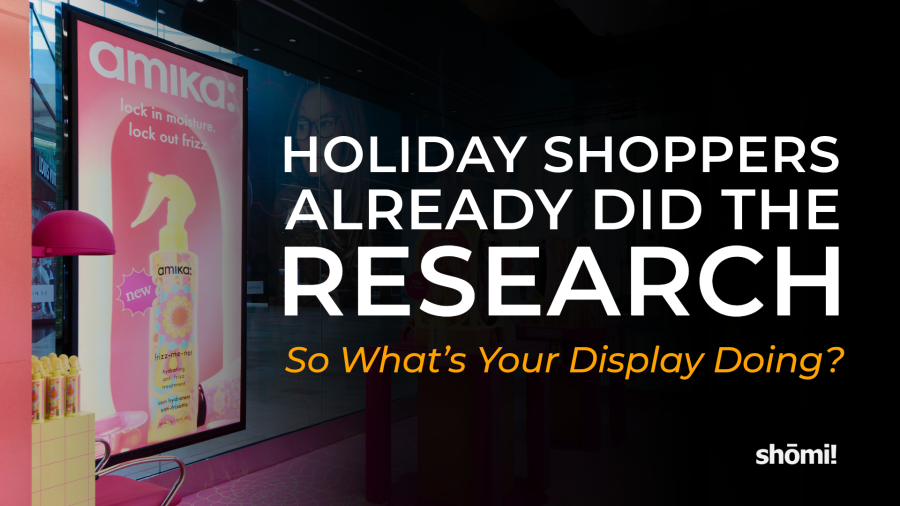
Many Have Already Done Their Research.
Good news if you build stores: 83% of Canadians expect to do their in-store holiday shopping, according to Salesforce data reported by Retail Insider. The not so good news? A lot of those people will know more about the product than your display does before they even park. They’ve read the specs. They’ve checked the price. They’ve read what three strangers thought of it. And the phone with all of that on it is still in their hand when they walk into your store. So the display doesn’t really need to introduce anything anymore. It needs to back up a decision that’s mostly made, show the price without making anyone hunt for it, and give them what their phone can’t: the actual product, full size, in good light.
What the holiday 2026 numbers say
Retail Insider ran Salesforce’s holiday outlook on September 1, with Caila Schwartz, Salesforce’s Director of Industry Insights, walking through the numbers. Canada came in at 83% planning to shop in stores, against 77% across the markets Salesforce tracks. Salesforce also found 42% of shoppers looked a product up online before going into a store, and about 80% use their phones while they shop. (Retail Insider doesn’t say whether those two are Canada-only or multi-market, so read them as Salesforce’s general shopper numbers.) People are watching their money, too: 56% of Canadians say they’re sticking to essentials, and 35% of shoppers are trading down to cheaper options.
Then there’s AI. A second Retail Insider piece, on September 10, says 39% of Canadian shoppers used an AI tool for shopping in the past 12 months, and around 11 to 12% now start there. Using the midpoint, that’s roughly 3 in 10 of the people who’ve at least tried it. Which means some shoppers are starting with a chatbot well before they even reach your display. Fun.
So people still want to go to the store. They just don’t want to learn anything while they’re there.
Let’s talk about design
I’ve been making files for walls, lightboxes and trade show builds for over a decade. Most of that time, the job was introducing the product. Big hero shot, a headline, and “just a couple more lines of copy about the product.” That made sense when the display was the first place someone met the product. It isn’t anymore. A lot of shoppers have already met it, read several strangers reviews, and asked a chatbot if the cheaper version is basically the same. So here are my thoughts on what to do about it.
1. Cut the spec sheet
About 4 in 5 shoppers have a phone in their hand. Your display of bullet points is up against a device with better bullet points and a search bar, and you’re not winning this one. Give the display one clear message, one fantastic image, and set the type big enough to read from the other side of the store. The details can live on the phone. That’s where they’re gonna look anyway.
2. Make the brand easy to spot
If they looked it up first, or a chatbot told them what to buy, they’re walking in looking for a name. So the logo has to read from across the store, not sit tiny in a bottom corner because it was “fighting with the hero image.” The type-size formula in point 5 (below) works for wordmarks too, so do the math. Same goes for colour. If the brand is a specific orange online, the display needs to be that orange, not a close-enough orange. Spec the Pantone, and check it on a lit sample if it’s backlit. And if it’s a brand display inside someone else’s store, you’re competing with the retailer’s signage too. Make sure yours wins at the shelf. Candy Pratts Price, the designer whose work at Bloomingdale’s helped redefine modern visual merchandising, said it plainly in VMSD‘s July-August issue: “Window displays today are driven by brand identity.” Same goes for the wall inside.
3. Match the online version
If 42% looked the product up first, whatever’s on your retail display should look like what they looked up. Same photo, same colour, same name. When the display and the product page don’t match, nobody thinks “ooh, creative.” They think “wait… is this the right one?” And that’s about the last question you want in someone’s head right before they make a decision.
4. Make the price easy to find
With 56% sticking to essentials and 35% buying cheaper versions, price is part of the decision, not something to tuck in a corner. They probably already know what it costs online anyway. “Ask an associate” just means they have to go find one…In December. Nobody has ever left a store thinking, “I loved how hard that was to price.” Put it where the eye goes second, right after the product.
5. Do what a screen can’t
A phone screen is a few inches across. Your wall can be eight feet and backlit. The phone wins on information. The wall wins on size and light. So stop competing with the phone on specs and win where it counts.
The catch is that big only works if it’s sharp. A blurry eight-foot graphic loses to a crisp phone screen every time. So here’s the cheat sheet I wish came attached to every brief.
How sharp does the image need to be? It depends on how close people get. HP’s large-format printing guide breaks it down by viewing distance:
| How close they stand | Example (HP’s categories) | Resolution at final size |
|---|---|---|
| Under 2 ft | Close-up displays | 200-300 PPI |
| 3-5 ft | Trade show graphics | 150-200 PPI |
| 5-10 ft | Posters and banners | 100-150 PPI |
| 20 ft and up | Outdoor banners | 50-100 PPI |
What that means in pixels. PPI is pixels per inch: how many pixels of your image get packed into each inch of the printed graphic. More pixels per inch means a sharper print. To find it, divide the image’s width in pixels by the print’s width in inches.
Say you’ve got an eight-foot wall graphic. That’s 96 inches wide (8 × 12 = 96), and people walk right up to it, 3 to 5 feet away. HP’s table says that distance needs 150 to 200 PPI, so we’ll use the low end, 150. That means the file needs to be 96 × 150 = 14,400 pixels across.
Now try a standard 4K image, which is 3,840 pixels wide. Spread across 96 inches, that’s 3,840 ÷ 96 = 40 PPI, roughly a quarter of the 150 you need (40 ÷ 150 ≈ 0.27). It’s below even HP’s 50 to 100 PPI for outdoor banners seen from 20 feet or more, and this is a wall people are standing in front of.
An AI image is smaller still. Midjourney’s own documentation lists an upscaled 16:9 image at 2,912 pixels wide. On the same wall, that’s 2,912 ÷ 96 ≈ 30 PPI, about a fifth of what you need (30 ÷ 150 ≈ 0.2).
So ask for the original high-res files early, before December happens to you.
How big should the type be? The United States Sign Council’s legibility research gives a simple formula: viewing distance in feet ÷ legibility index = letter height in inches. The index runs from 20 to 38 depending on the lighting, typeface, colours and whether the text is all caps or upper and lower case (Signs of the Times). Take 30 as a middle-of-the-road number and a headline you want read from 30 feet away needs letters about 1 inch tall (30 ÷ 30 = 1). That’s the formula’s answer, not a number for someone glancing past with a cart, so I’d go at least double.
Here’s the formula at a few retail distances, using the lowest and highest index in USSC’s table (20 and 38) and 30 as the middle. Letter heights are in inches.
| Viewing distance | Index 20 (hardest to read) | Index 30 (about the middle) | Index 38 (easiest to read) |
|---|---|---|---|
| 10 ft | 0.50 in | 0.33 in | 0.26 in |
| 20 ft | 1.0 in | 0.67 in | 0.53 in |
| 30 ft | 1.5 in | 1.0 in | 0.79 in |
| 40 ft | 2.0 in | 1.3 in | 1.1 in |
| 50 ft | 2.5 in | 1.7 in | 1.3 in |
| 100 ft | 5.0 in | 3.3 in | 2.6 in |
Height = viewing distance in feet ÷ index (30 ft ÷ 20 = 1.5, 30 ÷ 30 = 1.0, 30 ÷ 38 ≈ 0.79). Index 20 is external light, Clarendon, white on black, all caps. Index 38 is neon, Helvetica, white on black, upper and lower case. The height is for the initial capital in upper and lower case, or every letter in all caps (USSC, via Signs of the Times, 2006).
Proof it lit. If it’s backlit, approve the colour on a lit sample, not on your monitor. Your screen and a lightbox are two very different light sources, and the client is only ever going to see one of them in the store.
A word on pop-ups
A pop-up is a temporary store, kiosk or branded display set up in a mall, inside a retailer or on a busy street for a limited run, then taken down. If you’re building one this season, all of this applies with less margin for error. It’s only there for a limited run, so nobody gets time to warm up to it, and it has to earn its spot in the few seconds someone walks past with their phone out. That’s the case for everything above: one message, a brand that’s easy to spot, a price that’s easy to find, and the size and light a screen can’t match.
It’s also a case for starting early. A pop-up runs to a fixed date, and the files, approvals and production all have to land before it does.
What this doesn’t mean
It doesn’t mean slapping a QR code on everything and calling it a day. The shopper’s already got the website open. Sending them back to it from the display is like handing someone a map of the room they’re standing in. If a code gets them something the store can’t (other sizes in stock, delivery, a coupon), great. Otherwise, skip it. Andi Woung, Senior Manager of Windows Creative at Macy’s HSQ, put it better than I can in the same VMSD piece: tech “should complement creativity rather than replace it.”
And the store’s fine, by the way. It just doesn’t have to do the boring part anymore. The spec sheet moved to the phone. What’s left is the physical, persuasive, little-bit-of-a-show part, which, if I’m being selfish about it, is the part designers wanted to do anyway 😉
FAQ
Yes. Salesforce data reported by Retail Insider on September 1, 2026 found 83% of Canadian consumers expect to shop in physical stores this holiday season, compared with 77% of consumers across the markets Salesforce tracks.
Salesforce found that 42% of shoppers researched a product online before walking into a store, and roughly 80% use their phones while shopping in physical retail. These figures were not reported as Canada-specific.
Displays should carry less product information and more confirmation: one clear message, visuals that match the product’s online imagery, an easy-to-find price, and an emphasis on what a phone screen can’t deliver, such as scale and lighting.
It depends on viewing distance. HP’s large-format guidance recommends 200-300 PPI for close-up displays under 2 feet, 150-200 PPI for graphics viewed from 3-5 feet, 100-150 PPI for posters and banners at 5-10 feet, and 50-100 PPI for outdoor banners viewed from 20 feet or more. An 8-foot-wide graphic viewed from 3-5 feet needs at least 14,400 pixels across (96 inches × 150 PPI).
The United States Sign Council’s formula divides viewing distance in feet by a legibility index (20 to 38, depending on lighting, typeface, colour and case) to get letter height in inches. With an index of 30, text read from 30 feet needs letters about 1 inch tall.
According to Salesforce research reported by Retail Insider on September 10, 2026, 39% of Canadian shoppers used an AI tool for shopping in the past 12 months, and roughly 11 to 12% now start their shopping journey with AI.