
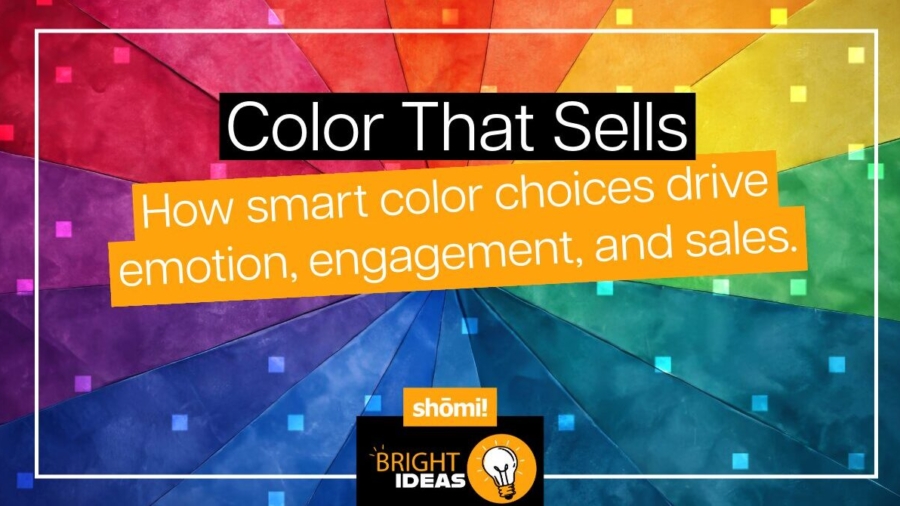
Walk into a Target, open Amazon, or step into an Apple store, and one thing hits you before the price tags do: color. Shoppers form an impression in under 90 seconds—and up to 90% of that judgment is based on color. That means your palette isn’t just “a design choice.” It’s your sales strategy in disguise.
In the vibrant world of retail, every detail counts. Yet, one of the most powerful, subconscious influences often goes overlooked or underestimated: color. The hues that dominate your store, your branding, and your packaging aren’t just aesthetic choices; they are silent salespeople, constantly influencing customer emotions, perceptions, and ultimately, purchasing decisions.
At shomi!, we know color doesn’t sit in the background. It leads the conversation, sets the mood, and nudges customers toward action. The right choice makes people stop, shop, and buy. The wrong one? You risk being invisible.
The Science: Why Color Sells
Color psychology in marketing isn’t just a theory; it’s a well-documented field. Research suggests that up to 90% of an initial product assessment is based purely on color. Furthermore, colors can evoke specific emotions, perceptions of quality, trust, urgency, and even value.
Color does more heavy lifting than most retailers realize:
- Pulls shoppers in. Target’s signature red screams urgency and energy.
- Sets the mood. Starbucks leans into green for freshness and trust. Shoppers feel it instantly.
- Communicates value. Apple’s crisp black-and-white world makes every product feel premium.
- Drives action. Amazon’s orange “Add to Cart” button is engineered to be clicked.
Lessons from Retail Giants: Color in Action
Brands meticulously select their palettes to align with their core values and target audience. Here’s how retail leaders weaponize color:

1. Target: The Power of Urgent Red
Red is one of the most psychologically stimulating colors, often linked to heightened energy, appetite, and a sense of urgency. Studies show that red increases heart rate and draws attention more than any other hue, which is why it’s commonly used to signal sales and promotions. Target’s bright red branding aligns with this effect—encouraging quick decisions, stimulating excitement, and highlighting deals. It reflects a fast-paced retail model focused on accessibility and instant gratification.
🧠 Psych takeaway: Red amplifies attention and drives immediate action, making it effective for sales, callouts, and impulse-buy zones.
📚 Sources: CCICOLOR Institute for Color Research; Frontiers in Psychology (2015); Marketing Letters (2012).

2. Starbucks: The Trustworthy Green
Green is associated with nature, balance, and calm. Research in environmental and consumer psychology indicates that green tones can promote feelings of safety, relaxation, and trust. Starbucks’ green identity aligns with these associations, helping to create a sense of freshness and wellbeing within its stores. This connection also supports the brand’s messaging around sustainability and ethical sourcing, reinforcing a calm and consistent customer experience.
🧠 Psych takeaway: Green evokes trust and balance—ideal for brands that want to create a relaxed, dependable, and natural impression.
📚 Sources: Elliot & Maier, Annual Review of Psychology (2014); Color Research & Application (2010).

3. IKEA: The Engaging Blue & Yellow Combination
Blue and yellow together form one of retail’s most psychologically balanced palettes. Blue is proven to build trust, reliability, and calm, while yellow evokes energy, optimism, and affordability. IKEA’s combination of these colors aligns with research showing that blue builds brand confidence and yellow draws attention and creates warmth. This pairing communicates both functionality and friendliness—an ideal mix for a brand built on accessible, reliable design.
🧠 Psych takeaway: Blue reassures; yellow energizes. Together, they create engagement through balance—stability with positivity.
📚 Sources: Journal of Business Research (2018); Color Research & Application (2006).

4. Apple: Black for Luxury and Focus
Black is strongly associated with sophistication, control, and exclusivity. In visual marketing, it helps define contrast, focus, and perceived value. Apple’s restrained use of black and white in its stores and packaging aligns with this psychology—reinforcing simplicity, clarity, and innovation. The high-contrast design makes products appear cleaner and more premium, reinforcing the brand’s position as a leader in minimalist, high-end technology.
🧠 Psych takeaway: Black communicates luxury and precision—powerful for brands emphasizing quality, focus, and design leadership.
📚 Sources: Labrecque & Milne, Marketing Letters (2012); Psychology & Marketing (2018).

5. McDonald’s: Appetite & Action in Red and Yellow
Red and yellow are among the most attention-grabbing colors in marketing. Red stimulates appetite and excitement, while yellow increases visibility and feelings of warmth. Combined, they are psychologically effective at creating energy and hunger—making them ideal for fast food and quick-service environments. McDonald’s use of these colors aligns with these effects, creating familiarity and signaling speed, comfort, and satisfaction.
🧠 Psych takeaway: Red energizes, yellow invites—together they create an emotional shortcut to appetite and approachability.
📚 Sources: Singh, Management Decision (2006); Bellizzi & Hite, Journal of the Academy of Marketing Science (1992).
The Emotions Behind the Hues
Every shade tells a story. Here’s what customers hear when they see your colors:

TIP: There’s no universal “right” color. The trick is aligning your palette with your audience and your brand’s promise.
Turn Color into Your Sales Engine: Actionable Steps
Now that you’ve seen the power of color in action, how can you apply these principles to your own retail business?
- Understand Your Brand Identity: Your colors should be an extension of your brand’s core message (luxury, speed, affordability, etc.).
- Know Your Target Audience: Different demographics respond to colors in varying ways. Mature shoppers may prefer muted tones; Gen Z may thrive on neon.
- Audit Your Current Palette: Take a critical look at your existing branding and store design. Are your colors consistent? Are they sending the right message?
- Strategic Application: Guide the shopper journey (e.g., Sephora’s black-and-white funnels), match the season (e.g., Nike’s seasonal color shifts), and make key products pop (e.g., grocery chains layering greens around produce).
Mistakes That Cost Sales
- Too many shades. A chaotic palette confuses, instead of converts.
- Cultural blind spots. Red = luck in China, danger in the West.
- Not testing in real life. A color that shines on screen might look flat under fluorescent lighting.
- Don’t forget to Test and Iterate: A/B test different color schemes on your website, ads, or packaging. Monitor sales, engagement rates, and customer feedback to see what truly works for your business.
Final Word: Color is Your Weapon
Retail moves fast. Color moves faster.
The world’s top brands don’t just “use” color—they weaponize it. They know it’s the split-second advantage that captures attention, builds trust, and moves product. By understanding the profound impact of color psychology, you can transform your retail environment from a mere store into a meticulously designed sales engine.
At shomi!, we design displays and campaigns that use color to work harder for you—turning casual shoppers into loyal buyers.
👉 Ready to see what the right palette can do for your next project? Let’s talk.

